

 800+ IT
News
als RSS Feed abonnieren
800+ IT
News
als RSS Feed abonnieren📚 How to build a dropdown filter component with Tailwind CSS and Flowbite
💡 Newskategorie: Programmierung
🔗 Quelle: dev.to
Today I am going to show you how you can build a dropdown filter component using Tailwind CSS and Flowbite to allow users to query through search results in your application based on checkbox and radio components.
Tailwind CSS is a popular utility-first CSS framework that can help you get started building UI interfaces faster by using utility classes directly inside your HTML.
Flowbite is a popular component library built on top of Tailwind CSS featuring interactive components like navbars, dropdowns, and modals to speed up your development.
We are going to use both of these technologies today to build the following dropdown filter component:
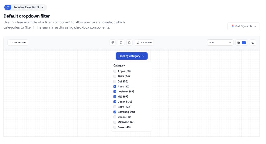
The code will support dark mode, responsive and you will also be able to position it anyhow you want using the Flowbite JS API and data attributes.
Let's get started!
Tailwind CSS Filter Dropdown
First of all make sure that you have both Tailwind CSS and Flowbite installed in your local project so that the utility classes and the data attributes that show and hide the dropdown will work.
Please follow the guides here:
After you have them installed in your project let's now set up the basic HTML markup. Let's first start by setting up the button that will trigger the dropdown:
<button id="dropdownDefault" data-dropdown-toggle="dropdown"
    class="text-white bg-primary-700 hover:bg-primary-800 focus:ring-4 focus:outline-none focus:ring-primary-300 font-medium rounded-lg text-sm px-4 py-2.5 text-center inline-flex items-center dark:bg-primary-600 dark:hover:bg-primary-700 dark:focus:ring-primary-800"
    type="button">
    Filter by category
    <svg class="w-4 h-4 ml-2" aria-hidden="true" fill="none" stroke="currentColor" viewBox="0 0 24 24"
      xmlns="http://www.w3.org/2000/svg">
      <path stroke-linecap="round" stroke-linejoin="round" stroke-width="2" d="M19 9l-7 7-7-7"></path>
    </svg>
  </button>
I've already added in the utility classes and notice how we also set an id and a data-dropdown-toggle data attribute that will select and toggle the dropdown component as we click on the button.
Next let's actually code the dropdown content and the checkbox filter items and the form component that will be used to query through the search results:
 <!-- Dropdown menu -->
  <div id="dropdown" class="z-10 hidden w-56 p-3 bg-white rounded-lg shadow dark:bg-gray-700">
    <h6 class="mb-3 text-sm font-medium text-gray-900 dark:text-white">
      Category
    </h6>
    <ul class="space-y-2 text-sm" aria-labelledby="dropdownDefault">
      <li class="flex items-center">
        <input id="apple" type="checkbox" value=""
          class="w-4 h-4 bg-gray-100 border-gray-300 rounded text-primary-600 focus:ring-primary-500 dark:focus:ring-primary-600 dark:ring-offset-gray-700 focus:ring-2 dark:bg-gray-600 dark:border-gray-500" />

        <label for="apple" class="ml-2 text-sm font-medium text-gray-900 dark:text-gray-100">
          Apple (56)
        </label>
      </li>

      <li class="flex items-center">
        <input id="fitbit" type="checkbox" value=""
          class="w-4 h-4 bg-gray-100 border-gray-300 rounded text-primary-600 focus:ring-primary-500 dark:focus:ring-primary-600 dark:ring-offset-gray-700 focus:ring-2 dark:bg-gray-600 dark:border-gray-500" />

        <label for="fitbit" class="ml-2 text-sm font-medium text-gray-900 dark:text-gray-100">
          Fitbit (56)
        </label>
      </li>

      <li class="flex items-center">
        <input id="dell" type="checkbox" value=""
          class="w-4 h-4 bg-gray-100 border-gray-300 rounded text-primary-600 focus:ring-primary-500 dark:focus:ring-primary-600 dark:ring-offset-gray-700 focus:ring-2 dark:bg-gray-600 dark:border-gray-500" />

        <label for="dell" class="ml-2 text-sm font-medium text-gray-900 dark:text-gray-100">
          Dell (56)
        </label>
      </li>

      <li class="flex items-center">
        <input id="asus" type="checkbox" value="" checked
          class="w-4 h-4 bg-gray-100 border-gray-300 rounded text-primary-600 focus:ring-primary-500 dark:focus:ring-primary-600 dark:ring-offset-gray-700 focus:ring-2 dark:bg-gray-600 dark:border-gray-500" />

        <label for="asus" class="ml-2 text-sm font-medium text-gray-900 dark:text-gray-100">
          Asus (97)
        </label>
      </li>

      <li class="flex items-center">
        <input id="logitech" type="checkbox" value="" checked
          class="w-4 h-4 bg-gray-100 border-gray-300 rounded text-primary-600 focus:ring-primary-500 dark:focus:ring-primary-600 dark:ring-offset-gray-700 focus:ring-2 dark:bg-gray-600 dark:border-gray-500" />

        <label for="logitech" class="ml-2 text-sm font-medium text-gray-900 dark:text-gray-100">
          Logitech (97)
        </label>
      </li>

      <li class="flex items-center">
        <input id="msi" type="checkbox" value="" checked
          class="w-4 h-4 bg-gray-100 border-gray-300 rounded text-primary-600 focus:ring-primary-500 dark:focus:ring-primary-600 dark:ring-offset-gray-700 focus:ring-2 dark:bg-gray-600 dark:border-gray-500" />

        <label for="msi" class="ml-2 text-sm font-medium text-gray-900 dark:text-gray-100">
          MSI (97)
        </label>
      </li>

      <li class="flex items-center">
        <input id="bosch" type="checkbox" value="" checked
          class="w-4 h-4 bg-gray-100 border-gray-300 rounded text-primary-600 focus:ring-primary-500 dark:focus:ring-primary-600 dark:ring-offset-gray-700 focus:ring-2 dark:bg-gray-600 dark:border-gray-500" />

        <label for="bosch" class="ml-2 text-sm font-medium text-gray-900 dark:text-gray-100">
          Bosch (176)
        </label>
      </li>

      <li class="flex items-center">
        <input id="sony" type="checkbox" value=""
          class="w-4 h-4 bg-gray-100 border-gray-300 rounded text-primary-600 focus:ring-primary-500 dark:focus:ring-primary-600 dark:ring-offset-gray-700 focus:ring-2 dark:bg-gray-600 dark:border-gray-500" />

        <label for="sony" class="ml-2 text-sm font-medium text-gray-900 dark:text-gray-100">
          Sony (234)
        </label>
      </li>

      <li class="flex items-center">
        <input id="samsung" type="checkbox" value="" checked
          class="w-4 h-4 bg-gray-100 border-gray-300 rounded text-primary-600 focus:ring-primary-500 dark:focus:ring-primary-600 dark:ring-offset-gray-700 focus:ring-2 dark:bg-gray-600 dark:border-gray-500" />

        <label for="samsung" class="ml-2 text-sm font-medium text-gray-900 dark:text-gray-100">
          Samsung (76)
        </label>
      </li>

      <li class="flex items-center">
        <input id="canon" type="checkbox" value=""
          class="w-4 h-4 bg-gray-100 border-gray-300 rounded text-primary-600 focus:ring-primary-500 dark:focus:ring-primary-600 dark:ring-offset-gray-700 focus:ring-2 dark:bg-gray-600 dark:border-gray-500" />

        <label for="canon" class="ml-2 text-sm font-medium text-gray-900 dark:text-gray-100">
          Canon (49)
        </label>
      </li>

      <li class="flex items-center">
        <input id="microsoft" type="checkbox" value=""
          class="w-4 h-4 bg-gray-100 border-gray-300 rounded text-primary-600 focus:ring-primary-500 dark:focus:ring-primary-600 dark:ring-offset-gray-700 focus:ring-2 dark:bg-gray-600 dark:border-gray-500" />

        <label for="microsoft" class="ml-2 text-sm font-medium text-gray-900 dark:text-gray-100">
          Microsoft (45)
        </label>
      </li>

      <li class="flex items-center">
        <input id="razor" type="checkbox" value=""
          class="w-4 h-4 bg-gray-100 border-gray-300 rounded text-primary-600 focus:ring-primary-500 dark:focus:ring-primary-600 dark:ring-offset-gray-700 focus:ring-2 dark:bg-gray-600 dark:border-gray-500" />

        <label for="razor" class="ml-2 text-sm font-medium text-gray-900 dark:text-gray-100">
          Razor (49)
        </label>
      </li>
    </ul>
  </div>
</div>
After putting these together make sure that you have Flowbite's JS file included somewhere in your HTML template so that the toggle will work.
If you turn on dark mode with Tailwind CSS the component's appearance will automatically switch:

More examples
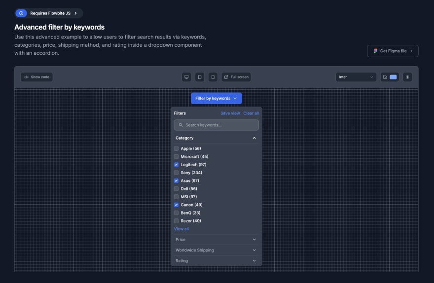
If you want to check out more examples of dropdown filter components you can check out the full collection on the Flowbite website.
Advanced filter by keywords
Filter by category

Filter by properties

You can view all of the Tailwind CSS Filters examples here.
Credits
This resource could not have been done without the open-source frameworks and libraries:
...