

 800+ IT
News
als RSS Feed abonnieren
800+ IT
News
als RSS Feed abonnieren📚 Visualizing the Deconvolution Operation
💡 Newskategorie: AI Nachrichten
🔗 Quelle: towardsdatascience.com
A detailed breakdown of transposed convolutions operation
Introduction
The transposed convolutions are the ones used for generating images, and though they’ve been around for a while, and were explained quite nicely — I’ve still struggled to understand how exactly they get their job done. The article I’m sharing describes a simple experiment illustrating this process. I’ve also included some tricks that help to improve the network performance.
Overall, there are several topics described in this article a reader may consider interesting:
- Overall visualization of the deconvolution operation
- Optimizing the network by separating more important components
- Addressing a synthetic dataset issue
The task for the illustration is the simplest I could think of: build an autoencoder for synthetic data. The fact that it is synthetic, may raise some issues. It’s true that the models trained on such data may not perform well on real data. But we will later see why this is the case and how to fix it. The model consists of one convolutional layer for the encoder, and one deconvolution (aka convolution transposed) for the decoder.
All the images and chars below are my own.
1. The Dataset
The data is a set of 1-dimensional Bezier curves looking like the following:
And here is the code that generates the data:
https://medium.com/media/db59dbb4724f4a6a167e5fb777c3ab7c/hrefThese curves contain 15 points each. Each curve will be fed into the network as a 1-d array (instead of passing [x, y] coordinates for each point, only [y] is passed).
Every curve can be characterized by two parameters, meaning that our network should be able to encode/decode any curve into a vector of size 2.
2. The Approach
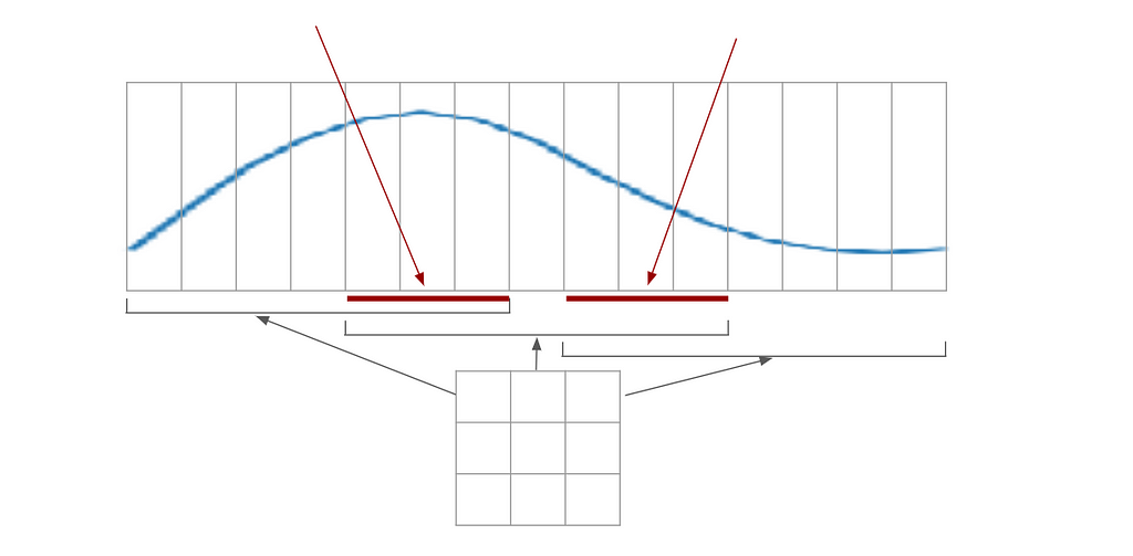
Here is an example network one could use to encode the curve:
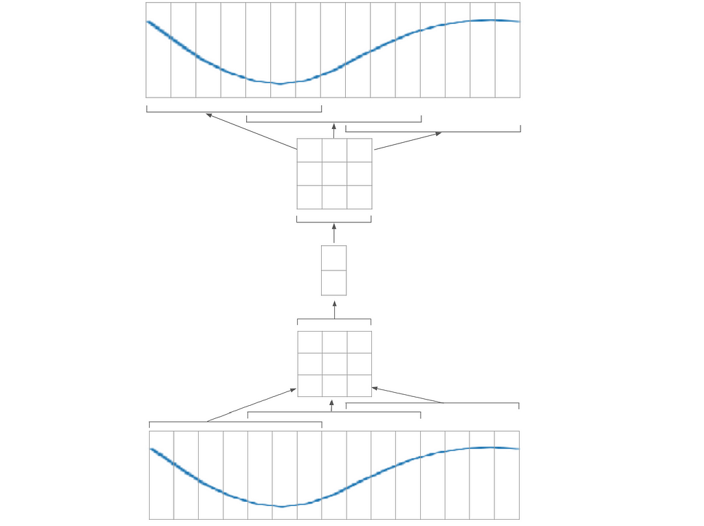
In the image above, the input signal (bottom) is broken into 3 patches of size 7 (by applying a convolution layer of window size 7 and stride 4). Each patch is encoded into a vector of size 3, giving a 3x3 matrix. This matrix is then encoded into a vector of size 2; then the operation is repeated inversely in the decoder.
The network may be broken into 2 parts. The first one will be able to encode/decode a part of the curve (the 7 pixels patch); whereas the second will only deal with the 3x3 matrix. This way, I will be able to train each part separately. I could make a smaller autoencoder that works with 7 pixels patches only:
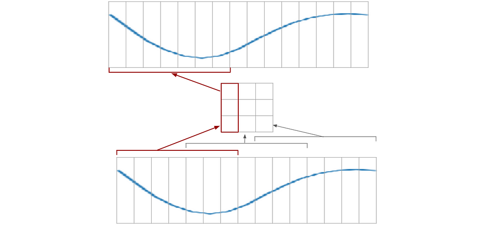
So I’m going to split each example into patches, and train the network to encode/decode the patches. Then, I will assemble this network to produce the whole curve.
I won’t be further encoding this 3x3 matrix, as this process will not carry any new information.
3. The Network
Models used
I will use separate models for the encoder and decoder. And they are quite simple:
https://medium.com/media/41f0deaef270e20bd5c8f80f03ebdbfb/hrefThe stride is given as 4 because as referred to by the images in the “Approach” section, the filter moves 4 pixels at a time. Since we’re implementing only one stage here, this stride is entirely optional; it will only have an effect later when we assemble a larger network.
Training process
To start with, I will set up a set of trainings with different seeds.
The code for the training is as simple as it can be:
https://medium.com/media/a22edb57c551d94591327bdb19cbe4ac/hrefHere is how the loss behaves for these experiments:
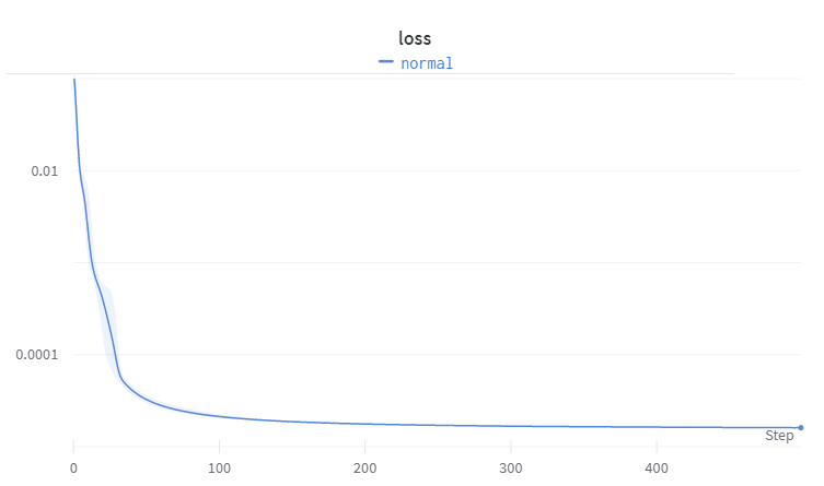
The image shows the mean and standard deviation of the loss for 10 experiments with different seeds.
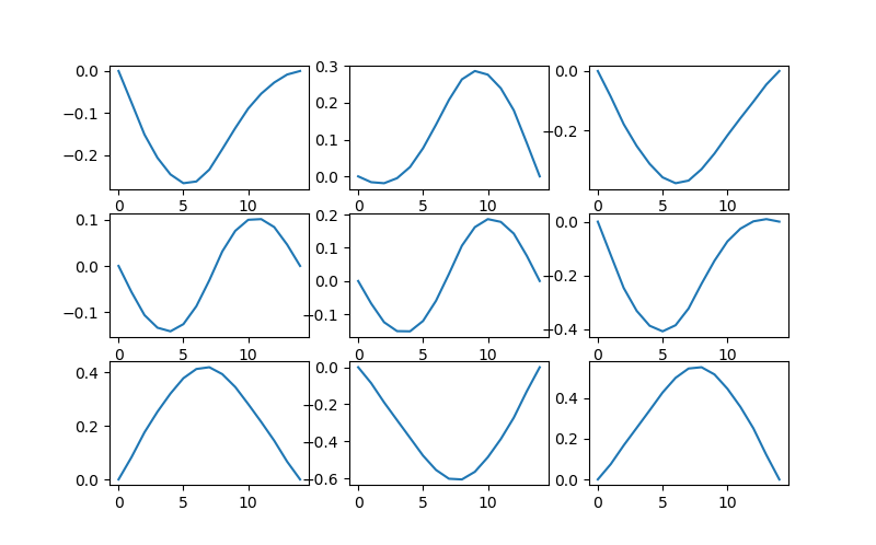
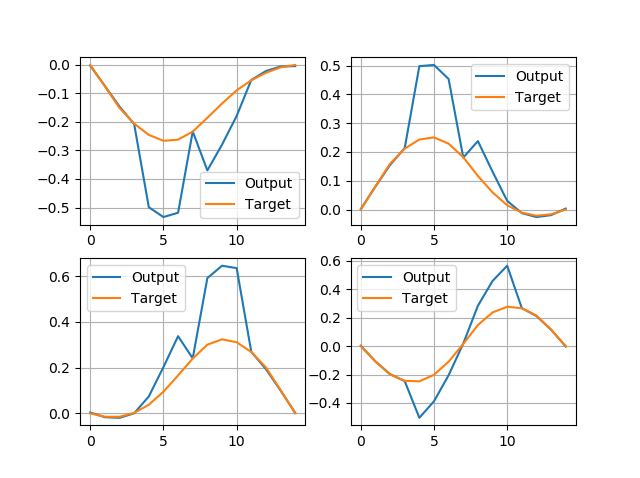
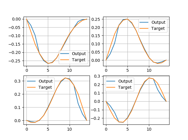
If I now compare labels with the network outputs visually, it looks like the following:
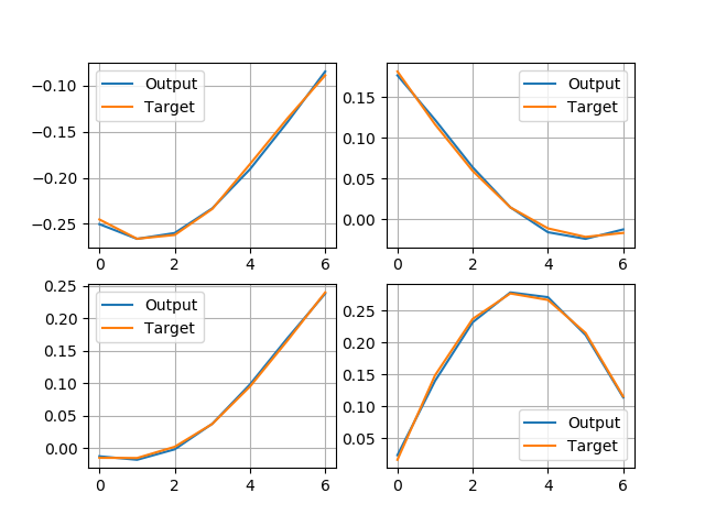
This doesn’t look bad, seems like the network is working and the loss value under 1e-4 is sufficient.
Next, I will illustrate how the encoder and decoder work in this example.
Decoder
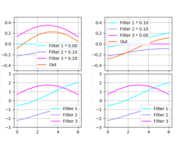
The decoder is meant to transform the code (3-dimensional vector) into the curve patch. As a deconvolution operation, it has a set of filters, each scaled by some value, then being summed up; in other words, the weighted sum of the filters should match the desired output.
The image below contains two examples of restoring a curve. The example on the left was decoded from vector [0.0, 0.1, 0.2] and on the right — [0.1, 0.1, 0.0]. Each example contains scaled filters on the top and filters without scaling on the bottom.
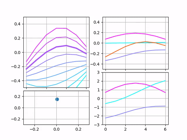
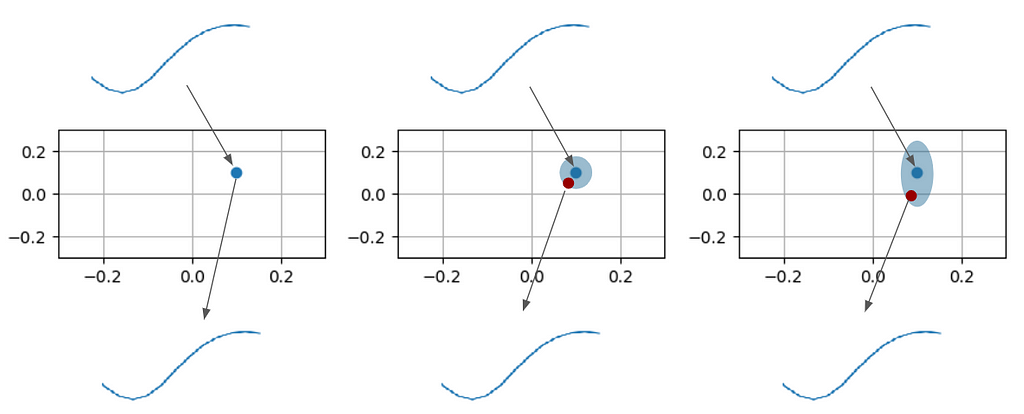
Sure enough, we could vary the vector components one at a time and render the network output in real-time, forming a cool-looking animation. So here it is:
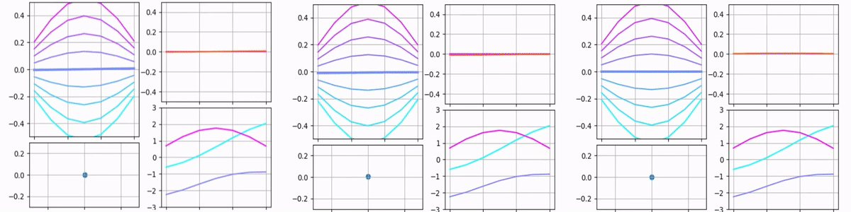
Each of the animations above contains multiple plots. The point on the bottom-left shows the input vector. Its X and Y coordinates and size represent the input’s first, second, and third components. The bottom-right plot shows raw filters and stays the same for all the animations. The top-right plot shows scaled filters and output. Since only one parameter is being varied, only one filter is scaled and the output matches this filter.
The top-left plot is probably the most interesting because it’s designed to show how the output depends on two components simultaneously. Each curve on it represents the output for different values of the third component. One may see that in the third animation the graph does not move, only different curves become bold. In the first two animations, only the middle curve remains bold because the third component remains zero, but overall it gives an idea of what the output would be if the third component was varied.
Here is the case when all components are varied simultaneously:
Encoder
The encoder in this example looks a bit less intuitive, but anyway it somehow gets the job done. (Its quality will be reviewed in the following sections)
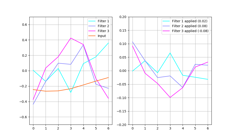
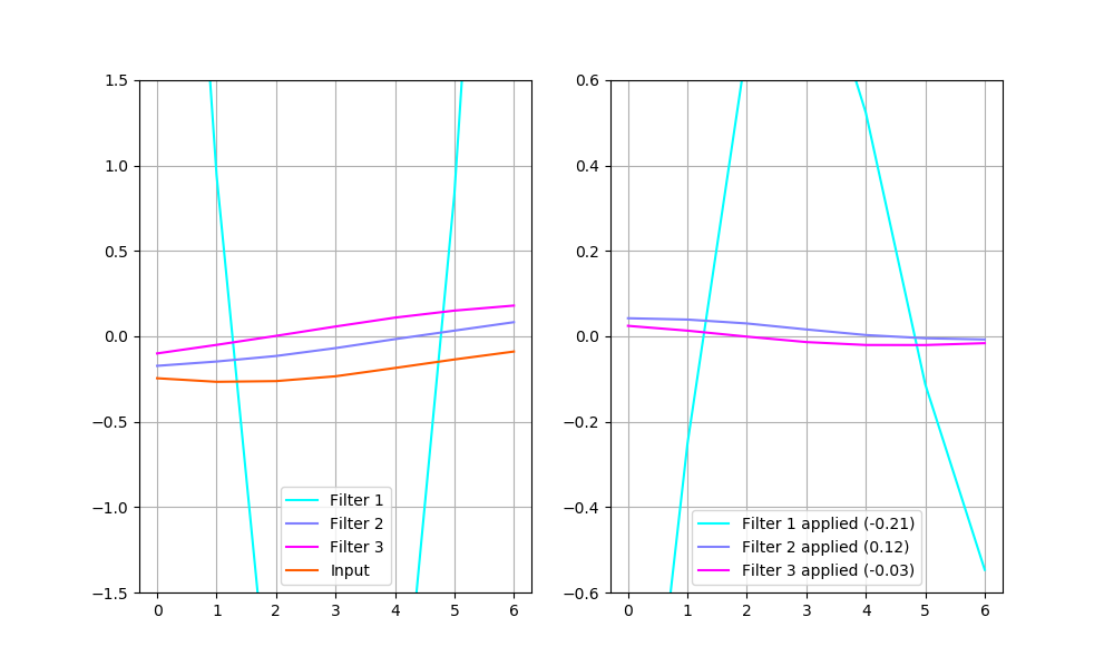
There are raw filters shown on the left, along with an example input. The plot on the right shows these same filters applied to the example input (i.e. every point of the input multiplied by every point of a filter). The labels also contain each filter’s output (i.e. the sum of every point of filter 1 multiplied by every point of the input gives 0.02).
The example on the plot above would be encoded into a vector (0.02, 0.08, -0.08). The decoder would restore the input in the way shown below:
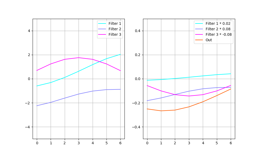
The plot on the left shows deconvolution filers. The one on the right — each filter multiplied by its code vector value along with their sum (that is also the output of the decoder).
So what’s the problem?
The solution seems to be working — the network encodes its 7-values input into 3-values code; then decodes it back with low error. But I see two possibilities for improvement:
1. The filters differ a lot when the network is trained with a different seed. It means that the network has too much flexibility and we can constrain it.
2. Encoder robustness. How can we make sure that the encoder will work for a wide variety of real data?
To illustrate the first case, I will simply plot the filters obtained by training with different seeds:
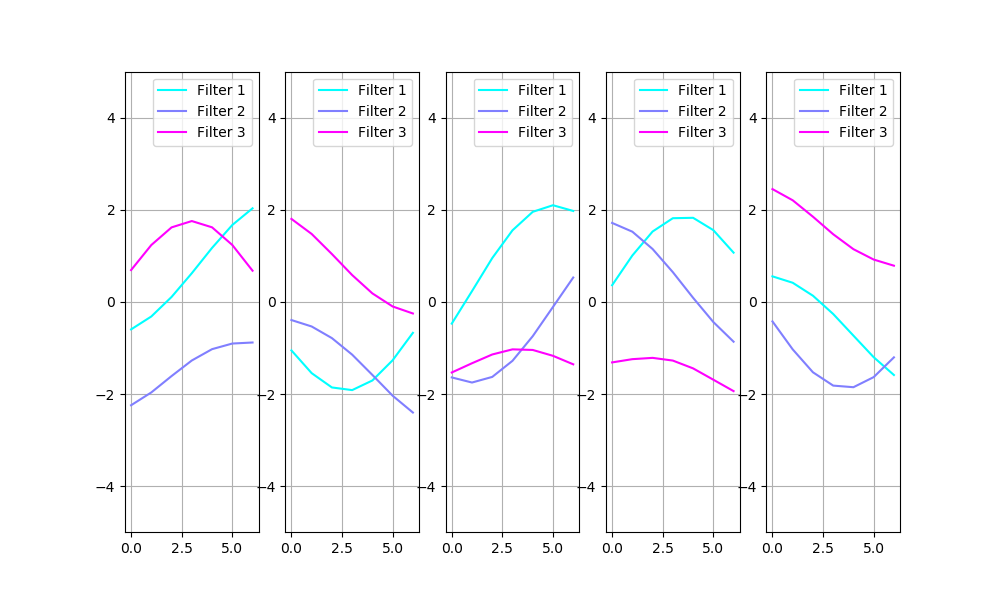
Obviously, we need to account for the filter sign and order: filter 3 on the first image and filter 1 on the second are identical. The set of filters, with compensation for sign and order, is shown below:
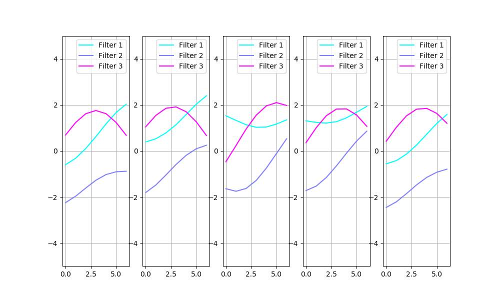
The filters clearly vary a lot here.
3. The Improvement
Code noise
The fact that different set of filters gives the same result is a sign that the filters may be constrained. One way to constrain the filters is to prioritize them. Similar to the PCA technique, separate the filters that encode most information and those encoding little details. This can be achieved by adding noise to the encoded image:
On the plot above, the image on the left illustrates a conventional autoencoder: input is being encoded onto a 2D plane; then decoded back. The network decodes a slightly shifted point from the 2D plane in the middle image. This forces the network to encode similar images into points that remain close on the plane. The image on the right shows the situation when the point for decoding may drift on the Y-axis further than on the X-axis. This forces the network to encode the most important feature into the X component because it’s less noisy.
Here is the same concept realized in code:
https://medium.com/media/d0c6a5ede90c397dbebe896d8e15db79/hrefAfter running the experiment again, I would receive a more consistent set of filters:
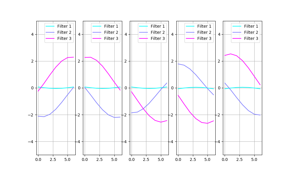
And if I compensate for the sign and order as before, in the “what’s the problem” section:
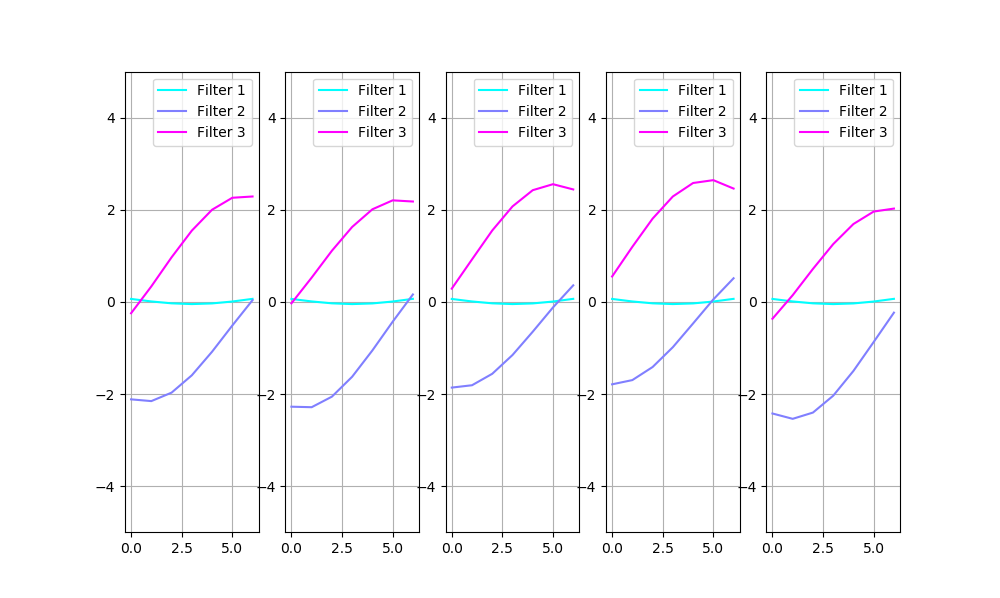
One may see clearly that there are filters curvy on one side and sharp on the other, and one component is curvy in the middle. Filters 2 and 3 seem to be of equal importance because they get encoded sometimes in the first component, and sometimes in the second. The third filter, however, is smaller in magnitude and is always encoded in the noisiest component, which suggests it’s less important.
The impact of this noise can be checked by comparing models’ performance while zeroing out different components of the encoded vector:
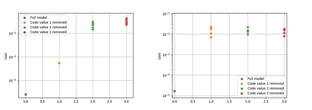
The plot above shows the loss change by zeroing the of the first, second, or third component, for the model with noise on the left and the original model on the right. For the original model, disabling each component leads to relatively same loss drop.
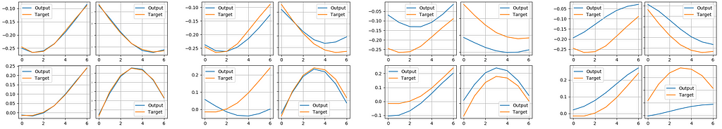
Here is how it’s compared visually. Find the model input and output, on the plot below. From left to right: full model; model with filter 1 disabled; model with filter 2 disabled; model with filter 3 disabled.
The model trained with noise:
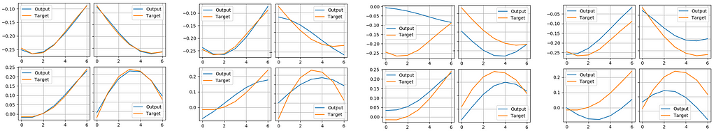
And for the original model:
The model trained with noise has a noticeably smaller error when only the noisy component is disabled.
Input noise
Let’s now take another look at the encoder filters. They are not smooth at all, and some of them look similar to each other. That’s strange, because the purpose of the encoder is to spot a difference in the input, and you can’t spot the difference with a set of similar filters. How is the network able to do it? Well, the answer is that our synthetic dataset is too perfect to train correct filters. The network can easily classify the input by a single point:
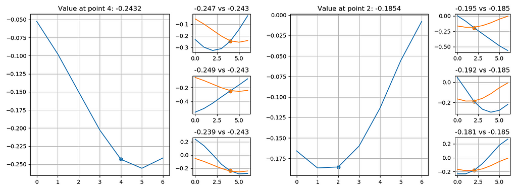
On each plot above, there is a curve example on the larger plot (referred to as ‘original’), and 3 examples that have a similar point to this original example. The examples themselves are different, but given the precise value at the point (i.e. -0.247 or -0.243), the network is able to make a decision about the whole example.
This can easily be fixed by adding noise to the raw input.
https://medium.com/media/67f5ed32816a06ed21e201b94104c780/hrefAfter training the models again, I obtained nice smooth filters:
One may see that Filter 1, the noisiest one, grows larger than the other filters. My guess is, that it’s trying to make its output larger than the noise, trying to decrease its effect. But since I have a tanh activation, its output cannot be larger than 1, so the noise is still in effect.
4. The Full Model
Assembly
Now that we have a working component of the model, we can apply it multiple times, so that it works for encoding/decoding the whole 15-points curve. There’s nothing special about this, all I need to do is not cut my example into pieces:
https://medium.com/media/ef10435e830e9d9d1fa2db1d06816a69/hrefThis would give me the following output:
Well, maybe I need to change something. The problem is, the deconvolution will sum up the overlapping parts of the image. So these parts on the plot below get doubled:
There’s an easy fix for this: I could decrease by half the weights of my filters, whose output is overlapped:
https://medium.com/media/a8f5c7fd3285db70e1397ef49f81283d/hrefAfter this manipulation I will get the following output:
Alternatively, I could reduce the filter values gradually, starting small near the center and reducing strongly on the sides:
https://medium.com/media/ee9785cd8ecaa433e3cf505885db7625/hrefWhich leads to a much smoother output:
This leads to another problem — the border points have nothing to overlap with, and the decoded image is different from what it should be. There are several possible solutions to this. For example, to include padding to the encoded image, so that the borders are also encoded, or to ignore these borders (maybe also exclude them from the loss calculation). I will stop here because further improvements are out of the scope of this article.
Conclusion
This simple example illustrates how deconvolutions do their job and how one can employ noise (sometimes of varying magnitude) for training a neural network.
The described method does work well for larger networks, and the noise magnitude(s) become a hyperparameter to experiment with. The method may not work with ReLu activations: their output may easily grow way larger than the noise magnitude, and the noise loses its effect.
Visualizing the Deconvolution Operation was originally published in Towards Data Science on Medium, where people are continuing the conversation by highlighting and responding to this story.
...