

 800+ IT
News
als RSS Feed abonnieren
800+ IT
News
als RSS Feed abonnieren📚 Hey, hey we're the translate, scale, and rotate CSS properties - and we don't monkey around
💡 Newskategorie: Programmierung
🔗 Quelle: dev.to
Learning transforms, you may have found it was not a case of monkey see, monkey do. You may have struggled to understand what was going on when you used a bunch of 'em.

In the hope of simplifying transforms and in particular to make animations more straightforward -- the translate, rotate, and scale properties have been added to CSS. They correspond to the CSS transform functions: translate(), scale(), and rotate() that are used as values in the transform property.
Let's explore these 3 properties to see if you should favour using the properties over their functional counterparts going forward.
What are the advantages of using translate, scale, and rotate properties over the transform functions?
I would file these properties as a quality of life improvement for animation aficionados, and as a minor improvment for others.
More succinct syntax
.before {
    transform: translate(50%)
}

.now {
    translate: 50%;
}
You can skip typing and reading transform: each time! You can bank them 10 keystrokes as the author, and the next dev can scan through your code a wee bit faster!

Reduce confusion on order of transforms
With transform, the transform functions get applied from left to right. Therefore, if you reverse the order of a list of a transform functions, the outcome can differ!
Ths can feel like a mischievous monkey is messing with you!

Conversely, it does not matter what order you specify the transforms with the properties in a CSS rule. They are always applied in this order:
-
translate, -
rotate, -
scale.
This feels more intuitive.

I am indifferent to this because I have the transform often enough by now for it to be familiar.
Writing and manipulating animations is more straightforward
When you use the transform property in animations, you will find yourself duplicating transform declarations when manipulating multiple transforms.
A simple animation - transform versus individual properties
For example, say we have a banana button. We want to rotate and scale it down to make it looks a bit interesting.

We want to catch the attention of our simian friends, so that they will press it! So let's create a repeating animation that scales the banana button up and down in a pulsing fashion.
With transform, you need to do the following:
/* hover effect with transform property */
.target {
  transform: rotate(30deg) scale(0.9);
  animation: animate 1s infinite;
}

@keyframes animate{
  to{
    transform: rotate(30deg) scale(1.1);
  }
}
To get the desired outcome, we must restate the transform declaration in full in the @keyframes animation.
If you omit rotate() from the declaration as below, the outcome will be different. The banana button will rotate anti-clockwise, back to zero degrees, and scale up. Omitted transforms are effectively reset.
@keyframes animate{
  to{
    transform: scale(1.1);
  }
}
With the individual properties, we only need to state the change to get the desired outcome:
/* hover effect with individual properties */
.target {
  rotate: 30deg;
  scale: 0.9;
  animation: animate 1s infinite;
}

@keyframes animate{
  to{
    scale: 1.1;
  }
}
This is a bit simpler. It may be more in line with your expectations. Buttt isn't this quite a trivial improvement? 🤨
This comes into it own when you have more complex animations.
Complex animation - transform versus individual properties
In cases where you have @keyframes with multiple tweens, you will repeat declarations when you use transform. When you are trying to get an animation just right, updating all these declarations can get tedious fast. Let's look at an example to demonstrate this.
Overview of eat animation
Let's make another banana-centric animation that is more complex. The scenario is a monkey eating a banana - let's call the animation eat.
The twist in the tale is that our fussy monkey takes a bite out of the banana, decides he doesn't like it, and hurls it at a wall behind him.
The objective here is not to create a big, realistic animation but to go far enough to show what a more complex animation would look like. I will focus only on animating the banana. We will have a static floating monkey head as a stand-in for our full realised monkey. He has no body to actually manipulate the banana - he is a jedi monkey!
You can see below roughly what we are going for:

The animation has the following major steps:
- The banana is brought up to the monkey's mouth - via
translate()androtate() - The monkey bites the banana - via
clip-path. This part of the animation does not work in Firefox for some reason! - The banana is brought back to its original position. You have to imagine the monkey chewing and tasting the banana at this point!
- The banana is hurled towards the wall in a series of spins - we use
scale()to fake that it is moving away from us (rather than use the Z axis). - When the banana hits the wall, it slowly slides down the wall until its hits the ground.
Version of animation using transform
This is how we can pull it off our eat animation using transform:
.banana {
  animation: eat 4s infinite;
}

@keyframes eat {
  10%,
  20% {
    transform: translate(20px, -40px) rotate(-40deg);
  }

  14%,
  100% {
    /* bite */
    clip-path: polygon(0% 99%, 1% 0%, 49% 14%, 100% 1%, 100% 100%);
  }

  25%,
  50% {
    transform: translate(0, -20px) rotate(-20deg);
  }

  51% {
    transform: translate(100px, -40px) rotate(-20deg) scale(0.9);
  }

  60%,
  70% {
    transform: translate(200px, -40px) rotate(1.5turn) scale(0.5);
  }

  95% {
    transform: translate(200px, 70px) rotate(1.5turn) scale(0.5);
  }

  100% {
    transform: translate(240px, 80px) rotate(2turn) scale(0.5);
  }
}
You can see it in action in this codepen:
Version of animation using translate, rotate, and scale properties
Let's convert our eat animation to use the translate, rotate, and scale propeties instead of transform.
The difference that I want to draw your attention to is that there is no repitition of values. When we used transform we stated scale(0.5) 3 times, whereas below we state scale: 0.5 once. We are keeping our code DRY (Don't repeat yourself).
.banana {
  animation: eat 4s infinite;
}

@keyframes eat {
  10%,
  20% {
    translate: 20px -40px;
    rotate: -40deg;
  }

  14%,
  100% {
    /* bite */
    clip-path: polygon(0% 99%, 1% 0%, 49% 14%, 100% 1%, 100% 100%);
  }

  25%,
  50% {
    translate: 0 -20px;
    rotate: -20deg;
    scale: 1;
  }

  51% {
    translate: 100px -40px;
    scale: 0.9;
  }

  60%,
  70% {
    translate: 200px -40px;
    rotate: 1.5turn;
  }

  60%,
  100% {
    scale: 0.5;
  }

  95% {
    translate: 200px 70px;
  }

  100% {
    translate: 240px 80px;
    rotate: 2turn;
  }
}
What might not be apparent from comparing the final code of each version is that these properties make the act of making an animation easier. It enables iterative changes to be made without having to juggle values in multiple places. This gives us a tighter feedback loop.
Actually, these properties open the door for us to use separate @keyframes for each property if we wish. This can be a cleaner route to take sometimes. Let's reformulate again and check the difference!
Verion of animation using multiple @keyframes with translate, rotate, and scale properties
Having independent properties enables us to subdivide our animation into separate @keyframes. This can make your code more modular and easier to manipulate.
.banana {
  --time: 4s;

  animation: translate var(--time),
    rotate var(--time),
    scale var(--time),
    bite var(--time);
  animation-iteration-count: infinite;
}

@keyframes scale {
  0%,
  50% {
    scale: 1;
  }

  51% {
    scale: 0.9;
  }

  60%,
  100% {
    scale: 0.5;
  }
}

@keyframes translate {
  10%,
  20% {
    translate: 20px -40px;
  }

  25%,
  50% {
    translate: 0 -20px;
  }

  51% {
    translate: 100px -40px;
  }

  60%,
  70% {
    translate: 200px -40px;
  }

  95% {
    translate: 200px 70px;
  }

  100% {
    translate: 240px 80px;
  }
}

@keyframes rotate {
  10%,
  20% {
    rotate: -40deg;
  }

  25%,
  50% {
    rotate: -20deg;
  }

  60%,
  70% {
    rotate: 1.5turn;
  }

  100% {
    rotate: 2turn;
  }
}

@keyframes bite {
  14%,
  100% {
    clip-path: polygon(0% 99%, 1% 0%, 49% 14%, 100% 1%, 100% 100%);
  }
}
Thanks to this split, we have 4 separate groups/timelines for our animation. This gives you more fine-grained control of the animation. You can change the timing, delays, and other aspects of the groups independently to hone your animation.
You can see the benefits of this when you use the Animations tab in the devtools in Chrome (and Chromium browsers too probably).
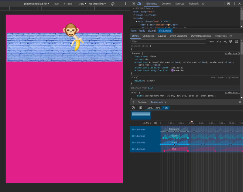
In the Animations tab, you can slow down, replay, or inspect the source code for each animation group. You can modify the timing, duration, or keyframe offsets of each group. You can read more about inspecting animations in the Chrome for Developers docs. The docs are a bit out of date - they say "Keyframe editing isn't supported" but you can make modifications from my exploration, your mileage may vary though!
Quick syntax review of translate, rotate, and scale
It would be a seamless transition if the properties and functions take the exact same list of values. However there are a couple of differences.
Firstly, you don't use commas to separate values for all of these properties.
The translate property maps closely to translate().
/* Single values - x axis */
translate: 100px;

/* Two values - x axis and y axis values */
translate: 50% 105px;

/* Three values - x, y, and z axis values */
translate: 50% 105px 5rem;
There was a surprise with the rotate property - when you provide 2 values, you specify a letter for the axis name as the first value.
/* single value - angle in deg, turn..etc */
rotate: 90deg;

/* two values - axis name plus angle */
rotate: x 90deg;
rotate: y 0.25turn;
rotate: z 1.57rad;
The scale property maps closely to scale().
/* Single values - scale by the same factor along both the X and Y axes */
scale: 2;

/* Two values - specify the X and Y axis scaling values  */
scale: 2 0.5;

/* Three values - specify the X, Y, and Z axis scaling values*/
scale: 200% 50% 200%;
Is there any difference in performance between the properties and transform functions?
No!
Animations using the translate, rotate and scale properties are just as efficient as animations that use the transform property. They both run on the compositor and work with the will-change property.
Are there any downsides?
I would say that the biggest downside is that you can't make a completely clean break from transform functions. The specification does not recommend the addition of properties for the skew() and matrix() transform functions. Albeit, these functions are used far less often than the others.

From an education point of view, it increases the learning load. Since there is a long legacy (in internet years) of using transform, there is a lot of code out there using it. You wouldn't exclude transform from the learning path. I guess that you would learn both. You might choose to emphasize transform less. Having multiple ways to do the same thing can be a burden rather than a boon in some cases.
What is the browser support like?
All 3 properties are now supported by all major browsers.
Final thoughts
The translate, rotate, and scale properties make it easier to write and manipulate transforms in animations. Generally, you will write slighlty shorter code if you favour using them. I would file these properties as a quality of life improvement for animation aficionados, and as a minor improvment for others.
If you are less generous, you could classify these properties as syntactic sugar. They do not offer extra functionality. It is just an alternative way.

It would be nice if there was properties for the skew() and matrix() transform functions also. That way you could move away from transform functions completely if you wish. Since the skew() and matrix() functions are used far less often, I guess they are seen as a low priority addition. They are not in the specification, so are not likely to come soon.
Resources
- If are new to transforms, check out the tutorial The World of CSS Transforms by Josh Comeau.
- CSS Transforms Module Level 2 Specification
- Rotate, Scale and Translate on MDN
- Rotate, Scale and Translate on Caniuse

You can subscribe to my posts through my web feed
...