Cookie Consent by Free Privacy Policy Generator ๐Ÿ“Œ CSS: 3 Sided Card

๐Ÿ  Team IT Security News

TSecurity.de ist eine Online-Plattform, die sich auf die Bereitstellung von Informationen,alle 15 Minuten neuste Nachrichten, Bildungsressourcen und Dienstleistungen rund um das Thema IT-Sicherheit spezialisiert hat.
Ob es sich um aktuelle Nachrichten, Fachartikel, Blogbeitrรคge, Webinare, Tutorials, oder Tipps & Tricks handelt, TSecurity.de bietet seinen Nutzern einen umfassenden รœberblick รผber die wichtigsten Aspekte der IT-Sicherheit in einer sich stรคndig verรคndernden digitalen Welt.

16.12.2023 - TIP: Wer den Cookie Consent Banner akzeptiert, kann z.B. von Englisch nach Deutsch รผbersetzen, erst Englisch auswรคhlen dann wieder Deutsch!

Google Android Playstore Download Button fรผr Team IT Security


๐Ÿ“š CSS: 3 Sided Card


๐Ÿ’ก Newskategorie: Programmierung
๐Ÿ”— Quelle: dev.to

The other day I was tasked with created a "3 sided card" that flips. It proved more challenging than I thought, though the solution isn't that complex.
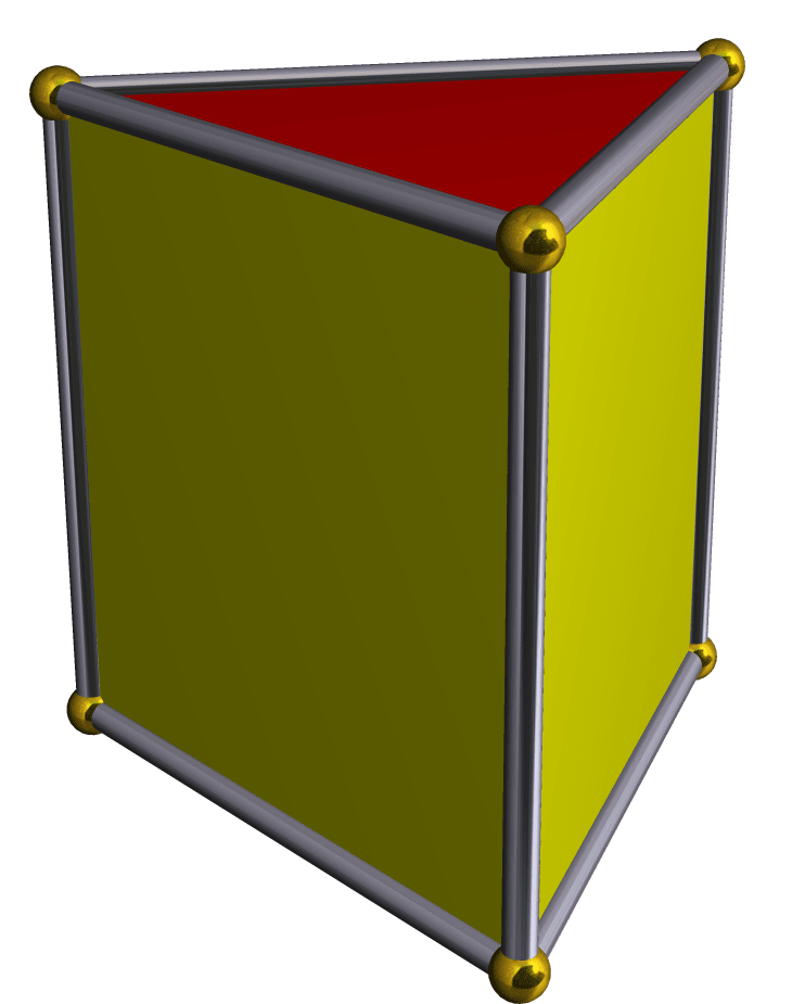
What we're building

Calling it a "3 sided card" is a misleading, but when I first started trying to build this, that's all I could think to call.

In reality, it is pentahedron โ€” in particular, a triangular prism. Imagine a cube where you remove one side, and then fold the adjoining two together.

The final product can be found at the end.

The gist

The structure consists of three divs making up the sides, wrapped in a div for the prism.

<div class="prism">
  <div class="side one">1</div>
  <div class="side two">2</div>
  <div class="side three">3</div>
</div>

We don't need to worry about the top and bottom.

The css is little more complicated. First, some non-critical styling to make it look nice.

.prism {
  margin: auto;
  width: 100px;
  aspect-ratio: 1 / 1;
}

.side {
  border: 1px solid black;
  display: flex;
  flex-direction: column;
  align-items: center;
  justify-content: center;
}

.one {
  background-color: #63cdda;
}

.two {
  background-color: #ea8685;
}

.three {
  background-color: #f5cd79;
}

The good stuff

Making this relies heavily on the rotate3d function, which I'll talk about in the next section.

For now, let's define the css for the prism and it's sides.

css

.prism {
  transition: transform 0s linear;
  transform-style: preserve-3d;
}

On the prism div, we define a transition for when the transform property changes. This will define how fast the card changes.

It's currently set at 0s for accessibility.

Below it we can define a media query for if the user has no preference for reduced motion.

@media (prefers-reduced-motion: no-preference) {
  .prism {
    transition: transform 0.5s linear;
  }
}

This will give the card a spin.

We will apply a transform in the next section.

Now the sides.

.side {
  position: absolute;
  height: 100%;
  width: 100%;
}

This ensures each side takes up the whole face of the prism.

Lastly, we add a transform property to each side.

.side.one {
  transform: rotateY(0deg) translateZ(29px);
}

.side.two {
  transform: rotateY(120deg) translateZ(29px);
}

.side.three {
  transform: rotateY(240deg) translateZ(29px);
}

Each side is rotated on it's Y-axis 120deg (i.e. 360/3).

The translateZ property was a bit of a guessing game. It's related to the width of the prism, but I had to figure out the right value by trial-and-error.

Html and JavaScript

Now, I haven't talk about rotate3d property yet. Before we add it, we're going to add a data attribute to the prism.

<div class="prism" data-degrees="0">
  <div class="side one">1</div>
  <div class="side two">2</div>
  <div class="side three">3</div>
</div>

Now we can manipulate the data attribute with JS and apply a rotate3d value based off of the data attribute.

function toggleDegrees(e) {
  const currentDegrees = +e.currentTarget.dataset.degrees || 0;
  const newDegrees = currentDegrees + 120;
  e.currentTarget.style.transform = `rotate3d(0, -1, 0, ${newDegrees}deg)`;
  e.currentTarget.dataset.degrees = newDegrees;
}

document.querySelector(".prism").addEventListener("click", toggleDegrees);

By constantly increasing the degree, instead of setting it back to 0, the card will keep spinning in one direction.

Live

Conclusion

I hope someone else finds this useful. I wanted to get thoughts typed out before I forget how to do this.

Any suggestions are welcomed!

...


๐Ÿ“Œ CSS: 3 Sided Card


๐Ÿ“ˆ 42.8 Punkte

๐Ÿ“Œ Thales launches double-sided ID card reader to simplify the ID verification process


๐Ÿ“ˆ 33.23 Punkte

๐Ÿ“Œ CSS Grid: Moving From CSS Frameworks To CSS Grid (2018 and beyond)


๐Ÿ“ˆ 28.72 Punkte

๐Ÿ“Œ Stylify CSS: Automagic CSS bundles splitting into CSS layers in Astro.build


๐Ÿ“ˆ 28.72 Punkte

๐Ÿ“Œ A BRIEF REVIEW OF CSS CASCADING, CSS SELECTORS and CSS SPECIFICITY.


๐Ÿ“ˆ 28.72 Punkte

๐Ÿ“Œ WhatsApp blind-sided by booby-trapped photo vulnerability


๐Ÿ“ˆ 25.14 Punkte

๐Ÿ“Œ http://sided.idrd.gov.co/isolucion/BancoAnexo/Registro/Usuario/3943/index0.html


๐Ÿ“ˆ 25.14 Punkte

๐Ÿ“Œ How Multi-sided Digital Platforms are Changing the Rules in IT


๐Ÿ“ˆ 25.14 Punkte

๐Ÿ“Œ Double-sided printing data ballsup leaves insurance giant Chubb with egg on its face


๐Ÿ“ˆ 25.14 Punkte

๐Ÿ“Œ HPR2987: World of Commodore 2019 Episode 5: New games from Double Sided Games


๐Ÿ“ˆ 25.14 Punkte

๐Ÿ“Œ SMASH: Synchronized Many-Sided Rowhammer Attacks From JavaScript


๐Ÿ“ˆ 25.14 Punkte

๐Ÿ“Œ Turkish Hackers Continue to Pester Austrians in a One-Sided Cyber-War


๐Ÿ“ˆ 25.14 Punkte

๐Ÿ“Œ Turkish Hackers Continue to Pester Austrians in a One-Sided Cyber-War


๐Ÿ“ˆ 25.14 Punkte

๐Ÿ“Œ Dell's new XPS 13 has a four-sided 16:10 InfinityEdge display


๐Ÿ“ˆ 25.14 Punkte

๐Ÿ“Œ SMASH: Synchronized Many-sided Rowhammer Attacks from JavaScript


๐Ÿ“ˆ 25.14 Punkte

๐Ÿ“Œ Printer Keeps Printing Double Sided: Troubleshoot & Fix Now


๐Ÿ“ˆ 25.14 Punkte

๐Ÿ“Œ How To Print Double Sided On Mac


๐Ÿ“ˆ 25.14 Punkte

๐Ÿ“Œ How to Print Double-Sided on Windows 11: 3 Easy Methods


๐Ÿ“ˆ 25.14 Punkte

๐Ÿ“Œ Astrea: Six-Sided Oracles Review (PC)


๐Ÿ“ˆ 25.14 Punkte

๐Ÿ“Œ Meta AI Releases MMCSG: A Dataset with 25h+ of Two-Sided Conversations Captured Using Project Aria


๐Ÿ“ˆ 25.14 Punkte

๐Ÿ“Œ CSS: How About Building A Search Engine With CSS?


๐Ÿ“ˆ 19.15 Punkte

๐Ÿ“Œ The Future of CSS: CSS Houdini


๐Ÿ“ˆ 19.15 Punkte

๐Ÿ“Œ New in Chrome 65: CSS Paint API, Server Timing API, and CSS display: contents


๐Ÿ“ˆ 19.15 Punkte

๐Ÿ“Œ MediaWiki up to 1.23.14/1.26.3/1.27.0 CSS User Subpage Preview common.css cross site scripting


๐Ÿ“ˆ 19.15 Punkte

๐Ÿ“Œ Schneider Electric U.motion Builder up to 1.3.3 css.inc.php css directory traversal


๐Ÿ“ˆ 19.15 Punkte

๐Ÿ“Œ mTheme-Unus Theme up to 2.2 on WordPress css/css.php files directory traversal


๐Ÿ“ˆ 19.15 Punkte

๐Ÿ“Œ MediaWiki bis 1.23.14/1.26.3/1.27.0 CSS User Subpage Preview common.css Cross Site Scripting


๐Ÿ“ˆ 19.15 Punkte

๐Ÿ“Œ Post-Modern CSS (In-Depth on CSS Grid, Flexbox and Other New Properties)


๐Ÿ“ˆ 19.15 Punkte

๐Ÿ“Œ Medium CVE-2021-33587: Css-what project Css-what


๐Ÿ“ˆ 19.15 Punkte

๐Ÿ“Œ State Of CSS Survey: Influence The Future Of CSS


๐Ÿ“ˆ 19.15 Punkte

๐Ÿ“Œ Do CSS framework users actually know CSS? We might have some data


๐Ÿ“ˆ 19.15 Punkte

๐Ÿ“Œ CSS Guide: Basics of CSS


๐Ÿ“ˆ 19.15 Punkte

๐Ÿ“Œ Stylify CSS: Code your Remix website faster with CSS-like utilities


๐Ÿ“ˆ 19.15 Punkte

๐Ÿ“Œ How to create navigation menu with HTML CSS step by step | web design tutorial | HTML CSS tutorial


๐Ÿ“ˆ 19.15 Punkte

๐Ÿ“Œ Schneider Electric U.motion Builder bis 1.3.3 css.inc.php css Directory Traversal


๐Ÿ“ˆ 19.15 Punkte


matomo