

 800+ IT
News
als RSS Feed abonnieren
800+ IT
News
als RSS Feed abonnieren📚 Visualizing Climate Change: A Step-by-Step Guide to Reproduce Climate Stripes with Python
💡 Newskategorie: AI Nachrichten
🔗 Quelle: towardsdatascience.com
A quick Matplotlib tutorial to build a remarkable visualization
Motivation
Climate change is one of the most pressing issues of our time. To help raise awareness and communicate the urgency of the problem, scientists and data analysts have developed a variety of ways to visualize climate data. One particularly effective method is the “climate stripes” visualization, first popularized by Ed Hawkins, a climate scientist at the University of Reading. In this article, we will walk through the process of reproducing climate stripes using Python, providing a step-by-step guide for anyone interested in creating their own climate stripes visualization. Whether you’re a climate scientist, data analyst, or just someone interested in learning more about the issue, this guide will give you the tools you need to make your own climate stripes and share them with others.
The beauty of this visualization resides in its simplicity. A quick look at it and the reader understands the message, without the need to get lost in the technical bits behind it.
Since their release, the climate stripes have been widely used in various media. In September 2019, this visualization even made it to the front cover of The Economist, contributing to its popularity.
The Economist on Twitter: "Climate change touches everything The Economist reports on. It must be tackled urgently. There is no alternative. Our special issue this week https://t.co/QtI6xgrpWR pic.twitter.com/2JYOQ58jpz / Twitter"
Climate change touches everything The Economist reports on. It must be tackled urgently. There is no alternative. Our special issue this week https://t.co/QtI6xgrpWR pic.twitter.com/2JYOQ58jpz
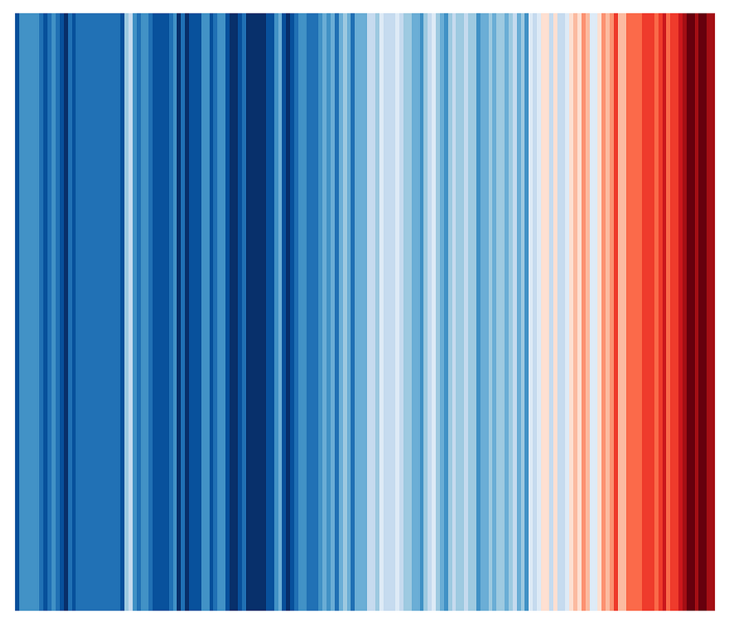
Ed Hawkins actually updated the stripes not too long ago with the 2022 data point and tweeted about it. Spoiler alert, the trend has not changed.
Ed Hawkins on Twitter: "Changes in global temperature (1850-2022) pic.twitter.com/uJ3dJzhIM2 / Twitter"
Changes in global temperature (1850-2022) pic.twitter.com/uJ3dJzhIM2
#1 The Data
The HadCRUT5 dataset consists of global historical surface temperature anomalies relative to a 1961–1990 reference period. It can be found on https://www.metoffice.gov.uk/ and was introduced in the paper by Morice, Kennedy et al. [1].
HadCRUT5 is a combination of sea-surface temperature measurements over the ocean from ships and buoys and near-surface air temperature measurements from weather stations over the land surface.
This short explanation does not do justice to the complexity of the measurement methods and the work to deal with biases in the data. The paper linked in the Reference section shows a more complete picture.
It is rare enough that the datasets we play with in these kinds of projects are clean to the point where they do not need any data cleansing at all, but this one actually is.
We just need to import the classic libraries to read and plot the data, and we are basically good to go:
import pandas as pd
import matplotlib.pyplot as plt
import matplotlib as mpl
from matplotlib.colors import ListedColormap
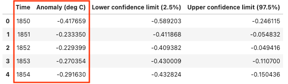
df = pd.read_csv('HadCRUT.5.0.1.0.analysis.summary_series.global.annual.csv')
df.head()
#2 Prerequisites
The Colormap
In order to build the graph, we will use “the eight most saturated blues and reds from the ColorBrewer 9-class single hue palettes”, as used in the original stripes, courtesy of Wikipedia and Cynthia Brewer — [2] and [3].
The Chart Building Methodology
The chart type we will use in this article is a simple bar chart which we’ll strip from most of its elements.
I have explained how to build compelling bar charts in this other article, which will again be useful here:
5 Steps to Build Beautiful Bar Charts with Python
#3 The Code
Enough chit-chat, let’s build this thing.
It is actually very simple to produce a first version, with only a few lines of code, following the steps below:
- Creating the figure object
- Creating the colormap
with the relevant colors described in the previous section - Linearizing the temperature anomalies data into the [0,1] interval
This is essential to use the colormap properly onto our graph - Plotting the bar chart
using the years in the X-axis and the anomalies, not in the Y-axis, but embedded in the colormap. The trick here is to use the same height for all the bars (set to 1 unit here) and let the color map tell the story
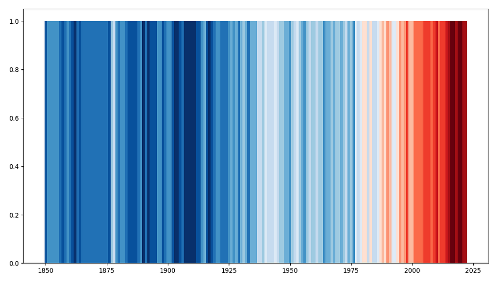
# Create the figure and axes objects, specify the size and the dots per inches
fig, ax = plt.subplots(figsize=(13.33,7.5), dpi = 96)

# Colours - Choose the colour map - 8 blues and 8 reds
cmap = ListedColormap([
    '#08306b', '#08519c', '#2171b5', '#4292c6',
    '#6baed6', '#9ecae1', '#c6dbef', '#deebf7',
    '#fee0d2', '#fcbba1', '#fc9272', '#fb6a4a',
    '#ef3b2c', '#cb181d', '#a50f15', '#67000d'])

# linearly normalizes data into the [0.0, 1.0] interval
norm = mpl.colors.Normalize(df['Anomaly (deg C)'].min(), df['Anomaly (deg C)'].max())

# Plot bars
bar = ax.bar(df['Time'], 1, color=cmap(norm(df['Anomaly (deg C)'])), width=1, zorder=2)
And this is what we get:
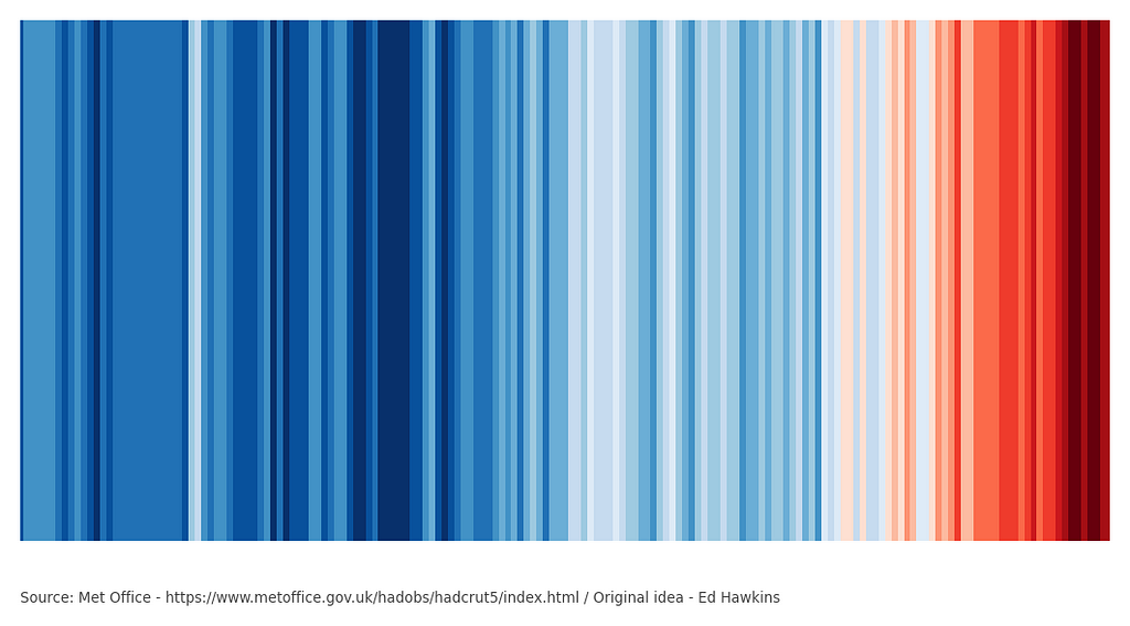
Now, it is just a matter of cleaning up the chart and adding the source of our data below it, which is super straightforward once:
- Removing the spines
Make the graph as bare as possible - Reformatting the X-axis and Y-axis
no labels, no ticks and defining the limits to avoid white spaces - Adding the source
of the data just below the graph - Adjusting the margins
to make sure the graph is centered - Setting a white background
to avoid any transparency issue later on
# Remove the spines
ax.spines[['top', 'left', 'bottom', 'right']].set_visible(False)

# Reformat x-axis label and tick labels
ax.set_xlabel('', fontsize=12, labelpad=10)
ax.set_xticks([])
ax.set_xlim([df['Time'].min()-1, df['Time'].max()+1])

# Reformat y-axis label and tick labels
ax.set_ylabel('', fontsize=12, labelpad=10)
ax.set_yticks([])
ax.set_ylim([0, 1])

# Set source text
ax.text(x=0.1, y=0.12, s="Source: Met Office - https://www.metoffice.gov.uk/hadobs/hadcrut5/index.html / Original idea - Ed Hawkins", transform=fig.transFigure, ha='left', fontsize=10, alpha=.7)

# Adjust the margins around the plot area
plt.subplots_adjust(left=0.1, right=None, top=None, bottom=0.2, wspace=None, hspace=None)

# Set a white background
fig.patch.set_facecolor('white')
ax.patch.set_facecolor('white')
And there you have it, the Climate Stripes, stripped from all elements, as neat as can be, and showing the data source:
If we’d like, we could also:
- Add ticks to the X-axis to show the years
- Set the source text to white
- Add a title to the graph
- Re-adjust the margins slightly to take into account the X-ticks
- Set the background color to black
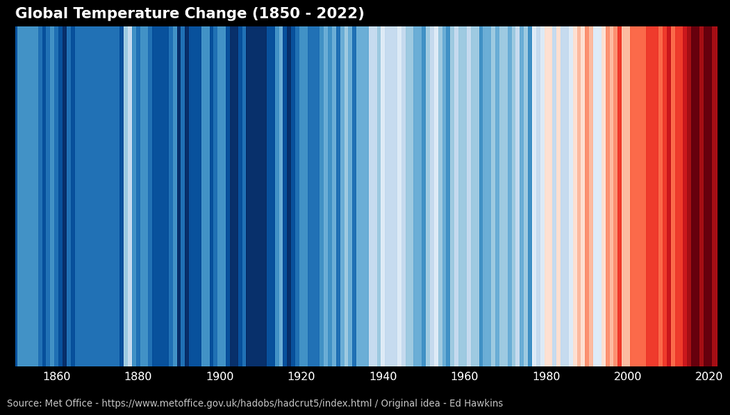
# Reformat x-axis label and tick labels
ax.set_xlabel('', fontsize=12, labelpad=10)
ax.xaxis.set_tick_params(pad=2, labelbottom=True, bottom=True, labelsize=12, labelrotation=0, labelcolor='white')
ax.set_xlim([df['Time'].min()-1, df['Time'].max()+1])

# Set source text
ax.text(x=0.1, y=0.12, s="Source: Met Office - https://www.metoffice.gov.uk/hadobs/hadcrut5/index.html / Original idea - Ed Hawkins", transform=fig.transFigure, ha='left', fontsize=10, alpha=.7, color='white')

# Set graph title
ax.set_title('Global Temperature Change (1850 - 2022)', loc='left', color='white', fontweight="bold", size=16, pad=10)

# Adjust the margins around the plot area
plt.subplots_adjust(left=0.11, right=None, top=None, bottom=0.2, wspace=None, hspace=None)

# Set a black background
fig.patch.set_facecolor('black')
ax.patch.set_facecolor('black')
And get this final version:
#4 Final Thoughts
The Climate Stripes have proven to be an extremely powerful tool for communicating the reality of climate change. By providing a simple yet impactful representation of temperature trends over time, this visualization has become a widely used and recognizable way of highlighting the urgency of the issue.
In this article I tried to highlight that the most amazing and relevant visualizations are sometimes not the trickiest to build.
Hopefully some will find it useful!
References
[1] — Morice, C.P., J.J. Kennedy, N.A. Rayner, J.P. Winn, E. Hogan, R.E. Killick, R.J.H. Dunn, T.J. Osborn, P.D. Jones and I.R. Simpson (in press) An updated assessment of near-surface temperature change from 1850: the HadCRUT5 dataset. Journal of Geophysical Research (Atmospheres) doi:10.1029/2019JD032361
Open Government License v3
[2] — https://en.wikipedia.org/wiki/Warming_stripes
[3] — https://colorbrewer2.org/#type=sequential&scheme=Reds&n=9
Thanks for reading all the way to the end of the article.
Follow for more!
Feel free to leave a message below, or reach out to me through LinkedIn if you have any questions / remarks!
Visualizing Climate Change: A Step-by-Step Guide to Reproduce Climate Stripes with Python was originally published in Towards Data Science on Medium, where people are continuing the conversation by highlighting and responding to this story.
...