

 800+ IT
News
als RSS Feed abonnieren
800+ IT
News
als RSS Feed abonnieren📚 Visualizing trade flow in Python maps — Part I: Bi-directional trade flow maps
💡 Newskategorie: AI Nachrichten
🔗 Quelle: towardsdatascience.com
Visualizing trade flow in Python maps — Part I: Bi-directional trade flow maps
The exchange of goods and services in exchange for their corresponding values is an intricate part of our daily life. Similarly, countries engage in different kinds of trade relationships for the exchange of products and services such as electricity, energy commodities, raw materials, processed goods, tourism, etc. Understanding the trade flow between countries (import and export) is crucial to assessing the earnings and expenditure of a country, the economic prowess, the security of supply, and the nature of the relationship between countries.
In this two-part series, I am going to share how the trade flow between countries can be visualized in maps using Python. The first part of this series will focus on visualizing the two-way (imports and exports) trade flow between countries. The second part will focus on visualizing the net trade flow between countries. I am going to use dummy datasets of a hypothetical product for this visualization. I will highlight my country and region (Nepal/South Asia) as an example for the demonstration purpose. Let’s get started.

Finding Coordinates of Arrows
In the trade flow maps, I aimed to represent two-way trade relationships between countries. For example, the export from Nepal to India would be represented by the first arrow (A1-A2) and the import by Nepal from India would be represented by a second arrow (A3-A4). In this way, each country pair relationship would require four coordinate points to define the start and end points of arrows to represent exports and imports respectively.
While it is also possible to assume a coordinate that can be detected automatically (for example, the centroid of a country geometry), I intended to mark the points in a map and get their coordinates individually. For this purpose, it is possible to create a project in an application such as Google Earth, export a KML file, and extract the coordinates with a converter (for example, the GIS data converter in the website of MyGeodata Cloud).
Keyhole Markup Language (KML) is a file format used to display geographic data in an application such as Google Earth. It uses a tag-based structure with nested elements and attributes and is based on the XML standard (Google, 2023).
Data
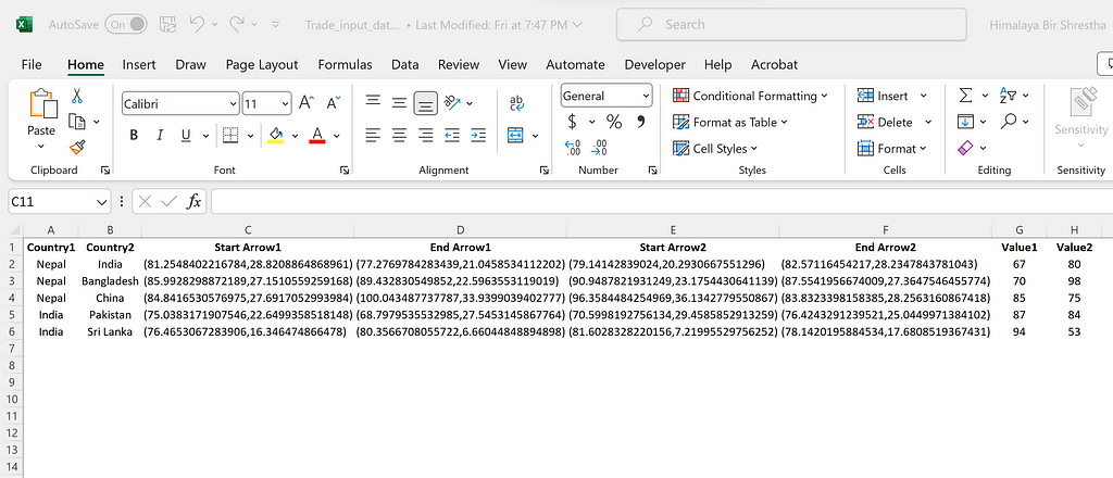
The structure of my input data looks as shown in the image below. It contains five different trade relationships between neighboring countries: Nepal-India, Nepal-Bangladesh, Nepal-China, India-Pakistan, and India-Sri Lanka. For each country pair, there are four coordinate points for the start and end points of the two arrows. Value1 represents the export from Country1 to Country2. Value2 represents the import by Country1 from Country2. The aim is to display this relationship in a Python map.
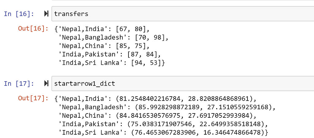
I read the above data as a pandas dataframe df. Furthermore, I created dictionary objects such as transfers containing the export and import volume between each country pair, and startarrow1_dict containing the coordinate of starting point of the first arrow.
Code description
In this section, I will describe the code used to visualize the trade flow maps. I will mainly use the matplotlib and cartopy packages. I have also used the same packages to visualize the global surface temperature anomaly in one of my previous posts.
- Import required packages
I started with importing the main required packages and dependencies as shown below:
import cartopy.crs as ccrs
import cartopy.io.shapereader as shpreader

import matplotlib.pyplot as plt
import matplotlib.patches as mpatches
from matplotlib import colormaps
from matplotlib.colors import Normalize
from matplotlib.cm import ScalarMappable

import numpy as np
import pandas as pd
import os
2. Read the shape file
As a shape file, I used the Natural Earth Vector. The vector file can be read directly by the shapereader module of the cartopy package.
# get the country border file (10m resolution) and extract
shpfilename = shpreader.natural_earth(
                           resolution=”10m”,
                           category=”cultural”,
                           name=”admin_0_countries”,
                          )
reader = shpreader.Reader(shpfilename)
countries = reader.records()
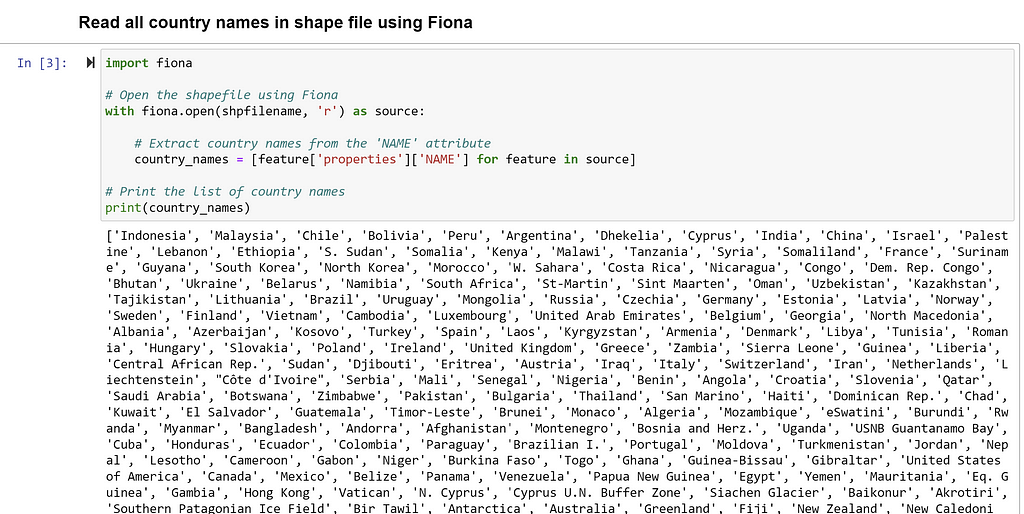
Using a package called Fiona, it is possible to read the list of all countries as shown below.
3. Extract the information of only required countries
Next, I created required, which is a list of six countries having trade relationships. I also created a dictionary object c, which contained the FionaRecord i.e., all relevant information of the countries that can be used for plotting.
# required countries
required = [“Nepal”, “India”, “Bangladesh”,”China”,”Pakistan”,”Sri Lanka”]

# extract the specific country information
c = {
     co.attributes["ADMIN"]: co
     for co in countries if co.attributes["ADMIN"] in required
    }
4. Plot the required countries and clipping
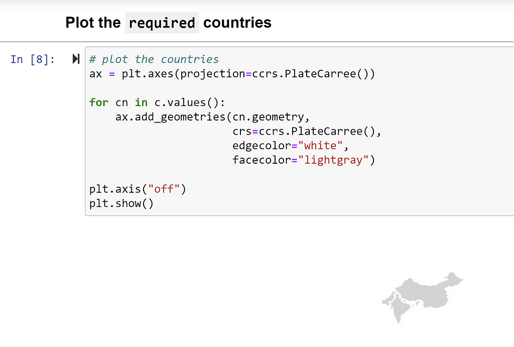
In this step, first, I plotted the geometries of required countries in a PlateCarree projection as shown below:
Next, I wanted to clip off the geometries of the rest of the world so that I could have a magnified view of the six countries alone. I determined the extent of the maximum and minimum longitude and latitude values respectively that could cover all six countries, set the extent for the axes plot, and plotted the countries. In the for loop, I also added an code that would display the names of the countries over the centroid geometry of each country.
The zorder attribute of the matplotlib package would determine the drawing order of the artists. Artists with higher zorder are drawn on the top.
# get overall boundary box from country bounds
extents = np.array([c[cn].bounds for cn in c])
lon = [extents.min(0)[0], extents.max(0)[2]]
lat = [extents.min(0)[1], extents.max(0)[3]]

ax = plt.axes(projection=ccrs.PlateCarree())

# get country centroids
ax.set_extent([lon[0] - 1, lon[1] + 1, lat[0] - 1, lat[1] + 1])

for key, cn in zip(c.keys(),c.values()):
    ax.add_geometries(cn.geometry,
                      crs=ccrs.PlateCarree(),
                      edgecolor="gray",
                      facecolor="whitesmoke",
                     zorder = 1)

    # Add country names
    centroid = cn.geometry.centroid

    ax.text(
        centroid.x,
        centroid.y,
        key,  # Assuming 'name' is the attribute containing the country names
        horizontalalignment='center',
        verticalalignment='center',
        transform=ccrs.PlateCarree(),
        fontsize=8,  # Adjust the font size as needed
        color='black',  # Set the color of the text
        zorder = 2
        )


plt.axis("off")
plt.show()
5. Set up colormap, add arrow patches, and color bar.
This is the most important section of the code. First, I selected viridis_r i.e., the reverse color palette of viridis as my colormap. Next, I determined the minimum and maximum value of any trade values between countries as tmin and tmax respectively. These values are normalized such that the tmin corresponds to the lowest end (0) and tmax corresponds to the highest end (1) of the colormap cmap and used accordingly in the succeeding code.
Then I looped through the transfers and used the FancyArrowPatch object to plot the arrows between countries. Each arrow object is associated with a unique color col that represents the trade flow from one country to another. While it is also possible to use an offset from the coordinates of the first arrow to plot the second arrow, I have specified the coordinates for the second arrow in my code. In the code, the mutation_scale attribute is used to control the length of the head of the arrow, and the linewidth attribute is used to control the width of the main line.
Finally, I added the horizontal colorbar below the main plot.
ax = plt.axes(projection=ccrs.PlateCarree())

# get country centroids
ax.set_extent([lon[0] - 1, lon[1] + 1, lat[0] - 1, lat[1] + 1])

for key, cn in zip(c.keys(),c.values()):
    ax.add_geometries(cn.geometry,
                      crs=ccrs.PlateCarree(),
                      edgecolor="grey",
                      facecolor="whitesmoke",
                     zorder = 1)

    # Add country names
    centroid = cn.geometry.centroid

    ax.text(
        centroid.x,
        centroid.y,
        key,  # Assuming 'name' is the attribute containing the country names
        horizontalalignment='center',
        verticalalignment='center',
        transform=ccrs.PlateCarree(),
        fontsize=8,  # Adjust the font size as needed
        color='black',  # Set the color of the text
        zorder = 2
       )

# set up a colormap
cmap = colormaps.get("viridis_r")
tmin = np.array([v for v in transfers.values()]).min()
tmax = np.array([v for v in transfers.values()]).max()
norm = Normalize(tmin, tmax)

for tr in transfers:
    c1, c2 = tr.split(",")
    startarrow1 = startarrow1_dict[tr]
    endarrow1 = endarrow1_dict[tr]

    startarrow2 = startarrow2_dict[tr]
    endarrow2 = endarrow2_dict[tr]


    t1 = transfers[tr][0]
    col = cmap(norm(t1))

    # Use the arrow function to draw arrows
    arrow = mpatches.FancyArrowPatch(
        (startarrow1[0], startarrow1[1]),
        (endarrow1[0], endarrow1[1]),
        mutation_scale=20,    #control the length of head of arrow
        color=col,
        arrowstyle='-|>',
        linewidth=2,  # You can adjust the linewidth to control the arrow body width
        zorder = 3
    )
    ax.add_patch(arrow)

    #OTHER WAY
    offset = 1
    t2 = transfers[tr][1]
    col = cmap(norm(t2))
    arrow = mpatches.FancyArrowPatch(
        (startarrow2[0], startarrow2[1]),
        (endarrow2[0], endarrow2[1]),
        mutation_scale=20,
        color=col,
        arrowstyle='-|>',
        linewidth=2,  # You can adjust the linewidth to control the arrow body width
        zorder = 4
    )
    ax.add_patch(arrow)

sm = ScalarMappable(norm, cmap)
fig = plt.gcf()
cbar = fig.colorbar(sm, ax=ax,
            orientation = "horizontal",
            pad = 0.05,  #distance between main plot and colorbar
            shrink = 0.8, #control length
            aspect = 20  #control width
            )
cbar.set_label("Trade flow")

plt.title("Trade flow in South Asia")
plt.axis("off")

plt.savefig("trade_flow2_with_labels.jpeg",
           dpi = 300)
plt.show()
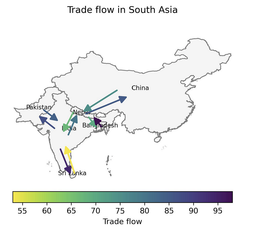
The end product is shown below. In my dummy dataset, the least trade flow is export from Sri Lanka to India (53 units), which is represented by yellow color. The highest trade flow is export from Bangladesh to Nepal (98 units), which is represented by violet color.
Conclusion
In this post, I demonstrated how the trade flow between countries including export and import relationships can be visualized in a Python map using two arrows. I have used the cartopy and matplotlib packages for this purpose. In the second part of this series, I will showcase how the “net” trade flow relationship can be visualized while highlighting the net exporter and net importer countries.
The notebook for this post is available in this GitHub repository. Thank you for reading!
References
Google Developers, 2023. KML Tutorial | Keyhole Markup Language | Google for Developers. The content of this page is licensed under the Creative Commons Attribution 4.0 License
Visualizing trade flow in Python maps — Part I: Bi-directional trade flow maps was originally published in Towards Data Science on Medium, where people are continuing the conversation by highlighting and responding to this story.
...