Data Visualization Techniques for Healthcare Data Analysis — Part III
Mastering data visualization: from effective bar charts to common pitfalls like 3D visualizations
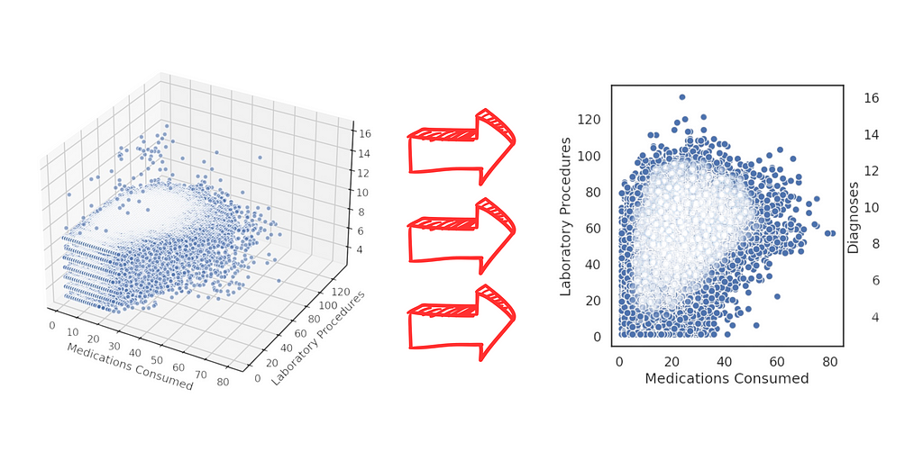
By the end, you’ll gain essential knowledge on building truly effective data visualizations, skills that will be invaluable in day-to-day tasks. Ready?
Table of Contents
- Python Libraries and Setup
- Initial Exploration: Shape, Types, and Summary
- Bar Charts: Use Cases and Best Practices
- Count Plots: Displaying Categorical Totals
- Crosstabs and Proportions: Normalizing Data for Clarity
- Scatter Plots: Exploring Variable Relationships
- Histograms: Visualizing Frequency Distributions
- CatPlots: Multi-Variable Analysis
- FacetGrid: Handling Multiple Dimensions in a Single Visualization
- Charts to Avoid: The Pitfalls of 3D Visualizations
- Stacked Histograms: Why Simplicity Matters
- Over-Complex Charts: When Too Much Is Too Much
- Comparison: Effective vs. Ineffective Charts
- Single-Tone Bar Charts vs. Over-Colored Charts
- 2D Scatter Plots vs. 3D Alternatives
- Maximum Clarity: Choosing Colors and Labels
- When and Why to Add Totals to Charts
- Avoiding Visual Clutter
- Delivering the Analysis Results
Python Packages Used in the Project
You may have noticed this already, but let me highlight it explicitly.
With just these four packages, you can create a comprehensive data analysis platform in Python:
# 1. Imports
import numpy as np
import pandas as pd
import matplotlib.pyplot as plt
import seaborn as sns
import warnings

# 2. Ignore warnings for clean output
warnings.filterwarnings('ignore')
NumPy and Pandas for data manipulation, and Matplotlib and Seaborn for visualizations. In nearly every project, these two pairs are fundamental, allowing us to perform analyses across various datasets, projects, and objectives.
These four packages form a robust open-source data analysis platform. NumPy and Pandas handle data manipulation, while Seaborn and Matplotlib take care of visualizations.
Seaborn excels in statistical charts, while Matplotlib provides more general-purpose charting. Notably, Seaborn relies on Matplotlib, meaning Seaborn-generated charts utilize Matplotlib’s libraries internally.
If visually intricate or interactive charts are not a priority, Seaborn and Matplotlib cover most data analysis needs. For enhanced aesthetics or interactivity, consider Plotly as an alternative — also in Python.
It ultimately depends on your goal: if you seek detailed data analysis with customized charts, Matplotlib and Seaborn are ideal. For more visually appealing and interactive charts, Plotly may be a better choice.
Let’s load these essential packages, and then activate the Watermark extension:
%reload_ext watermark
%watermark -a "panData"
Loading the Data
I retrieved the CSV file from the previous project — our prior output will now serve as the input for this project.
So, let’s proceed with loading the dataset for our data analysis work.
# 3. Loading the data
data = pd.read_csv("project_result.csv")
With the data loaded, let’s examine the first few rows of the dataset, showing all our previous work:
# 4. Viewing the data
data.head()
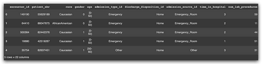
Now, let’s check the shape, which reveals the number of rows and columns:
# 5. Shape
data.shape

# (68629, 22)
And finally, let’s get the statistical summary:
# 6. Info
data.info()
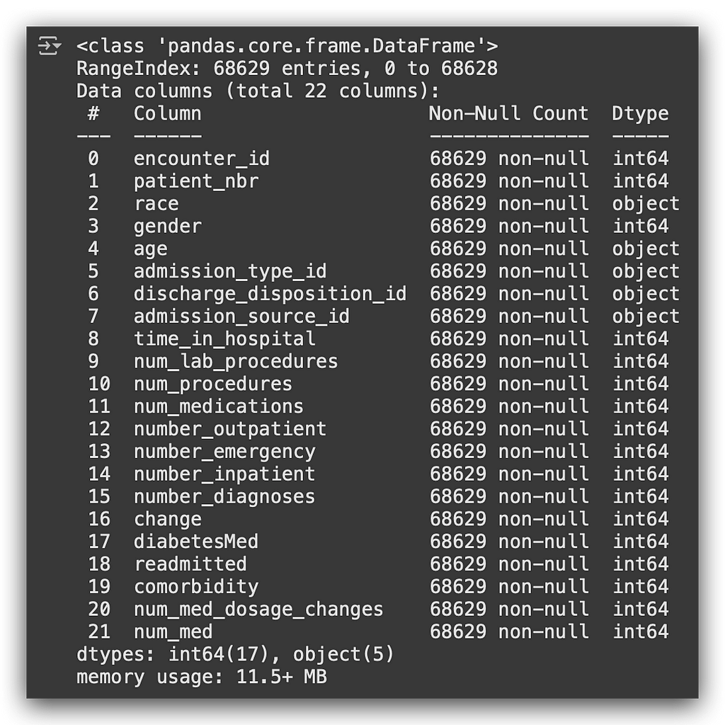
We’re now ready to start building visualizations.
Visualization, Interpretation, and Data Analysis
Here’s my proposed solution for data visualization. While there are many possible charts, I’ll explain my choice, detailing why I selected each type of chart and pointing out common pitfalls to avoid in chart creation.
In this notebook, .
on Medium, where people are continuing the conversation by highlighting and responding to this story.

SOCIAL SHARE CARD GENERATOR