
In the 11 years I’ve been writing annual iOS and iPadOS reviews every summer, I don’t think I’ve ever struggled to find an “angle” for my story as much as I did this year. The reason was twofold: I wasn’t particularly enamored with Siri AI and Apple’s belated chatbot efforts; and, as I realized during the summer, it can be challenging to write about an OS update that is largely focused on performance improvements and refinements.
“Everyone wants a so-called Snow Leopard year until it actually happens,” I thought to myself on several occasions over the past few months. Think about it: on paper, we all love a good ol’ basket of bug fixes that just make our phones better without changing much about the overall design and experience of iOS. It’s a commendable effort, and there’s no denying that iOS 27 is the snappiest (insert meme here), most stable version of iOS I’ve ever tested – and it has been since the first developer beta. In practice, though, it turns out that considering a major iOS update merely through the lens of improvements and fixes can be…a little boring.
So I’ve been sitting on this review for a while. I let it simmer. Then, a month ago, as I was sunbathing with my girlfriend Silvia down south in beautiful Vieste, Puglia, it hit me: iOS 27 is a geographically ambiguous update. Stay with me here. Depending on where you are in the world, this update can either be a little boring or pretty exciting.
If you’re a MacStories reader with access to Siri AI, you fall on the “pretty exciting” end of the spectrum. From my perspective as someone who’s been using frontier models and has embraced different agentic workflows over the past year, Siri AI can’t compete with the intelligence offered by models from the four American companies leading the AI race right now. As I wrote back in July, however, Siri AI has an advantage: its proprietary integration with iOS frameworks, personal context, and third-party apps.
As I’ll explore in the Siri AI chapter, the results can be hit or miss: inferior intelligence and lack of agentic features won’t impress power users who have grown accustomed to the likes of Claude Cowork and ChatGPT Work. At the same time, what Siri AI can accomplish with Apple’s own apps and compatible third-party ones is an objectively nicer and more powerful iOS-native experience than anything else on the market right now. And: even if Siri AI’s chatbot capabilities don’t land at the frontier of AI benchmarks, it undeniably is a better Siri for Siri-type tasks than it’s ever been. I know: that’s not a high bar to clear, but the difference is quite dramatic if you go back to the old Siri.
In the three months that I’ve spent with iOS 27, I’ve come to appreciate the “little boring” side as much as the exciting one, which is not what I was expecting after WWDC. Even if we set aside the dozens of features introduced by Siri AI and Apple Intelligence, iOS 27 is the kind of update that fixes hundreds (not hyperbole) of paper cuts throughout the entire operating system.
You may not notice them at first: perhaps you’ll think that Notes always allowed you to insert a divider line, or that Music’s Now Playing screen always worked in landscape mode, or that you’ve been able to export a frame from a video in Photos for a while now. And that’s where iOS 27’s “boring” nature turns into its opposite: if you’re the kind of iPhone and iPad user who cares about this stuff, these smaller enhancements across Apple’s entire catalog of apps will probably mean more to you than a barebones Siri chatbot app. My goal with this review is to shine a spotlight on these smaller improvements that have had a meaningful impact on my everyday iPhone experience.
I may have struggled to fully understand iOS 27 for a while, and perhaps to an extent I still do, as we’ll see with Siri AI. But I know one thing now: iOS 27 is not a Snow Leopard release. It’s less flashy than last year’s Liquid Glass update, and it’s not as bombastic for iPad users as iPadOS 26 was. Instead, iOS 27 shows that Apple is still capable of delivering something new while caring about the old.
Let’s dive in.
Design
If you’ve been following Apple for some time, you know that there’s almost a natural – some would say “institutional” – process to how the company’s design team takes bold leaps forward, then refines and iterates on them over time. It happened with Aqua. It happened – loudly, in the age of social media and the then-nascent YouTuber space – with iOS 7. This year, it’s happening with Liquid Glass. As John Gruber once quipped: this is how Apple rolls.
It’s no secret that I ended up enjoying Liquid Glass and what Apple set out to achieve with its focus on fluid, compact interfaces. That appreciation has only grown over the past year: I found myself gravitating toward third-party apps that embraced Liquid Glass instead of the ones that stubbornly refused to acknowledge its existence, which is usually a pretty good sign that something is clicking with me. As I wrote last year, however, Liquid Glass was not perfect: it carried intrinsic readability and accessibility shortcomings that would often make some UI elements hard to visually parse or small text illegible against clear backgrounds.
On balance, Apple stuck the landing with Liquid Glass in iOS 26. Anecdotally speaking, in conversations I’ve had with real-life friends (who are most definitely not MacStories readers) over the past year, I’d say that Liquid Glass was a success with people. The fact that a bunch of Android manufacturers have ended up copying Liquid Glass is a sign that, despite what some fringes of the old Apple commentariat would have you believe, the market has not rejected Liquid Glass. At the end of the day, the numbers speak for themselves.
One of the reasons I like covering Apple products is what I mentioned at the outset: success notwithstanding, the company does not stand still. As I suspected last year, Apple designers have not gone back to the drawing board and “scrapped” Liquid Glass (I remember reading some folks suggest that); Liquid Glass is still here, as is the focus on minimizing UI chrome and emphasizing the content space. The company has, however, done something unusual with iOS 27: it has doubled down on both ends of the Liquid Glass spectrum by embracing, once again, customization.
Instead of attempting to find a “balanced” take on Liquid Glass that would please everybody, Apple now allows users who really love Liquid Glass to make it even clearer and “glass-ier” than before; at the same time, it’s letting folks who strongly dislike it make Liquid Glass more opaque and frostier than ever.
In addition to new personalization options, Apple has improved the underlying Liquid Glass rendering engine to diffuse content more effectively, reworked the specular highlights system to create a better “layered” effect than iOS 26, and more. Will this be enough to guarantee a smoother adoption by app developers who have resisted Liquid Glass? Are these changes a cop-out, or a reasonable move to make the iPhone more customizable for folks with different priorities and needs?
Let’s take a look.
Customizable Glass
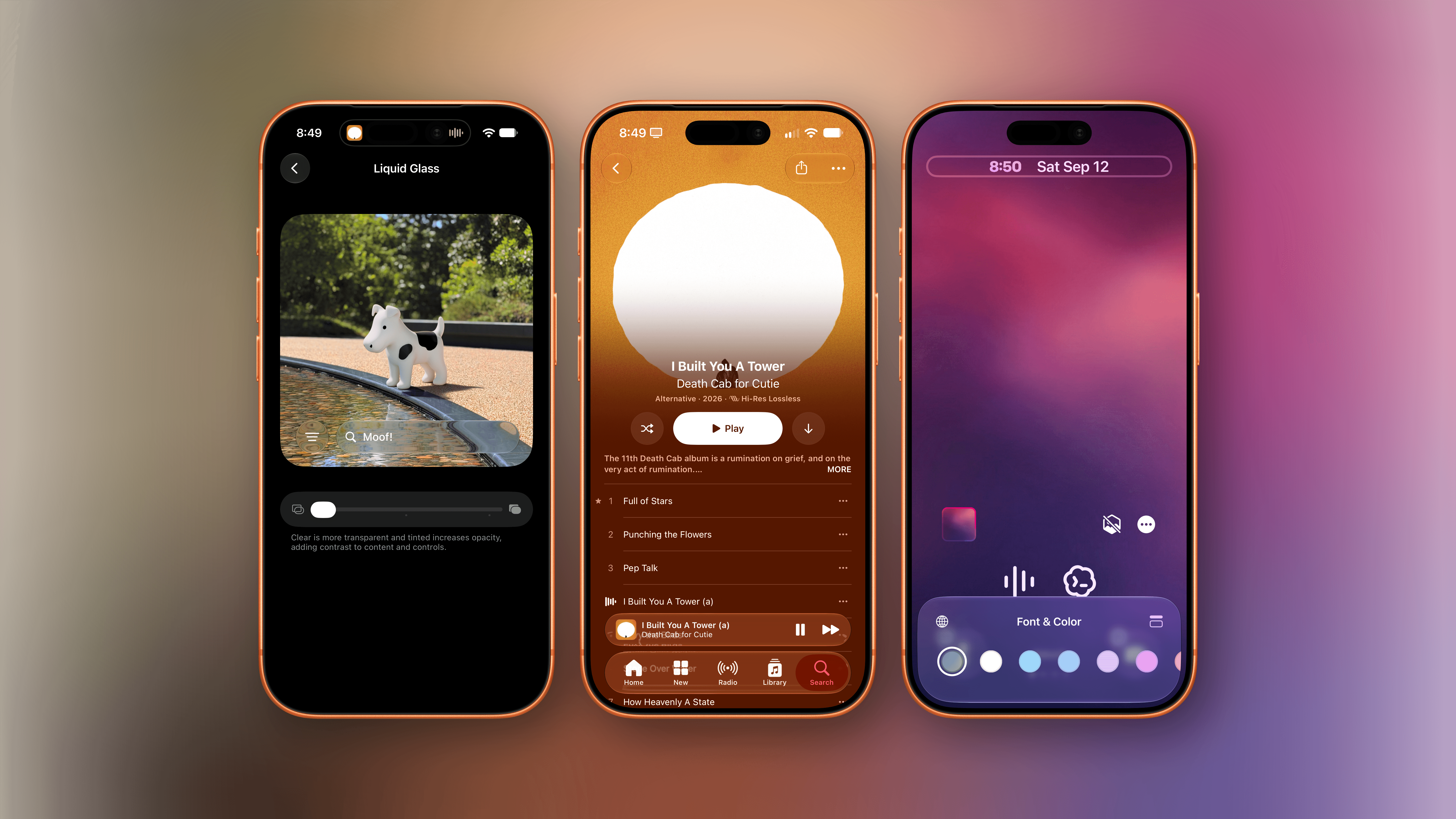
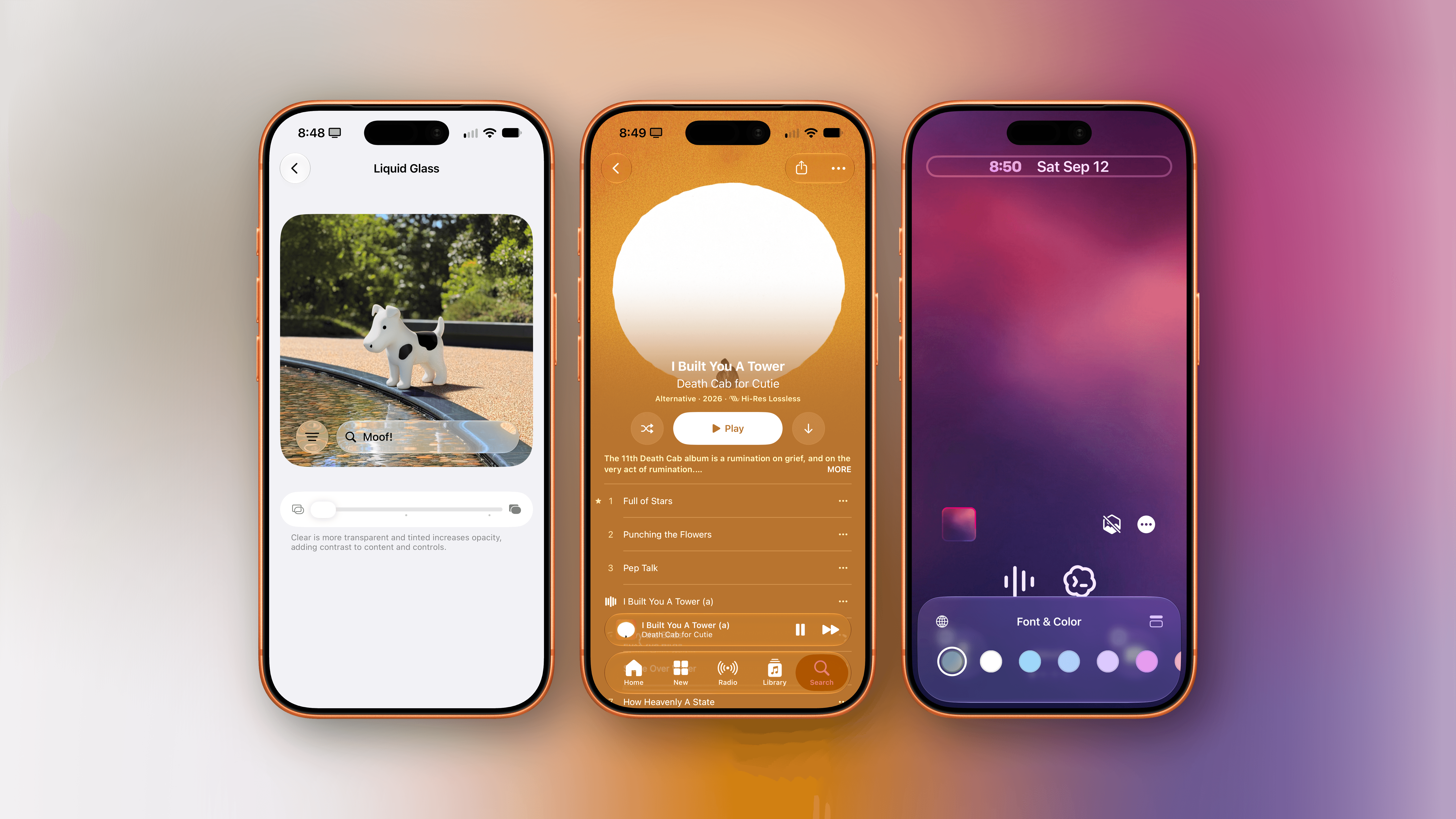
The first major change for Liquid Glass in iOS 27 is a new ‘Appearance’ section of Settings that consolidates some options (which were previously available under ‘Display & Brightness’) and introduces new personalization settings for the Liquid Glass material.
In iOS 26, Liquid Glass could only be either ‘Clear’ or ‘Tinted’. In iOS 27, there is now a slider in Settings → Appearance → Liquid Glass that lets you choose any level between three default styles: More Clear, Default, and More Tinted. Unlike last year’s basic preview, the new screen in iOS 27 lets you preview what real UI elements would look like with different glass levels on top of photos of Apple Park’s ring building, the Rainbow, and a certain mythical creature.
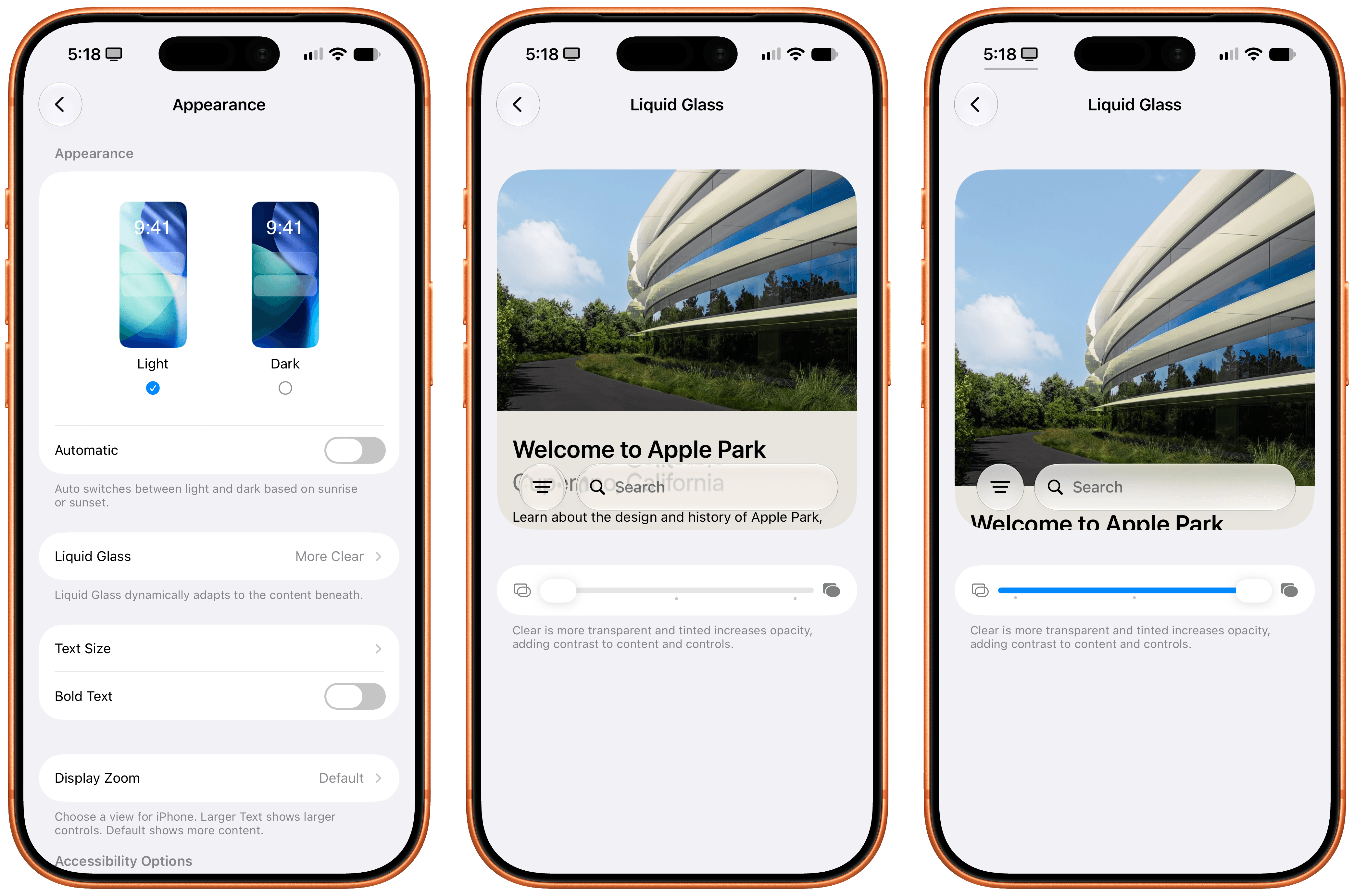
The new customization menu for Liquid Glass.
At its clearest setting, Liquid Glass is as clear as it’s ever been. If you’re a Liquid Glass sicko like me and did not mind the ultra-glassy look of iOS 26 beta 1 last year, dragging the slider all the way to the left in iOS 27 is what you want to do. As long as you can live with severe legibility issues in apps that scroll content under tab bars or floating toolbars, you’re going to have the time of your life with a hyper-polished glass material that fluidly morphs and animates on screen even better than last year thanks to iOS 27’s (many) performance and rendering improvements. I’ll be blunt: this is the setting I use, and I love it. YOLO.
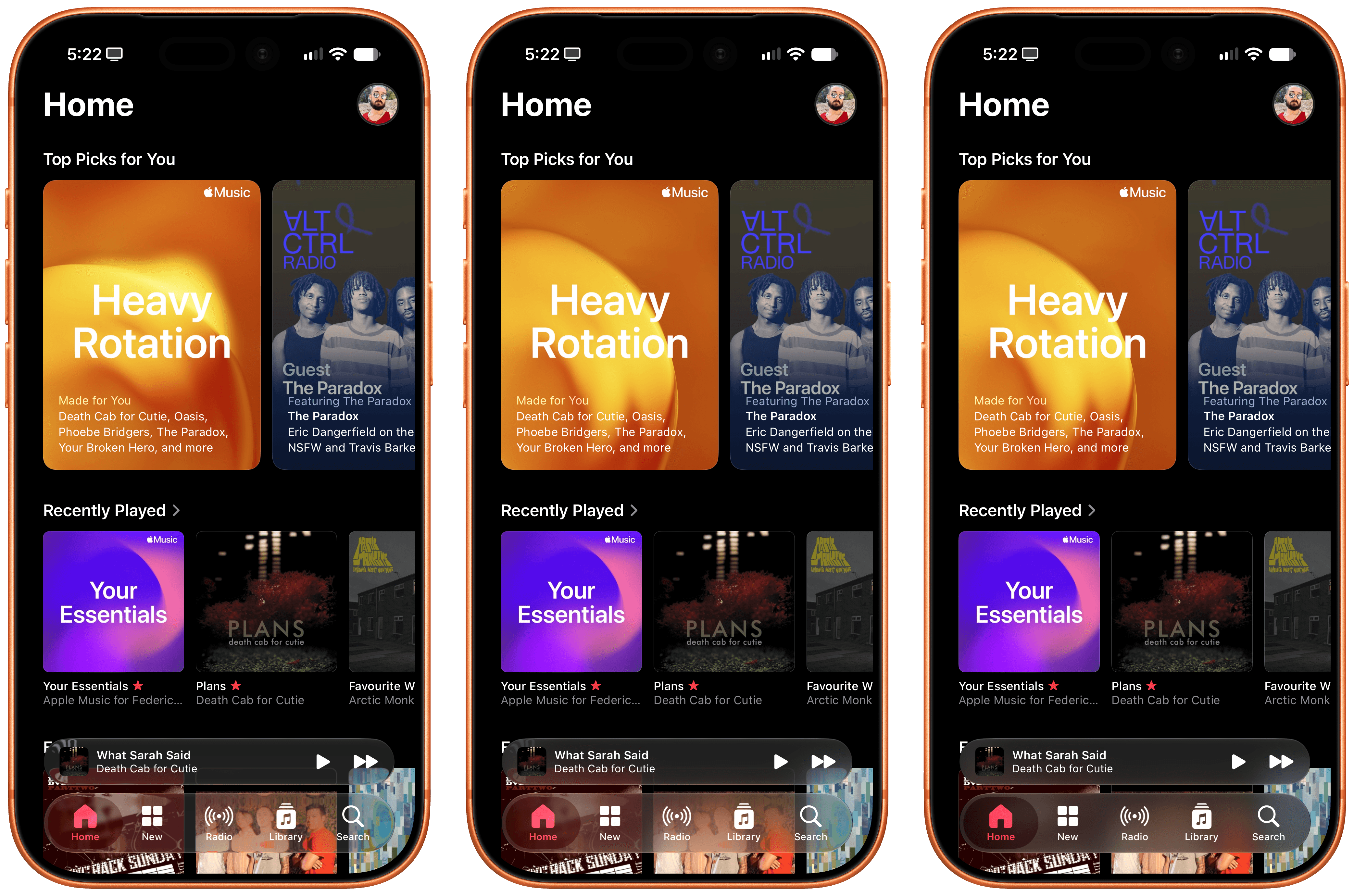
The same app with clearest Liquid Glass (left), default (center), and tinted.
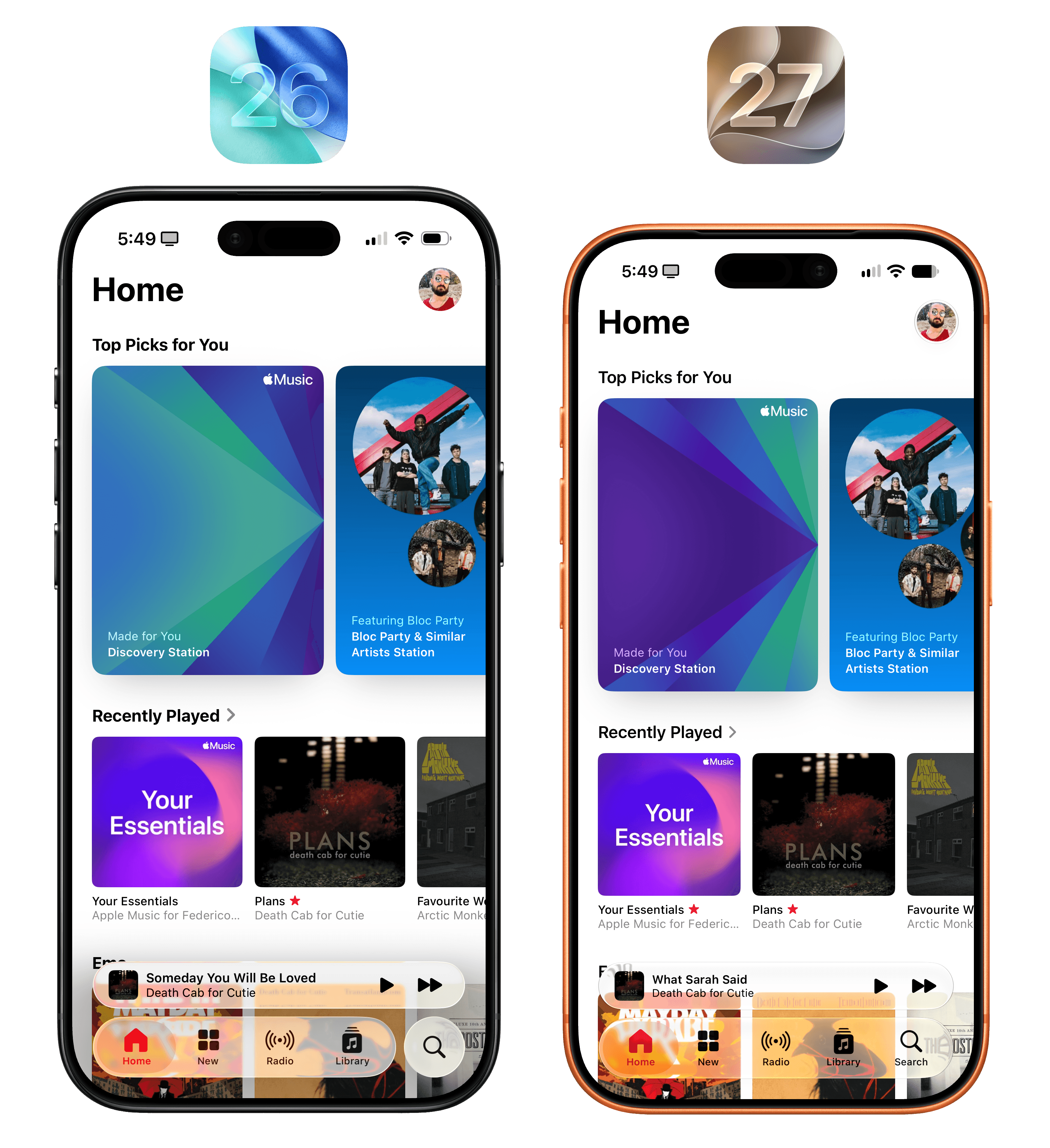
iOS 26’s clear Liquid Glass vs. iOS 27’s clearest setting.
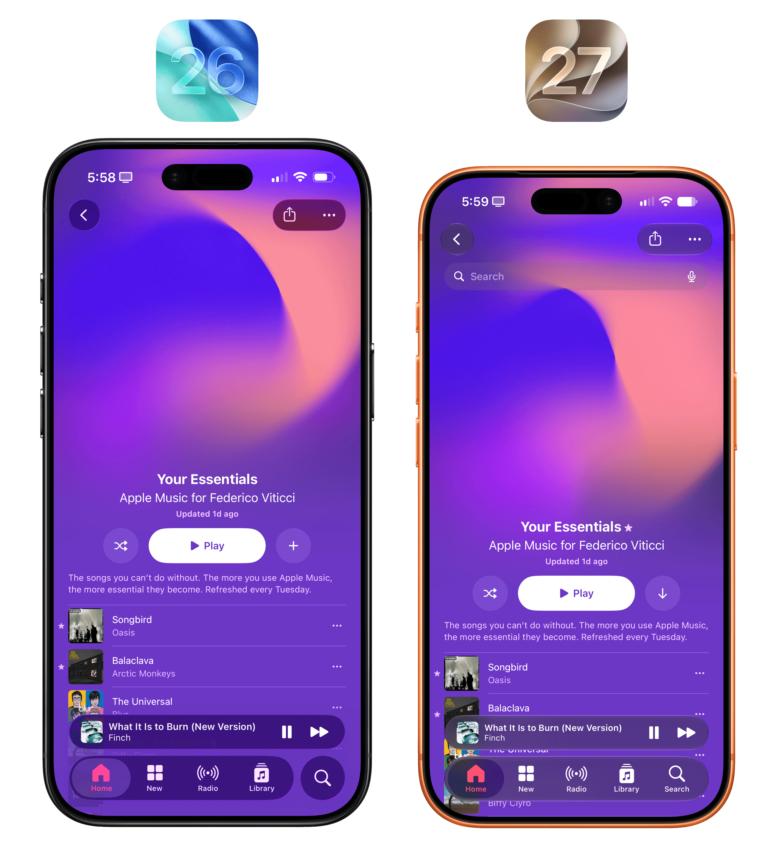
Tinted Liquid Glass across iOS 26 and 27. Notice the more “layered” appearance of iOS 27’s material.
On a more serious note, it is interesting to observe where the defaults have landed for Apple’s design team in the past year. On average, the new ‘Default’ option in iOS 27 is more tinted than the ‘Clear’ setting of iOS 26. This suggests to me that Apple collected feedback and understood that more people would benefit from having a slightly more tinted Liquid Glass appearance by default than the other way around. At the same time, Apple is introducing personalization as a way to appease those who loved Liquid Glass as well as those who couldn’t stand it.
I encourage everyone upgrading to iOS 27 today to play around with the new Liquid Glass appearance settings and see which one you prefer – and, remember, you can set the slider at any point between the three default styles offered by Apple. Below, I am including some comparison shots that demonstrate different Liquid Glass levels in Apple’s own apps as well as Waluigi’s Glass Lab, a demo app I created with Codex for this review to show off new Apple APIs and Liquid Glass UI elements. (No, I am not accepting testers for Waluigi’s Glass Lab, I’m sorry.)
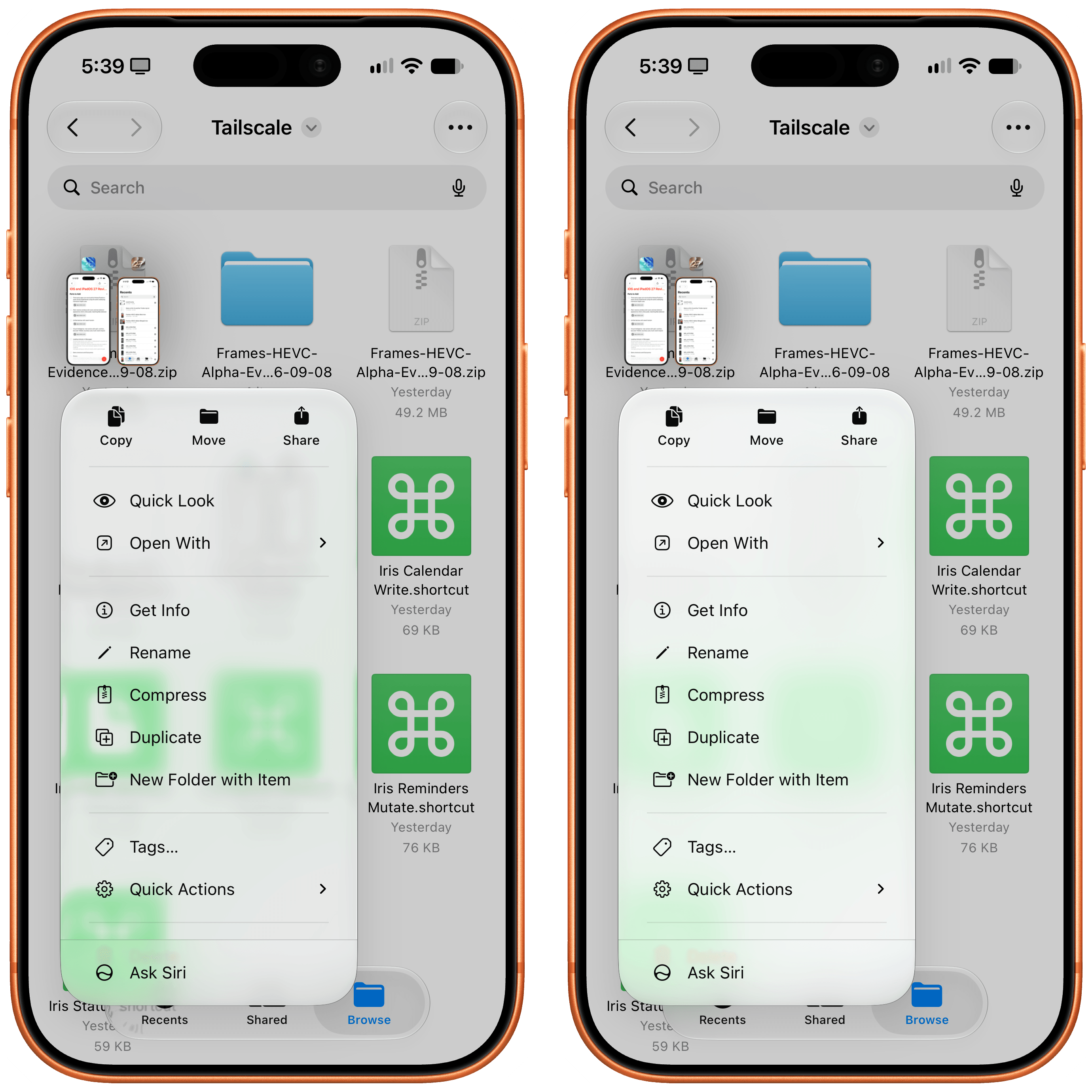
A context menu in Files with clear (left) and tinted Liquid Glass.
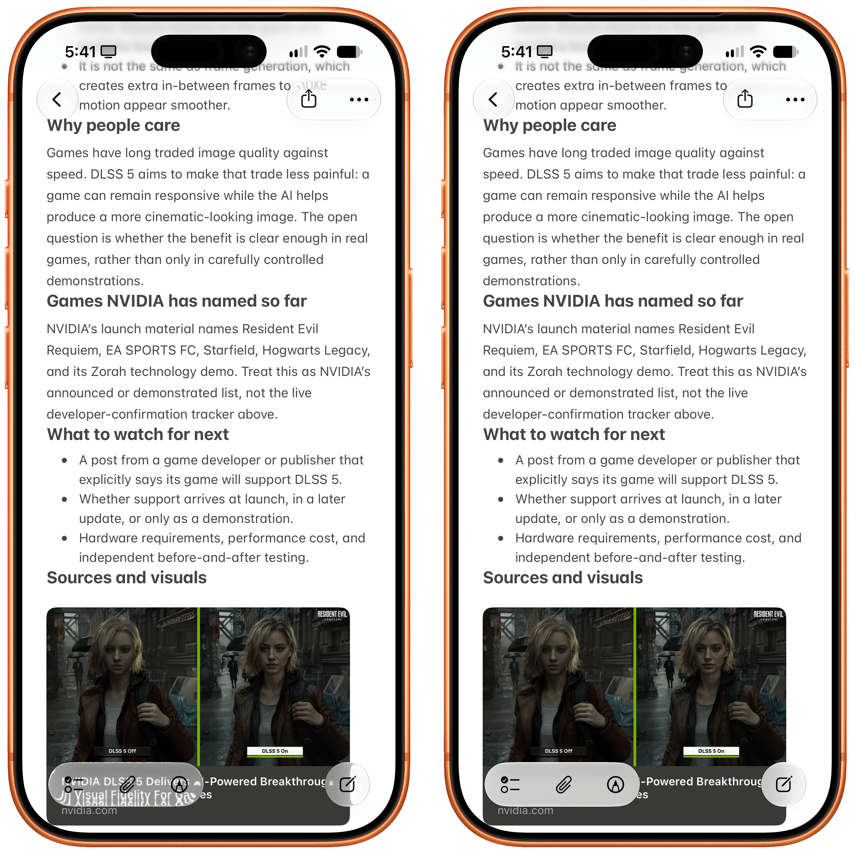
Notice how the Notes toolbars change between clear and tinted Liquid Glass in iOS 27.
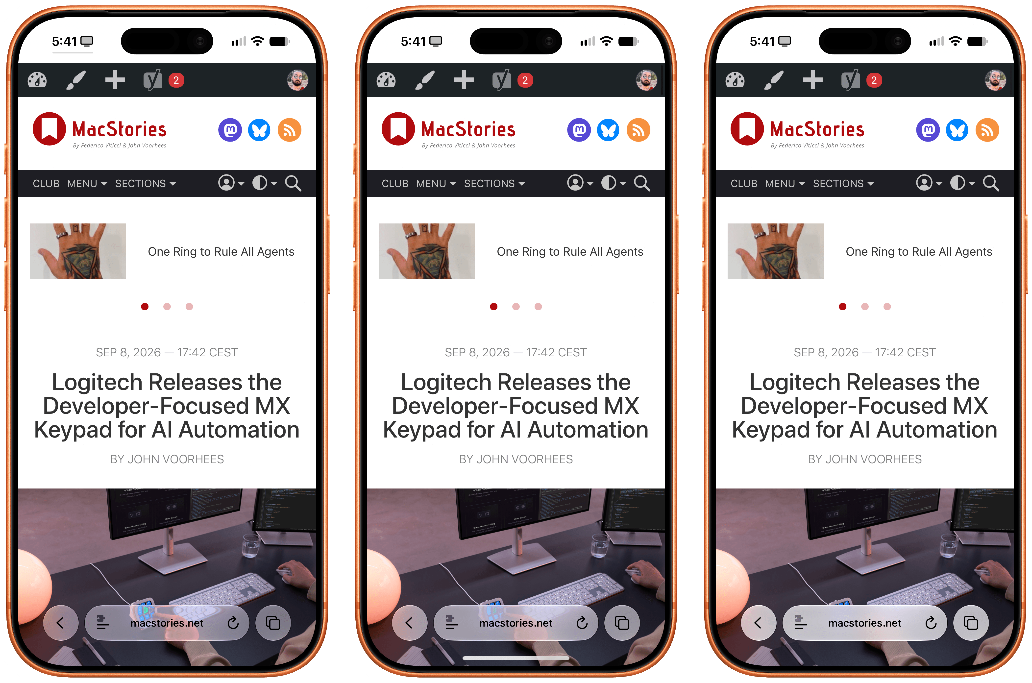
The Safari address bar with clear (left), default, and tinted Liquid Glass.
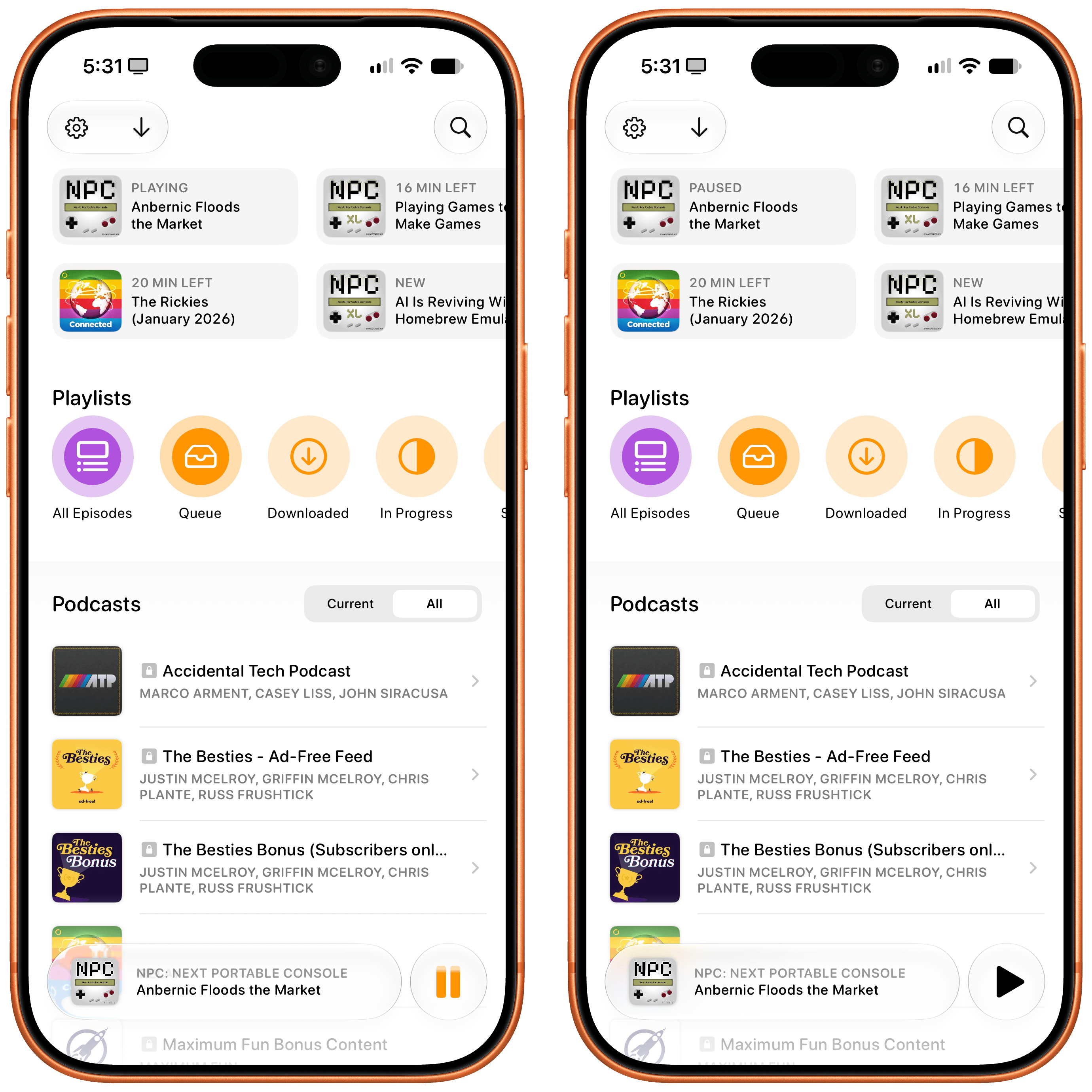
All third-party apps built for iOS 26 receive the new Liquid Glass material “for free” in iOS 27. Pictured: Overcast with clear setting (left) and tinted.
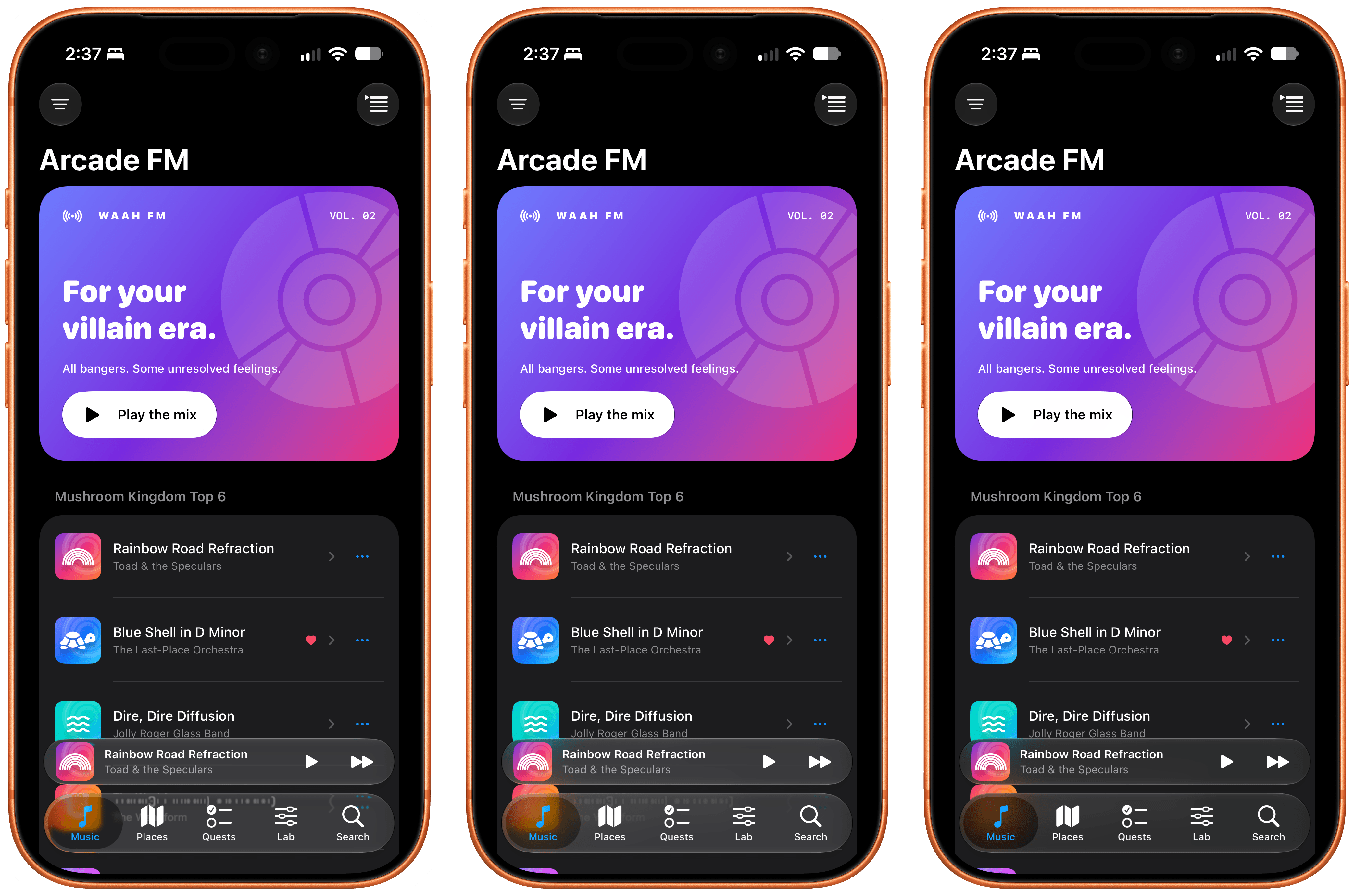
Waluigi’s Glass Lab with clear, default, and tinted Liquid Glass.
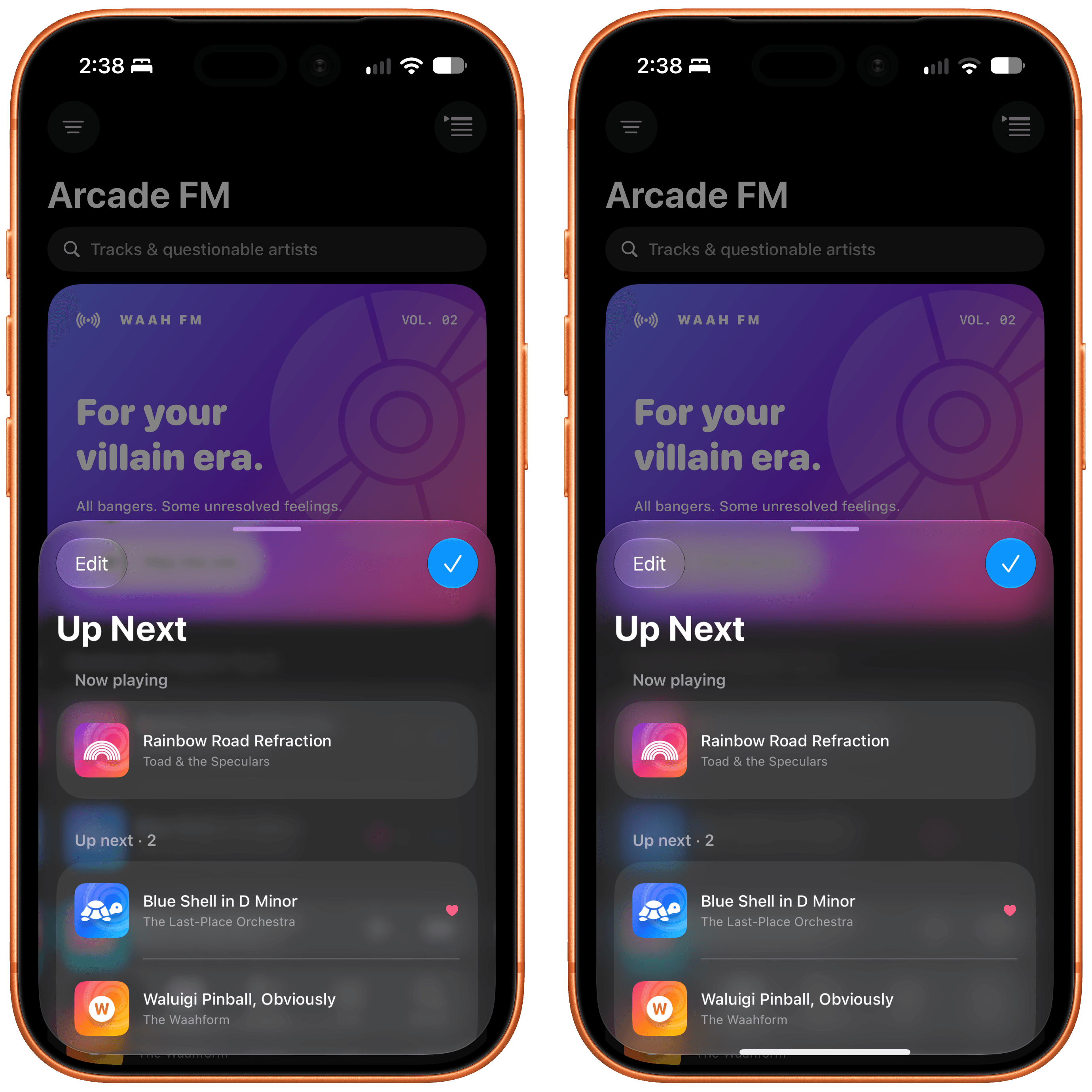
Clear and tinted Liquid Glass in this very important app.
After three months with iOS 27, my takeaway is that there’s more to this year’s Liquid Glass than different transparency levels alone. What I find more impressive, in fact, is the work that has gone into improving the underlying rendering engine and how it diffuses content and layers UI elements in the first place. It is maybe a little cliché to say, but this is what Liquid Glass should have been all along. Thanks to a combination of more effective diffusion and refraction, darkened edges, and brighter specular highlights, the updated Liquid Glass is more legible and does a better job of creating multiple “layers” of glass that stand out against content.
Take the Music app’s ‘Get Up!’ playlist and its warm orange background, for example, and its pink-accented tab bar. The selected ‘Home’ tab in iOS 27 is drastically more readable than last year’s – and I am using the clearest version of Liquid Glass.
, but Apple itself is using the unified style again in its apps.](https://cdn.macstories.net/images/uploads/2026/09/09/shortcut-upload-1788969914954-61034b4061.png)
Another iOS 26 reversal: the search button is back inside the tab bar instead of floating next to it. The other “button style” is still supported, but Apple itself is using the unified style again in its apps.
The context menu? The darker edge around it makes it feel more layered than before – almost as if it’s “floating” on screen. This has also allowed Apple designers to use a glassy material for it, which is stunning compared to last year’s dark context menu:
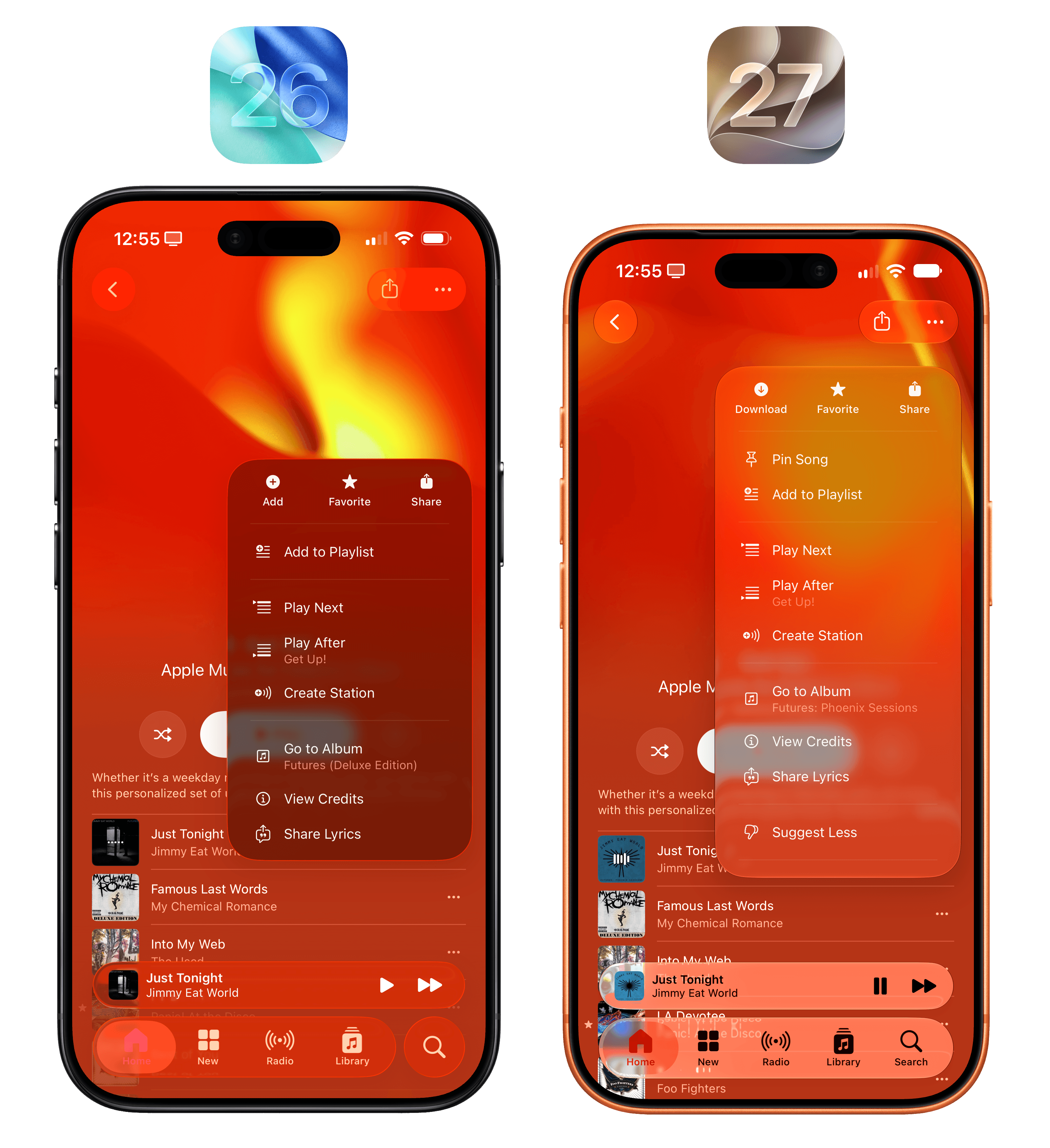
I mean, there’s no contest here, right?
As you use iOS 27, you’ll notice this better separation of layers and improved diffusion everywhere, so I’ll spare you the dozens of examples here. You get the gist.
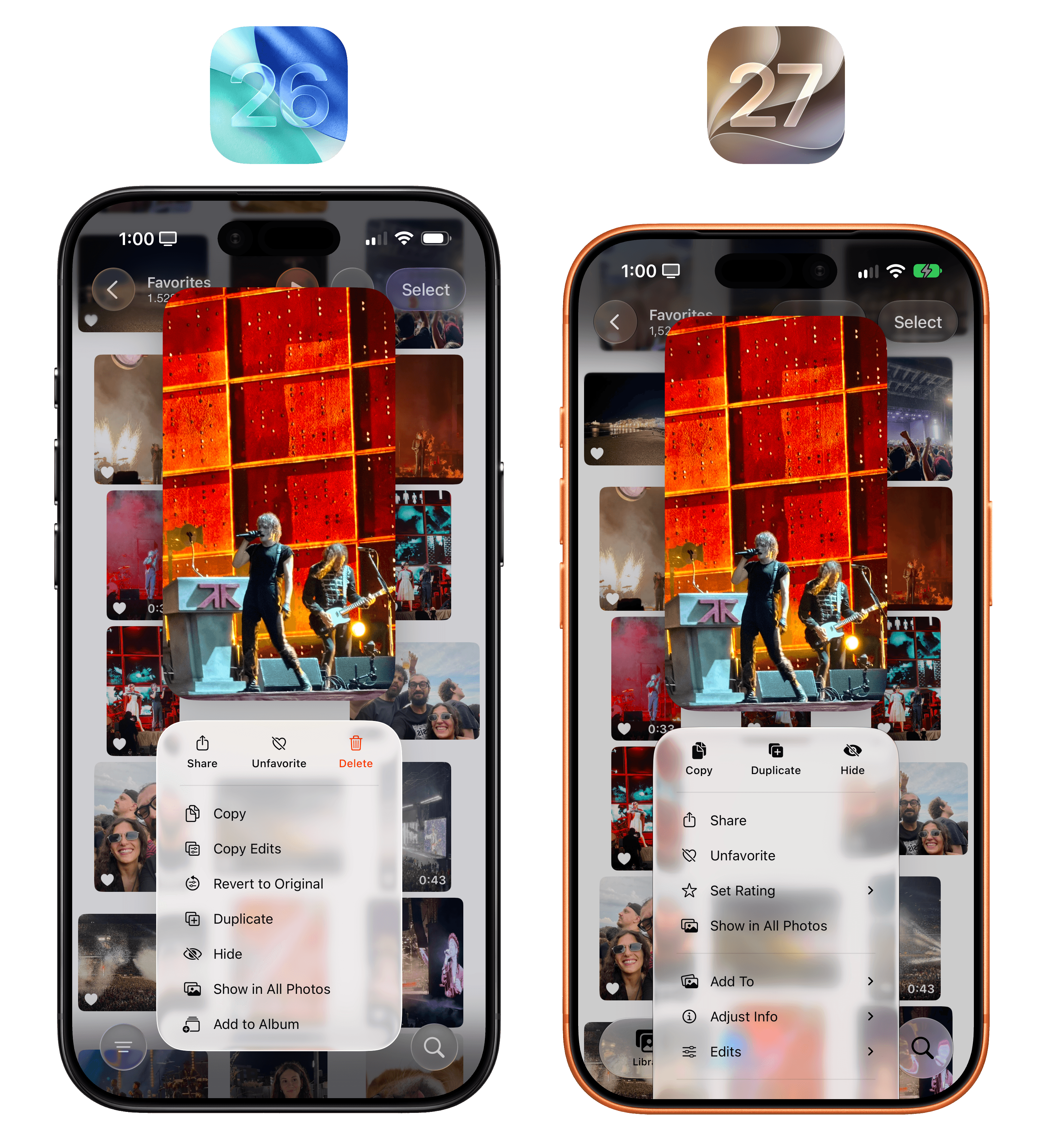
All this begs the question: is customization a way to fix Liquid Glass’ underlying problems by sweeping them under the rug of “fine, you fix it for yourself”? Yes and no.
To an extent, a slider lets Apple have their cake and eat it too: Liquid Glass die-hards are happy, the material is a bit more tinted by default, and those who absolutely despise it can adjust the slider all the way to the right. But I’m not a pessimistic tech commentator, and I’ve followed this company long enough to reiterate that I believe the static, “bestowed upon users with no tweaking allowed” era of software design is over, and has been for a while. I don’t know if making Liquid Glass more customizable had always been in the cards; what I do know is that Apple has been embracing deeper user customization for several years now. A more customizable Liquid Glass is consistent with the work Apple has been doing in opinionated, yet flexible UI design for the last six versions of iOS.
If you ask me, it would have been a mistake for Apple not to make Liquid Glass more customizable this year. In fact, I’d go one step further and wish I could customize Liquid Glass per app, just like I can tweak text sizes for individual apps across the system. I’d love to make Music clear and Safari a bit more tinted, for example.
The new Liquid Glass looks great, and there continues to be nothing else that matches its aesthetic, performance, and shape-shifting nature across the entire tech landscape.
Extra Large Widgets on iPhone
It is quite funny that one of my favorite “small” additions to iOS 27 for iPhone users is called “extra large” widgets. As the name implies, this new size class lets you add widgets that take up an entire Home Screen page, allowing apps to use an expansive canvas for custom content and interactions that would otherwise have felt cramped on smaller widgets.
In Apple’s apps, you can now find extra large Home Screen widgets for:
- Calendar
- Home
- Music
- Notes
- Photos
- Reminders
- Shortcuts
- Stocks
- Weather
I know what you’re thinking: these widgets were designed for the inner display of the iPhone Duo, and you wouldn’t be wrong. As early marketing materials and hands-on impressions have shown, it should be very nice to keep a stack of XL widgets on one side of the inner Home Screen and regular icons on the other.
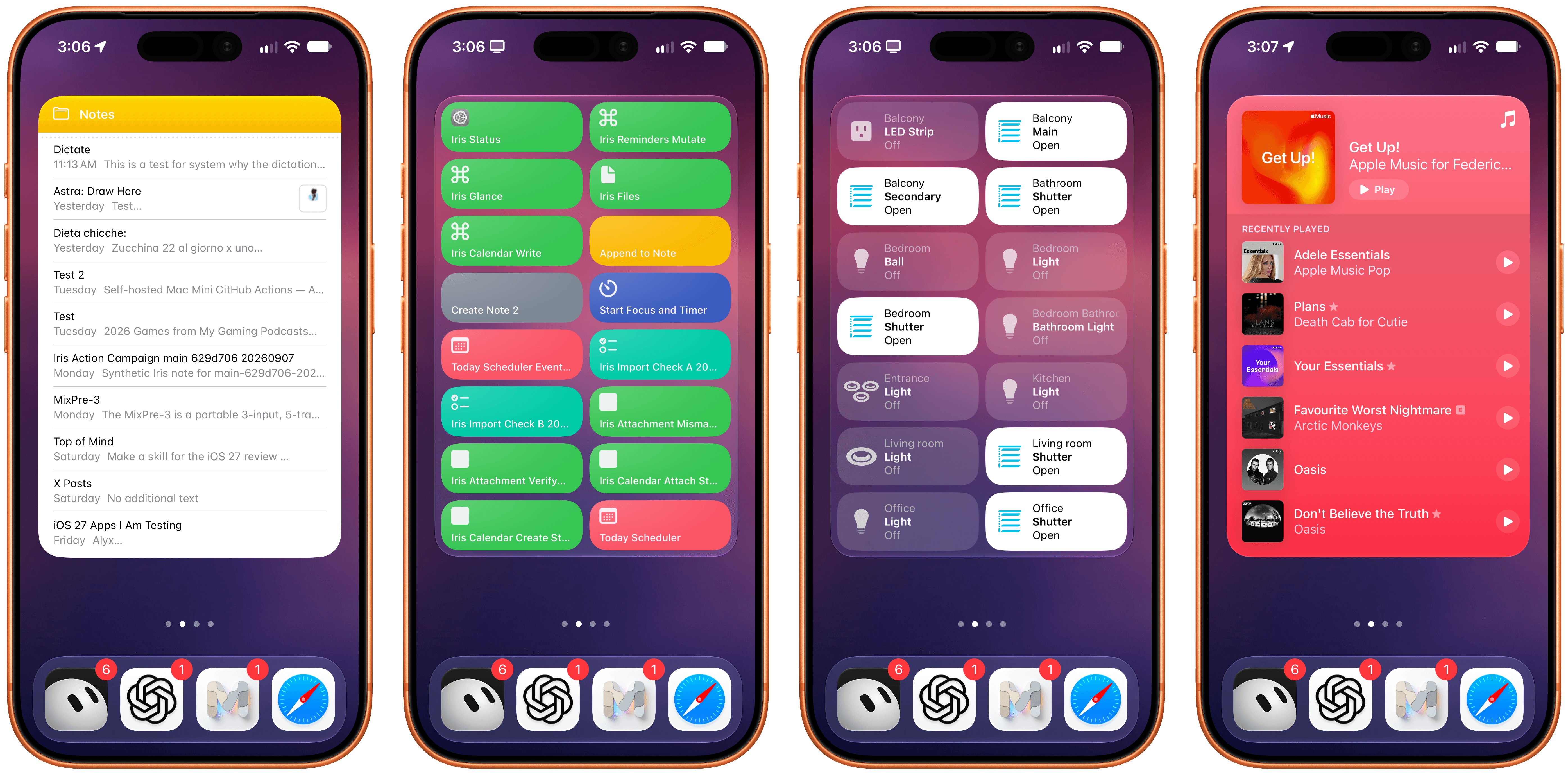
In my testing with the iPhone 17 Pro this summer, I’ve enjoyed this new widget family as a way to preview content that apps usually present as long lists. When I have a busy day with many events and tasks, it’s great to flick through the Calendar and Reminders widgets and get a complete overview of what’s coming up without opening those apps.
The new extra large widgets are also great as Home Screen-native control dashboards. Since the new size allows for multiple interaction areas in the widget panel, you can effectively have dozens of launchers or actions baked into the same widget. The Shortcuts XL widget, for instance, lets you run up to 16 shortcuts without launching the app; the Home widget lets you control up to 14 accessories or scenes from the Home Screen.
It’s no surprise, then, to see third-party developers jump at this opportunity to showcase even more content and actions from their apps on the Home Screen. The excellent dictionary app LookUp now comes with an extra large ‘Word of the Day’ widget that not only displays beautiful artwork for any given curated word but also embeds buttons to mark a definition as favorite, shuffle through words, and even listen to a word’s pronunciation from the Home Screen. The folks at Mercury Weather have shipped a stunning XL widget that’s not only tinted based on current weather conditions but also shows hourly and weekly forecasts in the same widget thanks to the increased content area. And, of course, apps like Launcher and Lock Launcher are taking advantage of the larger surface to embed even more app shortcuts on the Home Screen, effectively serving as quasi-replacements for the default Home Screen app launching experience.
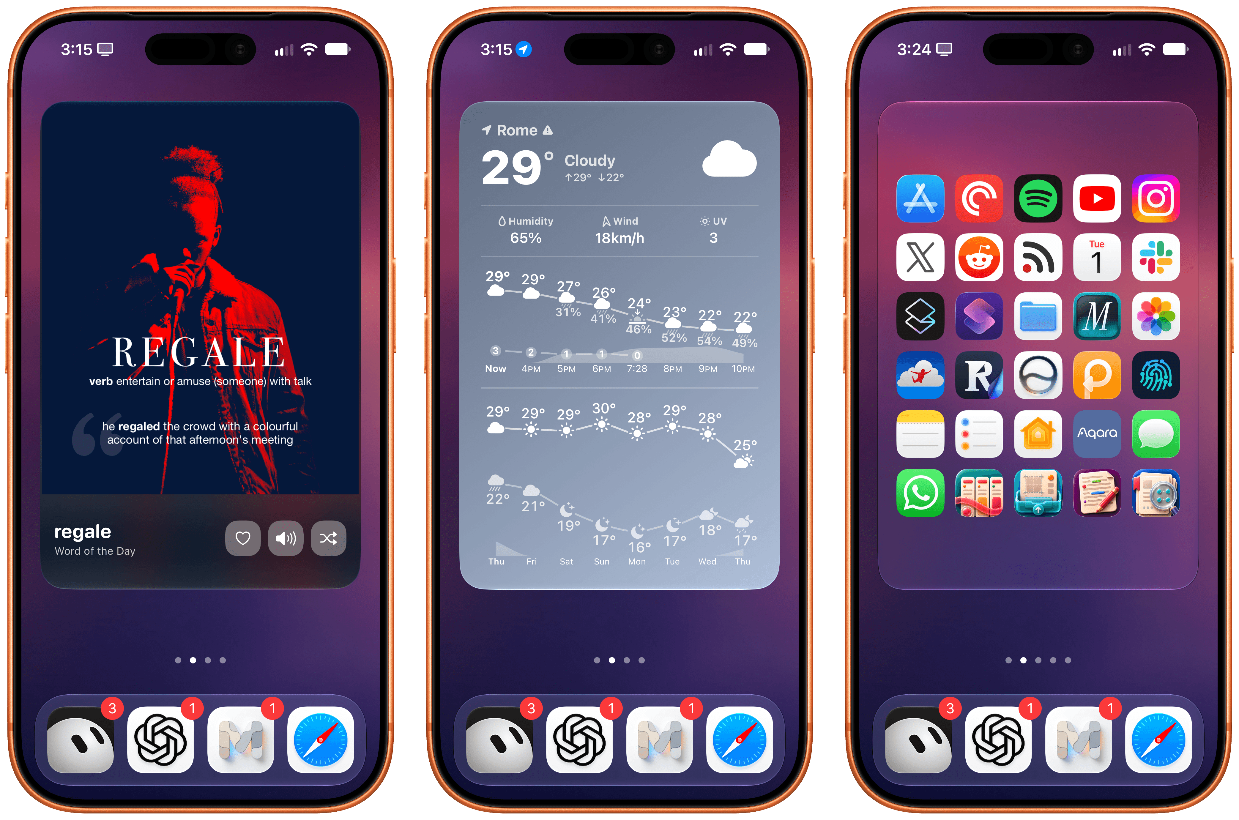
From left to right: LookUp, Mercury Weather, and Lock Launcher.
Extra large widgets are yet another step toward letting users have complete “mini app” experiences directly from the Home Screen – a trend that started years ago with the introduction of Home Screen widgets in iOS 14. I’m a fan of this new size, and I look forward to testing it on the iPhone Duo.
Lock Screen Changes
There are two changes worth noting to the Lock Screen this year. The first one is the complete opposite of extra large widgets: a minimized clock option that puts the current time next to the date at the top of the Lock Screen, right underneath the Dynamic Island.
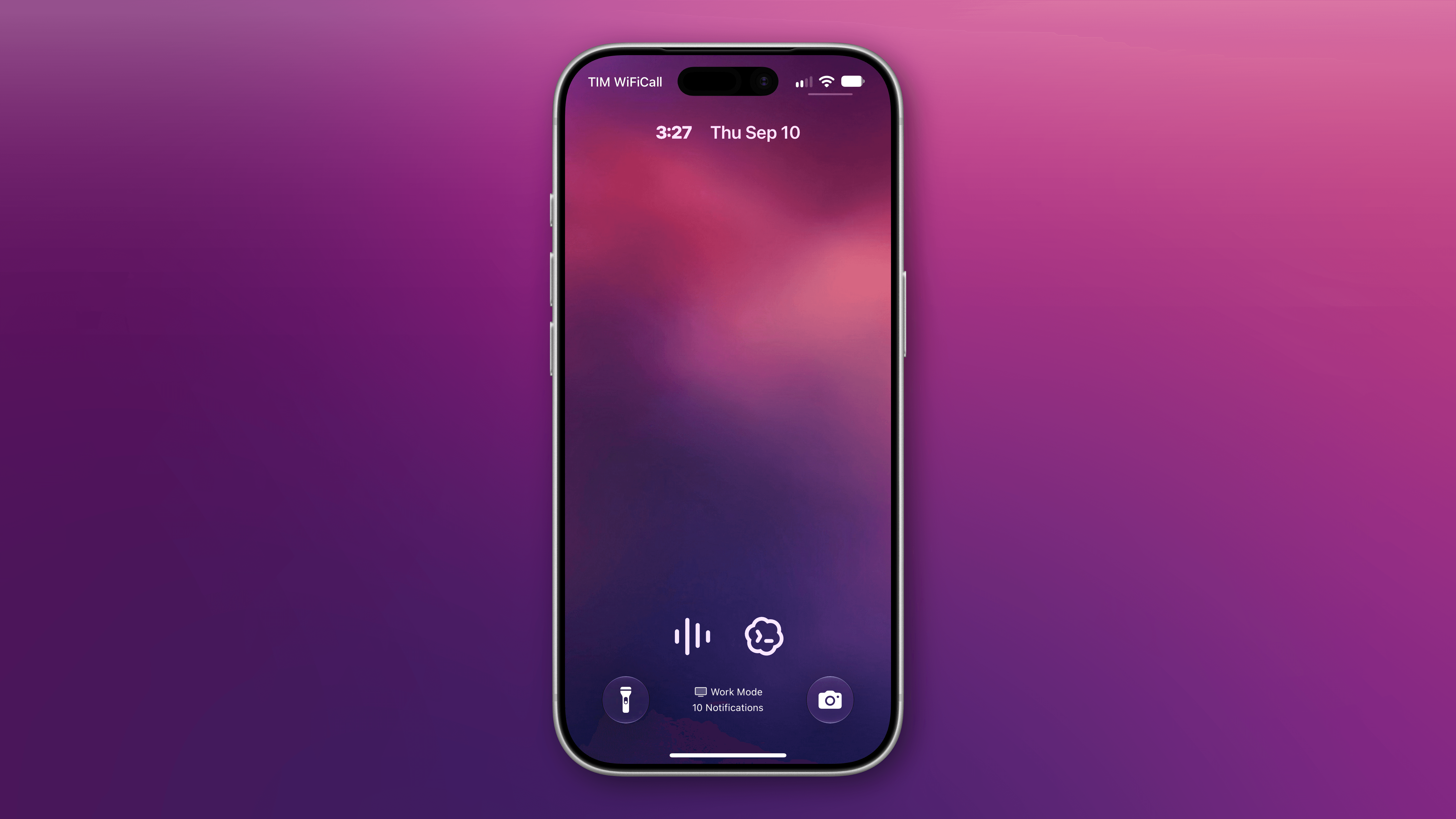
The new small clock on the Lock Screen.
To enable this mode, you can customize the Lock Screen, tap the clock to enter the ‘Font & Color’ panel, then tap the new symbol in the top-right corner of the panel to toggle between large and small clocks:
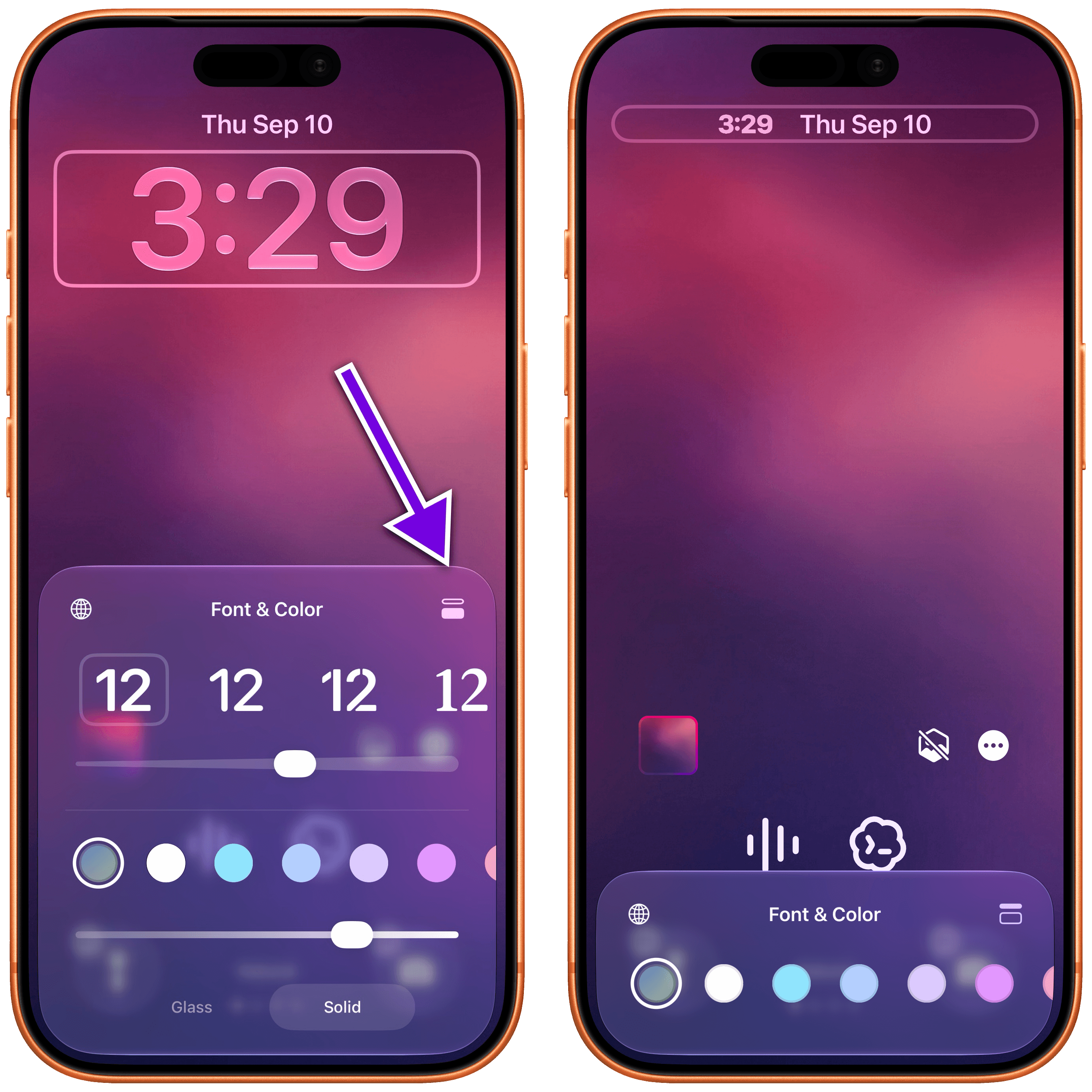
While I appreciate the addition of this option for minimalistic Lock Screen setups, it defeats the purpose of an always-on display for me. From my perspective, the point of having a modern iPhone with an always-on Lock Screen is to glance at the display from a distance and tell the time quickly if I’m not wearing my Apple Watch; the minimized clock prevents me from doing that. But I also know that this design makes more sense on the iPhone Duo and its smaller screen.
The other change is that you can now swipe away the system’s Now Playing control on the Lock Screen when something is playing. In iOS 27, swiping on the control will reveal a ‘Clear’ button that lets you remove the Live Activity from the Lock Screen:
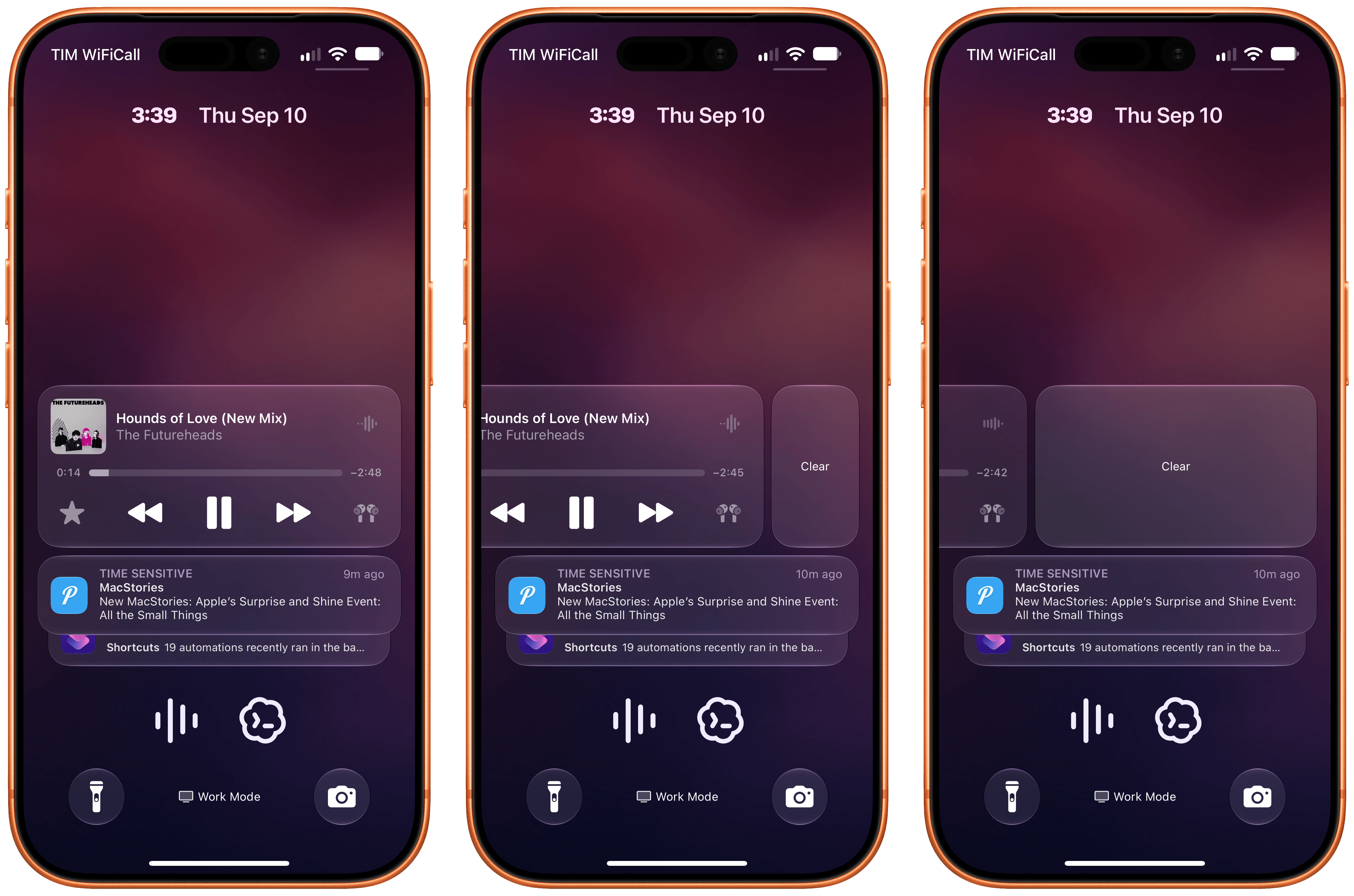
Notably, clearing away the Now Playing control also removes the activity from the Dynamic Island, but it does not interrupt or pause audio playback. It’s just a nice way to clear out the Lock Screen.
Icon Updates
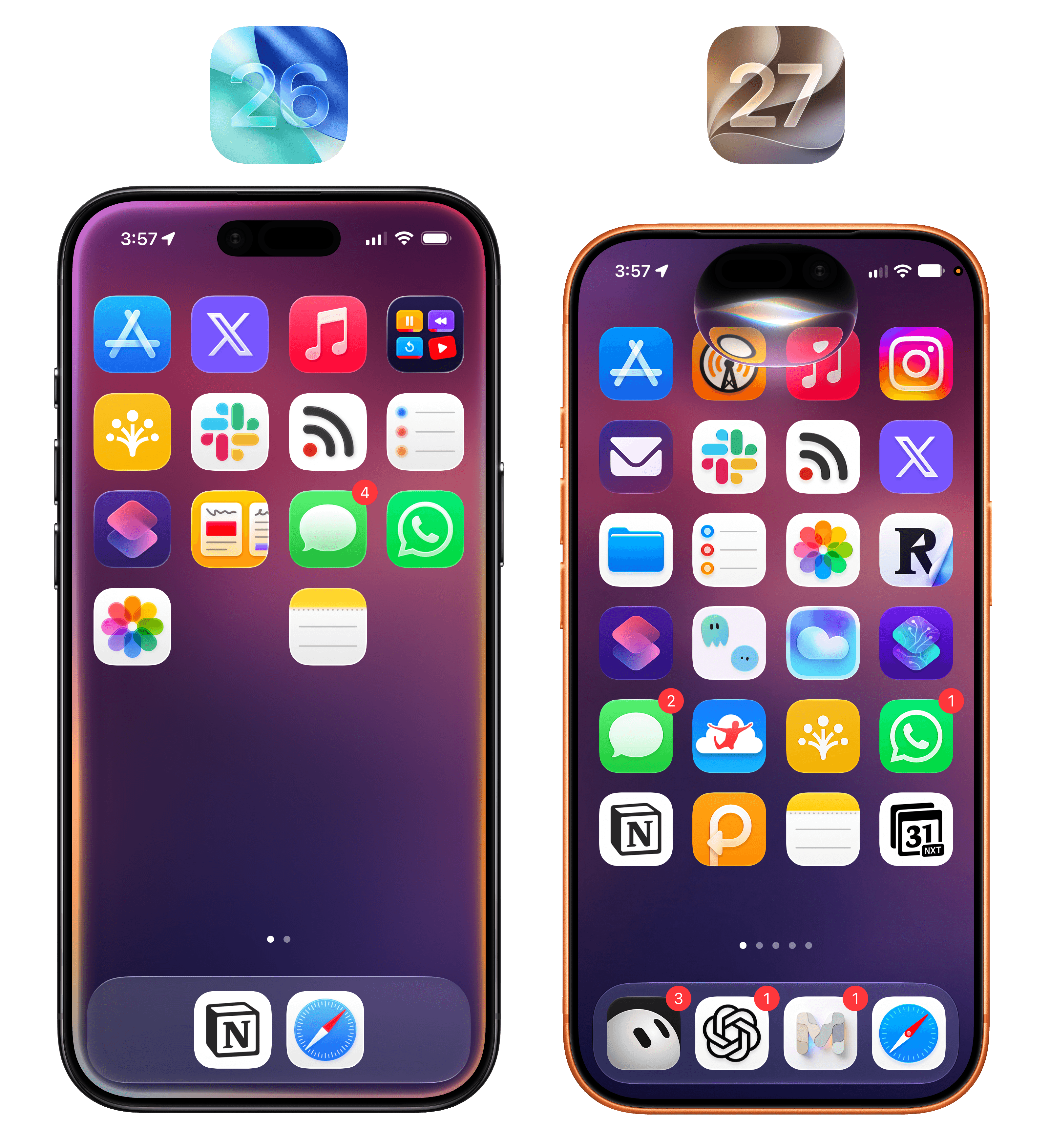
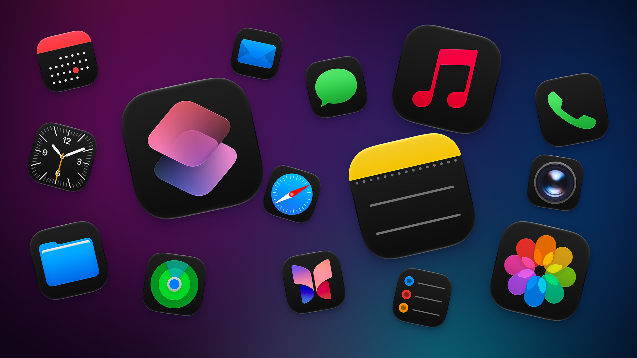
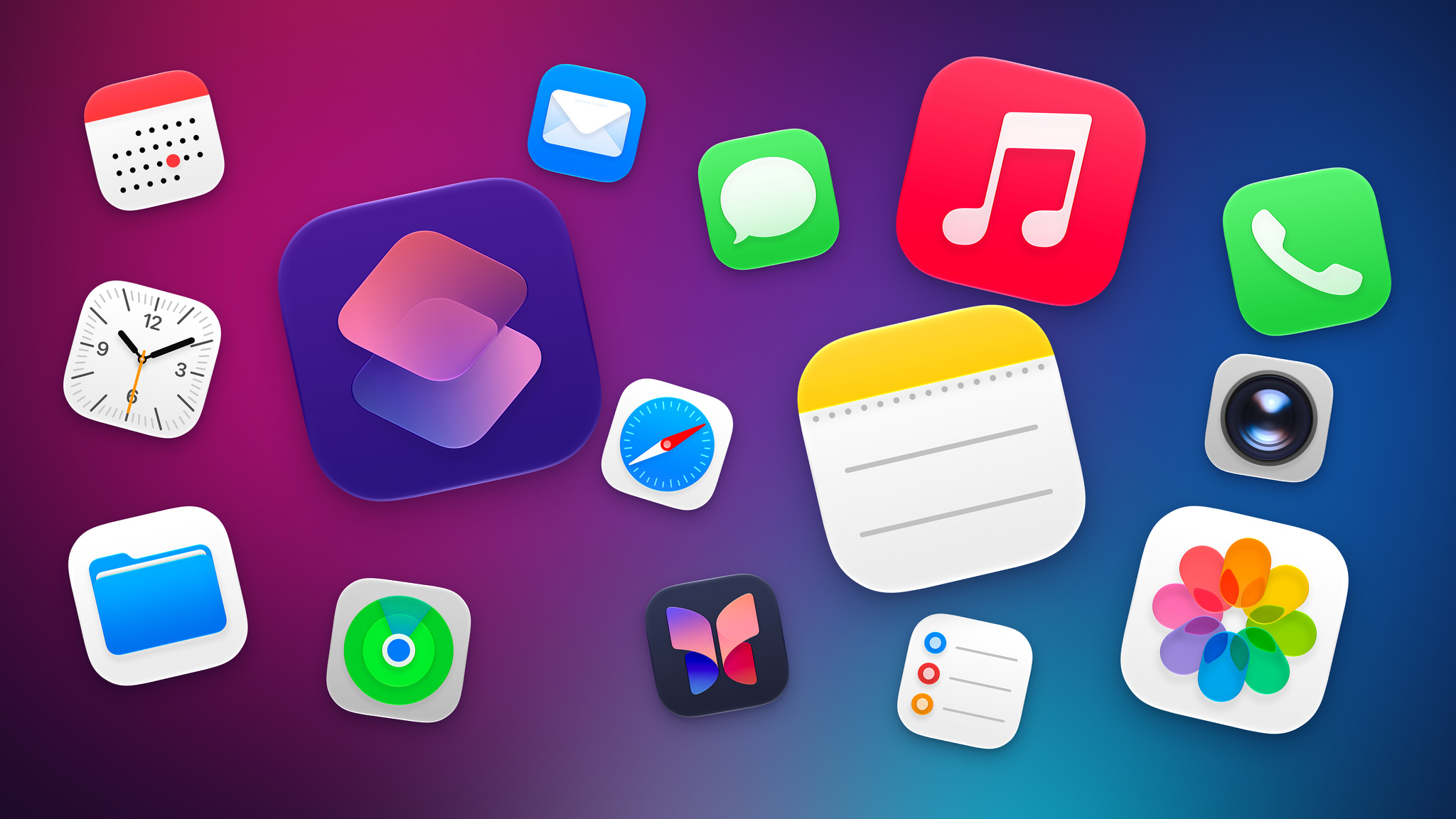
One last favorite change of mine deserves a proper visual look instead of too many words about it: all the Liquid Glass Home Screen icons have been refreshed with a more detailed, sharper look.
According to Apple, the new app icons in iOS 27 have “more character, detail, and sharpness in light, dark, tinted, or all-clear looks,” and this has been made possible by the use of additional Liquid Glass layers in each icon as well as the aforementioned improvements to rendering and diffusion.
I’ll explain it another way: comparing the old iOS 26 icons against the new ones in iOS 27 feels like putting prescription glasses on and seeing everything clearly for the first time. There is an underlying blurriness and softness to iOS 26’s original icons that I didn’t notice until I actually started comparing them side by side with iOS 27.
I love this change, and to properly show off the differences in this review, I decided to try something different. Below, you’ll find a gallery of all system icons from iOS 26 and iOS 27, which you can compare across the four system tints: light, dark, clear light, and clear dark.
I’ll let Apple’s work speak for itself here. If you’re like me, after seeing the new icons, you’ll probably wonder how we lived with iOS 26’s blurry Home Screen mess for a year. Good riddance.
Siri AI
It’s been challenging for me to think and write about Siri AI this summer, and I’ve already explained why: as a person whose workflow now revolves around agentic tools, I was not impressed by Siri AI at first.
I don’t think I was the only “power user” on Apple platforms who’s had this thought since getting their hands on the first beta of iOS 27 in June. If you’re reading this, chances are you’re pretty well versed in what models by OpenAI, Anthropic, or others now offer in terms of assistant features, web-based app integrations, memory, long-running tasks, and more. The product surface of Siri AI – the tentpole feature of iOS 27 that Apple is finally shipping after a two-year delay – has very little in common with those other agents or assistants, whatever you want to call them. Technically, yes – they are all based on a large language model under the hood. From a benchmark perspective, Apple’s new Foundation models are vastly behind the latest state of the AI frontier currently occupied by four American labs.
But as a product for people, Siri AI has a threefold advantage that no other company can match:
- It’s built right into your phone or computer
- It has a built-in knowledge graph about you in the form of personal context
- It can act upon, and retrieve data from, the native apps you use every day, from Apple to third-party ones
And these advantages sum up why I struggled to understand Siri AI at first. Is Siri AI only passable because it has an unfair advantage due to proprietary integrations that other AI models can’t use? Can it stand on its own as a good implementation of AI for most people? Does it fundamentally reinvent how we use our devices, or is it just a lot of hype for a slightly better Siri?
Unpacking the answers to these questions will be my goal with this chapter. But I’m going to do something unusual and share my takeaways up front, since they frame how I’ve been using and thinking about Siri AI.
I find Siri AI’s underlying models to be subpar compared to the competition: for anything beyond a simple knowledge query, I can’t see Siri AI replacing ChatGPT and its superior reasoning modes combined with web search. For simpler queries – the kind that a Google AI overview could also capably answer – the balance of speed and terse formatting is optimal in Siri AI. If I’m watching a movie and want to know how old an actor is, or if I want to know the meaning of a word, Siri AI is perfect for it and I no longer need to reach for ChatGPT or my personal agent in Open Minis. As we’ll see later, I find the Siri app to be extremely barebones and representative of the state of the art for chatbot design…two years ago.
The lack of an “agent mode” for Siri AI stings, and it’s why I can’t replace my beloved Codex or Hermes Agent setups with it.
However, Siri AI eventually clicked for me for the opposite reason: it can do things in and with apps that no other third-party agent can. Yes, they are simpler actions, and, no, results aren’t always perfect; but if you love the Apple app ecosystem and prefer using excellent native apps to cross-platform web ones, Siri AI is a breath of fresh air in the AI landscape right now.
See, Siri AI is complicated, polarizing, and almost impossible to agree upon.
Welcome to AI, Apple.
Foundation Models and Siri AI’s Architecture
Before I cover what the new Siri actually looks like and how it is split across a system-wide assistant and a brand new app, let’s talk about what it is and what powers it under the hood.
The new Siri is powered by a system orchestrator that coordinates user requests across different modalities (text, voice, and images) and five new Apple Foundation models, which are:
- AFM 3 Core
- AFM 3 Core Advanced
- ADM 3 Cloud
- AFM 3 Cloud
- AFM 3 Cloud Pro
The first two are on-device models, with Core Advanced being exclusive to more recent devices with higher RAM. ADM Cloud is an image diffusion model that runs in the cloud, and which I will not cover in this review since I have no interest in generative images. AFM Cloud and Cloud Pro are cloud models running on Private Cloud Compute, with some differences: while Cloud is optimized for latency and efficiency (both for users, since it’s faster, and for Apple, since it costs less to serve), Cloud Pro is capable of deeper reasoning and agentic tool use, and it does not currently run on Apple-made servers. Instead, Apple teamed up with Google and NVIDIA to host Cloud Pro on NVIDIA GPUs running on Google Cloud, while maintaining the same privacy and security guarantees as “regular” PCC. (Only Apple can deploy software to these nodes, and only Apple can sign that software. More details here.)
All of these models were, according to Apple, trained with proprietary data and reinforcement learning, then “refined” with data from frontier Gemini models. Essentially, the new AFM family of models was refined with distilled Gemini outputs. I can’t stress this enough: although Siri AI and AFM may exhibit some behaviors reminiscent of Gemini (as I’ll explain later), Siri AI is not “powered by Gemini” and there is no Gemini to be found in Apple’s operating systems. No Gemini model or agentic harness is being used by Apple.
There are a couple more details worth exploring about the underlying nature of Siri AI. The first concerns what is, in my opinion, the most interesting model of the bunch – the new AFM 3 Core Advanced that runs on-device. For starters, Apple now has a larger local model that is multimodal: Core Advanced supports vision capabilities and powers the advanced dictation and expressive voices of the new Siri. Because of the increased footprint and technical requirements of this model, however, Apple had to restrict it to more modern devices:
- iPhone Air, iPhone 17 Pro, iPhone 17 Pro Max, iPad (M4) or later with at least 12 GB of RAM
- Mac (M3) or later with at least 12 GB of RAM
- Apple Vision Pro with M5 (I always forget this exists)
The architecture of the model itself is also interesting. As I previously explained, while AFM 3 Core is still a 3B model with a dense architecture, AFM 3 Core Advanced is a 20B model that can run on devices with 12 GB of RAM. That’s made possible by a technology that Apple invented for sparse architecture models in which the model is stored in flash memory, activated parameters are locked in per prompt, and only 1 to 4 billion parameters are activated concurrently depending on the user’s request. From Apple:
One area of deep innovation is our most powerful on-device model, AFM 3 Core Advanced. Traditional large language models—whether dense or sparsely activated—require all weights to reside in active memory (DRAM), creating a massive footprint that limits scalability on consumer hardware. To break this barrier, AFM 3 Core Advanced introduces a novel sparsely activated architecture built on Instruction-Following Pruning (IFP), a technique developed by Apple researchers.
Instead of forcing the entire model into DRAM, the full model is stored in flash memory (NAND). Because NAND-to-DRAM bandwidth is too slow to swap weights token by token, as standard MoE models require, AFM 3 Core Advanced makes routing decisions per prompt. A lightweight, dense block selects a fixed set of experts during initial processing, periodically reselecting them during generation. To minimize data movement, the model relies on a high percentage of always-active “shared experts” alongside input-dependent “routed experts” swapped into DRAM only when needed.
You don’t need to be an AI expert to understand that what Apple wants to achieve here seems remarkably complex and optimistic. Here we have a company that is two years late to its original promises for an AI-powered Siri, and which is saying it has built a system to orchestrate five models, across multiple modalities, with support for proprietary World Knowledge (since you can now ask Siri general questions about anything, too), and which is going to draw from your personal context on-device as well as integrate with all kinds of third-party apps. And while all of this is happening, the system should know how to split inference across local and cloud models, how to allocate reasoning effort levels, how to coordinate actions across apps, and how to do it all in less than 15 seconds with a nice, minimalistic UI.
When I started working on this review, I struggled to visualize and understand the new Siri AI architecture in my head, so I built something with Fable 5.1 and GPT-6 Astra to help me, and I’m embedding it in this review because maybe it’ll help you too. For the following visualization, I started from Apple’s official Siri AI graphic that the company shared at WWDC, then I combined it with the Apple Intelligence Report that can be exported directly from the Settings app in iOS and iPadOS 27. The report contains all Siri AI requests that were issued by the user over the span of 7 or 30 days, and it includes details on the steps taken by Siri AI, what tools were loaded, how many tokens were in the system prompt, what third-party apps returned via App Intents, how much time each step took, and more.
The interactive visualization shows you some examples from my real requests – typos and everything – that were performed with Apple’s built-in apps as well as AskPlay and Emoji Countdown. As you can see, it’s a very intricate system that is executed remarkably fast by Siri AI and the system orchestrator.
By and large, what Apple has built works, and as a user of Apple devices and the new Siri AI, you will never see any of its underlying complexity.
The new Siri AI is far from perfect and objectively behind the state of frontier AI models, but it’s also doing things that no other company is, and I firmly believe it is going to be good enough for millions of people.
If you’re coming from any other AI product from OpenAI, Anthropic, Google, or the rest of the industry, you must reset your expectations in more ways than one when it comes to Siri AI.
First, unless you’ve been on the beta and have already let your device go through its new indexing process, you’ll probably have to wait a few days until you a) get access to Siri AI and b) can use it to its full extent. In order to work properly, Siri AI needs to build an index of your context and apps, and this process isn’t quick. You can speed up the indexing by keeping your phone on Wi-Fi and connected to a charger, but it’s not immediate. You can monitor its progress via a system message displayed in the Settings app; in my experience, while the initial indexing takes a while, subsequent updates to the index are much faster, if not downright immediate in some cases (such as downloading a new app and asking Siri AI questions about it).
Second, you should let go of a bunch of UI conventions you’ve probably grown accustomed to when using ChatGPT or Claude over the past two years. There are no model pickers, reasoning selectors, skills, @mentions of plugins, context windows, memories, “fast modes”, or usage resets in Siri AI. This new product embodies the quintessential “it just works” Apple mantra – sometimes to a fault. The new Siri looks and works like a more conversational Siri that also comes with a dedicated Siri chatbot app. There is nothing you can configure or tweak about it besides, well, using your devices with different apps.
There is a fascinating dichotomy occurring between the underlying complexity of Siri AI and the utter simplicity presented to users. Most frontier AI models and products wear their complexity on their sleeves, with different levers to pull and settings to tweak if you want to get the most out of them. Apple isn’t giving users this kind of customization (or responsibility?) yet, and I think it’s the correct choice to ease over two billion people into the uncomfortable world of AI.
The New Siri
Let’s talk about the actual product.
The new Siri presents itself across five different surfaces:
- Voice
- Text
- Siri app
- Camera
- Contextual menus in apps
I’ll save the Siri app for later; I want to focus on the system-wide Siri experience for now.
At its most basic level, you’ll immediately recognize the new Siri by its design. The old glowing animation around the device’s bezels is gone, replaced by a floating dark orb made out of Liquid Glass that, on iPhone, smoothly descends from the Dynamic Island to listen to you. The orb pulses slightly to indicate it’s listening, and as you speak your requests to Siri, its multicolor waveform (the only place where Siri kept its former colors) reacts in real-time. The fluidity and responsiveness of the animations are top notch, which shouldn’t come as a surprise from the team that gave us the Dynamic Island, Liquid Glass’ morphing transitions, and the iPhone Duo’s flavor of iOS.
Old and new Siri.
The new Siri animation.
The new Siri animation is even more impressive on iPad, where the orb “comes out” of the device’s bezel like a drop of liquid that lands at the top of the screen and, since it’s made of glass, beautifully refracts whatever is underneath. Even better, this fluid transition can be triggered from anywhere in the iPad status bar:
I can’t stop staring at this.
As you talk to the new Siri, you’ll see the orb dynamically shrink into a “thinking” activity with a loading indicator, then expand again into a dark, translucent overlay that, unlike other chatbots, presents results visually with a combination of text, images, and custom UIs belonging to the apps whose data is being fetched thanks to Apple’s App Intents framework. Ask for your tasks, and you’ll see a Reminders snippet; ask for where you went today, and you’ll get a grid of photos; if you want to quickly save an idea, ask Siri to make a note, and you’ll be presented with an inline Notes card at the end. You get the idea.
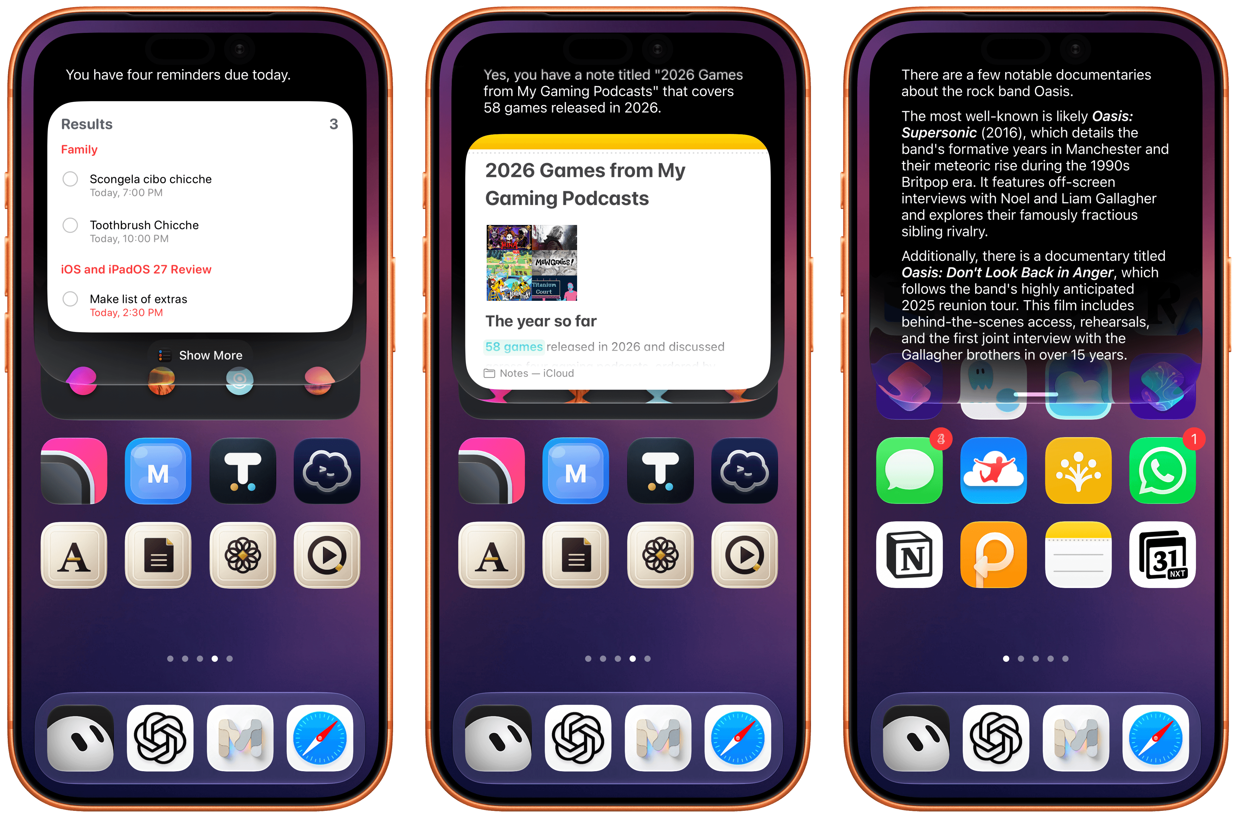
Different examples of the Siri UI.
At any point during a conversation with the new Siri, you can switch to text input by swiping down on the Siri response and start typing. This is part of a larger story in iOS 27: system-wide access to Siri and the unification of Siri and Spotlight. The assistant and the system’s search feature have been merged into the same UI element – a floating search field that can be activated from anywhere by swiping down on the Dynamic Island. Doing this will reveal the new call-to-action for this box: Search or Ask.
Just as with the previous Spotlight, you’ll see some suggestions for apps you can launch or other activities; the difference is that now the system can determine whether you’re searching for something or formulating a request for Siri. If the latter mode is detected, Spotlight search results will be collapsed, and ‘Ask Siri’ will appear next to your query, indicating that you can hit Return to ask Siri AI a question instead of searching with Spotlight.
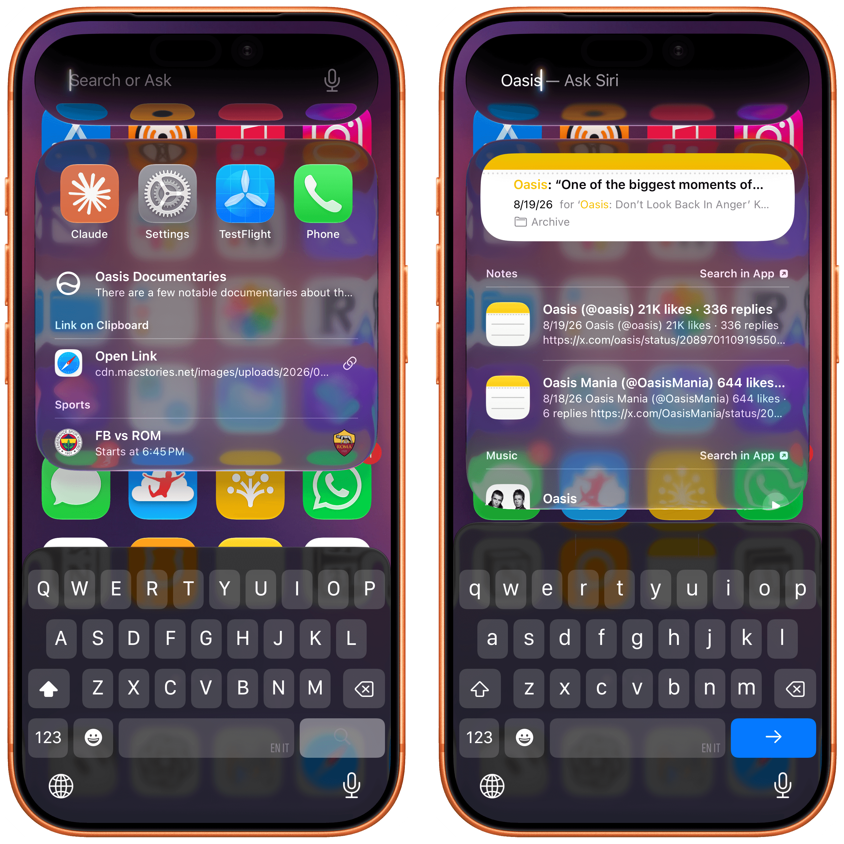
From the same search box, you can either search with Spotlight or ask Siri.
It takes a while to get used to the idea that you can now search and ask questions from anywhere on your iPhone without using your voice, and it’s awesome. iPhone users never had the ability to invoke Spotlight from outside the Home Screen when using apps; in the three months I’ve spent using iOS 27, I can’t tell you how accustomed I’ve become to jumping between apps or searching inside them without leaving the app I’m in.
When using the new Siri and alternating between search and ask modes, you’ll never be able to tell which local model is being used or if Siri is going off to the cloud and picking one of the two models running there. You can infer what’s going on (if a request is taking a bit longer, the underlying Siri orchestrator probably decided to use extended reasoning in the cloud), and there are ways to inspect your Siri AI reports later, but – by design – all complexity is abstracted from the experience when Siri AI is visible to the user.
What you will notice, however, is the new Siri voice.
The New Siri Voice
The new expressive voices for Siri AI are powered by Apple’s larger on-device model and, as such, are exclusive to more recent devices. They are a substantial jump in terms of voice quality and expressivity compared to the older Siri voice in iOS 26: tone and cadence feel more natural, enunciation sounds less robotic than before, and, most of all, the voices can be customized.
Once you have the new Siri AI, head over to Settings → Siri → Voice, and you’ll be presented with a gorgeous new voice preview and personalization screen that lets you pick from a selection of unlabeled voice types across six English accents (American, Australian, British, Indian, Irish, South African). You can tap the colored dots to preview each voice, and Siri will speak a longer demo sentence than iOS 26. Amusingly, a part of the sentence is about the fact that otters hold hands so they don’t drift apart. I did not need to know this, and I can’t stop thinking about this fact now.
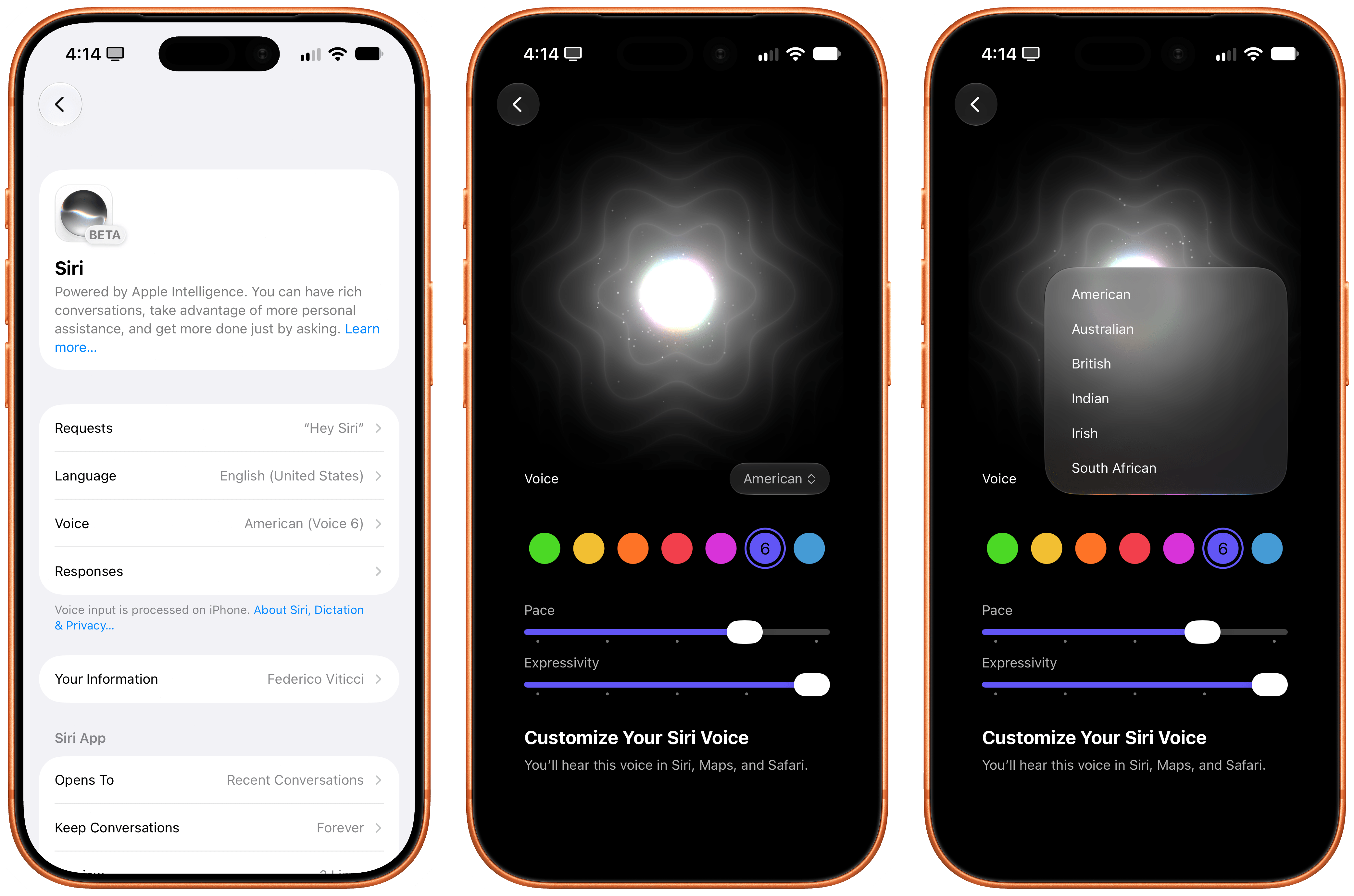
Siri’s new voice customization screen.
Anyway, only American and British voices support personalization in the form of pace and expressivity sliders. Pace is easy to understand: drag it all the way to the right to make it go fast. For my taste, I have set the pace to the fourth notch of the slider. Expressivity is a little trickier to understand: it sets the voice’s underlying tone and how the assistant switches intonation between different phrases. Personally, I’ve set mine all the way to the right.
There is no denying that the new Siri voices are vastly superior to what Siri sounded like before. Here, let’s do a comparison between Siri in iOS 26 and Siri in iOS 27:
Make sure to watch until the end for a…surprising response. (Sound on.)
The new voices are impressive for something that is being generated on-device, and I think most iPhone users upgrading to Siri AI now will notice the difference and think that Siri sounds better than ever. It’s remarkable that all of this is being generated locally across multiple accents.
In the context of the broader AI industry and voice experiences, however, the new Siri voice still trails the frontier. As far as voice itself is concerned, ElevenLabs’ v3 model sounds more natural than Siri AI and was introduced over a year ago in June 2025. I would argue that even Kokoro, an open-weight text-to-speech model with 82 million parameters that supports more voices and the ability to create custom ones, sounds nicer than Siri. (You can listen to this very paragraph generated with Kokoro.) And then there’s GPT-Live, the frontier bidirectional voice model by OpenAI that powers ChatGPT Voice, introduced earlier this year. GPT-Live is, by all measures, the current state of the art for natural assistant/person conversations since it supports interruptions, real-time tone and cadence adjustments (you can ask ChatGPT to slow down or whisper), and long-running back-and-forth conversations that Siri AI is simply not designed for.
This is an important point: if you think that Siri AI will allow you to ramble to a digital assistant for 10 minutes and have a “conversation” with it like you can with ChatGPT Voice, you’re going to be disappointed. Siri AI is not capable of that kind of voice interaction yet. Siri AI’s voice experience is still based on the classic “ask question/wait/listen to answer” pattern from the older Siri. It’s slightly more conversational, and it sounds better than ever, but it can’t hold a prolonged conversation: you can’t go for a walk and start talking to Siri AI to brainstorm with it like many folks do with ChatGPT Voice.
To give you even more context, here’s a comparison between Siri AI and ChatGPT Voice, recorded using the GPT-Live-1 model for paid users:
Siri AI and ChatGPT Voice are two fundamentally different products, and OpenAI’s advantage in voice is obvious…until I switch languages. (Sound on.)
Comparisons between Siri and other AI-based voice experiences are a good indicator of where things stand right now. Apple is still behind the top American labs when it comes to sheer model quality, and can’t yet enable experiences we’ve seen in other chatbots. Over a billion people can chat for free with GPT-5.5 Instant and GPT-Live-1-mini in ChatGPT, and both models are superior to Apple’s roster of five Foundation models – not to mention that they are available worldwide and are multilingual by default. Siri AI is only launching in English, despite the two-year delay. The comparison to the rest of the industry isn’t even fair.
At the same time, not everyone is interested in or trusts the likes of OpenAI and Anthropic for their digital assistant needs. In fact, I’m willing to bet that there are hundreds of millions of people who just wanted a better Siri because, frankly, the old one was an awful product that Apple should have been embarrassed by.
The new Siri is a much smarter, more capable, and nicer Siri than before. On a scale from “awful” to “state-of-the-art AI frontier”, Siri AI sits comfortably in the middle. It is a solid product that finally gives Apple users a good digital assistant that works well enough for most requests. At the same time, it is a product that will not “wow” AI power users and proves that Apple still has a lot of work to do if they want to compete in this space, especially if their newfound rival (and defendant) enters the hardware market in the near future.
And since multiple things can be true at the same time (and people can hold multiple opinions – what a concept), it is also undeniable that Siri AI delivers a “good” experience across the more challenging spectrum of an entire operating system, which neither OpenAI nor Anthropic can currently match.
But how is it better?
Siri as a General Assistant
Put simply: Siri is smarter overall for most things and has pretty good and up-to-date world knowledge baked in. When I ask something like “what tasks do I have today”, the new Siri gives me both my reminders and calendar events, which the old Siri couldn’t. Last week, I asked about what Liam and Noel Gallagher had been up to recently, and after a few seconds, Siri rightly pointed out they’d just attended the Venice Film Festival and that rumors of a 2027 Oasis tour were circulating. When I ask Siri to send my most recent photo to Silvia, the assistant prompts me to pick a recent photo, then prepares an iMessage preview, and confirms with me that I want to send it. As we’ll see in a later section, working with Siri AI and apps can be a remarkably efficient experience, and – once again – it’s leagues above what the old, dumb Siri used to be.
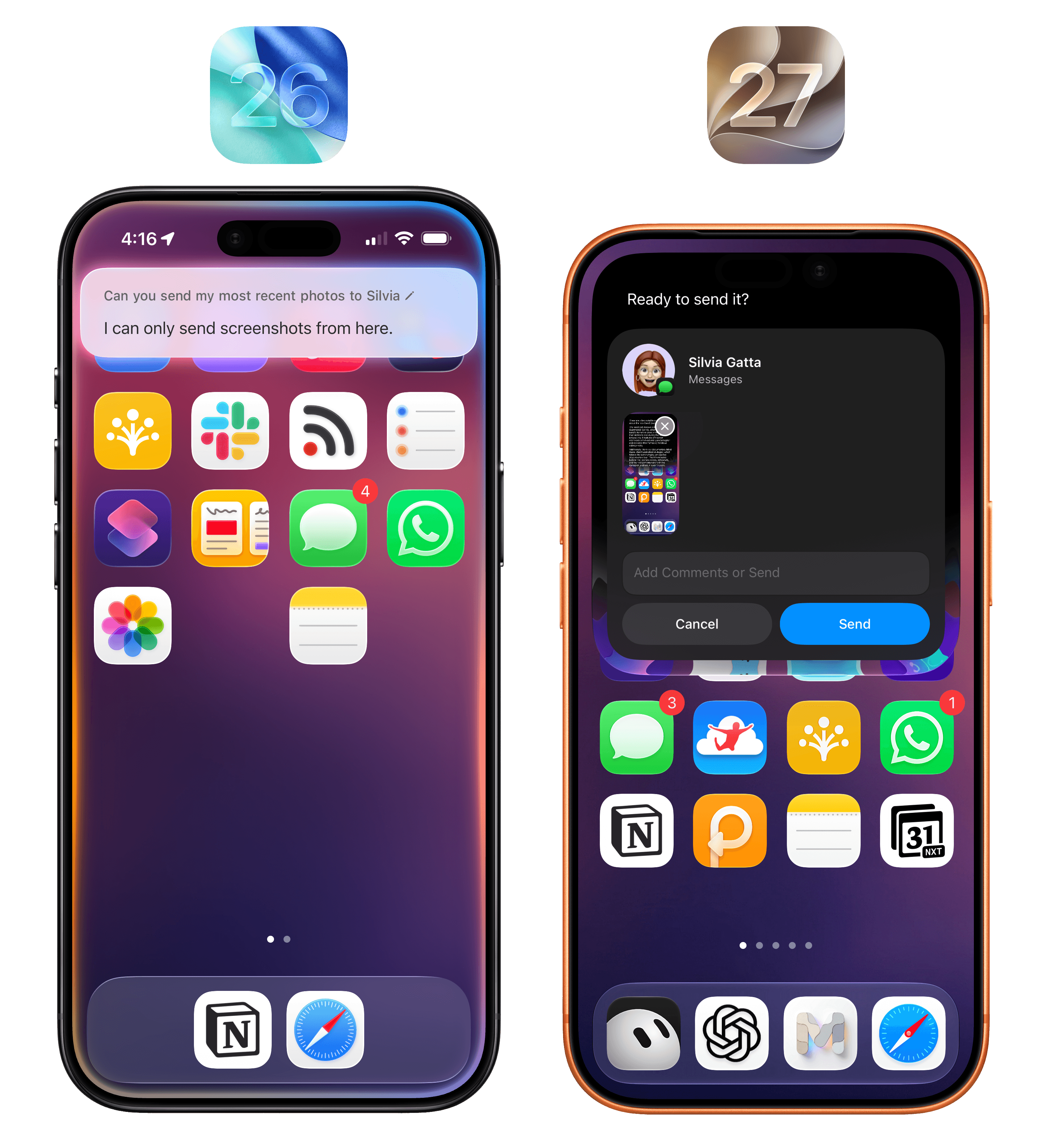
The new Siri can just do things.
As a result of all this, I find myself defaulting to Siri AI for most “quick questions” about on-device things or web searches that I would have completed with Google AI overviews before. Since Apple’s world knowledge graph is good and up-to-date enough, whenever I have a question that doesn’t need a deep research report, I use neither ChatGPT nor Google anymore: I just ask Siri. If I want to go deeper on a topic, then, yes, I tend to switch back to another agent, but for any simple factual question, Siri AI is my default search engine now.
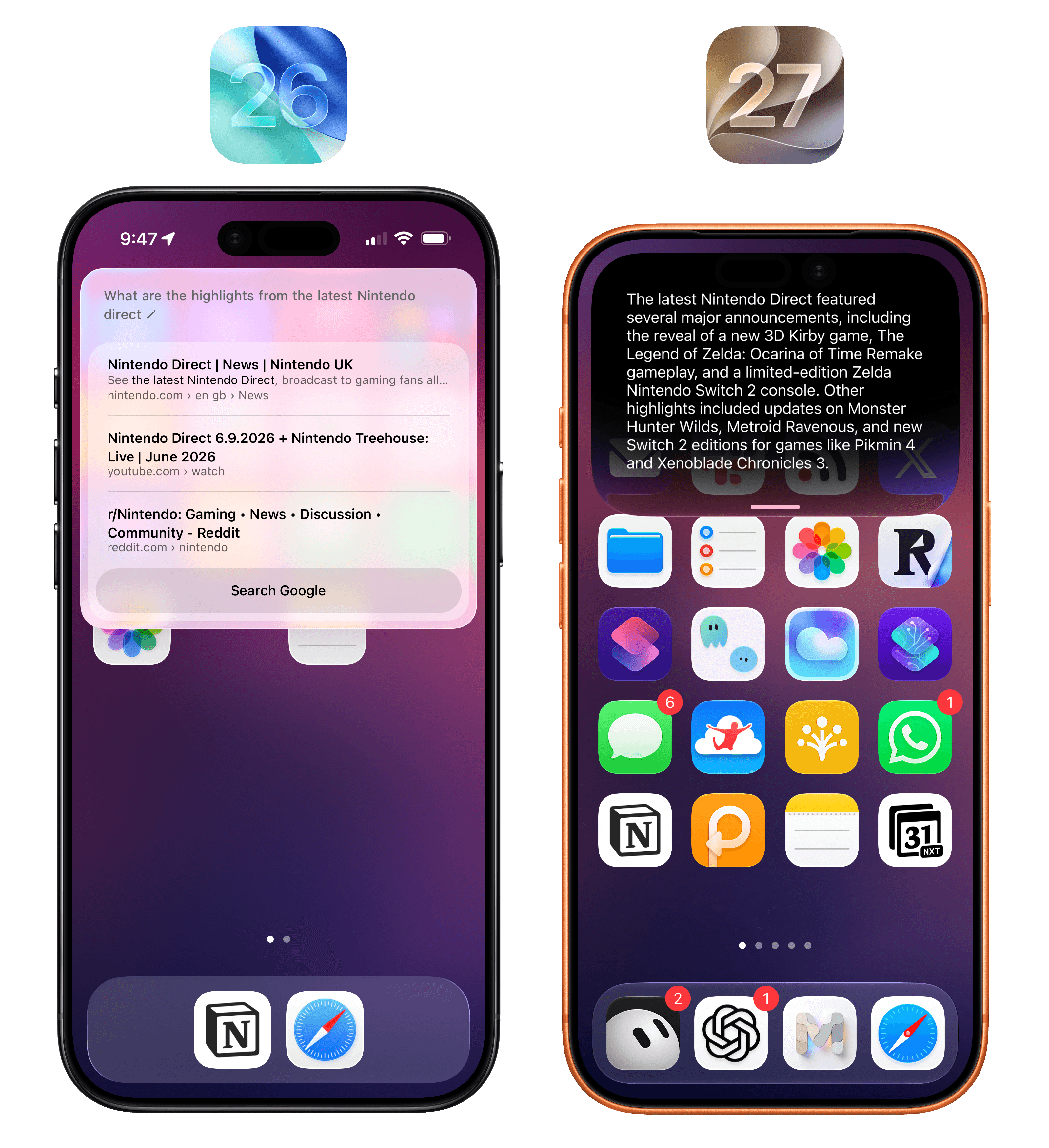
Apple’s world knowledge engine supports recent results, and it’s a dramatic improvement for quick web searches compared to the old Siri.
When writing this review, I frequently had to go back and test the old Siri in iOS 26 and, let me tell you: after using Siri AI in iOS 27, I was shocked to re-experience just how bad Siri was. The effect is quite dramatic: the new Siri is no longer plagued by those useless “I found these on the web” results like before, nor does it go off to ChatGPT to get some additional help. In most scenarios, the new Siri just answers and provides you with a good-quality response. If you have multiple Apple devices, I suggest leaving one on iOS/iPadOS 26 for a short while so you can have some fun comparing the two versions of Siri side by side, which will make you appreciate the new one even more.
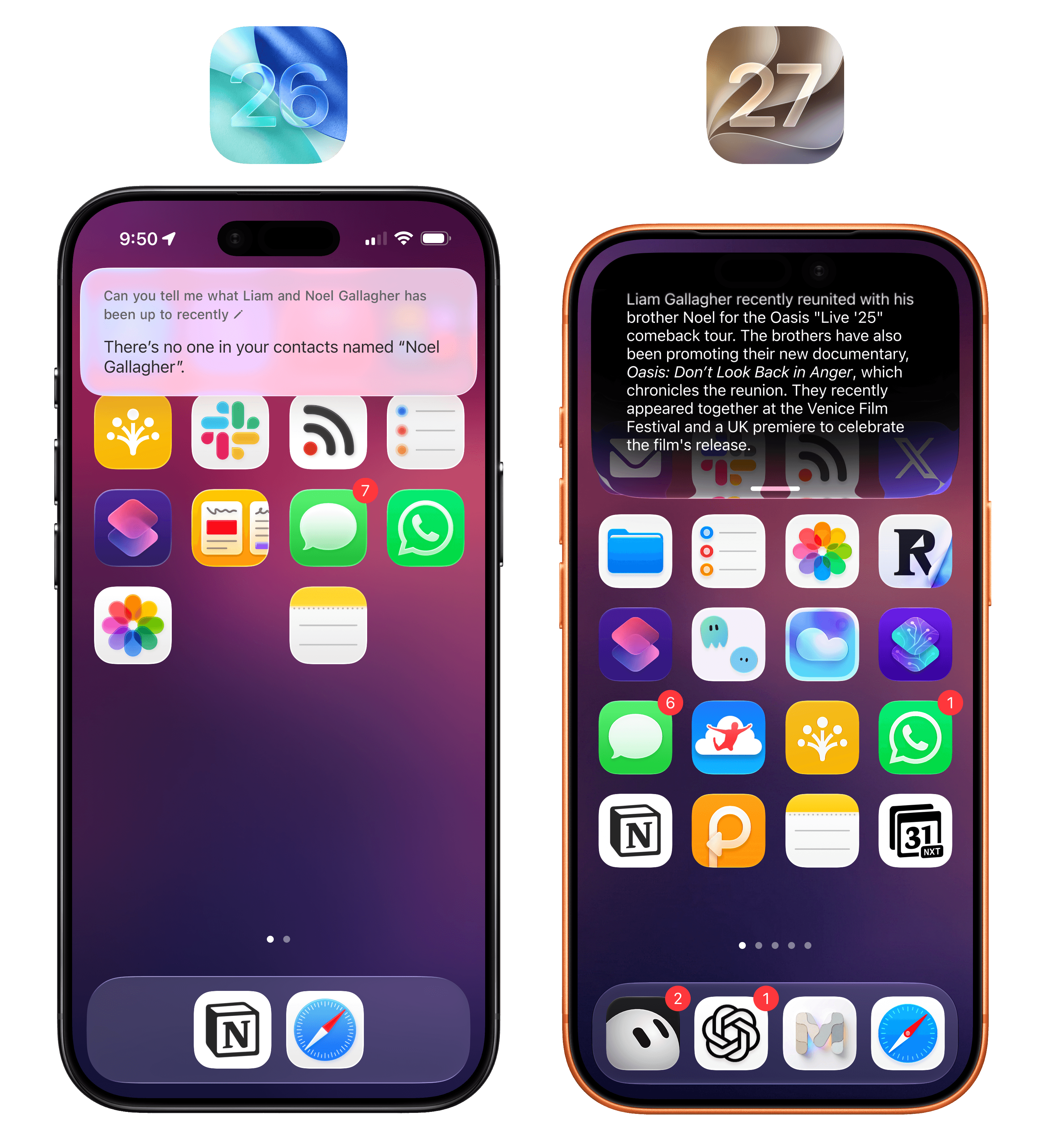
Presented without comment.
Beyond system-wide access, new voices, and superior world knowledge compared to iOS 26, Apple’s big bet with Siri AI is going past what other self-contained agents and chatbots can do. When you’re using ChatGPT Work or Claude Cowork, or perhaps even more complex products such as Hermes Agent or OpenClaw, you are always recreating your profile, workspace, and preferences in a silo. This is why memory is such a sought-after currency in the AI market: by locking users into their ecosystem, different AI providers can make it less enticing to switch to a competitor. If you’re OpenAI and aiming to build an operating system, it makes a lot of sense to lay a foundation in the form of memories, computer history, and other personalization tools that make users feel like they can’t switch to anything else.
Despite the efforts of AI labs over the past year to go beyond chatbots and ship a semblance of a platform, the truth is that only Apple and Google actually have a platform where AI can be deeply embedded and serve as an app-agnostic assistant layer. In simpler terms:
Apple thinks you’re going to be using Siri AI because it works with any app on your phone, gathers context about you automatically from any app, and can also see what’s on your screen no matter the app you’re using.
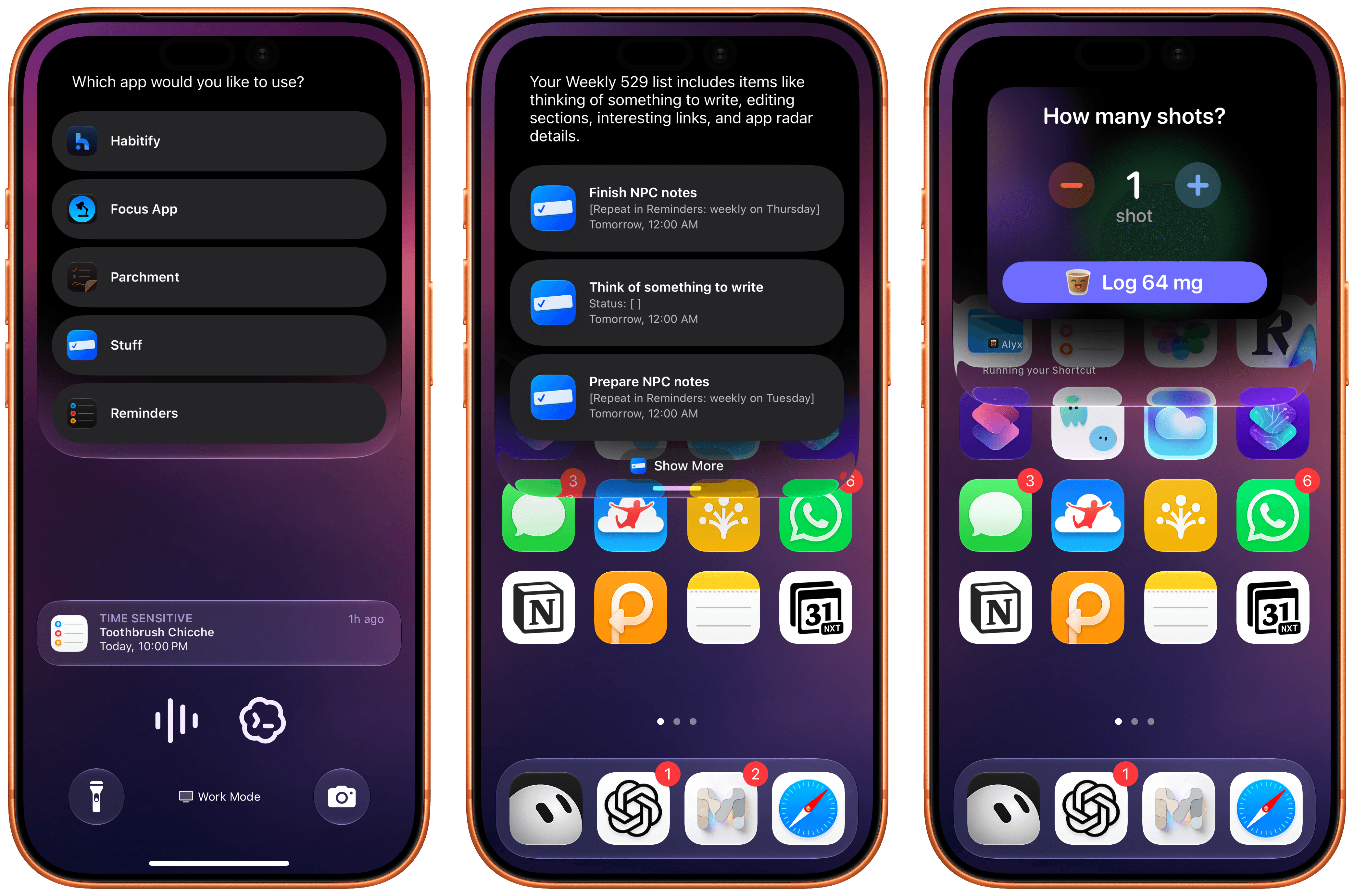
Siri AI can regularly ask you to confirm which app you want to use as default for any particular domain (left). In these examples, I asked for some tasks in Stuff and logged an espresso in Alyx.
These capabilities are what Apple refers to as on-screen awareness and personal context, and although I’ve experienced some issues with them, I’m also very excited about their potential: they’re the features that have made Siri AI stand out the most for me.
On-Screen Awareness and Personal Context
The idea of on-screen awareness is straightforward enough: Siri can now see what’s on screen and act on it. It may not sound like a big deal, but that would be a wrong assumption: the system Apple has built around on-screen awareness is a great example of how we can weave AI features throughout the interactions we have every day.
At a high level, whenever you’re looking at something on-screen and want to ask Siri a question about it, you can invoke the assistant and just ask. Being able to ask Siri questions about the current state of an app visible on screen isn’t new – in fact, it was introduced in iOS 9 with the ability to say “Remind me about this”. What’s different now is that we have the power of an LLM to process not just a deeplink to an app’s screen, but an entire set of annotated data points (provided that app developers support them) that give Siri plenty of information about what’s visible on the user’s device.
Under the hood, iOS 27 apps can embed invisible annotations about any content shown on screen, so that Siri AI gets direct metadata from each compatible app instead of merely taking a screenshot and performing OCR on it. For instance, if you’re looking at a page that mentions an event, you can say “add this to my calendar”, and Siri will know what you mean and create an event with the title and dates extracted from the visible page. But it goes deeper than that. Say that you’re looking at an album in the Music app, and you want to play a specific song but can’t tap the screen. Say “play the third one” and Siri will know that you mean the third one in the list and start playback immediately because it’s not screenshotting what’s on screen and then searching for the song: the song is an entity that’s been annotated with an identifier that tells Siri exactly what to play.
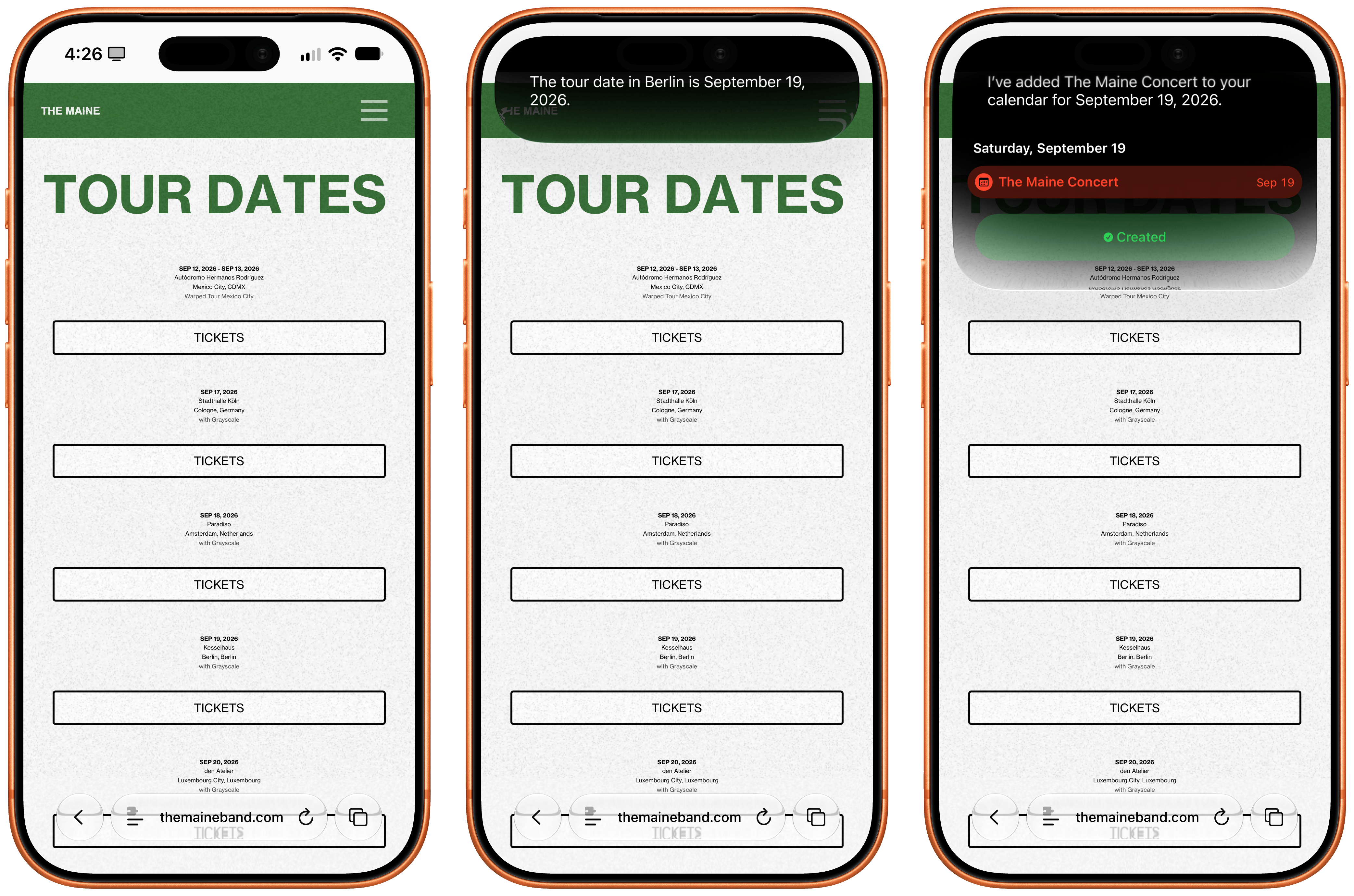
Adding a concert date to my calendar with Siri.
Once you understand the flexibility of this on-screen system in Apple’s own apps (and, hopefully, lots of third-party ones soon, too), you can start mixing and matching requests, which is where the fun begins. I was in the Music app, and I wanted to know more about a specific song of an album, so I asked: “Did the first one also come out as a single, not as part of this album?” Sure enough, Siri AI saw that I was looking at Oasis’ The Masterplan, that the first song was Acquiesce, and that it was, in fact, originally released as a B-side to the Some Might Say single.
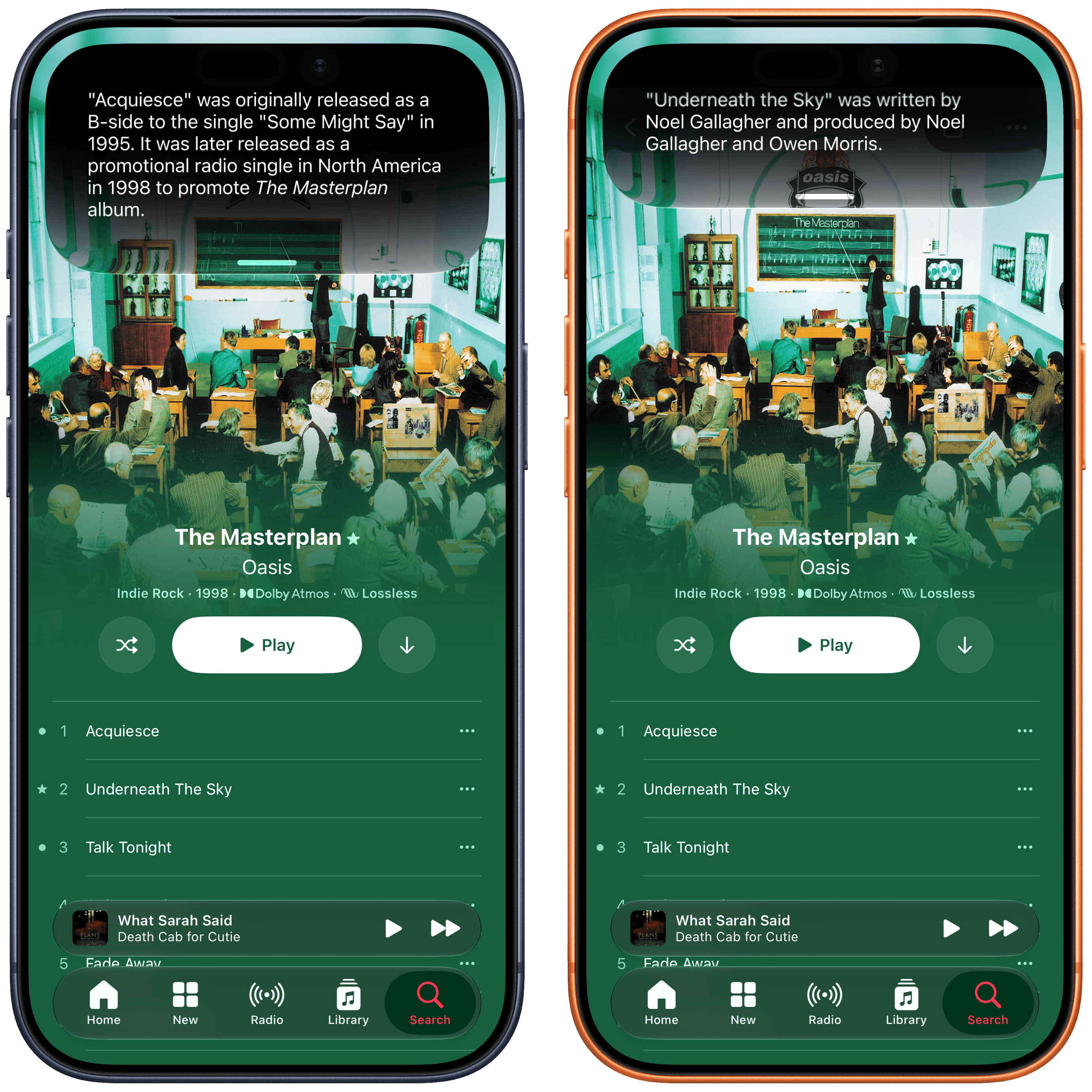
Here, I asked for more information about “the first one” and “the second one”. Siri AI knew what I meant.
Combining on-screen awareness with additional search queries or actions is one of my favorite aspects of Siri AI, and I think Apple’s engineers have done an outstanding job integrating this in their apps and creating APIs for developers to do the same. When looking at a text in the Messages app, you can say “love that last message” and Siri AI will add a heart Tapback to it; in Files, you can say stuff like “send the third document to John” and Siri will know from your context (more below) and on-screen awareness that you mean a specific person and the third item in a list.
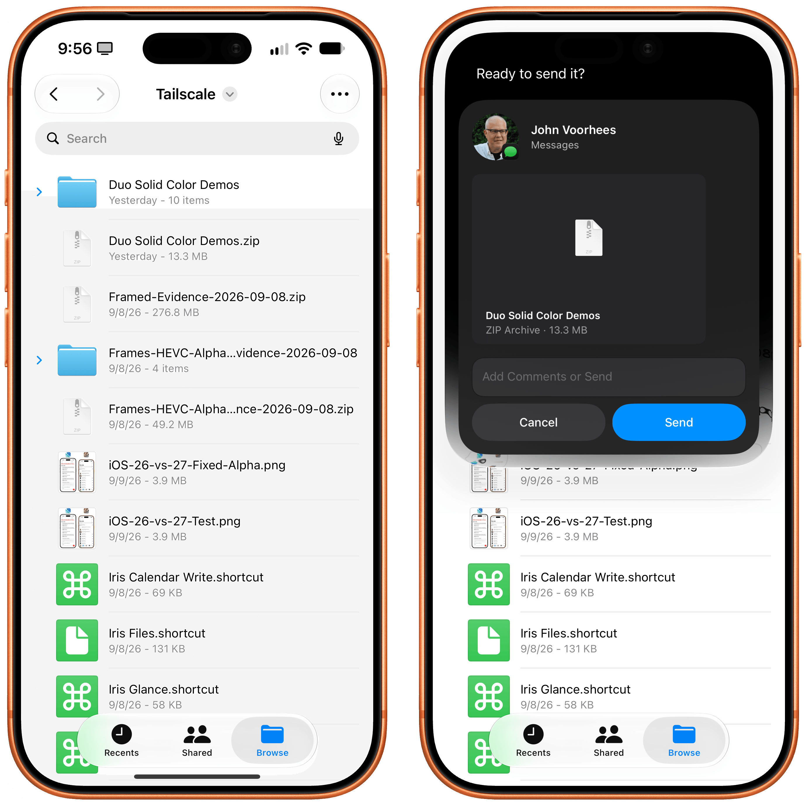
“Send the second file to John” is what I asked here.
How effective on-screen awareness turns out to be will depend on how well third-party developers support it. From what I have seen in Apple’s apps so far, though, I believe pervasive, reliable on-screen awareness has the potential to reshape how we think of Siri. It takes a while to accept that Siri can be this good and versatile: I still struggle sometimes to remember that, when looking at Reminders, I can say “mark the second one as done”, or that I can look at a calendar event and say “email the participants that I’ll be 10 minutes late”, and Siri will draft a message with Mail about it. I think others will go through a similar “reset phase” as they figure out that Siri is actually pretty great for this stuff now.
Personal context is the trickier Siri characteristic to explain, as well as the area where Siri AI has struggled the most for me over the past three months.
The theory is the following: by building an index of your apps and data, Siri AI is able to draw from your personal context and answer questions without you having to mention an app by name, specify a time period, or be too precise about your question. This is not meant to be proactive assistance (which Siri AI cannot do and is currently the holy grail for AI labs alongside recursive self-improvement); personal context is more like an automatic “enrichment” of answers that doesn’t require you to ask.
A popular example used by both Apple and Google is the flight one: ask about when you’re supposed to pick up a friend at the airport, and Siri will tell you that Myke’s flight lands at 3 PM because it has that context from iMessage. In my tests, I’ve seen personal context in action in a handful of ways. One time, I asked where my dogs went the day before, and Siri told me that Ginger was at the beach, which it knew because it had a Ginger album from Photos and indexed photos of her taken at the beach. My query was generic, but the answer was precise. Likewise, when I asked “Did John tell me things I have to do this week?”, Siri gave me a list of things John previously told me over email and iMessage.
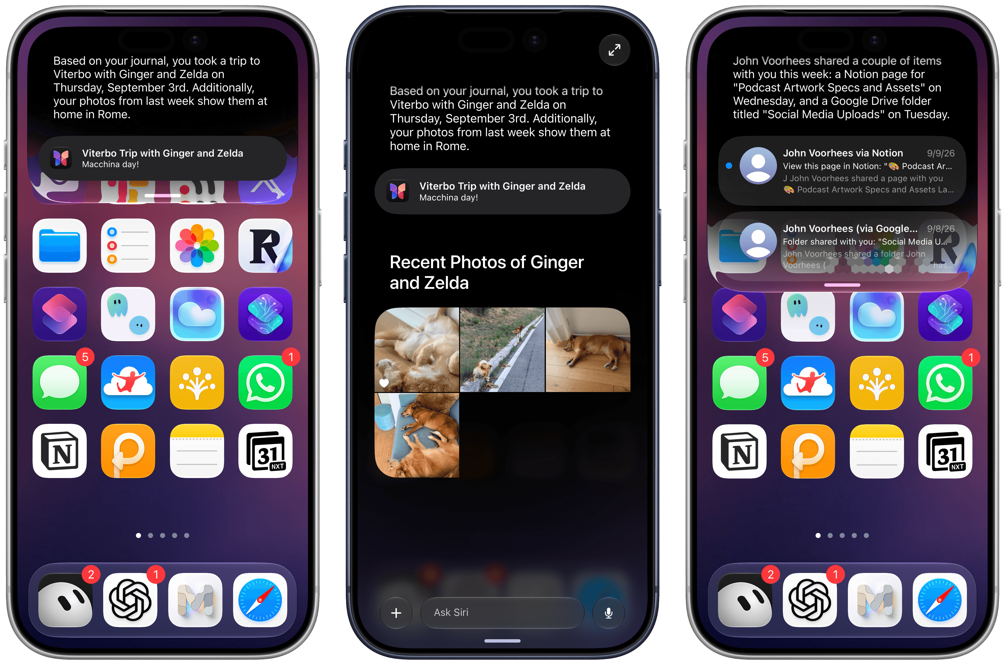
Examples of personal context in action. You can always expand Siri snippets to go full-screen and continue typing, chatbot-style.
You’re not supposed to know that personal context is working, and that can be both a blessing and a curse. When Siri AI does bring up a useful piece of information about you, unprompted, it feels amazing, and it perfectly encapsulates Apple’s competitive advantage in AI: unlike other companies’ assistants, Siri AI can know everything about you as long as you keep using Apple devices.
On the other hand, I’ve frequently run into scenarios where a question I knew had data to back it up in iMessage couldn’t be answered by Siri AI at all, or where the context about me was simply stale. This, I believe, is a byproduct of Apple’s on-device indexing approach: results don’t get indexed immediately, and the entire thing can feel like a mysterious black box.
As a result, my mind hasn’t been blown by personal context in Siri AI yet, but I remain hopeful that Apple is on the right track from a strategic perspective. I wonder if more capable hardware and future model updates will be able to help in this regard, letting the index be refreshed more frequently and proactively suggesting more details in new Siri chats.
The Siri App
The new Siri is no longer just a voice assistant on iOS and iPadOS: it’s also a full-blown app with an icon on your Home Screen. The app holds all of your conversations with Siri and allows you to keep expanding a conversation after your original request, meaning two things: Siri is now also a traditional chatbot, and your Siri sessions are no longer ephemeral since they can be reviewed and continued later.
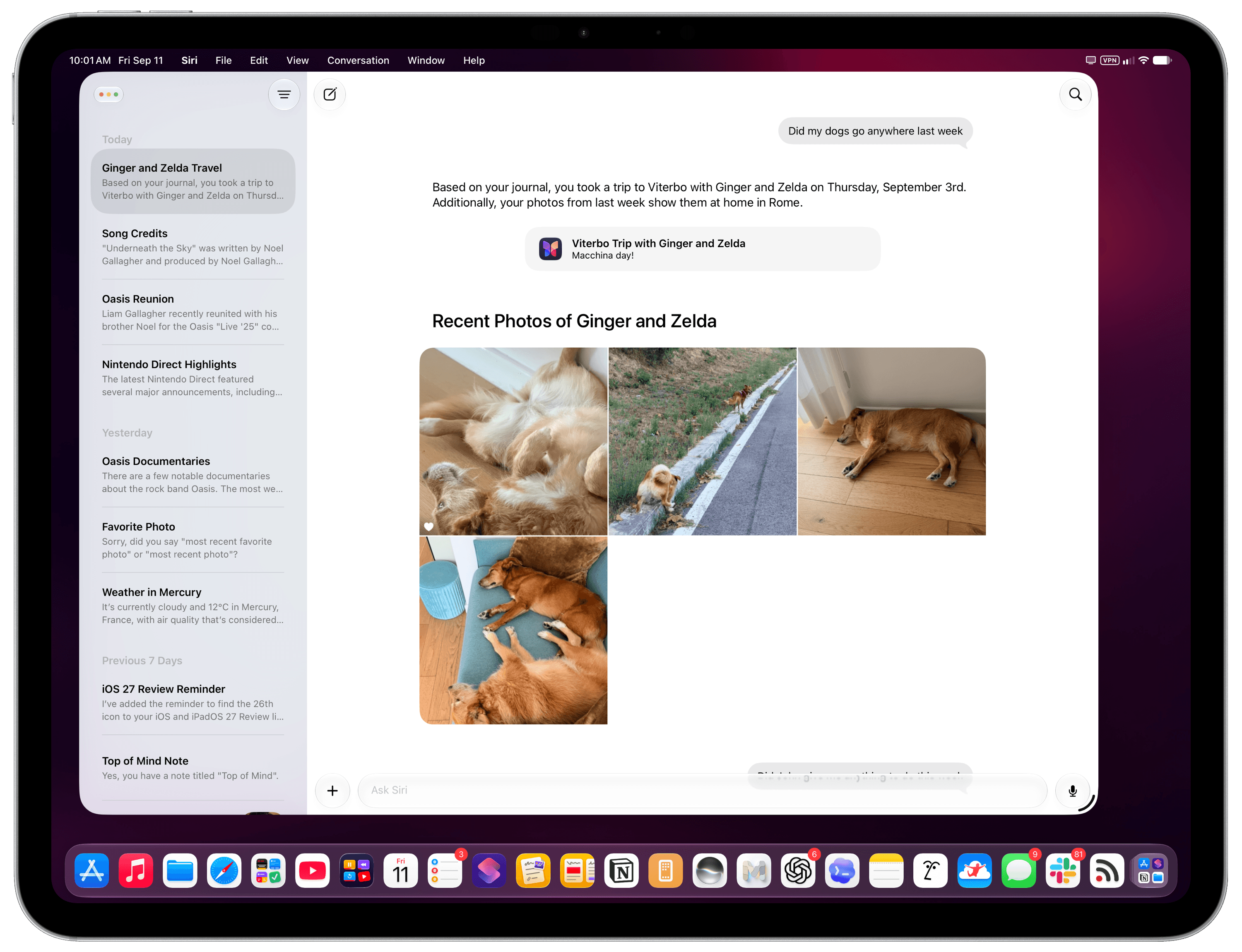
The new Siri app on iPad.
The problem is that the Siri app is, quite frankly, a pretty bad app. It is extremely barebones compared to the rest of the AI industry and their chatbot offerings, lacking all kinds of integrations and features that people have gotten used to having in ChatGPT or Gemini. It feels like using GPT-4 in ChatGPT from a couple of years ago. Furthermore, it performs badly, with slow animations, visual previews that are frequently missing on screen, and other technical issues that do not meet Apple’s standards of excellent iOS apps (such as Notes, Safari, Reminders, or Journal).
Really, there isn’t much to say about the Siri app other than it’s nice to have a place where you can revisit and resume previous conversations. By default, the app opens with a “cascading” grid layout that looks great in screenshots but is the most uncomfortable layout I’ve ever used in practice if you want to find a specific chat. Thankfully, you can revert to a classic list mode by tapping a button in the top-right corner of the app.
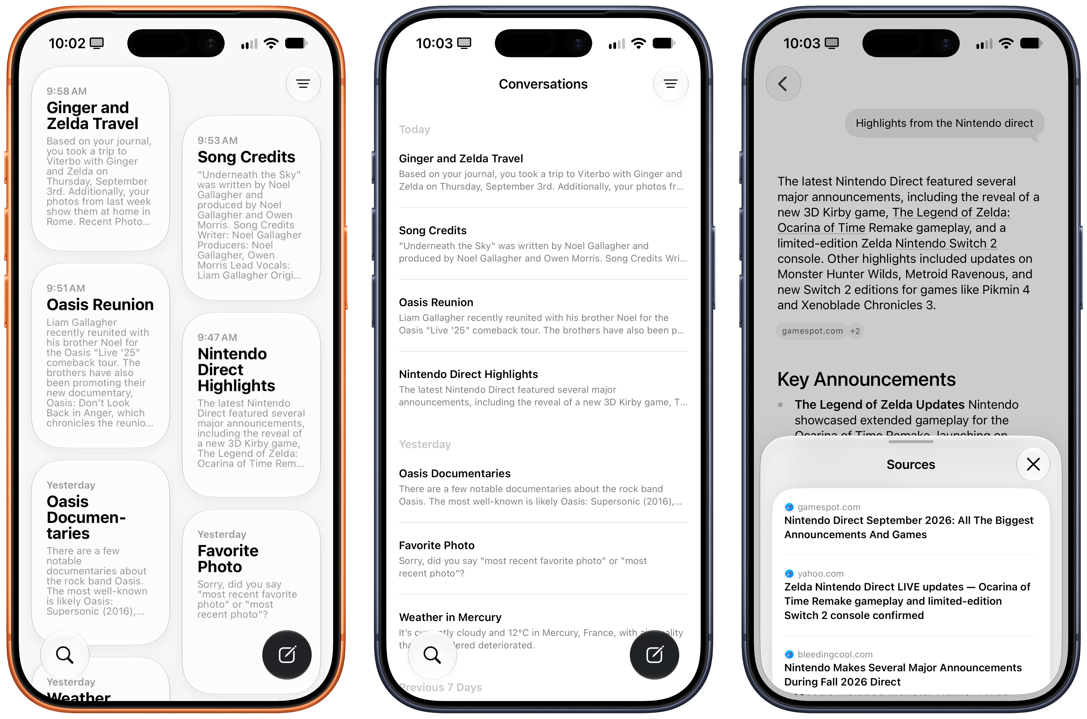
You can switch between different view modes, and also tap on citations to see web sources.
You can then rename, pin, or delete conversations, and you can tweak three settings for the Siri app in Settings → Siri:
- You can choose to open the app to recent conversations or a new conversation
- You can keep conversations forever or have them automatically deleted after 30 days or 1 year (there is no custom option)
- You can set the preview text for the main view from ‘None’ to five lines of text
Inside conversations, you can long-press a response to share it as a PDF, copy it, or have Siri’s voice read it aloud (with a nice mini audio player inside the app); you can attach files and photos; and you can press a microphone button to alternate between text and voice input.
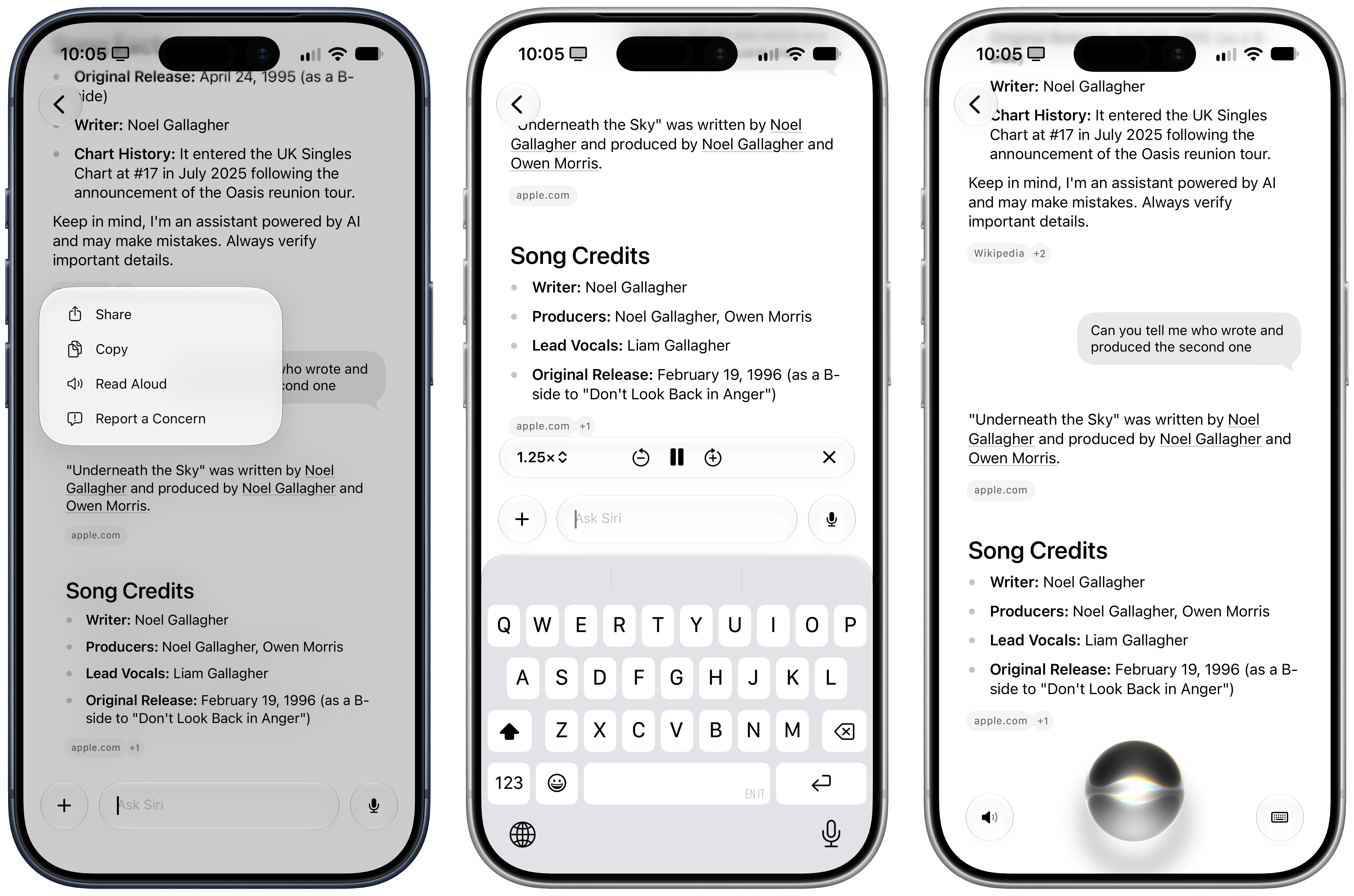
And…that’s basically it. Coming from ChatGPT, Gemini, Claude, Grok, or any of the Chinese LLMs such as Kimi and GLM, the Siri app feels like an overly simplistic product that was almost built out of spite, even though Apple had more than two years to put this together. You cannot organize chats in folders or tags. There is no support for reusable commands and instructions in the form of skills. Given Apple’s invisible approach to context, there is no support for any kind of personalization or user-reviewable memory whatsoever. Want to tweak Siri’s writing style? You can’t. Want to review what Siri knows about you? That’s not possible.
I may be used to working with frontier AI models more than the average user, but it’s hard to deny that this app feels very primitive by any modern standard. Even more annoyingly, Siri isn’t aware of itself at all: Siri AI cannot search and find its previous conversations with you, so while you can resume a conversation later, start a new one and ask “hey, did we ever talk about this topic?”, and Siri AI has no idea what you’re talking about.
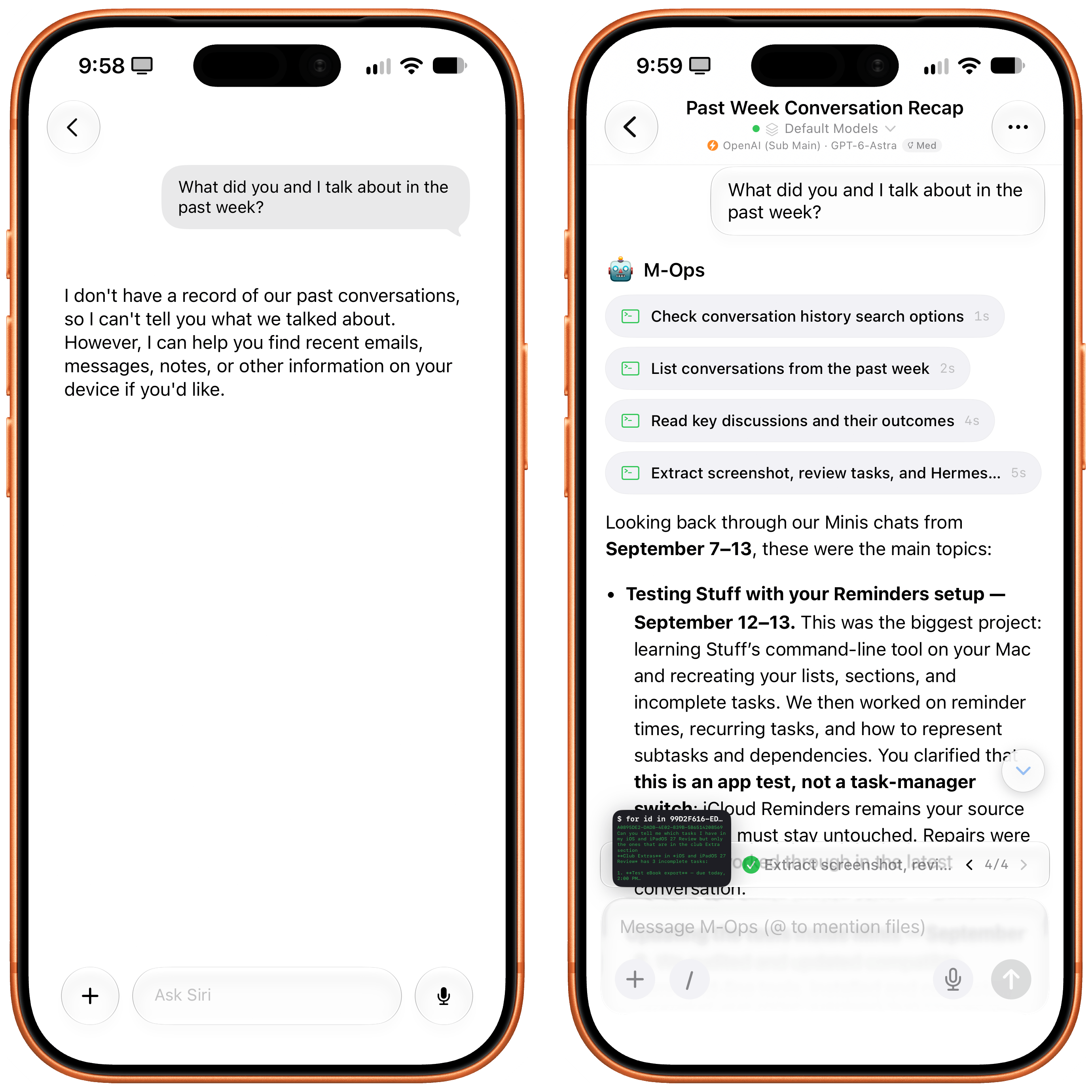
Unlike an agentic assistant such as Open Minis (right), Siri AI has no idea about its previous context or session history.
This all goes back to a longstanding issue with Apple’s product philosophy: the “it just works” approach can be amazing when everything goes as expected, but it can be detrimental to the user experience when something breaks, or when the user wants to have slightly more control over a particular app. Historically, in my iOS and iPadOS reviews, I’ve pointed out many such examples, from last year’s barebones launch version of Local Capture (which was later improved), to the Home app’s automatic grouping in iOS 13 and the lack of app labels in multiwindowing for iPadOS 13.
I think the Siri app, and Siri AI in general, suffer from this very issue: in an era where users demand to be able to inspect and tweak what AI knows about them and how it operates for them, Siri AI and its app expose no such controls. I mean, it is literally a product where you can ask questions about apps on your device…and there is no picker to visually @mention those apps in a chat.
Some might say that I’m too hard on Apple, and that I should be happy that Siri finally has an app. Let me be clear: I’m very glad that Siri can now be accessed as a persistent application on your Home Screen that lets you keep the same chat going for multiple days. But even if we set aside the more cutting-edge aspects of competing AI services, the new Siri app launching with iOS 27 feels instantly outdated. I expected more after a two-year wait.
Visual Intelligence and the Siri Camera
When Visual Intelligence debuted with iOS 18.2, it did so with little fanfare as a hidden feature that required you to long-press the also semi-forgotten Camera Control button to trigger it. Over the past two years, I have never seen anyone in real life use Visual Intelligence, and I think that’s going to change with iOS 27 and Apple’s decision to rebrand it as just “Siri” and put it front and center in the Camera app.
You can still activate The Feature Formerly Known as Visual Intelligence by long-pressing the Camera Control button, but you don’t have to: just open the camera, then swipe from the default Photo mode to Siri (which has been prominently placed before Portrait mode), and you’ll be able to freeze-frame and start asking questions as before.
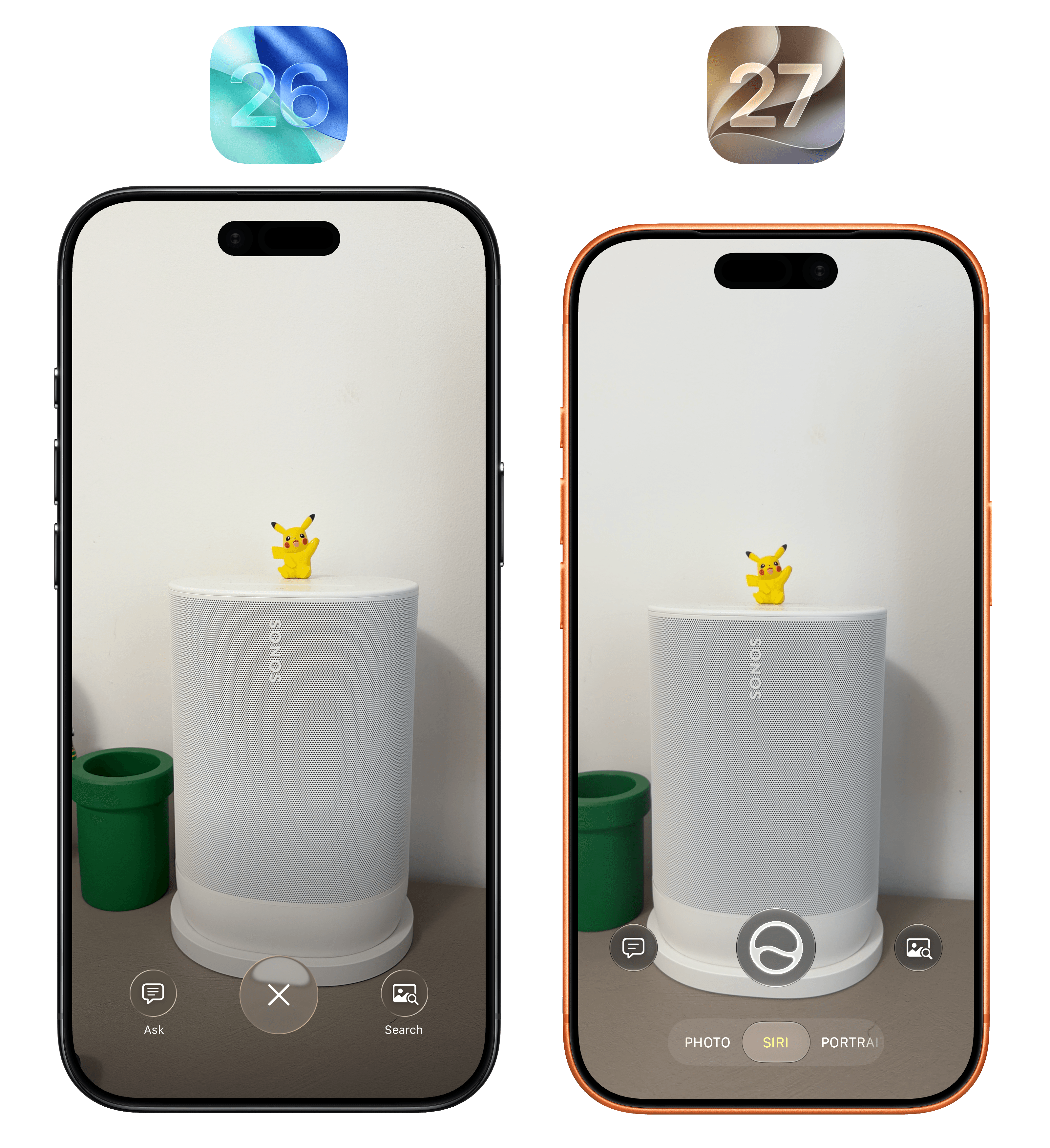
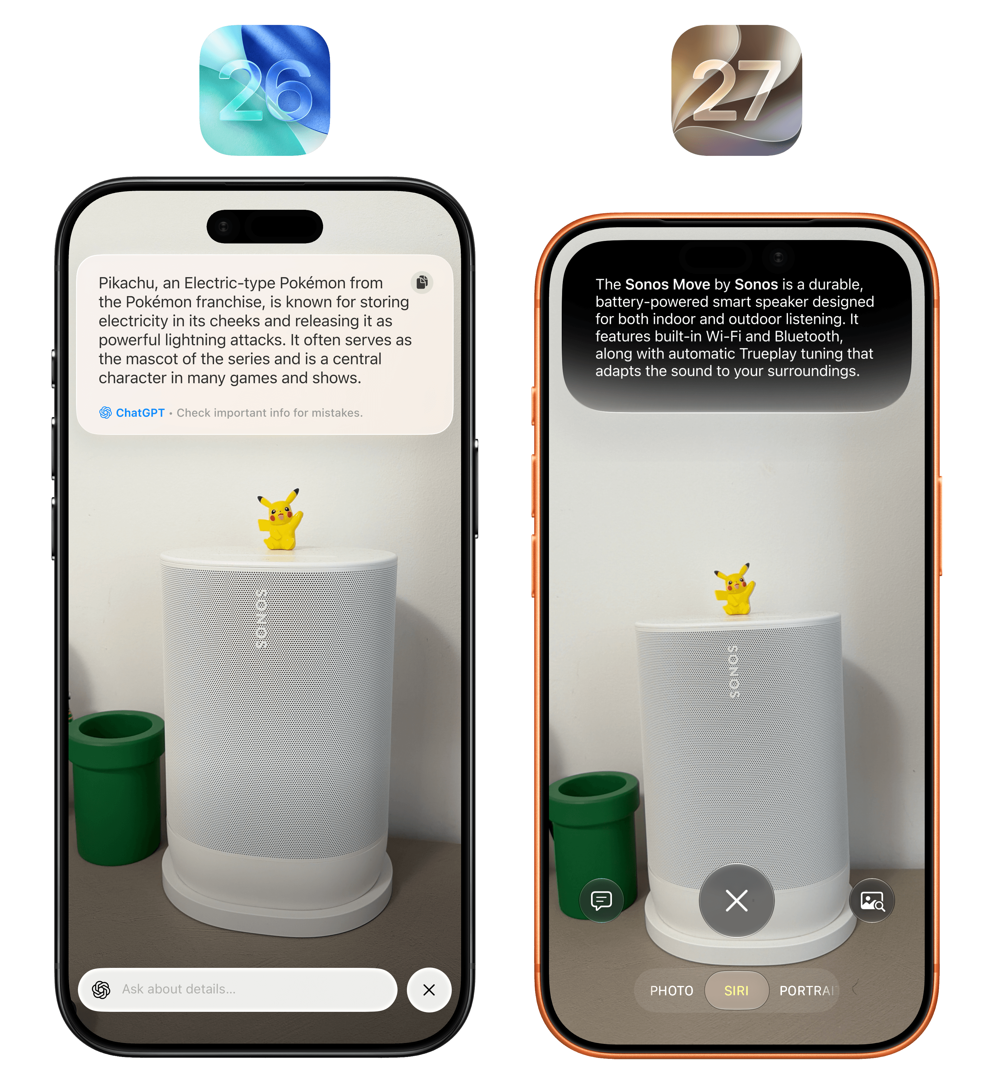
It’s interesting to note what ChatGPT in iOS 26 and Apple Intelligence in iOS 27 thought was the main subject of the picture in Visual Intelligence.
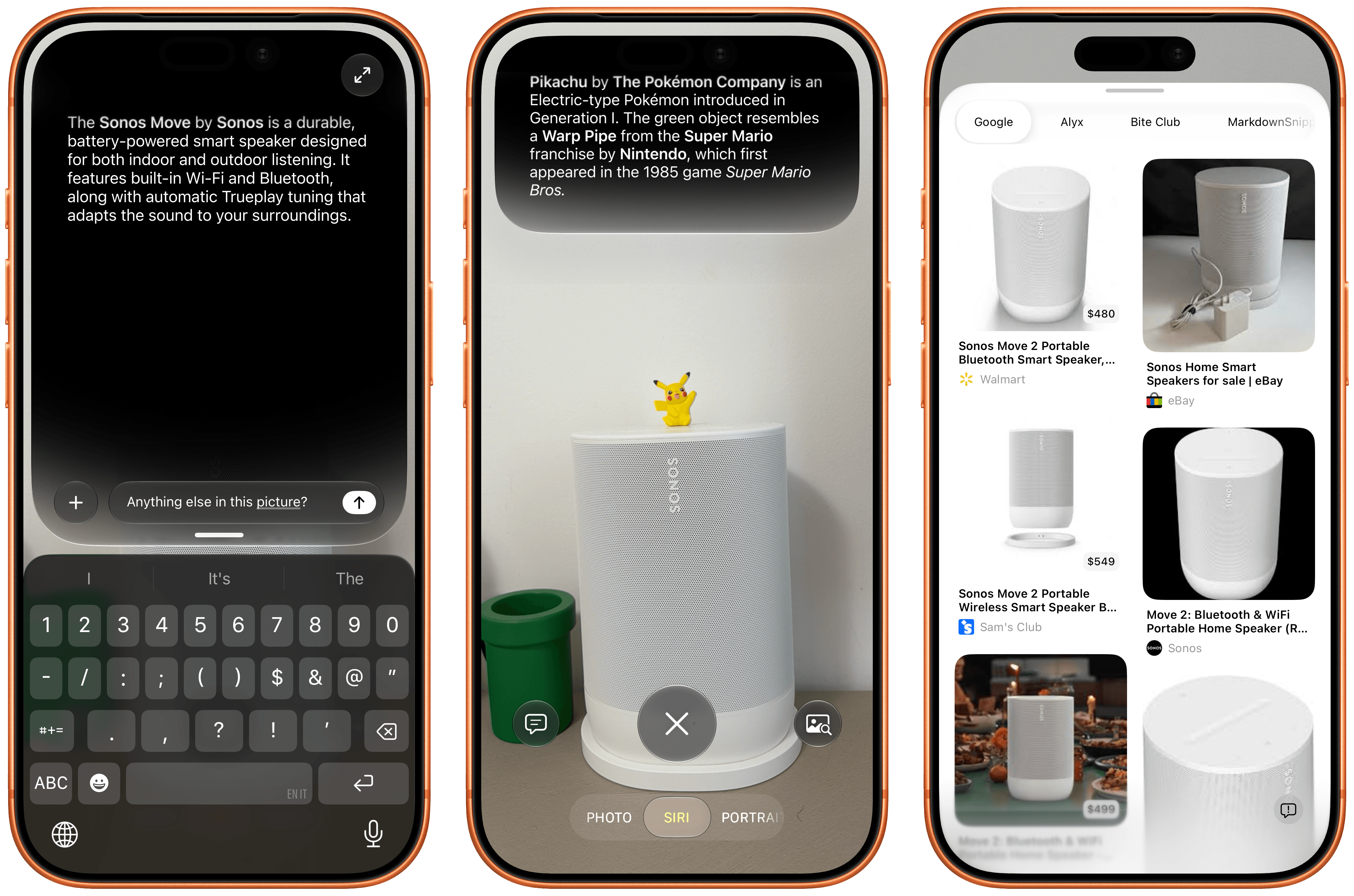
Despite the fresh coat of paint, the underlying mechanics of the feature are the same. You can freeze-frame on any subject, and Siri will give you an automatic response based on what you’re looking at. The Siri camera, as before, supports a variety of data detectors for text, units, and other symbols recognized on screen, and it allows you to either follow up by typing a question or check out related image results with extensions, with Google Images still being the default provider.
The most important difference from iOS 26 is that answers in the Siri camera will be provided by the new Siri AI, not ChatGPT. And that means that you can integrate this new Siri surface with everything else on your device. A few months ago, our building manager posted a notice with the dates for the mosquito spraying that happens every couple of weeks during the summer. Every year, we want to make sure we remember this is happening so we can close our windows beforehand. When I saw it, I opened the Siri camera, pressed the side button to invoke Siri inside the camera, and asked it to add those dates to our Family calendar. Siri froze the frame, found the dates, and created about a dozen events with the right time inside the calendar that I share with Silvia.
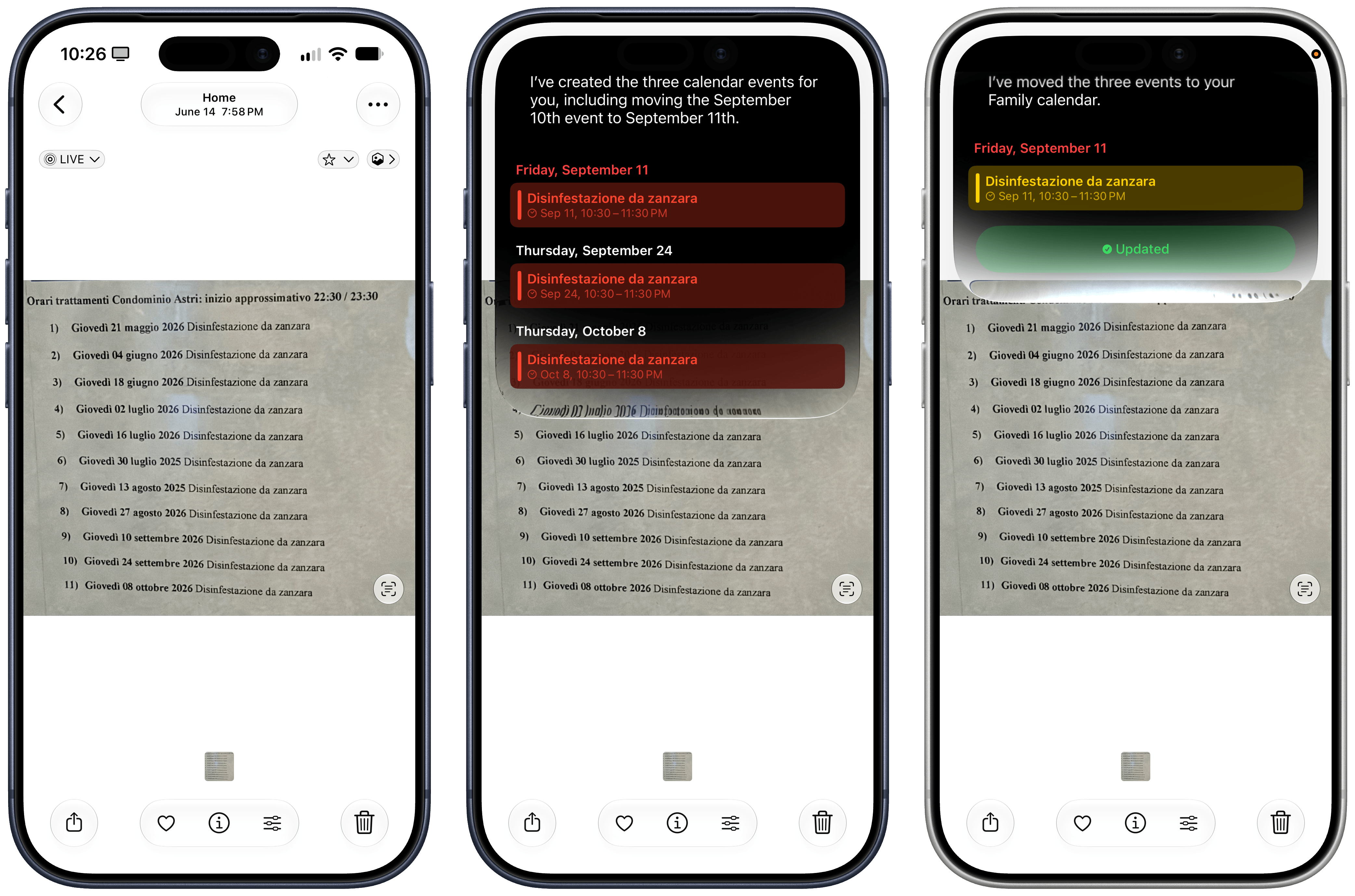
This kind of interaction is terrific with Siri AI – and it proves that the model is inherently multilingual, even if it’s launching as English-only.
Earlier this summer, I spent a few days in Gaeta, and as we were walking to dinner one night, we spotted this huge vessel docked in front of the restaurant. Typically, I would have taken a picture, started a new ChatGPT thread, uploaded the image, and asked a question about it. This time, I simply held down the Camera Control button (which now defaults to Siri AI mode in the Camera app) and captured a photo. A few seconds later, Siri AI told me I was looking at the Palinuro, a three-masted barquentine that serves as a training vessel for the Italian Navy – which was spot-on. An interaction that would have taken 20-30 seconds with ChatGPT was reduced to a five-second affair with Siri AI. Better still, I was able to ask follow-up questions from Siri AI’s floating overlay as well as find the chat in the Siri app later, where I continued asking questions about the ship’s history and usual locations.
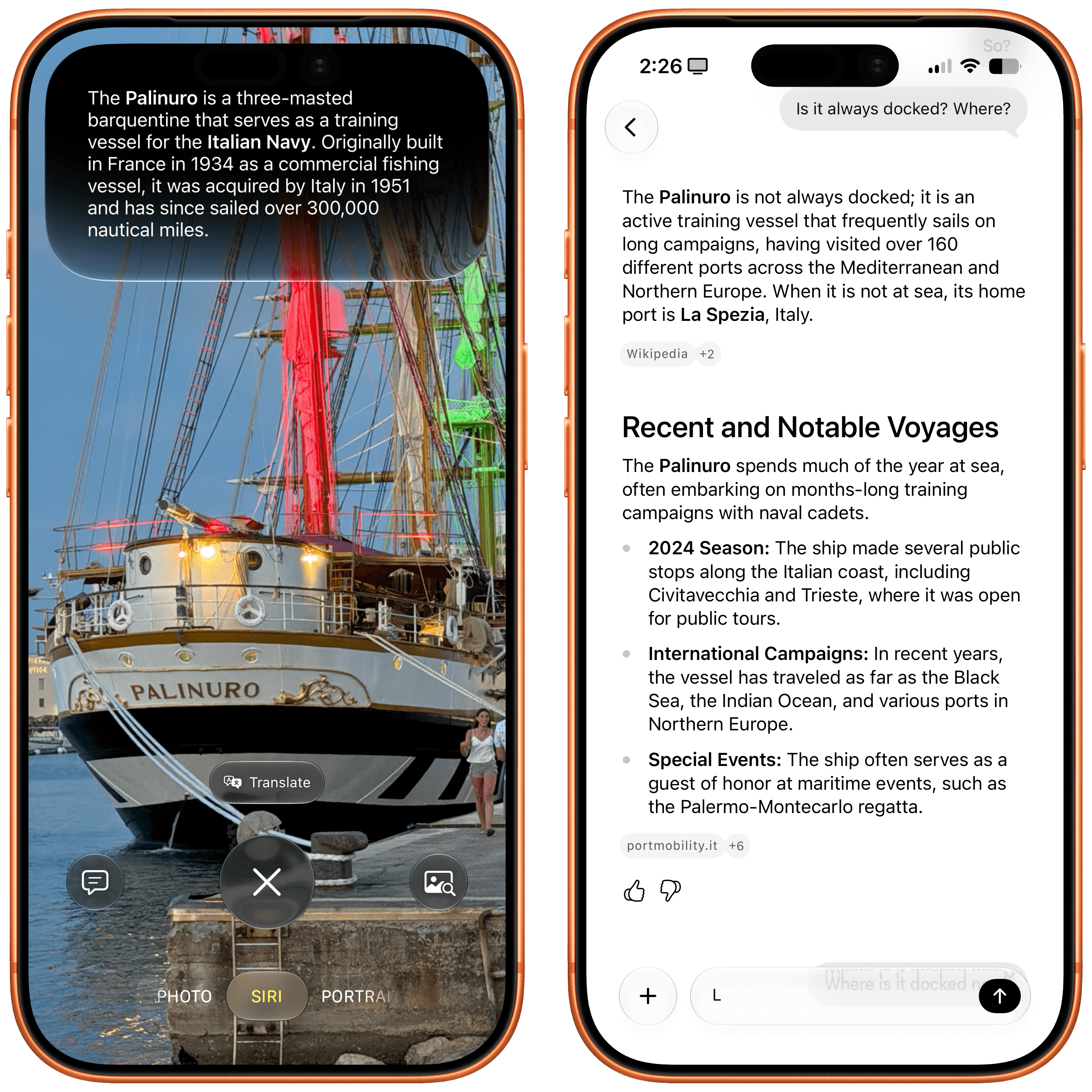
The ability to go from Siri in the Camera to a longer conversation in the dedicated Siri app is one of my favorite aspects of Siri AI.
These are just two examples of the kind of integration that you can have between the Camera app and Siri, and it would be impossible for me to cover all of them. As you may have noticed with my recent coverage of AI products and features, my job is becoming more about explaining the foundation and harness of AI tools rather than what they can accomplish – because they can achieve almost anything. And so depending on what apps you use and what you need from Siri, perhaps you’ll use the Siri camera to translate a restaurant menu and send it over iMessage to a friend; maybe you’ll want to point the camera at a book and ask Siri to create a note about it in Apple Notes; perhaps you’ll point the camera at a monument in Florence and ask Siri to tell you more about its history. All of these use cases will work, and this AI feature – like everything else – will be what you make of it.
Write with Siri and Context Menus
There are two more Siri AI surfaces I want to cover. The first one is ‘Ask Siri’, a permanent fixture of every context menu in iOS and iPadOS 27 that lets you instantly pass whatever item you’ve selected – whether it’s a file, some text, a note, or a link – to Siri as input, so you can ask something about it. This isn’t a particularly special feature, but it highlights the kind of pervasive integration Siri AI now has at a system level.
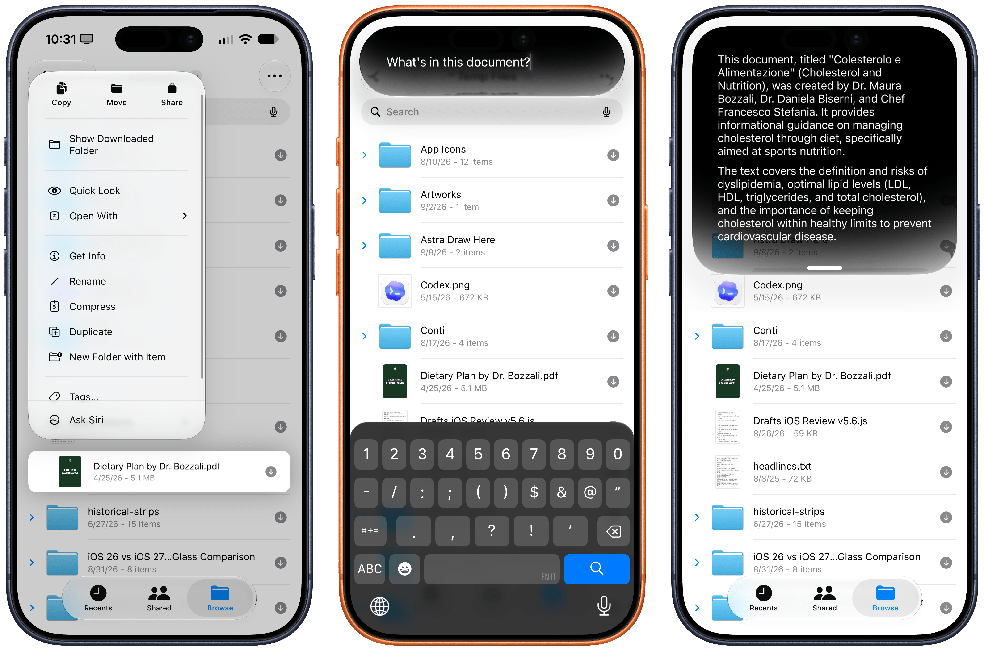
You can ask Siri anything from anywhere in iOS 27.
The other integration is ‘Write with Siri’, a system-wide replacement for Writing Tools that eschews Writing Tools’ menu and options in favor of a more freeform interaction with Siri.
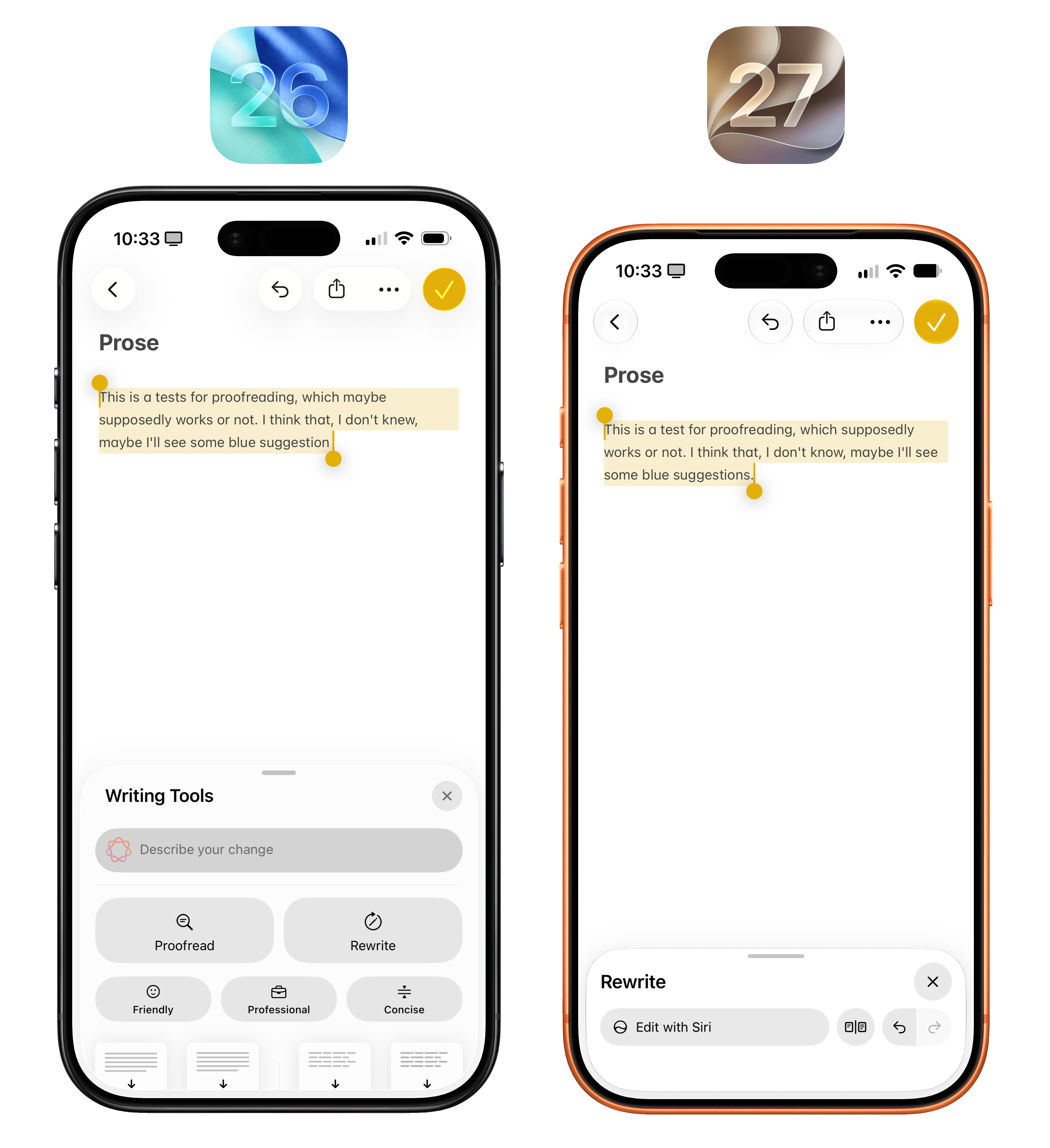
You can access Write with Siri via the Siri button above the keyboard on the left, or by selecting the Siri icon in the action menu when some text is selected. With an active text selection, default ‘Proofread’ and ‘Rewrite’ options will also appear in the QuickType bar.
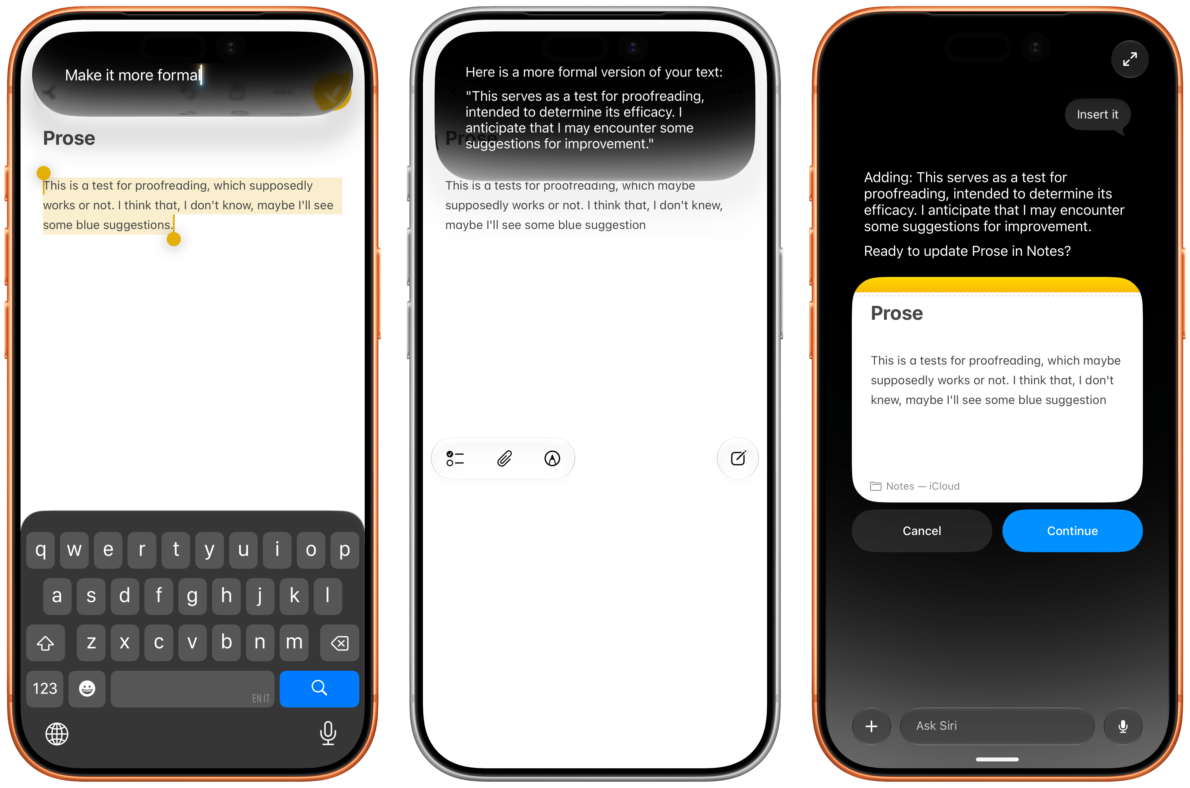
You can just do anything with text using the new Siri.
No matter the activation method, there’s no longer a “static” UI for how you want text to be modified or generated: you can just ask Siri. That’s how LLMs work – you ask, they do – so why limit this feature to three writing styles or four formatting options, as it used to be in iOS 26, when you can just prompt the model to write or format text in any way you want?
Now, I’ve never been a huge Writing Tools fan, so I don’t have a strong opinion about the rebrand in iOS 27, but I think the new design works and makes sense given the stronger abilities of Siri AI. I like that you can compare before/after changes with inline, swipeable cards at the bottom of the screen, and I like that you can ask it to edit anything as long as you’re in a text field. I’m not going to use this much, but for quick typo checks or making an email sound more formal, I find the new feature more versatile and capable than before.
Using Siri AI
I’ll be honest: I’m not one of those people claiming they have completely stopped using ChatGPT or other agents in favor of Siri AI.
The new Siri is not an agentic product that is able to carry out long-running tasks to completion, and it would be downright absurd to compare Siri AI to the likes of ChatGPT Work, Claude Cowork, Grok Bot, Hermes Agent, Open Minis, or OpenClaw. I would love for Siri AI to become that kind of experience, and Apple seems to think it now has a foundation in place to enable agentic behavior at some point. But as things stand now, given my reliance on Notion, Slack, and Superhuman for work, and given the simpler, less intelligent nature of Siri AI, I can’t imagine using Apple’s assistant for productivity purposes. In the making of this review, I never used Siri AI once; research work, editing, asset management and video production, database organization, and coding tasks all took place in either Codex with GPT-6 Astra, Claude with Fable 5.1, and Open Minis on iOS.
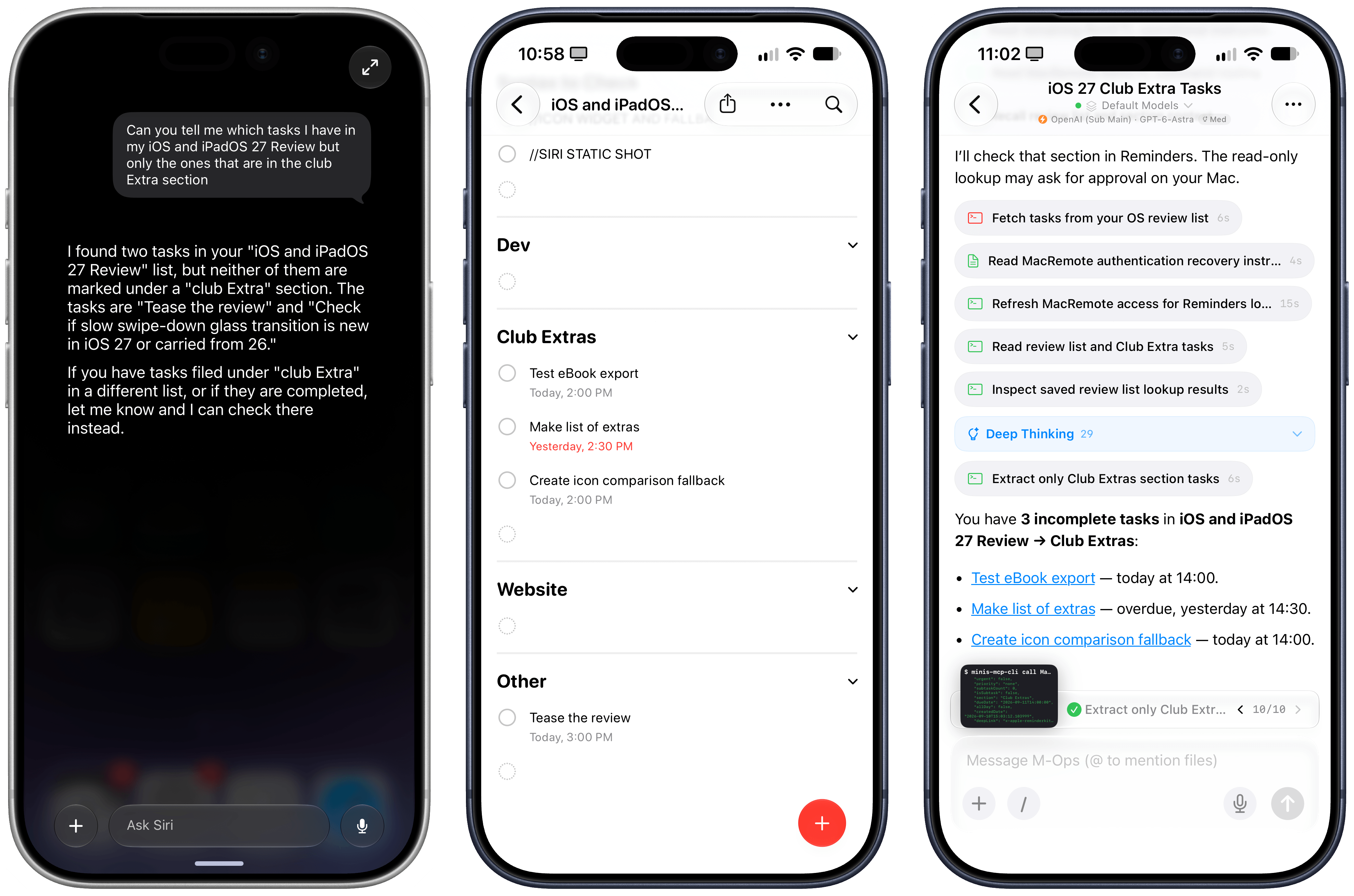
This is what I mean by not being able to use Siri AI for work. The same question could not be handled by Siri in Reminders, whereas my agent with Open Minis completed it just fine.
Instead, I’ve come to appreciate Siri AI for what it is – a much better, smarter Siri that doesn’t aim to replace your favorite agent (yet) – without being upset that it’s not something more.
I’ve thoroughly enjoyed using Siri with Apple Notes, Reminders, HomeKit, and third-party apps such as AskPlay, Monologue, Alyx, MusicBox, and LookUp. I’ve found Siri AI to be best at quick, one-off interactions that perhaps involve a couple of follow-ups, but not anything much longer than that. If I realize that a question I have requires deeper research and more back-and-forth, that’s where I fall back to ChatGPT or the excellent Open Minis for iOS.
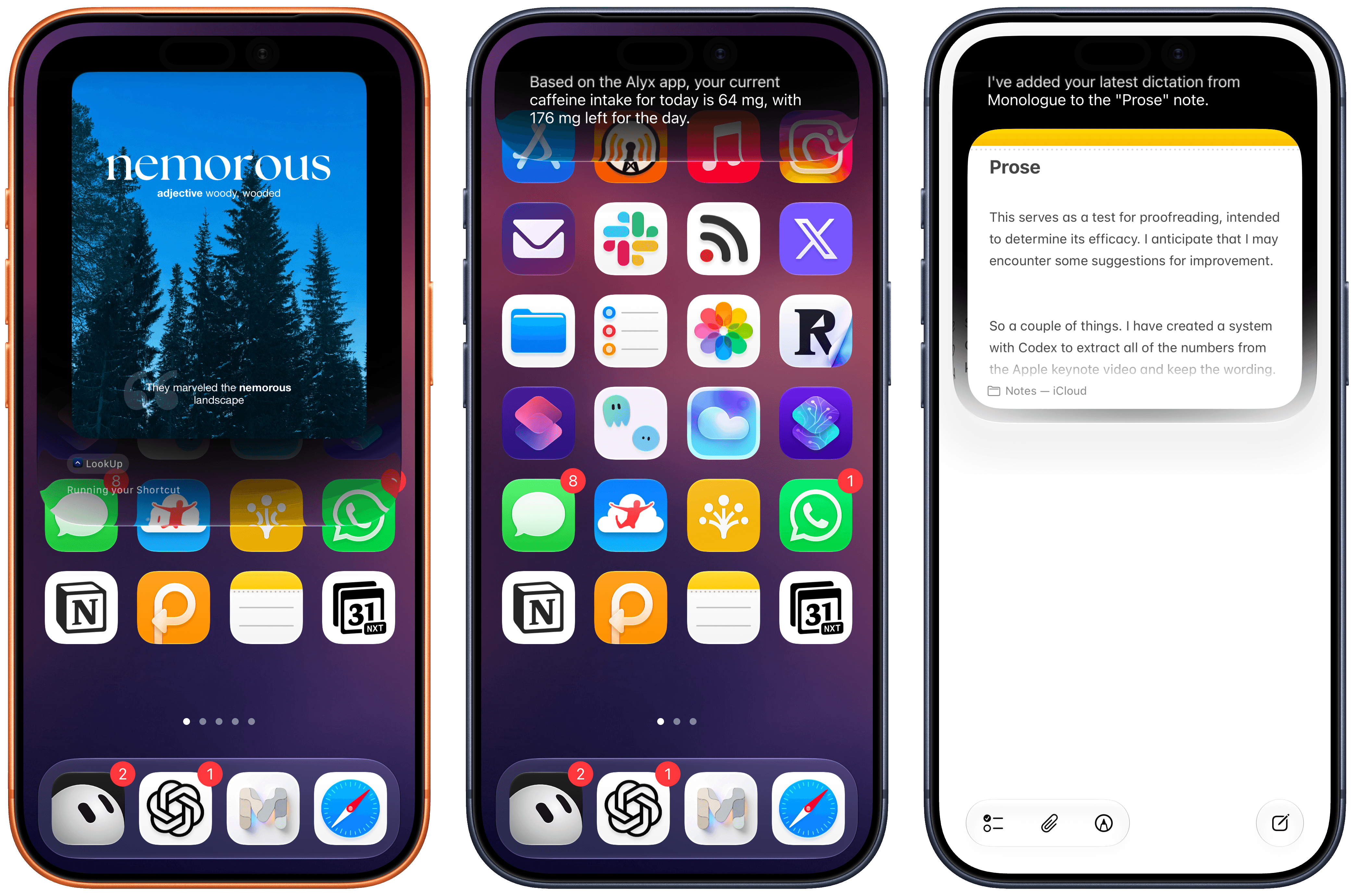
Siri AI integration worked well for me with LookUp, Alyx, and Monologue. It’s also nice to chain output from one app onto another, such as getting a dictation from Monologue and asking Siri to add it to a note.
As I’ve outlined across this entire chapter, there are pros and cons everywhere with Siri AI. Put another way: Apple’s belated effort has paid off, but there’s still so much work to be done. For starters, I think it’s bewildering that Apple hasn’t been able to work with the EU and offer Siri AI in more regions and languages. The fact that Siri AI is still not multilingual is the single reason I still have a ChatGPT Voice shortcut on my Lock Screen, and I continue to believe that if Apple can’t swallow their pride and figure out how to build AI tools for the EU, they will only drive more users to competitors who have learned to work under European regulations.
Second, Siri AI still exhibits old behaviors such as slow performance, requests that time out, or “sorry, something went wrong” messages that aren’t helpful and do not inspire confidence in the product. There are new issues, too. I’ve discovered, for instance, that I can ask Siri to perform two things at the same time – such as setting a timer and turning on a light – but not three. If I ask for three things in the same question, the third one will be silently dropped. Indexing remains a mystery: sometimes I can find messages with Silvia or John from two years ago, but if I ask for something they texted me yesterday, Siri AI can’t find anything.
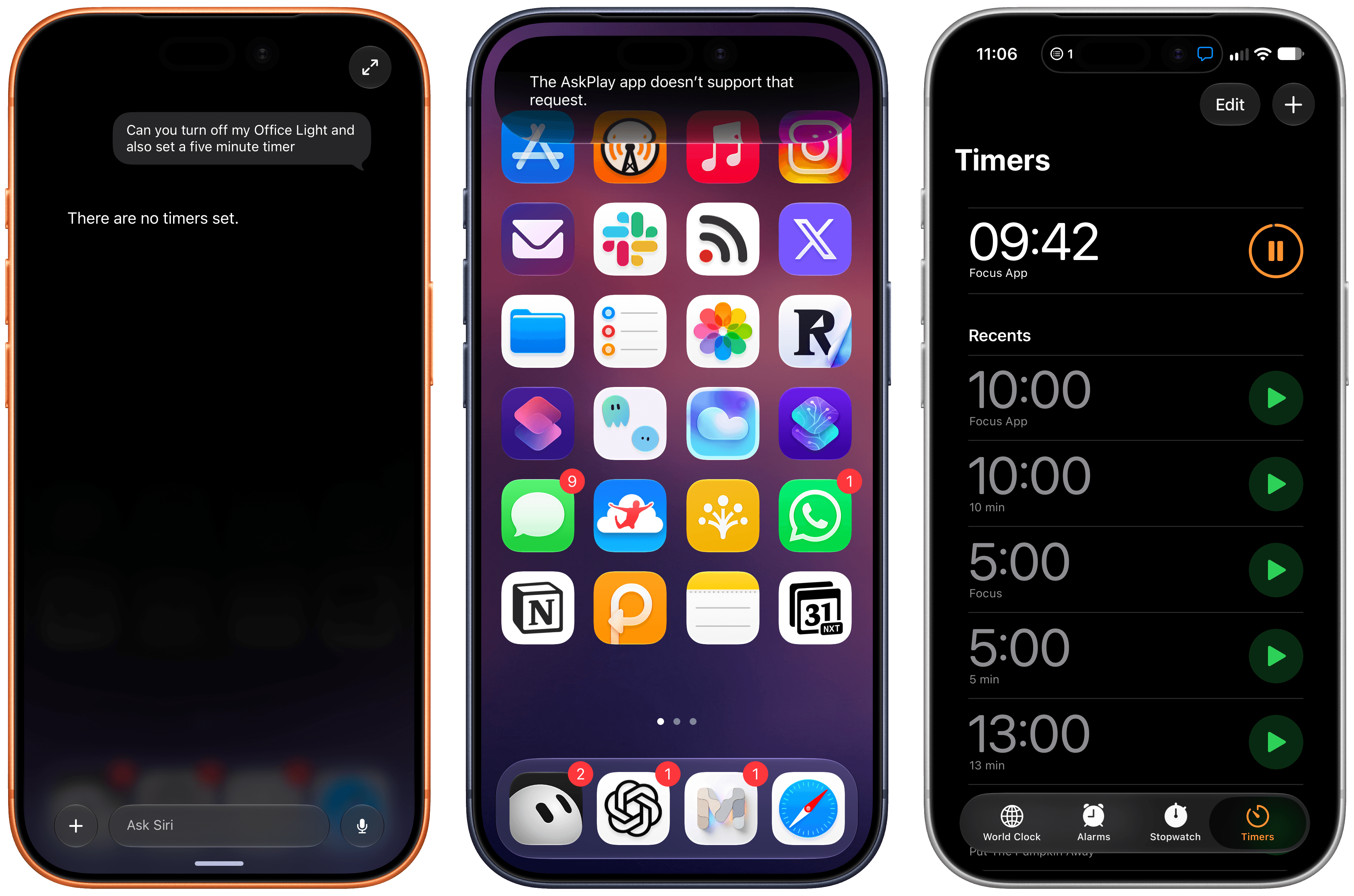
If my experience is any indication, expect to see a lot of strange errors involving third-party apps and multiple requests in Siri AI.
The system also gets confused with names of third-party apps, which remain my biggest question mark and will need more coverage as more apps add support for Siri AI and App Intents. I was using Focus, a timer app, which added support for Siri AI; every time I asked Siri to start a timer in the Focus app, it kept creating a timer labeled ‘Focus’ in the Clock app instead. The model and system orchestrator also appear to exhibit the typical tells of Gemini models, inherited through distillation. Apple’s Foundation models can often be lazy at tool calling and will consider a question answered after doing the bare minimum. In one test I did, I asked whether I had recently been on any trips, and since the Mercury Weather app exposes the ability to search for trips, Siri AI defaulted to Mercury Weather, which had no recent trips in my library. Only when I pushed back and added “you have to look in Photos too” did Siri AI realize that I’d indeed been on vacation two weeks before.
If you’ve ever used Gemini models with external integrations, this kind of behavior may sound familiar. And if you plan on using Siri AI with lots of apps on your device, expect to issue very detailed prompts to get the kind of result you want. Unlike large frontier models, Apple’s models aren’t able to infer user intent unless you are very clear about what you’re seeking.
Once I understood these limitations, I started having a considerably nicer experience with Siri AI, and I accepted that I shouldn’t expect it to be an alternative to ChatGPT Work or Hermes Agent. Instead, Siri AI is a great “quick answer assistant” that happens to work with native apps and – importantly – can be activated from anywhere and can see my screen. I’ve become a heavy user of on-screen awareness to capture all kinds of things in Notes; I like using Siri AI to quickly summarize articles in Safari; in general, I find myself context-switching between the app I’m using and ChatGPT less because Siri AI can give me a pretty good answer right there.
ChatGPT is for projects, Siri AI is for quick actions and fast answers. This is how I think about these AI products, and I’m happier now that I’m not trying to force Siri AI into being something it can’t be.
Siri AI permeates iOS 27, and that’s a threat to OpenAI and the hundreds of millions of people using ChatGPT for free with GPT-5.5 Instant. I don’t think Apple’s Foundation models are as good as GPT-5.5 Instant, but Siri AI is the more ergonomic and integrated product. When the underlying chatbot and its world knowledge capabilities are good enough, and they can also be invoked via voice, text, the Camera app, context menus, or keyboard shortcuts, why would I open a siloed chatbot when I can use Siri AI and get a comparable answer more comfortably? If you’re a casual user of ChatGPT and do not pay for it, I think Siri AI can be a very compelling product that provides similar answers and, unlike OpenAI’s chatbot, integrates with the iPhone apps you already use. I don’t think it’s a coincidence that OpenAI is now following in Anthropic’s footsteps to monetize the business and enterprise markets rather than the consumer one.
At the same time, my concern is that we may be collectively assuming that “normal people” won’t see the differences between the capabilities of ChatGPT and Siri AI. In this industry, we have a tendency to sell “normal people” short and paint them as some perplexed bunch of occasional smartphone users who somehow passively accept any technology that is thrown at them. I strongly disagree with that. Maybe those people don’t care about ChatGPT Work, Codex, or Fable (yet?), but they can tell when an AI assistant is useful and when it’s not. People will compare the utility of ChatGPT to Siri AI, and I worry that Apple’s 1.0 product will feel like it’s too little, too late – especially since Siri AI will be launching in select regions and in English only.
In the AI scene, companies move fast and break things. Apple needs to move fast without breaking anything – not anymore, at least. That’s a tough challenge, but here we are.
iPadOS
How do you follow up one of the biggest and most important software updates ever released for the iPad? Unsurprisingly, if you’re Apple, you don’t. Unlike its predecessor and its complete rethinking of multitasking and windowing, iPadOS 27 is a smaller release that only introduces a handful of iPad-specific changes and is instead focused on improving performance, tweaking Liquid Glass, and matching the other features introduced on iOS 27, such as Siri AI.
There is very little in the way of iPad-only functionalities this year, and I don’t think that’s going to shock anyone who’s spent any number of years working on the iPad. Historically, we have gone multiple years between iPad-focused updates – and that was before something as groundbreaking as iPadOS 26. I’m not saying that Apple isn’t capable of shipping major updates year after year; I’m simply arguing that, at this point, we know that the iPad’s typical cadence – including its 18-month refresh cycle for hardware – doesn’t lend itself to major platform updates every September.
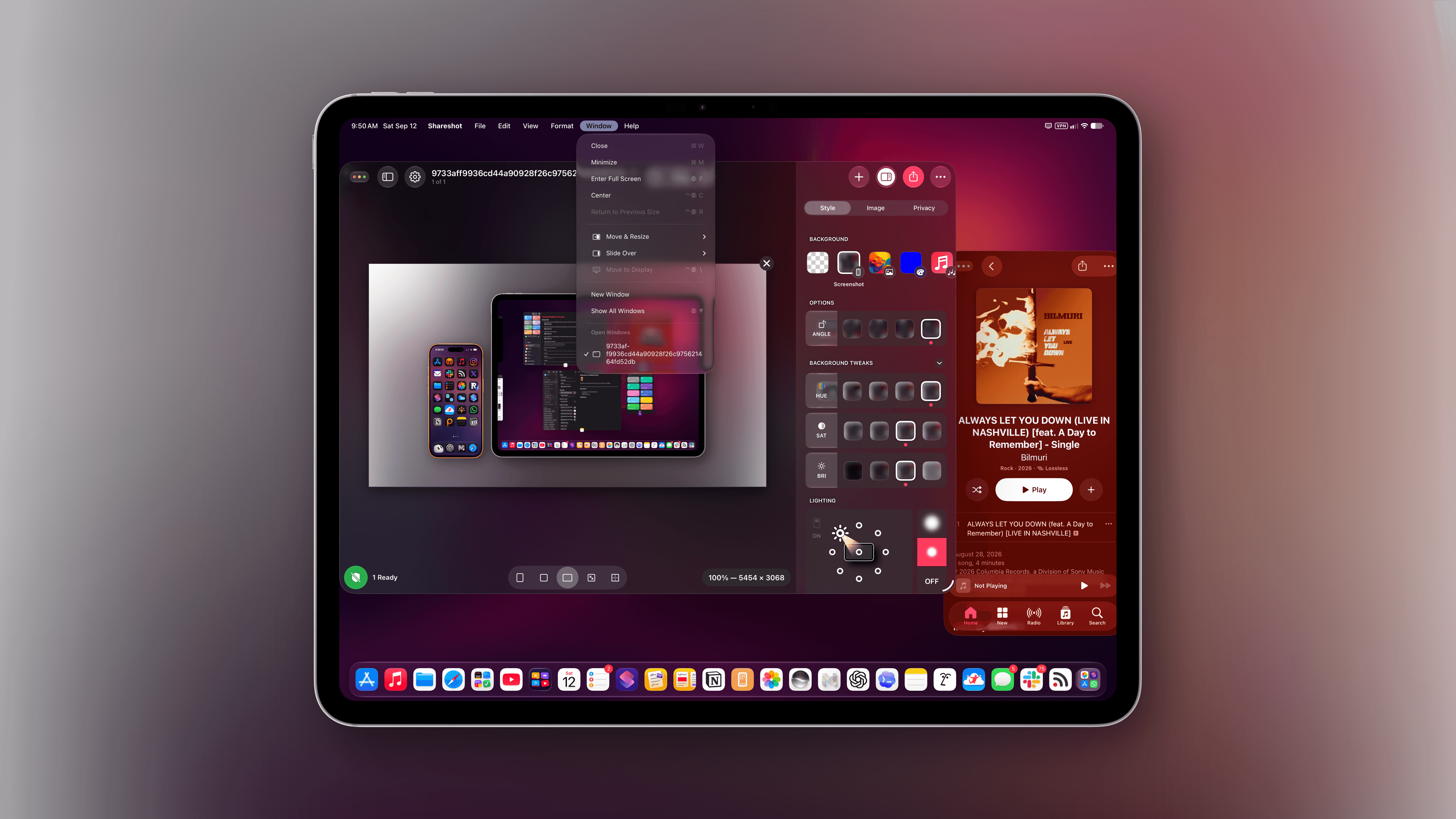
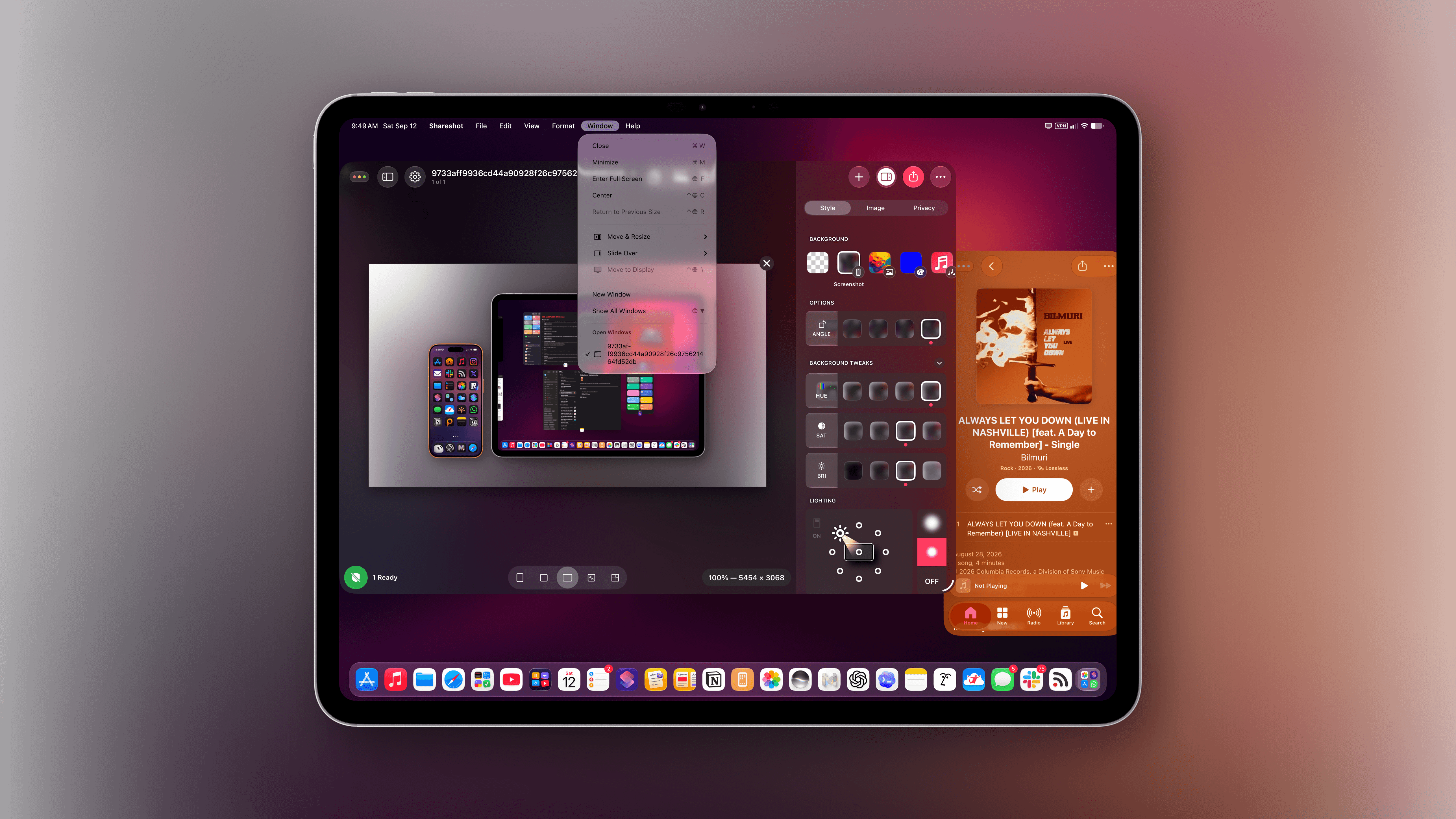
That’s not to say the journey toward making the iPad more like a laptop for professional users has stopped, despite the slower pace. The most relevant addition to iPadOS 27, in fact, is a reworked menu bar that behaves more like its counterpart on macOS now, in a couple of distinct ways. For starters, the name of the foreground app is now always shown in the top-left corner of the menu bar, right next to the date and time.
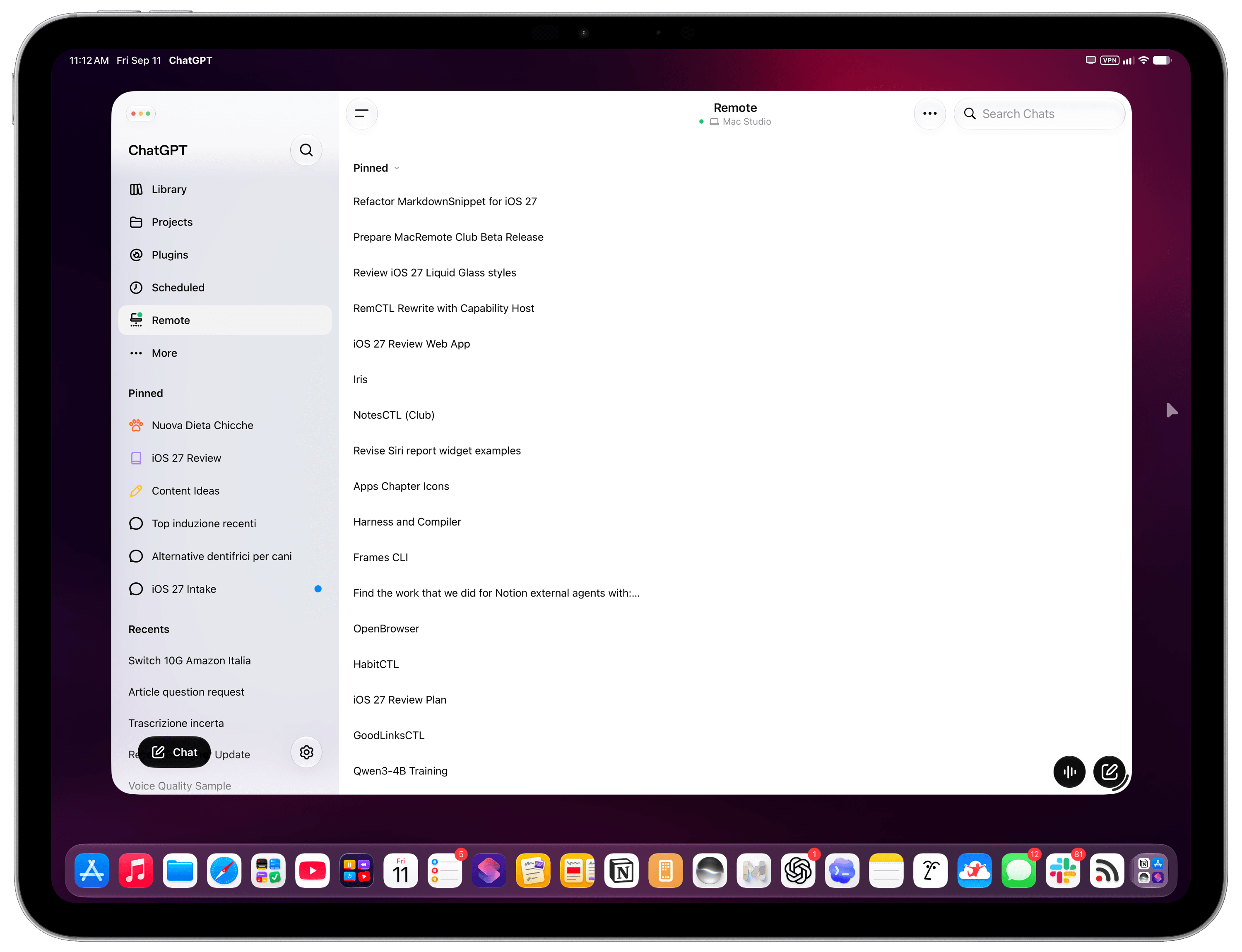
The name of the foreground app is now always shown in the menu bar. As you can see, the menu bar is also left-aligned now, just like on macOS.
In addition to serving as a helpful visual aid for what is currently the active window in the foreground, the app’s name also acts as a pointer target to reveal the full menu bar on hover. Although this interaction was available before in iPadOS 26, I find hovering the pointer over the name of an app a more natural way of revealing the full menu bar than hovering over some empty space at the top and hoping it works.
Revealing the menu bar on hover.
But that’s not all: you can now make the entire menu bar always visible by default, just like on a Mac. To turn on this option, head over to Settings → Multitasking & Gestures → Automatically Show and Hide Menu Bar and disable the toggle. Now, the menu bar will always be displayed in its expanded state with the classic ‘File, Edit, etc.’ menu items.
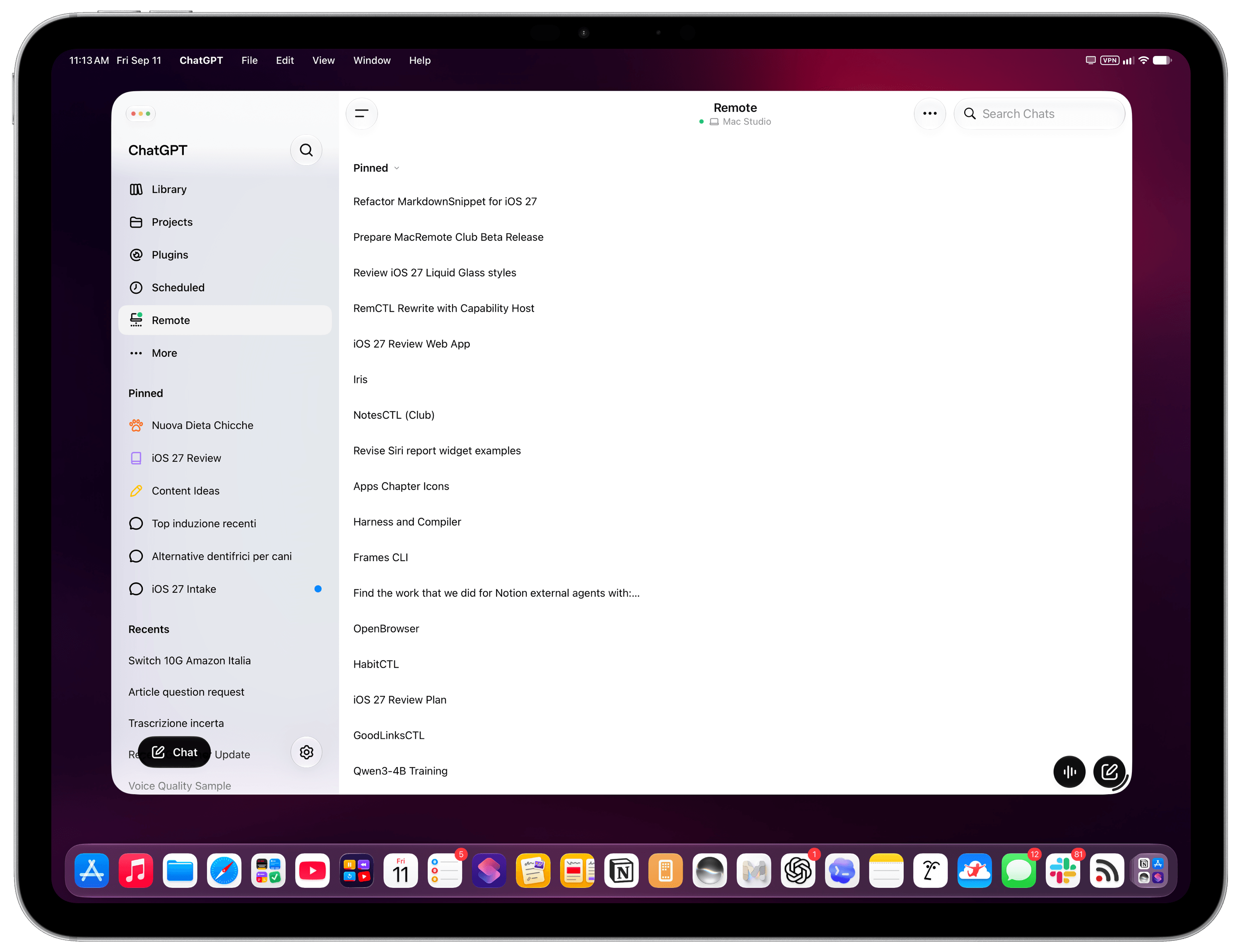
The full, left-aligned menu bar in iPadOS 27.
And speaking of those menu items, icons next to menu labels are now used more sparingly than before. This has been a contentious topic in some parts of the Apple community for the past year, and I don’t have a particular opinion about this since the icons never bothered me that much. That said, I will agree that the menus now look cleaner and less visually busy. But I’ll let John analyze this change in more depth in his Golden Gate review, since much of this debate originated with longtime Mac users. Overall, I’m a fan of the always-visible, left-aligned menu bar because a) it’s more consistent with macOS and b) it makes it easier to discover commands nested inside menus.
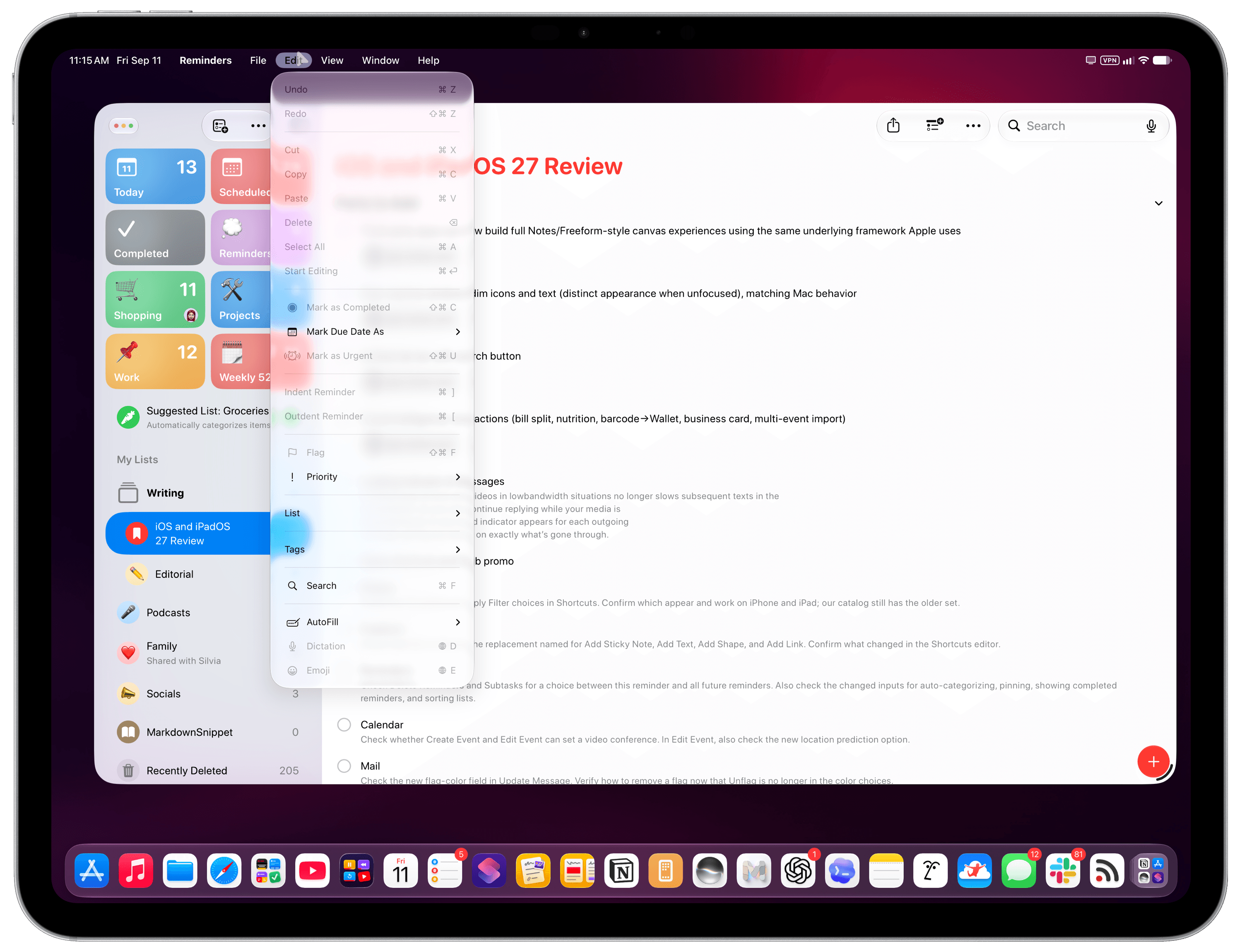
Menus with fewer icons.
There isn’t much else to discuss about iPadOS 27 beyond the menu bar and changes that I’ve already covered in the Design and Siri AI chapters. In terms of iPad-exclusive features, Visual Intelligence has now expanded to the iPad, and it lets you circle elements in screenshots with the Apple Pencil to look them up using Siri AI. It’s very nicely done, but I don’t really use it.
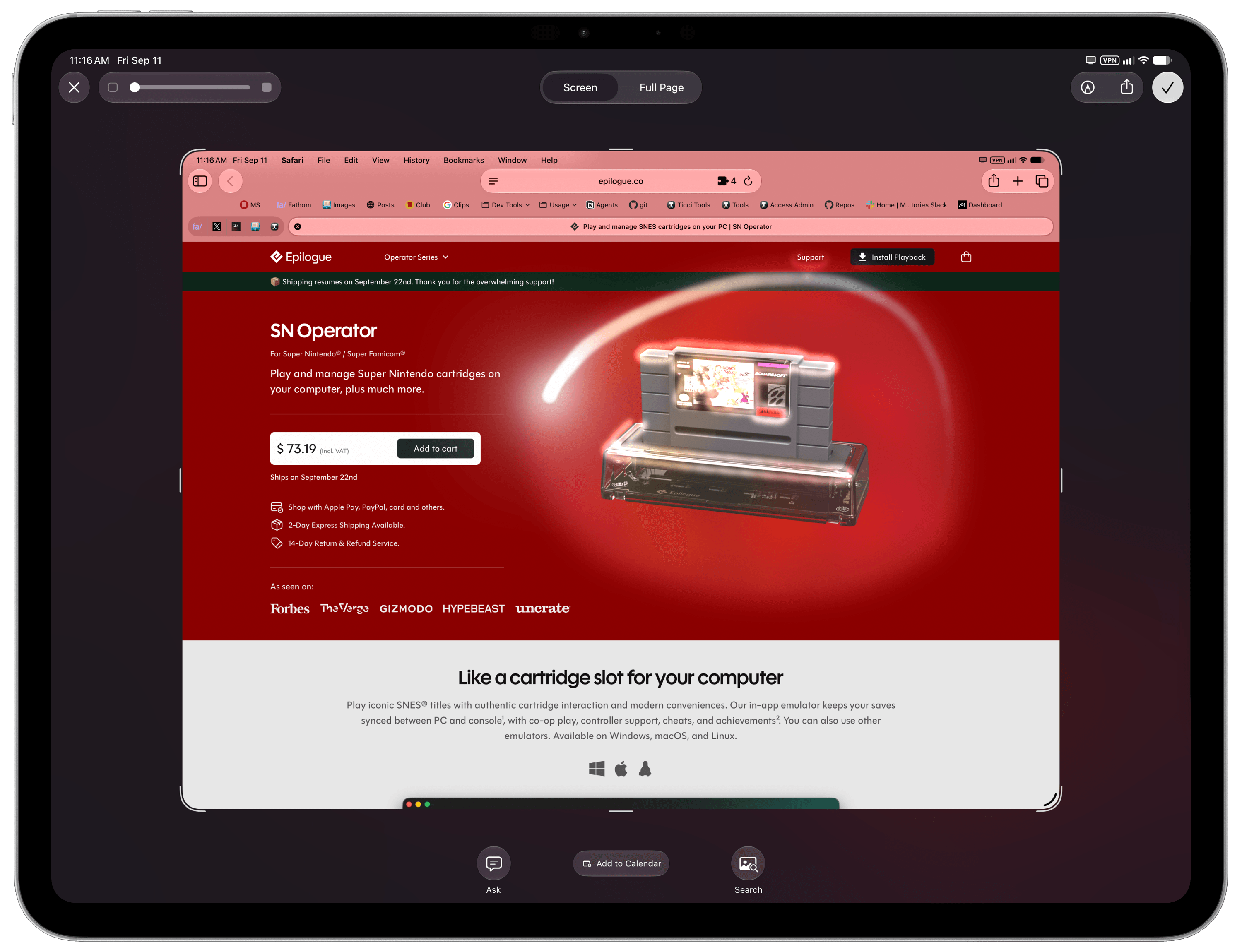
Visual Intelligence on iPadOS.
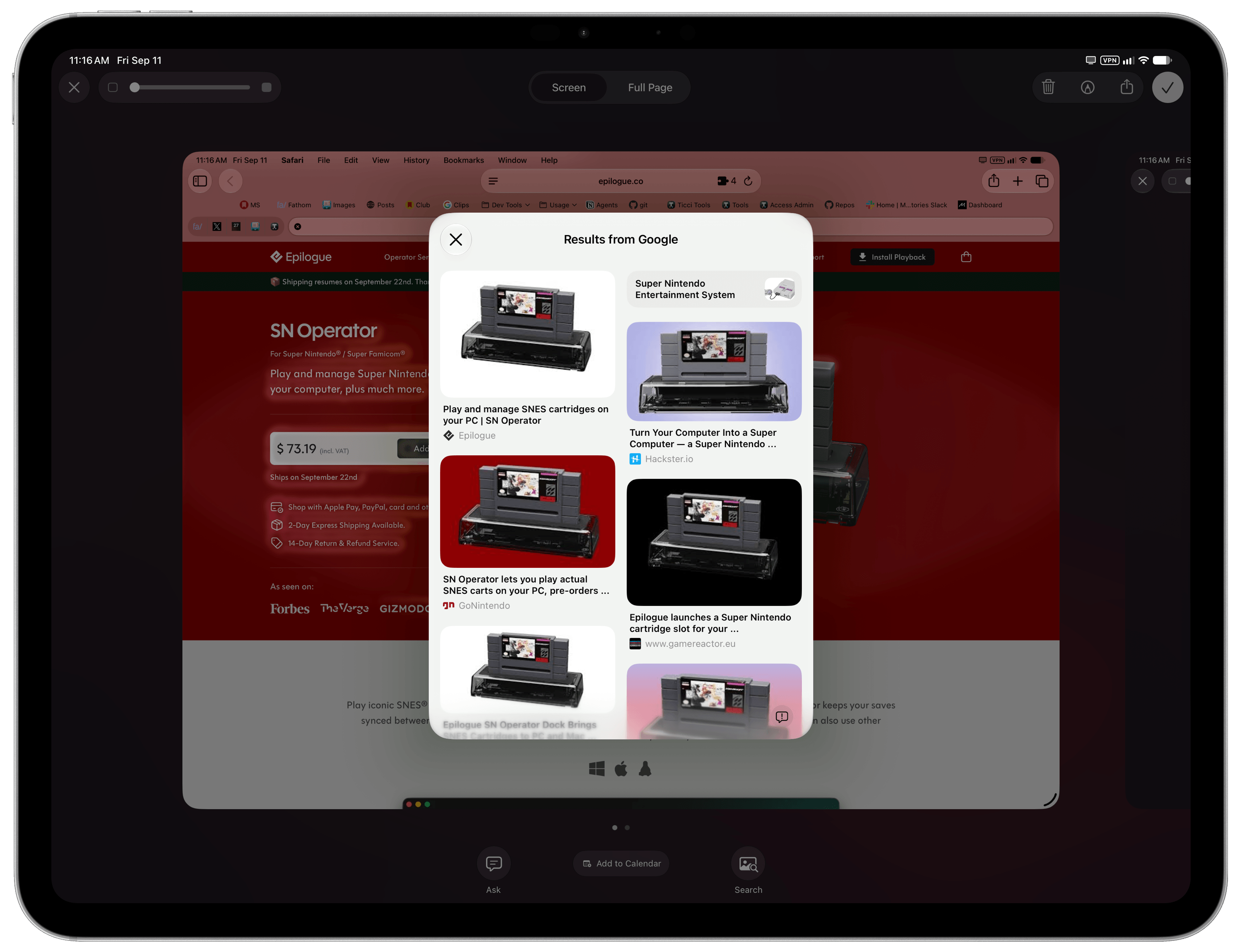
As everyone guessed months before the introduction of the iPhone Duo, the ability to resize iPhone apps running on the iPad was, in fact, a prelude to iOS apps expanding horizontally on a new form factor. Again, this one isn’t for me, since the apps I use have native iPad versions (essentially every iOS 27 app beta I tested was a Universal app with built-in iPad support). However, if you use an iPhone-only app on your iPad and that app updates for iOS 27, you’ll be able to resize it either on an iPad or in iPhone Mirroring mode on a Mac. Since I believe it’s more useful to do this on a Mac, I’ll let John cover this in his macOS Golden Gate review, too.
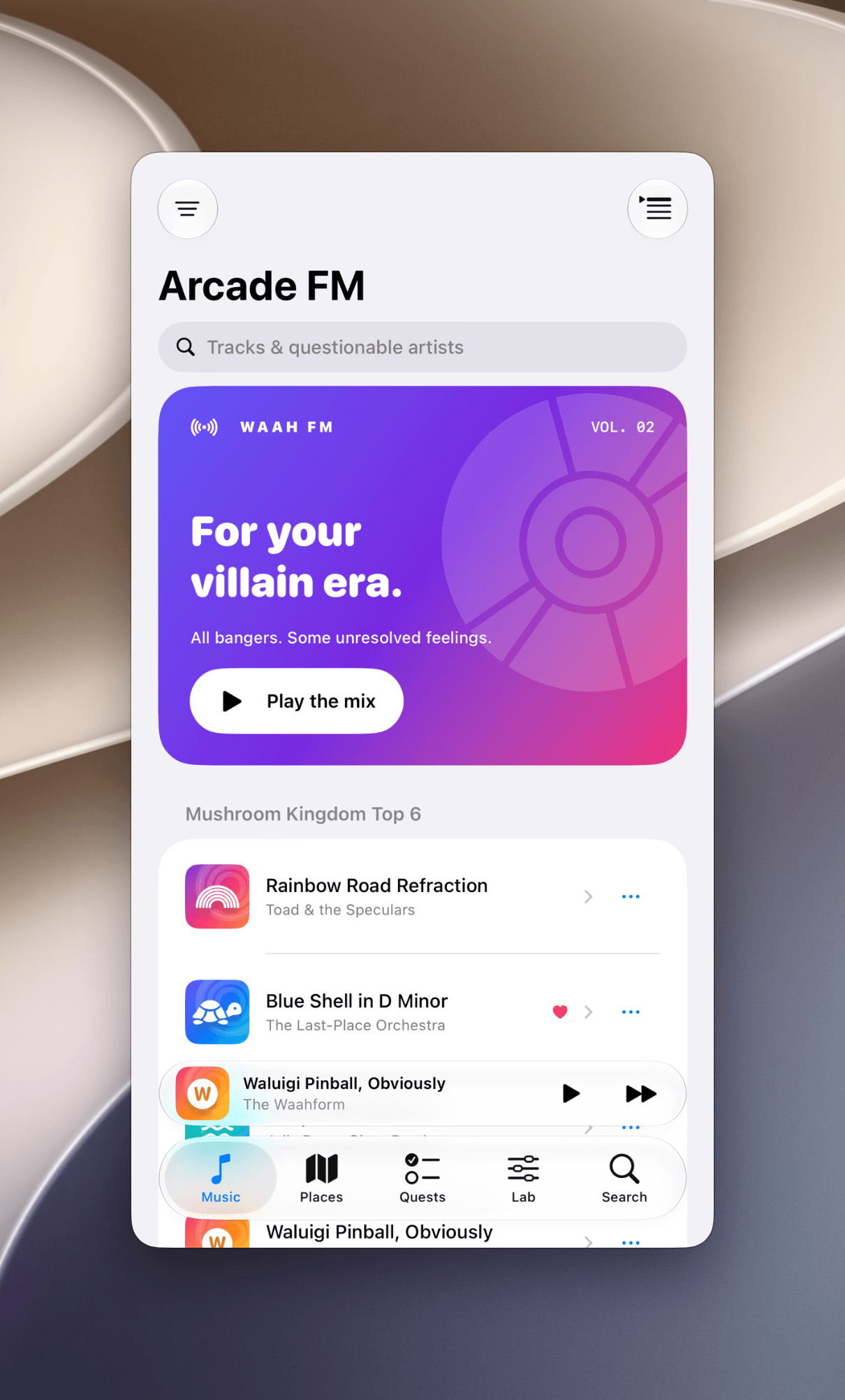
An iPhone app…
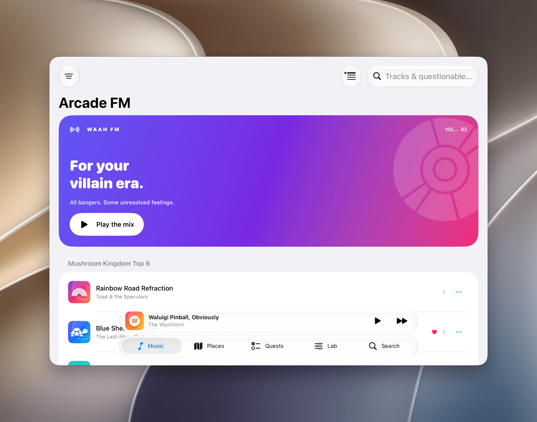
…can now almost become an iPad one when resized.
And to wrap up the list of iPad enhancements that are coming from macOS and will make more sense in the context of John’s review: the sidebars on iPad are no longer “floating” glass panels; they’re edge-to-edge again.
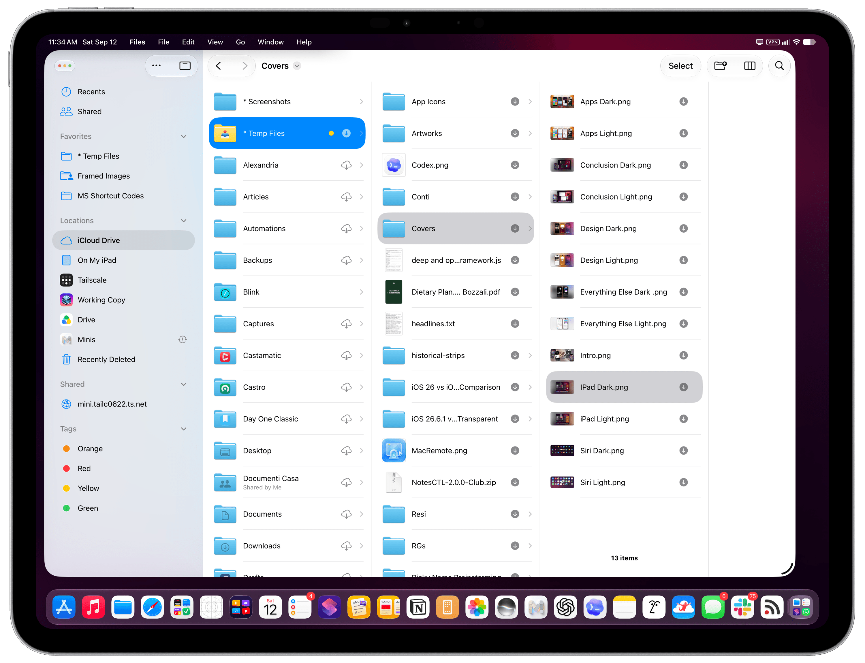
The “new” iPadOS 27 sidebars.
This was another heavily debated topic in the Mac community for the past year, and it’s actually a reversal I agree with. Sidebars are supposed to look edge-to-edge like this, and I never fully understood why Apple went with that look in iPadOS and macOS 26. I can’t wait to read where John lands on this one as a Mac user who actually didn’t hate macOS Tahoe as much as others.
And that’s a wrap on iPad-only changes for this year. I continue to believe that iPadOS would benefit from a stronger Spotlight with the same integrations seen on macOS last year, a clipboard manager, proper support for clamshell mode (especially now that Control Center can be invoked on external displays, also new this year!), and – a bigger conversation – a more vibrant app ecosystem in the age of AI.
Clearly, though, this was not the year for another iPadOS milestone at Apple. And given the excellent work the company has put into system performance, Liquid Glass improvements, and the launch of Siri AI after several delays, I can’t really blame them for it.
Apps
Given the growing number of built-in Apple apps, their cross-platform nature, regional restrictions for certain features, and the simultaneous release of iOS, iPadOS, and macOS 27, we think it’s best to split app coverage between my review and John’s. We debuted this approach two years ago; this year’s reviews will follow the same structure. It makes even more sense this year given Apple’s focus on fixes and smaller tweaks that encompass apps across its entire family of OSes.
This year, you’ll find the following apps covered in John’s upcoming review of macOS Golden Gate:
- Home
- Image Playground
- iPhone Mirroring
- Maps
- Passwords
- Podcasts
- Preview
- Sidecar
- Weather
I’ll be covering the rest here.
Calendar
Can you believe it? Fourteen years after Fantastical first brought natural language event creation to iOS, when LLMs were a distant dream, Apple’s Calendar app is getting support for “describing events” with natural language in iOS 27. Talk about a “finally” here.
When typing an event or reminder in the Calendar app, you’ll notice that some parts of the sentence will be highlighted in red to signify that they have been recognized by Apple Intelligence. By “some parts”, I mean the time of an event and the date, but only after you accept a suggestion for a recognized date above the keyboard. When an event gets parsed by AI, you’ll also see an Apple Intelligence symbol next to your typed sentence, and you’ll be able to tweak the event’s title in a separate field.
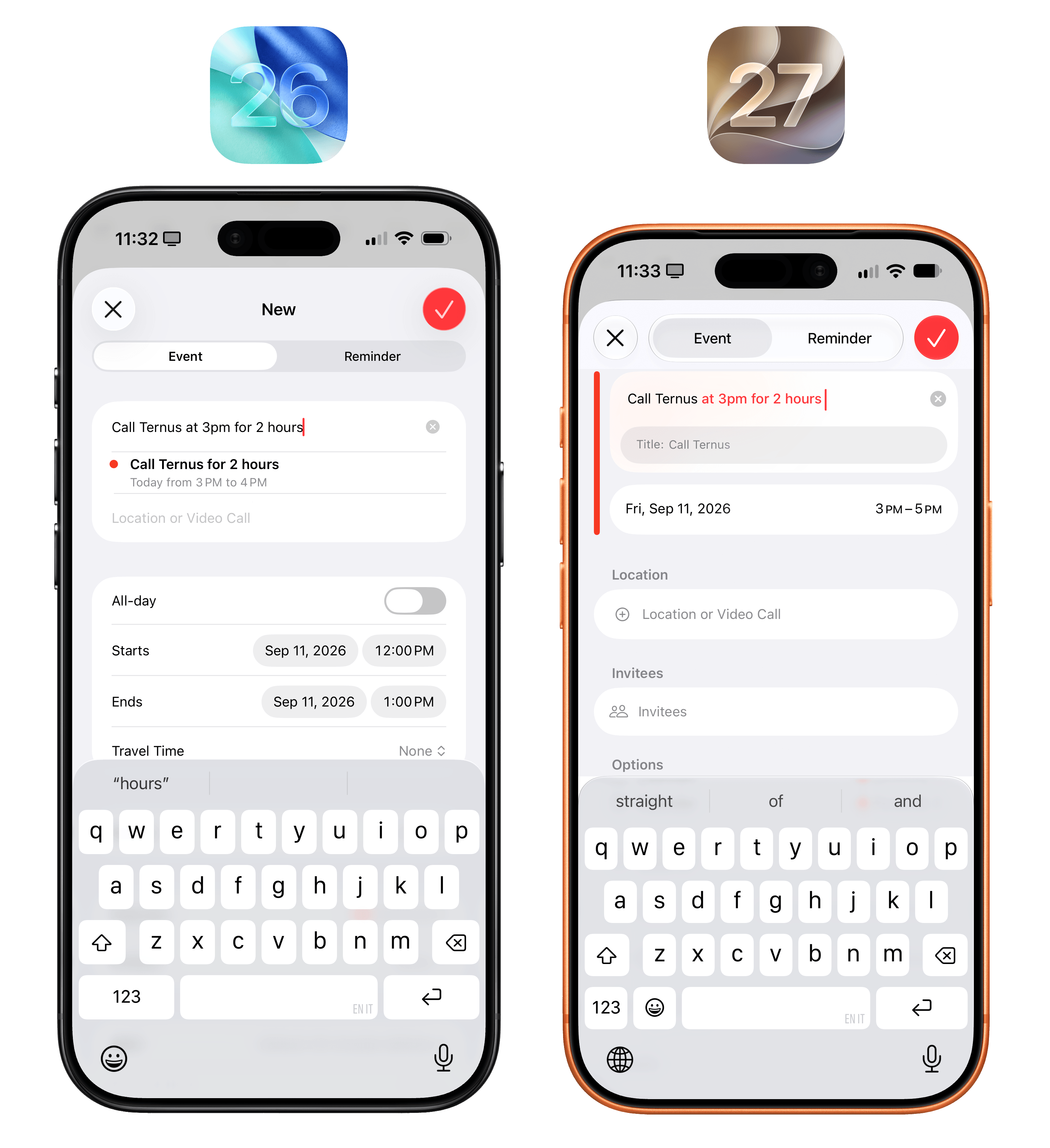
Natural language event creation is slightly better than before, but not much.
Unfortunately, despite being over a decade late to this feature, Apple’s take on natural language event creation is still inferior to Fantastical’s version from 2012. I’m actually astounded by how barebones this functionality is compared to the rest of the industry and other apps that were doing this before AI. Apple’s system does not support specifying calendars or any other metadata about an event. It only works automatically with event times, and if you want a date to be parsed, you need to manually accept a suggestion. I think a Shortcuts user with a decent prompt for the ‘Use Model’ action and the Cloud Pro model could do a better job than this parser.
For all these reasons, I’m very much let down by natural language event creation in iOS 27, and I hope Apple can ship a real version of this feature next year. They might as well have skipped this.
Camera
As happens every September, Apple likes to save some surprises for the Camera app very late in the beta cycle, so they can make new feature announcements coincide with new iPhone reveals. This year is no different: as part of the iPhone 18 Pro’s unveiling and its pro photography narrative, Apple also added customizable controls to the Camera app in the Release Candidate version of iOS 27.
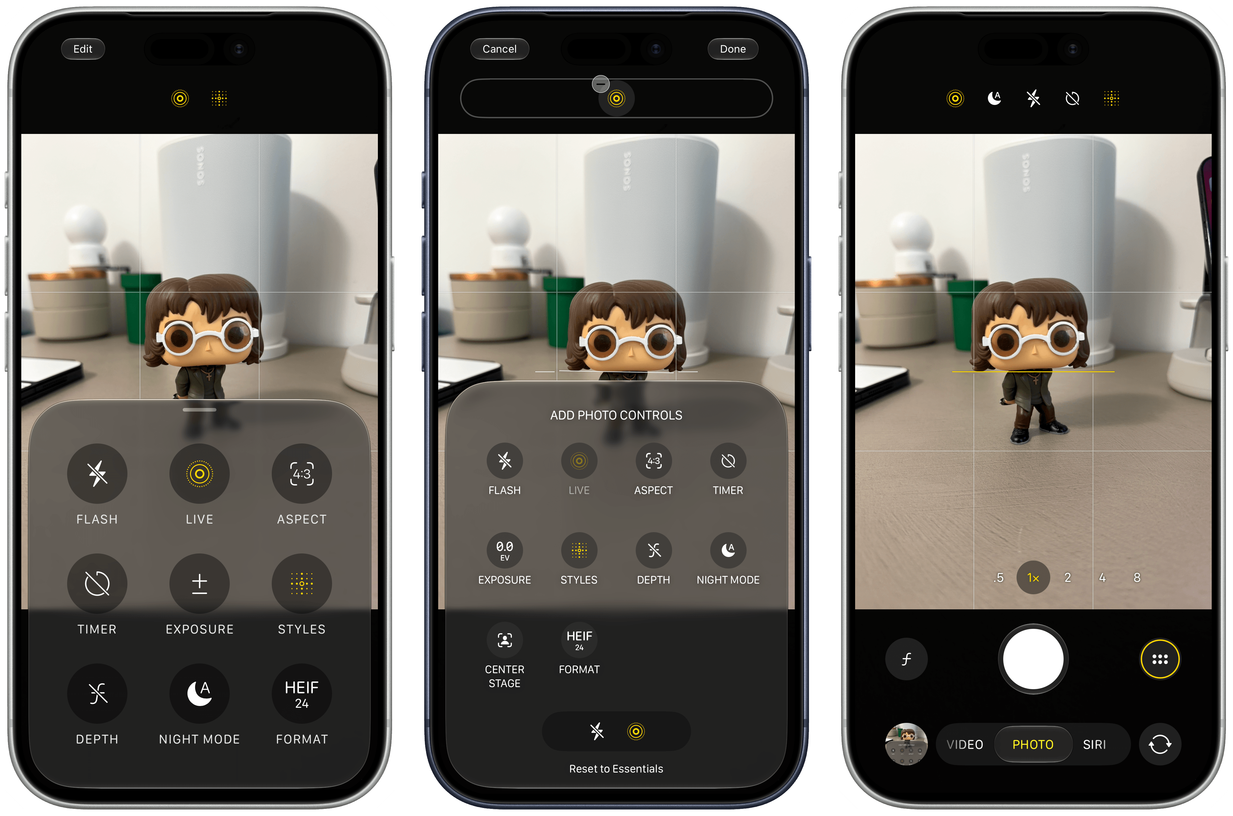
Customizing controls in the Camera app.
To customize which controls are available for quick access in the Camera app, tap the grid button on the right side of the shutter button, then tap ‘Edit’ in the top-left corner of the viewfinder. Doing so will reveal a good-looking Liquid Glass panel with a list of controls that you can tap to add to the strip at the top of the viewfinder. You can also remove existing ones, or reset everything to the default state if you want to revert your changes.
Note that control customization is available for all modes of the Camera except for Siri and Panorama.
Clock
Morning alarm people, rejoice: in iOS 27, you can now set an independent volume level for alarms that is different from your ringtone volume or other system alerts and sounds.
(I used to have alarms in the morning, like a regular person. Then, the alarm became my dogs kissing my face because they want to eat. I prefer it.)
This feature is actually part of a bigger overhaul of volume levels with separate sliders that you can find in Settings → Sounds & Haptics. While everything used to be controlled by the ‘Ringtone & Alerts’ slider in iOS 26, iOS 27 has spun off ‘Alarms and Timers’ and ‘Alerts and System Sounds’ into their own categories, probably because nobody uses ringtones anymore.
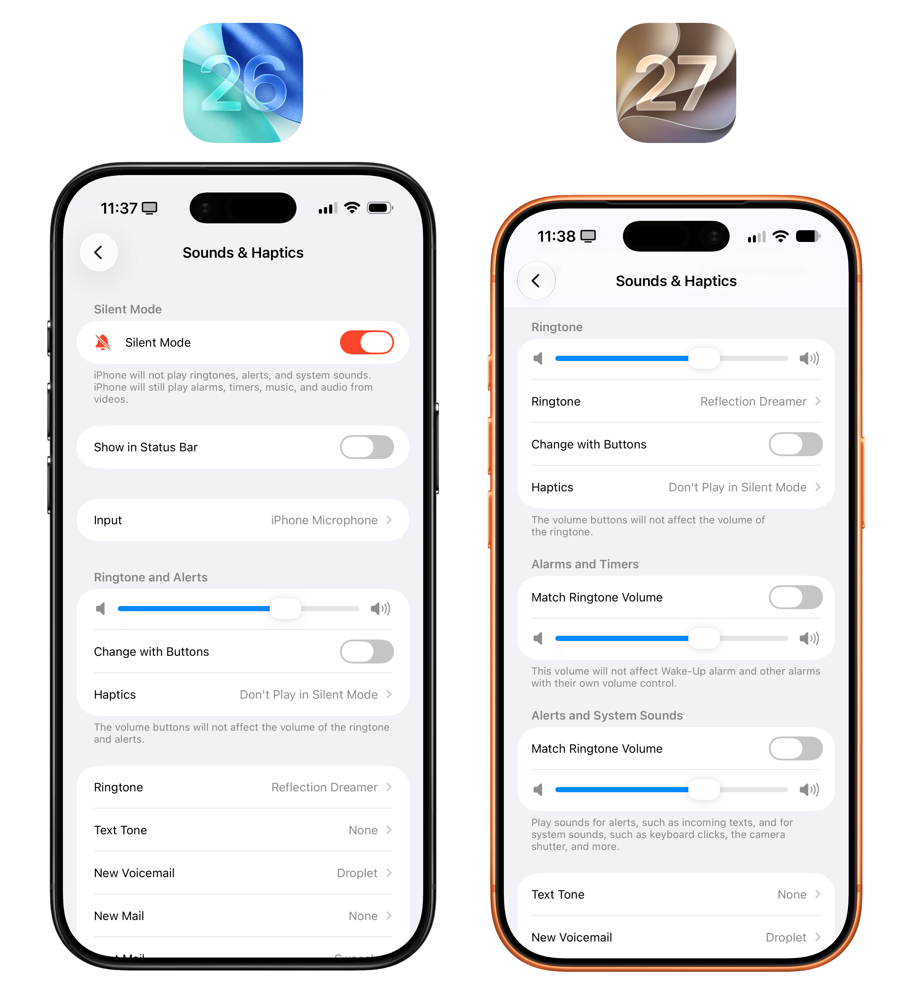
At long last, separate volume sliders.
By default, the new sections will have ‘Match Ringtone Volume’ enabled; if you turn it off, you’ll unlock a separate volume slider for those features.
I keep my iPhone permanently on mute, so this feature isn’t for me, but, as always, I am glad to see more customization everywhere.
Files
There are only two improvements to the Files app worth noting this year.
The first one is for iPad users: if you transfer large files to external drives on a regular basis, you should notice that those copies will be up to five times faster than in iPadOS 26. Apple claims that this change makes the Files app “just as fast as Finder on the Mac”, and my understanding is that these tests were conducted with APFS-formatted drives over a USB4 connection. I do not need to transfer large files from my iPad Pro to an external drive anymore (I now record podcasts on my Mac via Google Chrome and Riverside), so I’m looking forward to seeing what my friend Chris has to say about this.
Second: Files now supports AI-powered renaming of files and folders. I like this feature a lot. When you press ‘Rename’ on a file or folder and wait a couple of seconds, you’ll see some naming suggestions appear above the keyboard. Choose one, and the file or folder will be renamed instantly.
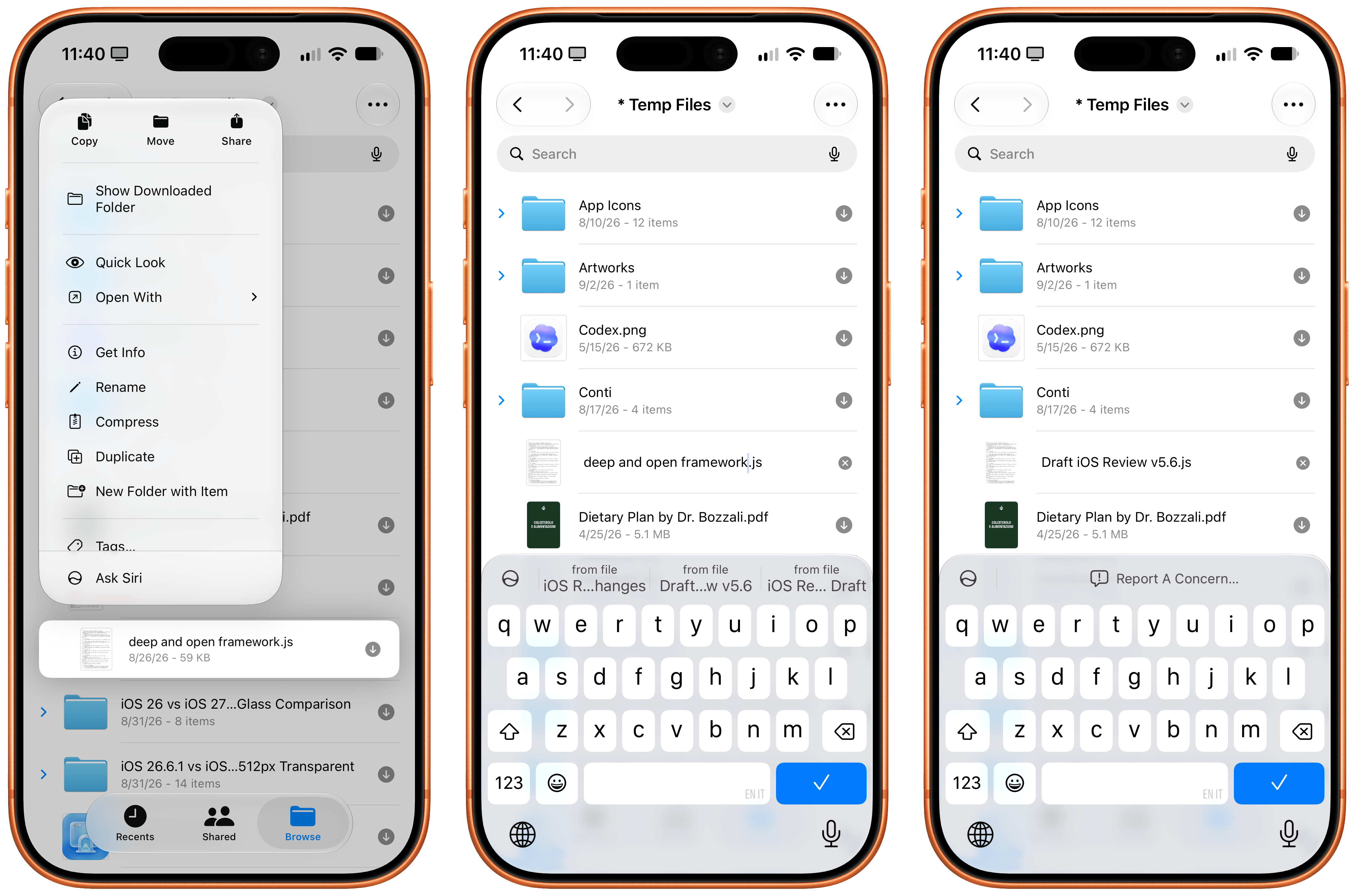
AI-based file renaming works pretty well.
AI-assisted renaming also works when saving a document via the Files picker. Clarus was, in fact, recognized as a “dog”.
It’s interesting to observe how this feature works behind the scenes. The model powering this appears to be using a mix of file analysis and vision capabilities to suggest names. The model can suggest a cleaner title for a PDF by reading it, or a more descriptive name for a folder based on the items inside it, but it’ll also attempt to inspect an image with vision and offer a new name. For instance, I had a file in iCloud Drive called Codex.png for the Codex icon, and when I tried to rename it, the Files app offered “Blue Cloud” as a suggestion.
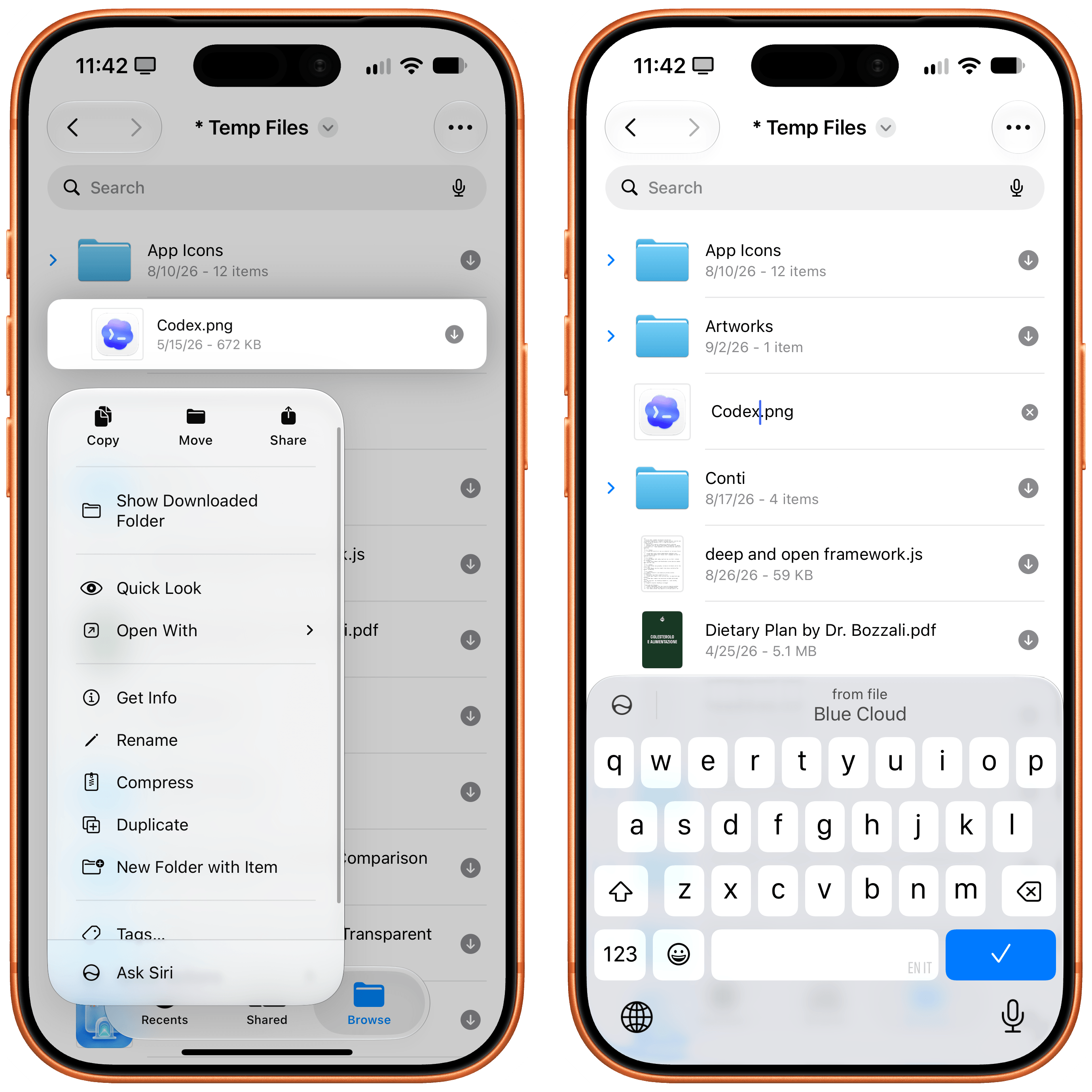
That’s not necessarily better than the actual filename I had, but it confirmed that the model is analyzing images before offering filename suggestions. Amusingly, when I tried to rename a photo of Liam and Noel Gallagher, the system came up with “Two People” as the name, but when I tried with a photo of my dog sleeping, it didn’t work.
For science, I also tried to prompt-inject this feature by leaving some instructions inside a text document I wanted to rename, and the model ignored them. Good job, Apple.
Find My
Continuing Apple’s streak of smaller additions throughout the OS this year, the Find My app has received a new option for location sharing and better support for pinpointing your location.
When sharing your location with someone, you can now choose a ‘Custom’ option that will bring up a date and time picker to share your location for an exact amount of time or until a specific date and time. This is great for conferences or vacations, for example, where you may want to share your location with other people but have it expire automatically at a specific time. It also works for quick sessions – the minimum duration is 15 minutes.
New location sharing options in Find My.
Additionally, in iOS 27, location sharing automatically picks the right device: your iPhone if it has an active phone number, or your Apple Watch if it’s a GPS + Cellular model.
Journal
I’ve long been the kind of person who wants to keep a journal, and I’ve never been able to stick to it. For a while now, I’ve thought that my problem is that I’m a writer by trade: after I spend all day writing and talking, I don’t want to sit down at the end of it and write some more about myself.
This is why the AI integrations in the Journal app for iOS and iPadOS 27 are especially interesting for someone like me. This year, you’ll find a new ‘Text’ icon above the keyboard (next to the smart journaling suggestions) that opens a panel of writing prompts. If you get stuck while journaling about your day or a particular activity, Apple Intelligence can help you keep going by asking questions related to what you’ve written so far. You can pick a question, which will be added to the journal entry in purple text, and then continue writing below it.
Generative prompts in Journal.
As with all generative text – and especially text generated by models that are not state-of-the-art in 2026 – some suggestions can be pretty good, others are kind of creepy, and some are just nonsensical. When I journaled about trying to finish this review in time, Apple Intelligence asked me if I felt stressed or how the rush would impact my day, and that was pretty good. But when I added a screenshot of my review workspace in Notion that had a pencil emoji, Apple Intelligence asked me if there was a deeper meaning behind it. And for another entry with separate photos of my dogs sleeping, Apple Intelligence – and I’m quoting this insanity below – asked:
What stories could emerge from the contrast between the two resting positions?
Buddy, they’re two pictures of my dogs sleeping. Don’t try so hard.
I’ll also note that journal entries now show timestamps in addition to dates, which I’m very surprised was not the case before.
I can’t believe I’m typing this, but Apple fixed Mail search in iOS 27 thanks to the new indexing behind Siri AI, and I’m now at the point where I may seriously consider switching to Apple Mail again. From my perspective, this is the biggest plot twist of the app story in iOS 27.
As part of this year’s focus on system-wide performance improvements and the new indexing that powers Spotlight and Siri AI, Apple completely re-engineered the Mail app’s architecture to support faster message loading and vastly improved search that finds relevant messages more quickly, with optional support for natural language queries. This has been a recurring frustration across my entire history of iOS reviews: Apple Mail’s search was never good enough. It was slow, it could never find what I was looking for, and as soon as AI integrations for Gmail started coming out two years ago, it seemed like I would be done with Apple Mail forever and use third-party services instead.
Lo and behold, they actually did it with iOS 27. The new indexing works and the search is great – it’s as simple as that. I’ve been able to find messages from 11 years ago in just a few seconds, and the app’s improved search suggestions do a nice job of highlighting the most relevant and recent messages from a specific contact while still showing you historical results from previous correspondence. And it is fast: on my iPhone 17 Pro, results from a decade ago appear as I type, and when I open an old message that I would assume is not in the system’s cache, it loads in less than two seconds.
Mail search actually works in iOS 27.
Even nicer: you don’t have to phrase your search queries too precisely to find messages. Thanks to Mail’s new ranking system and Apple Intelligence, the system will know what you mean if you type a sentence such as “Email from Myke in 2013”. Trying to search with this query in iOS 26 would return no results, whereas iOS 27 immediately found my first email conversation with Myke from 13 years ago.
This all comes together nicely when you combine the improved indexing and ranking of Mail with Siri AI. A few days ago, I asked Siri to find all emails from Google Search Console in my inbox and archive them. In less than 10 seconds, Siri AI asked me to confirm that I wanted to archive 40 messages and displayed a visual snippet. That was it. This kind of request would have taken at least a minute with a frontier model that would have pinged a Gmail connector and reasoned through the steps; Apple’s hybrid orchestration system did it in under 10 seconds because the data had already been indexed on-device. I’ve had similar positive experiences with Mail and Siri AI when searching for specific threads, asking to summarize the latest message in a thread, and more. Alongside Notes and Reminders, Mail makes for one of the best demos of Siri AI to date.
Siri AI is great at taking actions on multiple messages in Mail.
The Apple Mail engineers responsible for these improvements honestly deserve a round of applause this year. You know me: when I dislike something, I don’t mince words, but when I like something, I’m not shy about that either. As things stand in iOS 27, I genuinely believe Apple went from having the worst search of any native email client on iPhone and iPad to the best, if you consider privacy, speed, on-device processing, and just how nice everything looks with Liquid Glass. A plot twist, indeed.
There are some other additions to the Mail app worth mentioning. App integrations are making their debut in the form of the same suggestions seen in Messages, which I will cover later. If you’ve enabled order tracking via Wallet, the integration in Mail will now show you links to manage or track an order in Safari in addition to opening it in Wallet.
New order tracking options in Mail.
Lastly, Apple Mail now also integrates with ‘Write with Siri’, and the system supports composing and editing messages in your own style based on context. I don’t like doing this personally, but I think it’ll be a popular feature with lots of users.
I did not expect a comeback story with Apple Mail in iOS 27. If you haven’t played with Apple’s email app in a while, now’s the time to take it for a spin again. Just let it index for a few days first.
Messages
Much to my surprise, the Messages app is having a relatively quiet year with iOS 27. As with the rest of the system, there are small improvements across the app, but there’s no single “big” feature in Messages for the first time in a while.
Let’s begin with Justin Bieber having mastered the art of filing feedback with Apple. Everyone knows that the best way to effect change is to complain loudly about an iOS feature on social media, which Bieber eloquently did last year when he voiced his keyboard dictation concerns on Instagram.
In iOS 27, you now have the option to hide the dictation button from the Messages text field so that you, or Mr. Bieber, won’t accidentally press it anymore. To do this, head over to Settings → Messages → Show in Text Field, and you’ll get options to show a button to record an audio message, start dictation, or – finally – ‘None’.
Not only is this a welcome tweak to the compose experience in iMessage, but we should all be relieved that Mr. Bieber won’t get to put John Ternus in “a rear naked choke hold”. The new Apple CEO lives to fight another day.
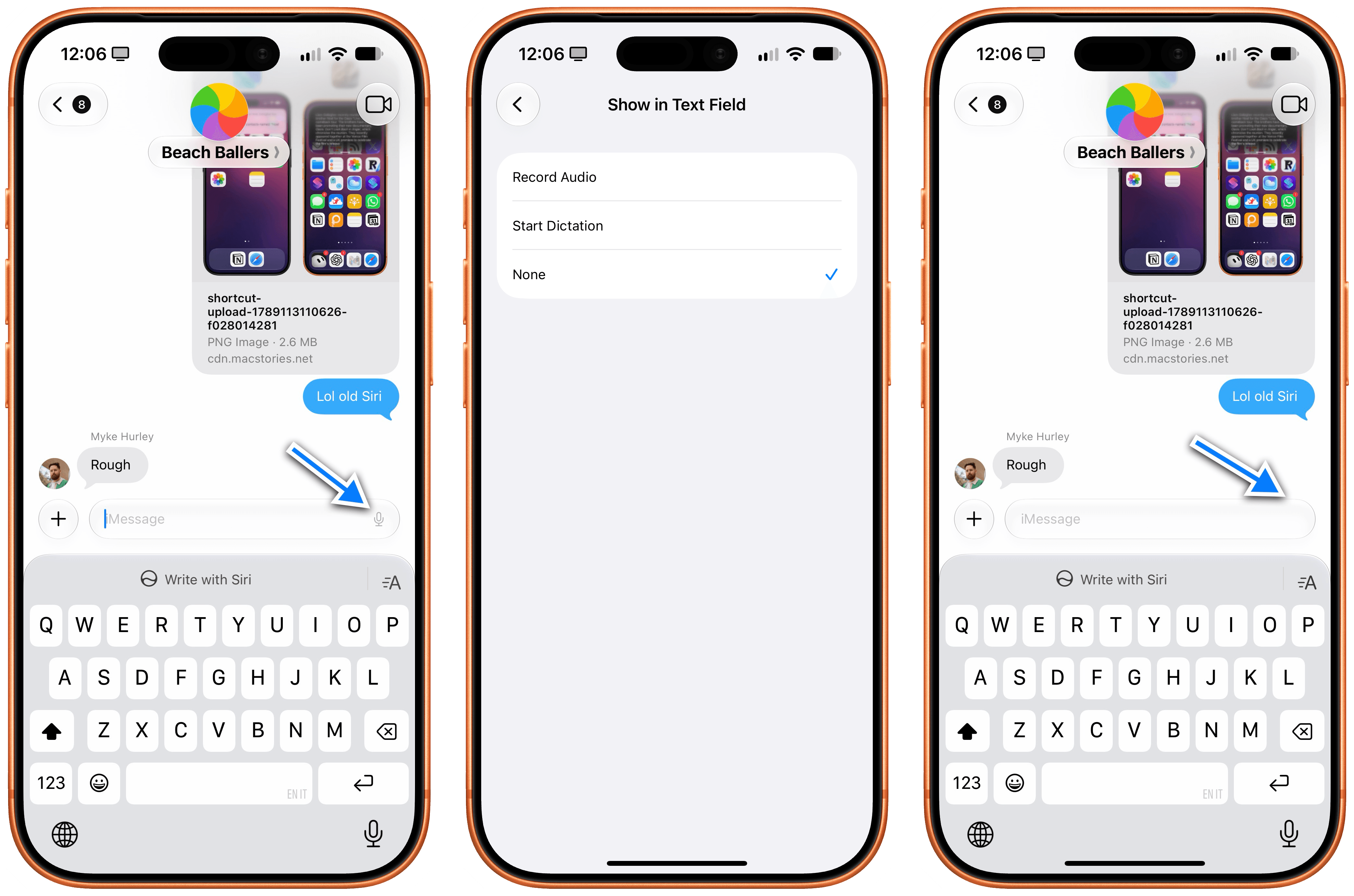
Thanks, Bieber.
Moving on to non-threatening feature additions to iOS 27’s Messages app, Apple has now consolidated Tapback reactions in notifications. When multiple people in a group chat send the same reaction to a message, instead of getting separate alerts for them, the system will coalesce them in the same notification. It’s a small thing, but it’s nice to have.
Lastly, the Drawing app. This is a new app in the iMessage app drawer that lets you draw with native PaperKit tools (the same ones seen in Notes and Freeform, which third-party developers can now use too) to send drawings to your friends.
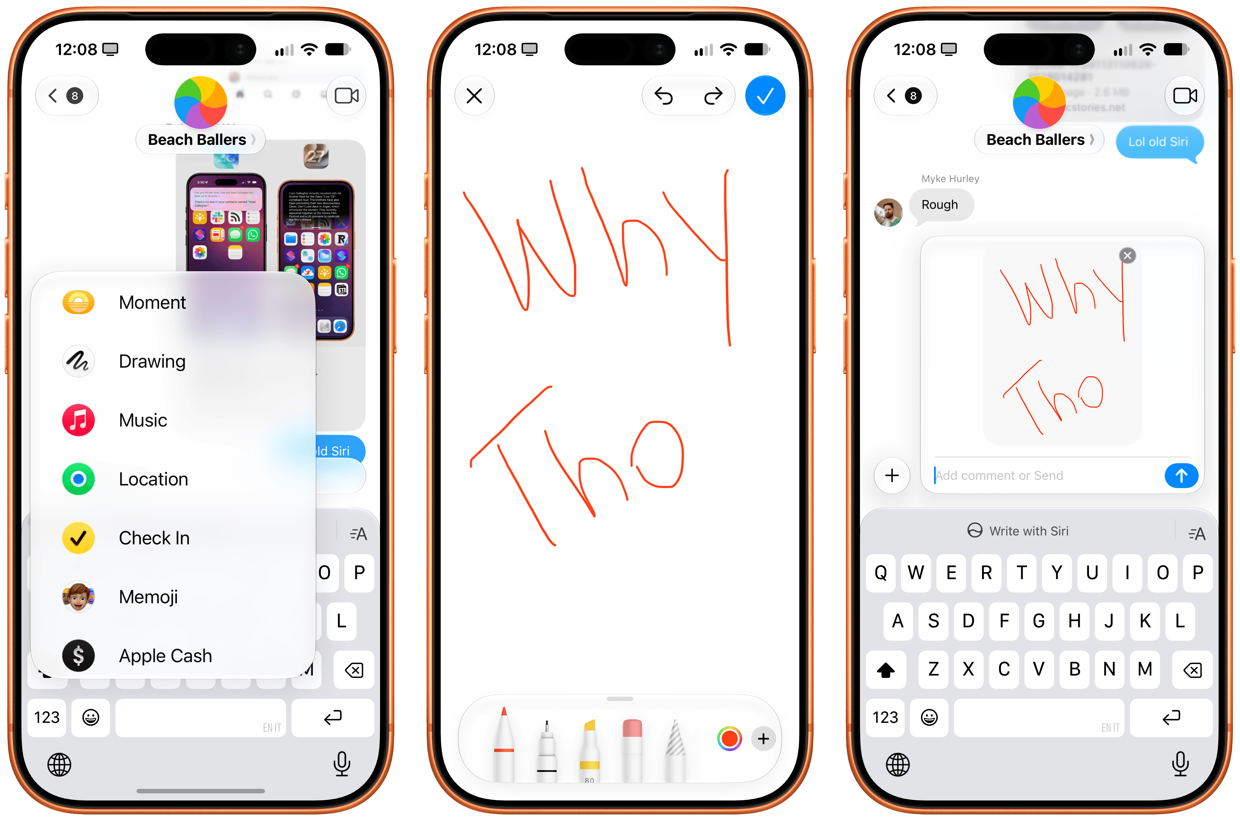
Sure.
Why does this exist? Who at Apple is constantly sketching in iMessage and pushed for this?
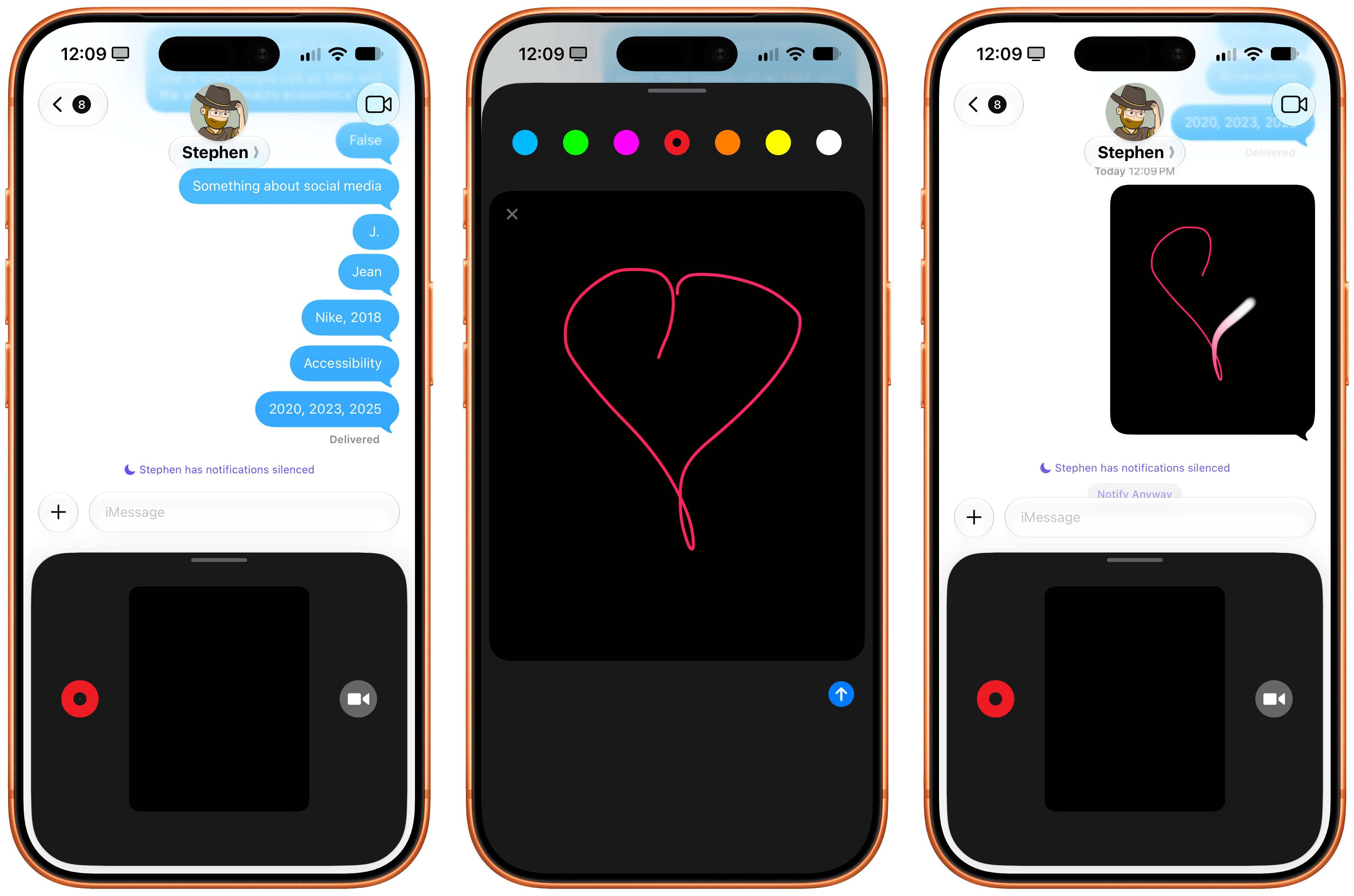
“This is it. You send your heartbeat. It is racing, thumping. Your crush sends their heartbeat back.”
And more importantly: why does Digital Touch also still exist?
Music
As the kids say these days, Apple Music continues to “mog” Spotify in the design department, and the iOS 27 version is so much better-looking than Spotify for iPhone, it’s not even funny anymore.
In iOS 27, Apple has redesigned artist pages with extended artwork whose color bleeds through the entire page, and put buttons to read an artist’s bio, play their top songs, and favorite them front and center. The result is dramatic and makes the old Music app feel like it was designed a decade ago.
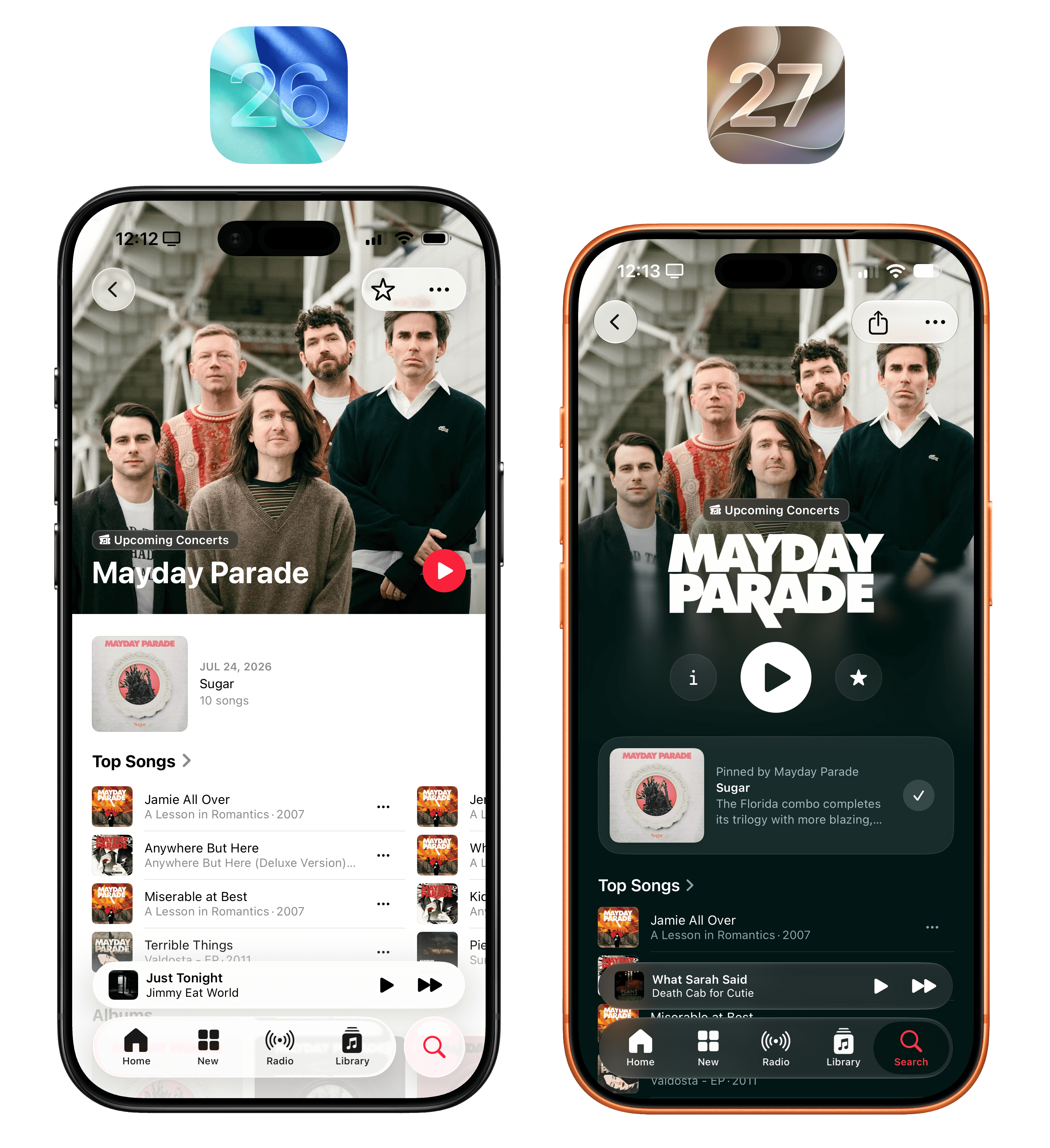
In addition to redesigned artist pages, Apple is also letting artists upload their own custom logos, as seen with Mayday Parade here.
I highly recommend taking a tour of different artist pages in Apple Music and looking at the enhanced art and motion effects the company has sprinkled throughout the catalog. No music streaming service looks as nice as Apple Music does, especially in iOS 27 – not to mention the app’s state-of-the-art real-time lyrics support, which continues to be one of my key reasons for not using Spotify.
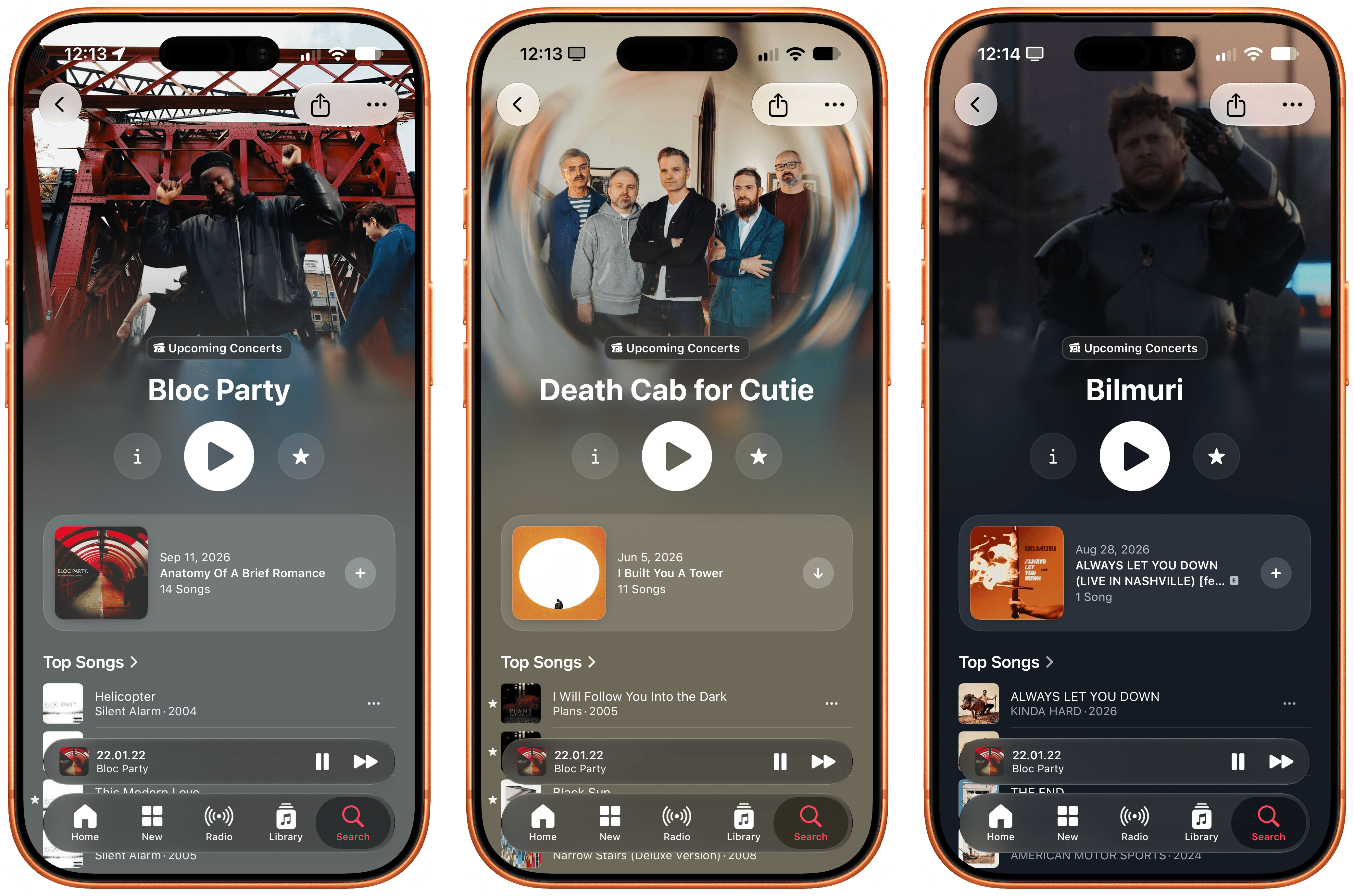
I mean, this is outstanding design.
Also new in iOS 27: there’s landscape support in the Now Playing screen on iPhone (we all know why this was added in a bunch of system apps this year) as well as improved transitions for AutoMix, which I don’t use because I’m too old for it.
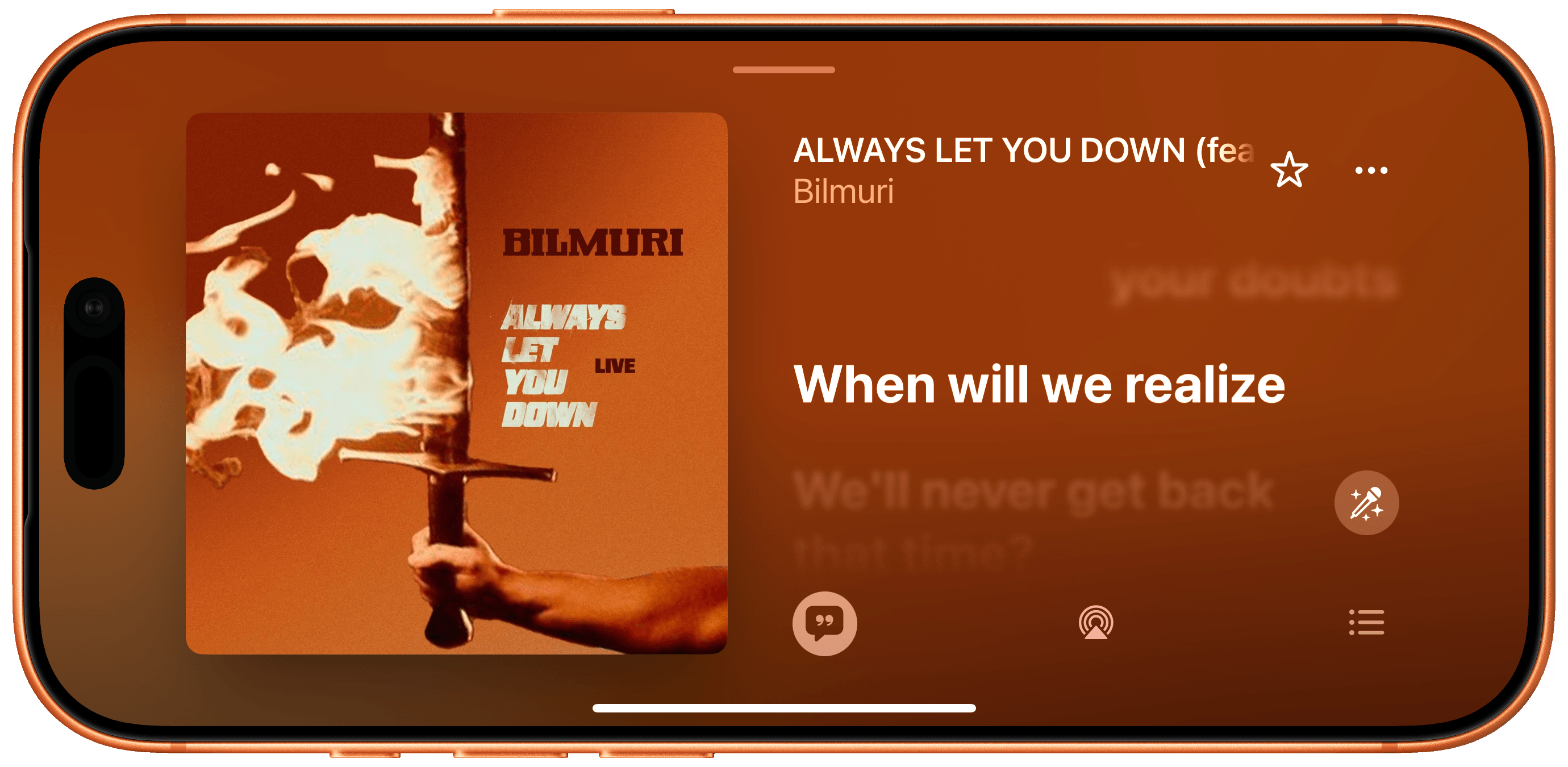
This is so good on a MagSafe charger.
The one blemish of the Music app in iOS 27 is, unfortunately, its Siri AI integration. I don’t know if the Music or Siri team is to blame here, but conversational music playback and search with Siri AI is a far cry from the outstanding experience of Apple Mail. While Siri AI can play specific albums or playlists in your library quite reliably, the same can’t be said for searching Apple Music or extracting information from the service’s catalog. When I asked to play some of Oasis’ ‘Live 25’ songs, Siri AI queued 25 songs from Oasis instead, and that tells you everything you need to know.
I hope to see much deeper integration between Apple Music and Siri AI in iOS 28.
Notes
While working on NotesCTL, my upcoming Apple Notes CLI for people and AI agents, I’ve been using the Notes app more as a capture system that sits in front of my intricate Notion workspace. I’ve long regarded the modern Notes app as one of the best of Apple’s built-in apps for iPhone and iPad, to the point where, over the summer, I even considered writing this entire review in Notes.
In iOS and iPadOS 27, in addition to excellent integration with Siri AI, Notes is getting some smaller improvements that, while not groundbreaking, will make power users happy. Perhaps they’ll even convince some of them to switch back from other note-taking apps.
Let’s start with the smaller things. In Notes’ action menu (open the copy and paste menu, then swipe left), you’ll find a new ‘Insert Divider Line’ option that, well, inserts a line in the current note.
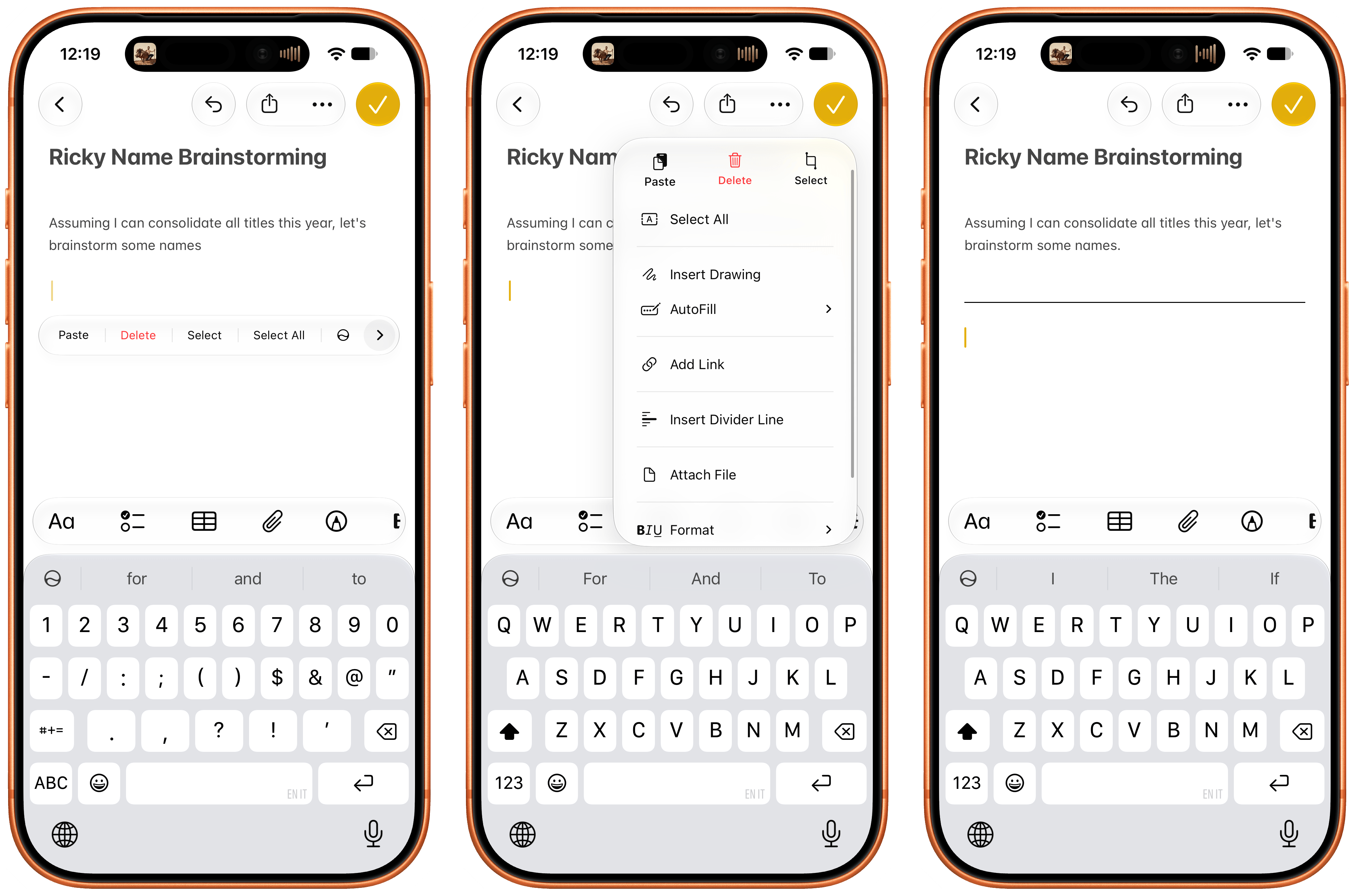
If you’ve ever worked on longer notes containing multiple sections, you know that this is actually a nice thing to have. Interestingly, divider lines are also backward compatible with devices running iOS 26: on those devices, divider lines will render as three dashes (---).
The ability to deeplink to a specific note inside the Notes app, introduced in iOS 17, is expanding in iOS 27 with support for linking specific sections of a note as well. As always, you can create an internal link to a note either via the ‘Add Link’ menu or by typing >> to bring up the inline note-linking tool. After selecting a note in the quick menu, if the note contains sections (headings), you can hit / to drill down into the contents of the note and select a particular section you want to link to.
Creating section links in Notes.
When creating section links from the full-blown ‘Add Link’ menu, you’ll find a dedicated ‘Link to Section’ page that lets you preview and navigate all sections contained within the note:
As with divider lines, these links cannot be created on iOS 26, but they are backward compatible with it. When you tap one of these links, you’ll be taken directly to the linked section of the destination note, which will be briefly highlighted on screen. This is a fantastic improvement to the Notes app, and it’ll make it possible for folks to create rich “table of contents” notes and Notion-like dashboards that cross-link to specific sections of other notes in the app. I love it.
Then, there’s the feature I did not expect to see in the Notes app, ever: integration with Markdown.
Support for the popular plain-text formatting standard has been implemented by Apple in a couple of different ways. You can export an entire note as Markdown from the share sheet. Doing this will convert every element of a note to Markdown, including tables and colored text, which makes Apple’s flavor of Markdown compatible with popular forks such as MultiMarkdown and GitHub Flavored Markdown. Even more interesting, however, is the fact that Apple Notes can export notes with attachments, which will be stored in an /Attachments subfolder and referenced within the Markdown text as an inline link. This is what I mean:
Exporting Markdown from Notes preserves local attachments, too.
This is a solid decision: it means that you can now export a rich-text note from Apple Notes, grab the resulting folder, load it up in apps like iA Writer or Ulysses, and every reference to every attachment will load correctly. Even Apple Pencil drawings survive the Markdown export: they will be rendered as high-fidelity PNGs and stored in the Attachments folder. At this point, nothing is stopping you from creating a shortcut that takes a rich-text note from the Notes app, uploads images from the Attachments folder to a CDN, replaces the local references with a public HTTPS link, and gets that Markdown ready for publishing on a blog. I’m just saying.
I continue to be amazed by the progress that Apple has made in the Notes app in recent years. The app can now be used as a serious productivity powerhouse, which is why I’m building NotesCTL and look forward to releasing it soon.
I wouldn’t put it past Apple to copy Notion and add support for databases and properties to the Notes app. Stranger things have happened to this app, which is way more powerful than you’d expect given its humble origins nearly two decades ago.
Phone
The one addition to the Phone app this year is Call Context, which is another enhancement powered by Apple Intelligence. This feature is designed to surface relevant information about a contact or business while you’re on the phone with them; in my limited experience with this, it does work as advertised.
According to Apple, this feature will bring up reservation codes and confirmation numbers while you’re on a call with a business, but since I fundamentally dislike jumping on a phone call with hotels or airlines and prefer email or WhatsApp, I have not been able to test this.
Call Context did work when I was on the phone with a contact whose birthday it was. Mind you, the contact was my mom, so I didn’t really need a reminder. Regardless, I thought it was nice that the Phone app embedded a birthday popup and cute animation in the call screen, and I imagine this could be useful if you’re on a call with an acquaintance or a distant relative and want to pretend you remembered it was their birthday all along.
They’ll never know. Apple Intelligence will.
Photos
There are several additions to the Photos app this year, which can be categorized into three buckets that encapsulate iOS 27 as a whole: small quality-of-life features, performance improvements, and AI. Personally, I really like the first two categories, and I strongly dislike the AI features added to Photos; I find them pretty gross.
The Photos app is much faster than before, with new photos and videos loading up to 70% faster after they’ve been captured. I haven’t verified these claims with a stopwatch, but, anecdotally, the claim holds up. I took a lot of photos and videos this summer, and as soon as I opened the Photos app, the thumbnails were already there and I could open each item to view it in full screen immediately.
Apple’s focus on performance has also paid off in the search index, with up-to-date results that surface faster than before. To make search even more personal, you can now add custom keywords to photos and videos. To do this, swipe up on a photo to open the inspector, scroll to the bottom, and you’ll find a text field that lets you enter multi-word keywords. These keywords will show up in search results immediately, and they’re a nice way to find items with specific words that may not be supported by Apple’s search engine by default.
Adding keywords to photos in iOS 27.
Speaking of photos showing up immediately: iOS 27 also brings a new option to prioritize iCloud sync for the rest of the day if you want to make sure that items upload to iCloud right away. To enable this, go to Collections, tap your profile picture at the top, then choose ‘Sync Immediately’ and set it to ‘For Today’. As Apple explains, this feature will affect performance and will be automatically disabled when Low Power Mode or Low Data Mode is turned on; in my experience, it’s been a great time-saver when working on this review to ensure that screenshots would sync across my devices as soon as I took them.
The smaller tweaks to Photos are my favorites this year. I have to start with one of the all-time greats returning to iOS: the Camera Roll is back. Well, sort of. In iOS 27, if you want to just see photos and videos you’ve taken and nothing else (no screenshots, no downloaded images from the web, etc.), you can press the filter button at the top of the screen and choose ‘Captured by Me’. Doing this will filter the main view of the Photos app to what it used to be: a beautiful grid of just your photos and videos.
Finally, a Camera Roll.
This feature is awesome, but I’m bummed that it can’t be made a default view option of the app. I want Photos to always load like this; instead, when you quit the app and reopen it, you’ll have to re-apply the filter manually. Since this is one of the best “hidden” features of iOS 27, I feel pretty confident that lots of people will ask for it, and Apple will add a way to make the original Camera Roll the default view, in all its glory.
Another longstanding limitation of Photos that’s been addressed in iOS 27 is the inability to save frames of videos as images. How many times have you had to quickly and precisely take a screenshot of a video to freeze an exact frame from it? No more. In iOS 27, you can simply pause a video, press the ‘…’ button in the top-right corner, and choose ‘Save Video Frame as Photo’. Unlike screenshots, the resulting image will be saved at full resolution with metadata from the original video. This is exactly what I wanted Apple to do, and I have no notes.
And how often have you ended up taking a picture of your passport or driver’s license again because you knew you had one in Photos, but you couldn’t find it? This has also been solved in iOS 27 with the new ‘Identity Documents’ collection. This section aggregates all pictures of IDs you’ve taken over the years. It’s not perfect since iOS 27 recognized Volume 1 of my Berserk collection as a government ID but, hey, who hasn’t wished to be Guts every once in a while?
I’ve never been into star ratings, but they’ve found their way to Photos for iPhone and iPad. I’m fully aware that some people like to meticulously rate their music and photos, and because of that, I think Apple is doing the right thing in bringing the feature to the Photos app. After enabling this feature in the redesigned settings screen for Photos under Settings → Apps → Photos → View Options → Rating Controls, you’ll see a star badge appear at the top right of a photo when viewing it in full screen. You can tap that to give the photo a star rating, which can later be used as a filter in the main Library tab. Since I’d give all photos of my dogs five stars anyway, I wouldn’t know how to properly take advantage of this.
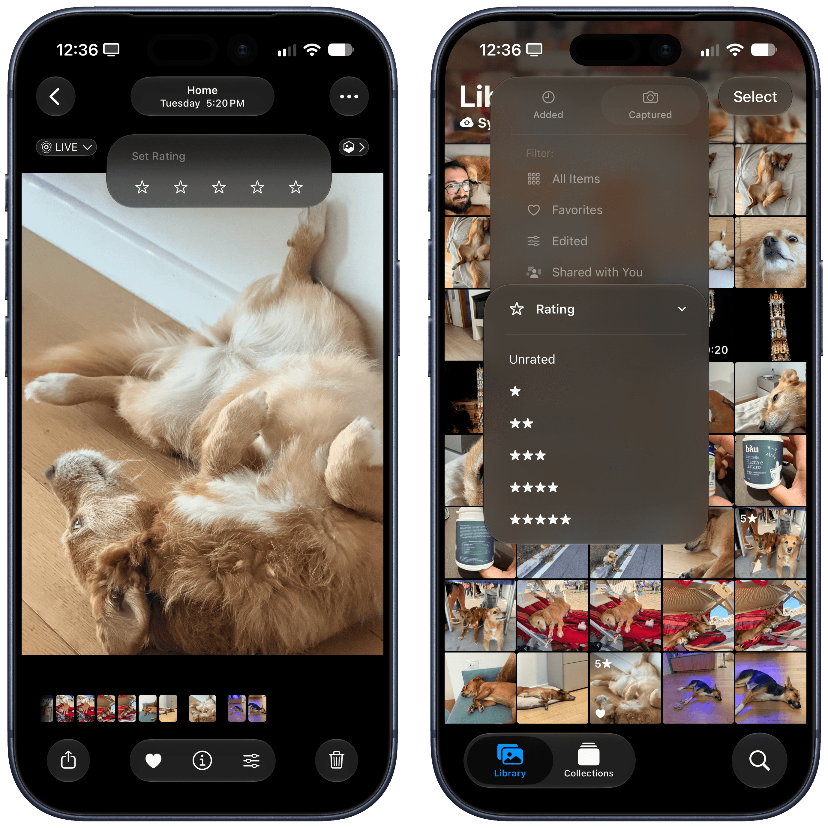
I think there’s a bug with this feature? All my dog photos are getting five stars.
Another feature that I never use is shared albums (not to mention the shared library), but I should note that they’re getting some welcome enhancements in iOS 27. iCloud shared albums now support full-resolution sharing (imagine my surprise when I learned that it wasn’t the case already), and they can be set to expire after 30 days, giving other people a chance to get those photos after, say, a vacation, without cluttering your library forever.
Which brings me to the three Apple Intelligence features added to the Photos app: Spatial Reframing, Extend, and Clean Up. I find the first two kind of gross and useless (and I’ll explain why shortly); the third one already exists in iOS 26, but it’s been improved in iOS 27 with a ‘High Quality’ mode for detailed edits.
The new Clean Up, like the other AI features, can be accessed from the new Tools menu (the one with an Apple Intelligence logo) when viewing a photo. After you select it, you’ll see a loading bar while the model used by Clean Up is prepared. Clean Up defaults to an auto mode, which, as the name implies, automatically determines whether it should use a “fast” version of Clean Up for quick touch-ups or a “high quality” one for detailed work.
Objectively speaking, Apple’s claims that Clean Up has been overhauled in iOS 27 thanks to the new Foundation models hold up. When I tried to edit a photo of my dog and brushed over a flower vase in the background, iOS 26’s Clean Up removed the entire dresser the vase was on top of, and it left a smudgy mess in the picture. With the same gesture using iOS 27’s high-quality Clean Up, only the vase was removed.
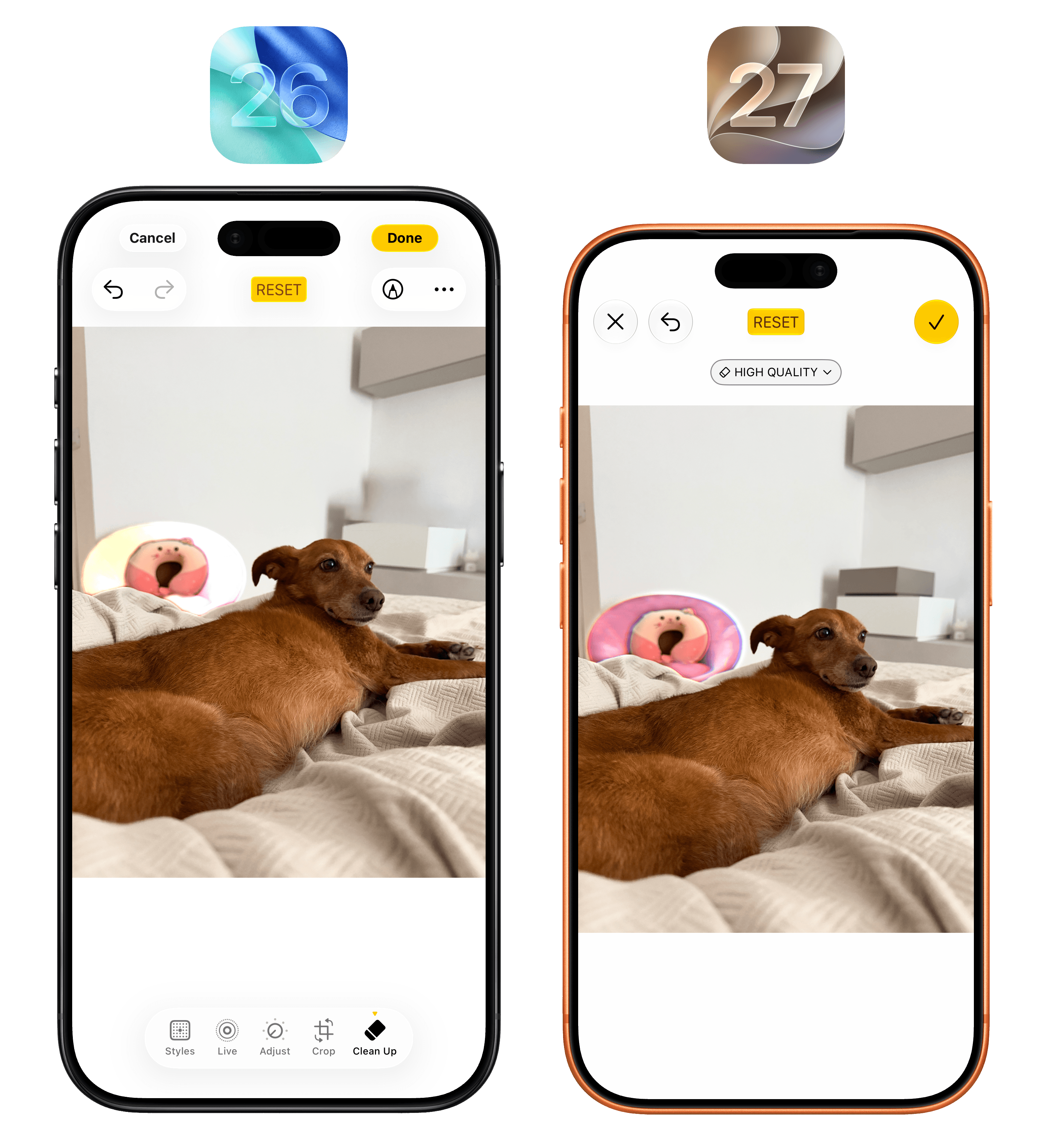
See, I like Clean Up, and I use it frequently. So why don’t I like Spatial Reframing and Extend? Simple: while Clean Up is about touch-ups that remove small details of a photo without fundamentally altering its nature, I find generative features such as Apple’s Spatial Reframing and Extend, or what Google does on Pixel phones, to be slop generation machines for my memories.
Extend is a generative fill that uses a diffusion model to imagine pixels outside the bounds of an original photo. It just makes up what it “thinks” may have been around a subject in a photo, thereby altering a memory with whole scenery, structures, or objects that simply did not exist. Spatial Reframing is even stranger: it lets you adjust the composition and framing of a photo by twisting and rotating subjects, thus also imagining parts of an image that were never captured by you.

Oh no.
Although I use AI for so many things in my life, generative applications of it for images, music, creative writing, and, yes, memories aren’t areas I’m remotely interested in. I understand why Apple feels the pressure to add these options to their apps now given the competition and their marketing campaigns, but you won’t find a detailed explanation of these features in my review.
Reminders
The Reminders app – which is my primary task manager thanks to my own Reminders CLI – is getting some very minor updates in iOS 27.
The natural language creation I described in the Calendar section is also in Reminders, and it’s just as bad there. If you’re looking for an excellent natural language utility for fast task creation on iPhone and iPad, I can’t recommend Remind Me Faster enough.
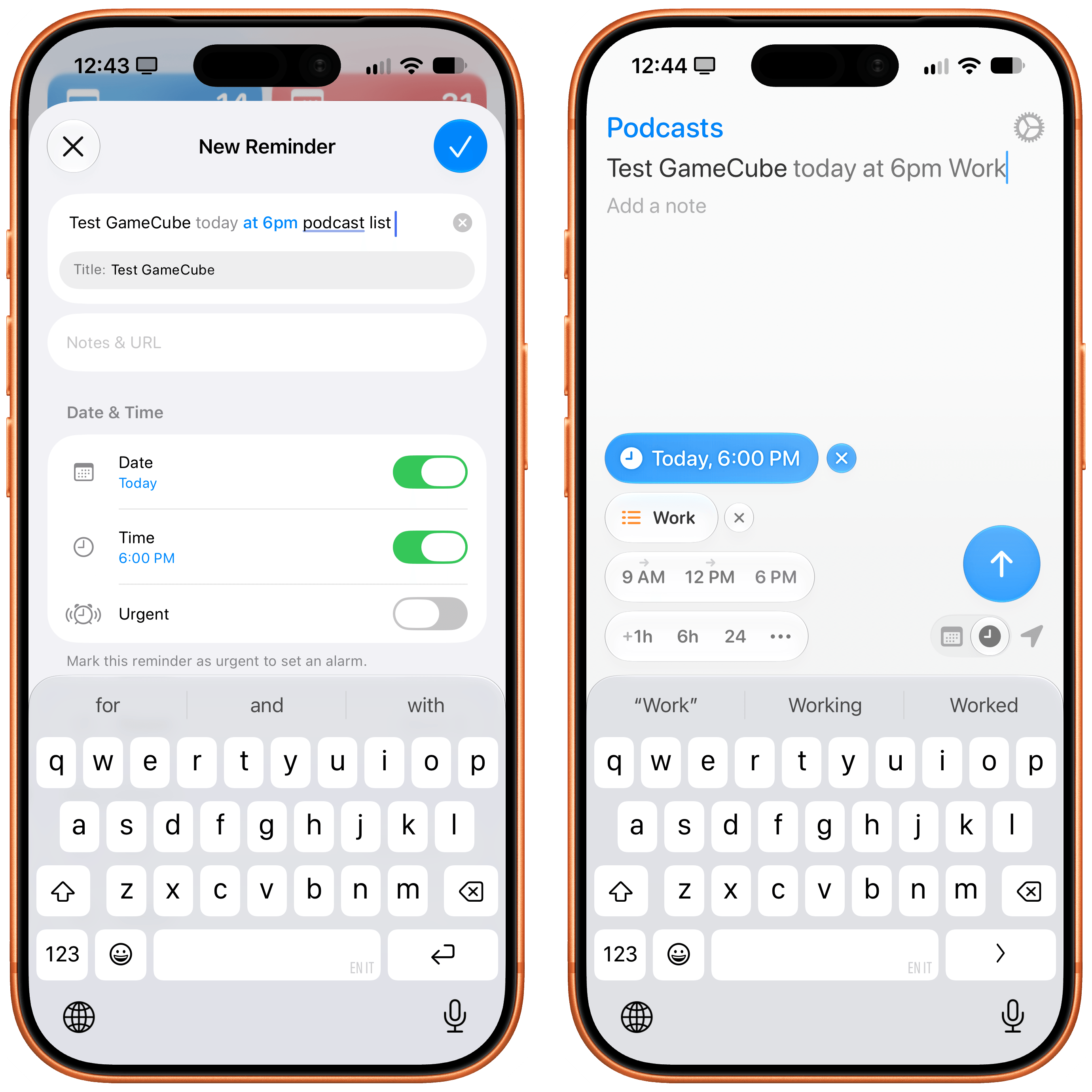
Remind Me Faster is still the best natural language entry utility for Reminders on all Apple platforms.
There’s a redesigned inline metadata editor: when you tap a reminder, the old toolbar above the keyboard has been replaced by small buttons at the bottom of the selected item’s card, which include more options than before. Alas, there is still no shortcut to quickly change the list a reminder belongs to.
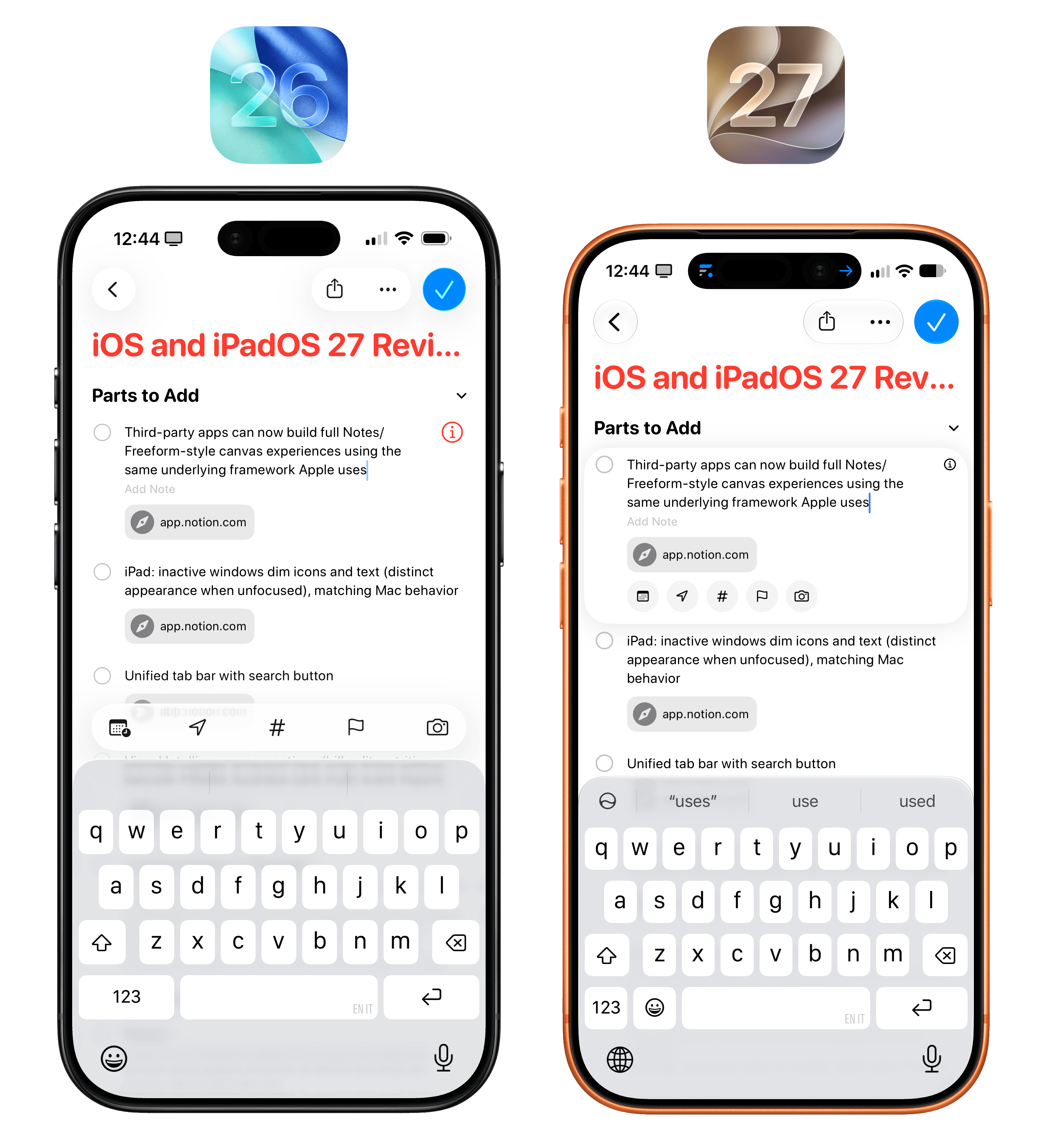
Lastly, Apple claims iOS 27 features improved organization for items in grocery lists, but since I use my iPhone in English and live in Italy, I haven’t been able to test this for myself. (If you use Reminders in English, groceries in other languages won’t auto-organize.)
Safari
Aside from technical improvements to WebKit, which are beyond the scope of this review, there are three additions to Safari for iOS and iPadOS 27: AI-powered tab organization, AI-powered extension creation, and the ability to get notified when content on a website changes.
I’ll start with the last one, which has never worked for me in my testing over the summer. With the new ‘Notify Me’ feature of Safari, you can describe a change you’d like Safari to look for on any particular webpage, and set a frequency: hourly, daily, weekly, or monthly. Once you’ve described the change and set a schedule, Safari will start monitoring the selected page, and, in theory, should notify you when the change is detected.
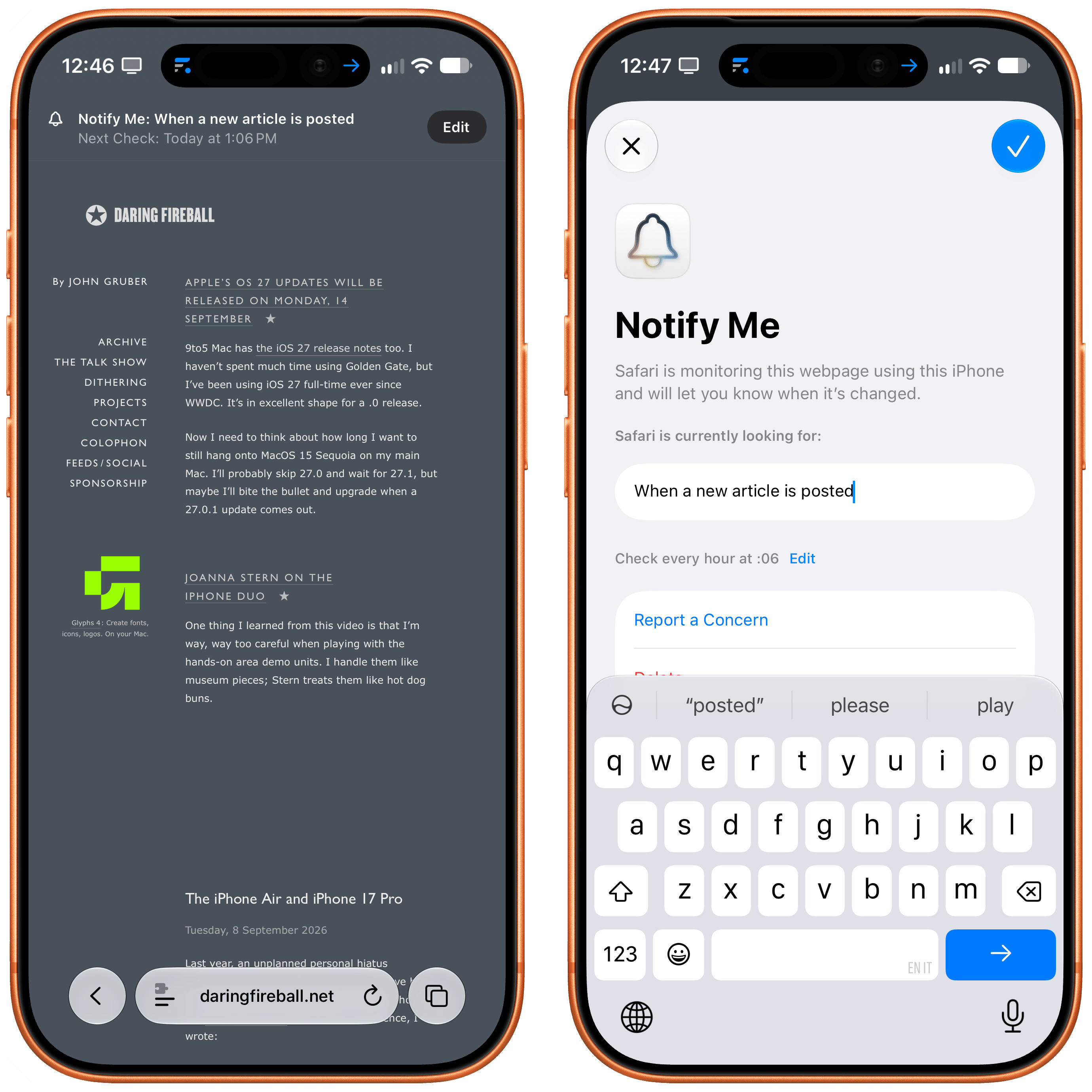
I’ve tried to test this feature with some blogs I follow by asking Safari to watch for “new articles posted”, and I’ve never been notified about any of them. I like the principle behind this addition: by using a combination of AI and Safari in the background, iOS can let you know if you’re missing out on any important new information added to, say, your kids’ school dashboard or a particular item that went on sale. I just hope Apple can improve the heuristics behind it so that it starts working for different types of websites. Your mileage, of course, may vary.
Next up is Apple Intelligence-powered tab organization into topics, which is…passable, but not great. The idea, once again, is sound: wouldn’t it be nice if AI could automatically tidy up your tabs and create topical tab groups for them? This feature works, but its results can be very generic, and can’t be improved or refined with additional prompting or custom instructions (a common refrain in the Apple Intelligence and Siri AI story this year).
For starters, you have to go hunt for this feature: in Safari’s tab overview, tap the filter button (the three horizontal lines), and you’ll see an option to ‘Organize Tabs’. Once enabled, Safari will start organizing related tabs into topics.
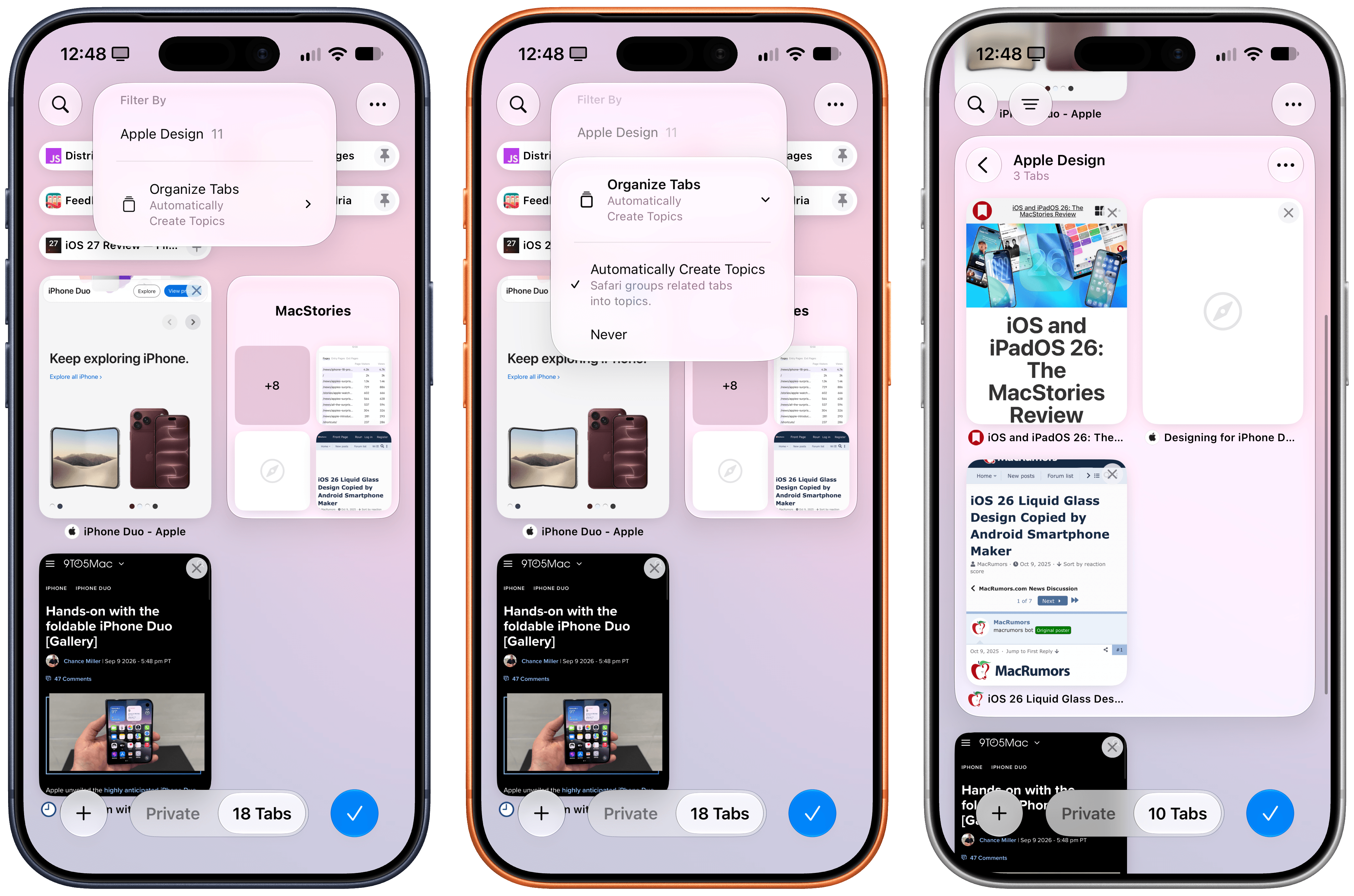
My issue with this feature is that it can be unreliable and it’s impossible to manage. Sometimes, I’m looking at a collection of tabs that are clearly related, and Safari just doesn’t organize them. There isn’t a button to ping Safari and tell it to organize those tabs, so you’re left staring at the Apple Intelligence abyss and wondering why it’s not working. Other times, tab organization does work, but the topics are so bland, they might as well not be there. If I’m opening 10 different MacStories tabs, with five about hardware and five about iOS, you’d think that Safari would organize them as “Hardware” and “iOS”, not throw all 10 of them into “MacStories”.

Since I’ve tested my fair share of AI browsers in the past year, I strongly believe that for AI-based tab grouping to be useful, it needs to be customizable. Let me assign rules or instructions to the browser! Without personalization, and with models that have small context windows and likely can’t process too much tab content at once, we’re left with pretty generic tab topics that aren’t that useful.
The last addition to Safari also marks Apple’s entry into the vibe-coding/“personal software” space for consumers with the ability to create your own Safari extension by describing it. Alas, like the other AI features in Safari, this has been very broken for me during the course of the iOS beta, to the point that – as of the release candidate – I was unable to create any extensions in Safari.
Again, the theory makes sense: you want to make a fun or productive tweak to Safari? Just describe the extension you want in natural language, and Safari will make it for you. In practice, I can’t comment on this feature since, every time I tried making an extension, Safari would say “Unable to create extension” and recommend other extensions from the App Store instead. I think it’s a nice touch that Apple, despite shipping what is essentially a little vibe-coding product to eschew the App Store altogether, is still suggesting third-party extensions, but we have to wonder how long that’s going to last if the future of computing involves the ability to just create any software you want, the moment you need it.
Anyway…that’s a topic for another time. For now, I hope Apple can get this feature working.
Shortcuts
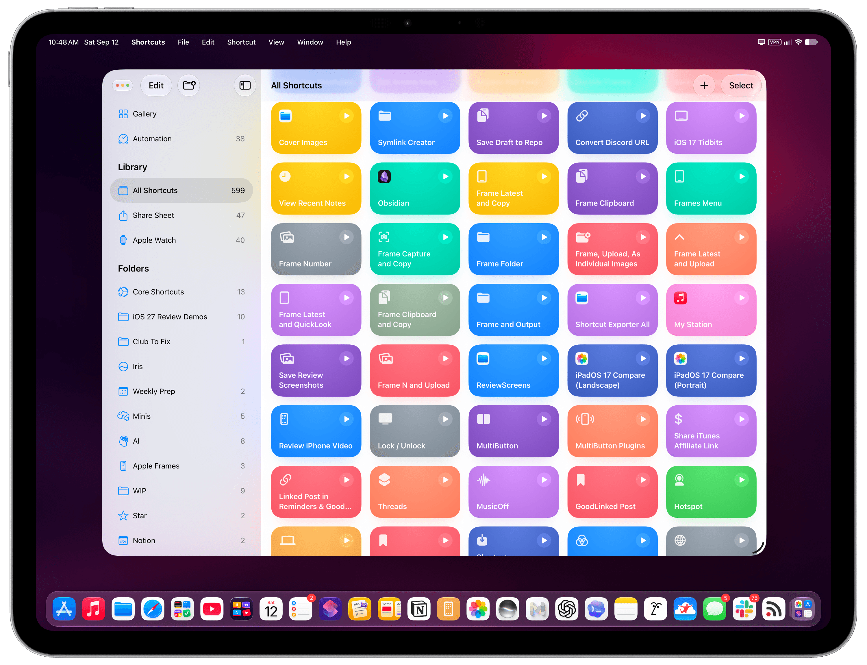
I decided to close out this chapter with my favorite Apple app of all time, which also happens to be the one that is receiving the most substantial updates in iOS and iPadOS 27: Shortcuts.
Looking back at the past few years of Shortcuts coverage in my annual iOS reviews, I wouldn’t have guessed we’d end up here again. Year after year, I’ve used this part of the review to complain about the same thing: new actions added to Shortcuts were mostly about toggling settings and launching apps; there was very little in the app for those of us who have been building complex workflows in it since the Workflow days.
Shortcuts for iOS and iPadOS 27 is different. There are plenty of new actions this year, and a few of them – global variables, reading what’s on screen, Markdown in Notes – fix problems I’ve been working around for over a decade. More importantly, however, Shortcuts is once again paving the way for the future of productivity on Apple platforms, and I can’t even describe how happy it makes me to see Shortcuts thrive and expand as a tool that will democratize automation.
In a world where any workflow can now be automated with AI and agents, Shortcuts for iOS and iPadOS 27 isn’t bucking the trend: it’s embracing it with new ways to create shortcuts with natural language, actions to tap into Foundation models in the cloud, and deeper integration with Siri AI to easily trigger any of your shortcuts, no matter what you’re doing on your iPhone and iPad. Beyond that, Apple is turning the Shortcuts app into a codified, browsable library of all the capabilities of Siri AI that can be freely remixed by users.
There’s a lot to get through.
New Actions
Apple added a variety of actions to the Shortcuts app this year, addressing two features in particular that have been heavily requested in the automation community for years: the ability to store content in Shortcuts with optional global variables, and more flexible conditional blocks.
Store Content, Get Stored Content, and Delete Stored Content
Let’s start with the big one.
Shortcuts finally has a way to save a value and get it back the next time a shortcut runs. There are three new actions for this: ‘Store Content’ saves whatever you pass as input under a name you choose, ‘Get Stored Content’ retrieves it, and ‘Delete Stored Content’ removes it. This system has been elegantly designed so that it’s very intuitive to use, but at the same time flexible enough for power users:
- You can store all kinds of text and files with the new Storage actions.
- A stored value can be specific to the shortcut it belongs to, or it can be marked as “global”, meaning that all other shortcuts in your library can access it.
- At any point, you can open a shortcut’s inspector panel, then select Storage, and review the content stored in the shortcut and available globally. You can change the local or global nature of stored content later, too.
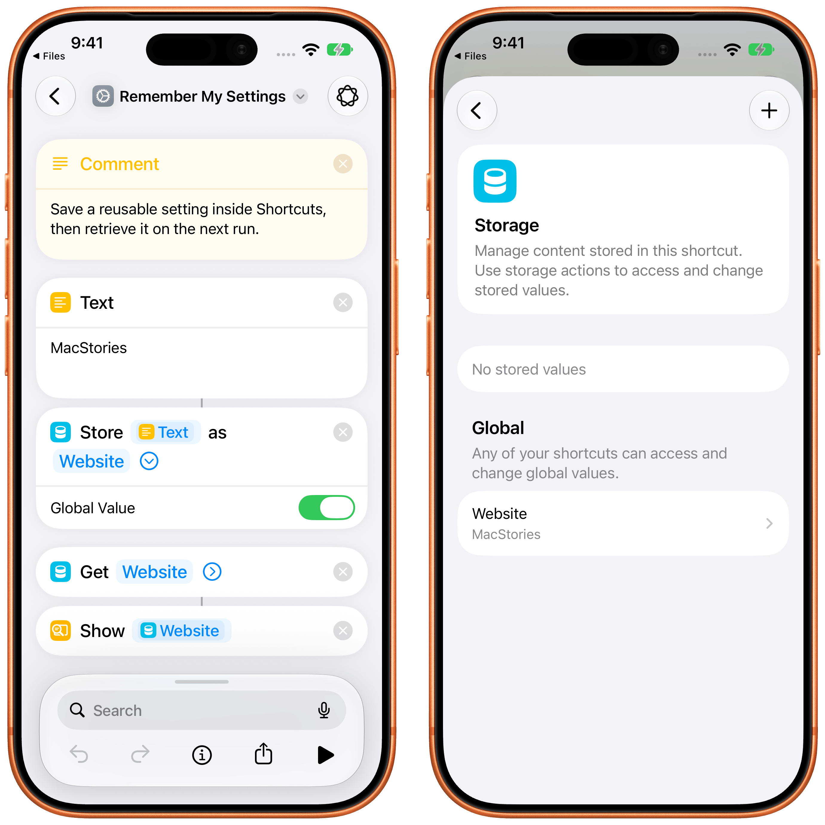
Storing content is now possible in Shortcuts.
If you’ve never needed this, it may sound trivial. Believe me, as someone who has created thousands of shortcuts over the years, it’s not. Until now, if you wanted a shortcut to remember a secure credential, the last item you picked from a list, or whether it had already run today, you had to save a text file in iCloud Drive, rely on a note in the Notes app, or install Data Jar. I have entire groups of shortcuts in my library that are mostly file-management utilities just to remember a single setting. Over the years, I have created increasingly complex systems to store assets for my Apple Frames shortcut, only to eventually give up and use the MacStories CDN. Almost all of that can go away now thanks to the ability to store content inside shortcuts.
I say “almost” because, alas, it’s not possible to use the Storage actions as a distribution method across multiple users. If I design a new version of Apple Frames to store assets inside itself and share that shortcut with my readers, they won’t be able to retrieve assets stored in my iCloud account inside my personal Shortcuts storage container. This makes sense, and I don’t fault Apple for designing a system that is going to be optimized for individual users, but keep this in mind if you plan on sharing shortcuts that embed content you want other people to use in their own Shortcuts apps.
I should also stress the importance of the ‘Global Value’ toggle. When you turn it on, the stored content is saved in a special shared space in iCloud, so any shortcut on any of your devices can read from and write to it. This is Apple’s take on global variables, a concept that’s been requested by fellow advanced users of the Shortcuts app on several occasions over the years. With this system, it’s going to be possible to store things like secure credentials, templates, and image assets directly within Shortcuts – no more base64-encoded strings, at last.
Get What’s On Screen and Get Selected Text
As part of on-screen awareness in iOS 27, Apple has completely rebuilt the ‘Get What’s On Screen’ action with support for multiple data types and more flexible configuration options for visible apps.
With the updated action, you can read one of the following data items visible on screen:
- Contacts
- Email Addresses
- Files
- Images
- Messages
- Notes
- Phone Numbers
- Postal Addresses
- Reminders
- Text
- URLs
- Voice Memos
- Webpages
Each of these variables does, of course, contain its own set of properties: inspect the variable for on-screen images, for example, and you can see whether it’s a screenshot or screen recording; get a reminder from the screen, and you can see the list it belongs to, or whether it contains images.
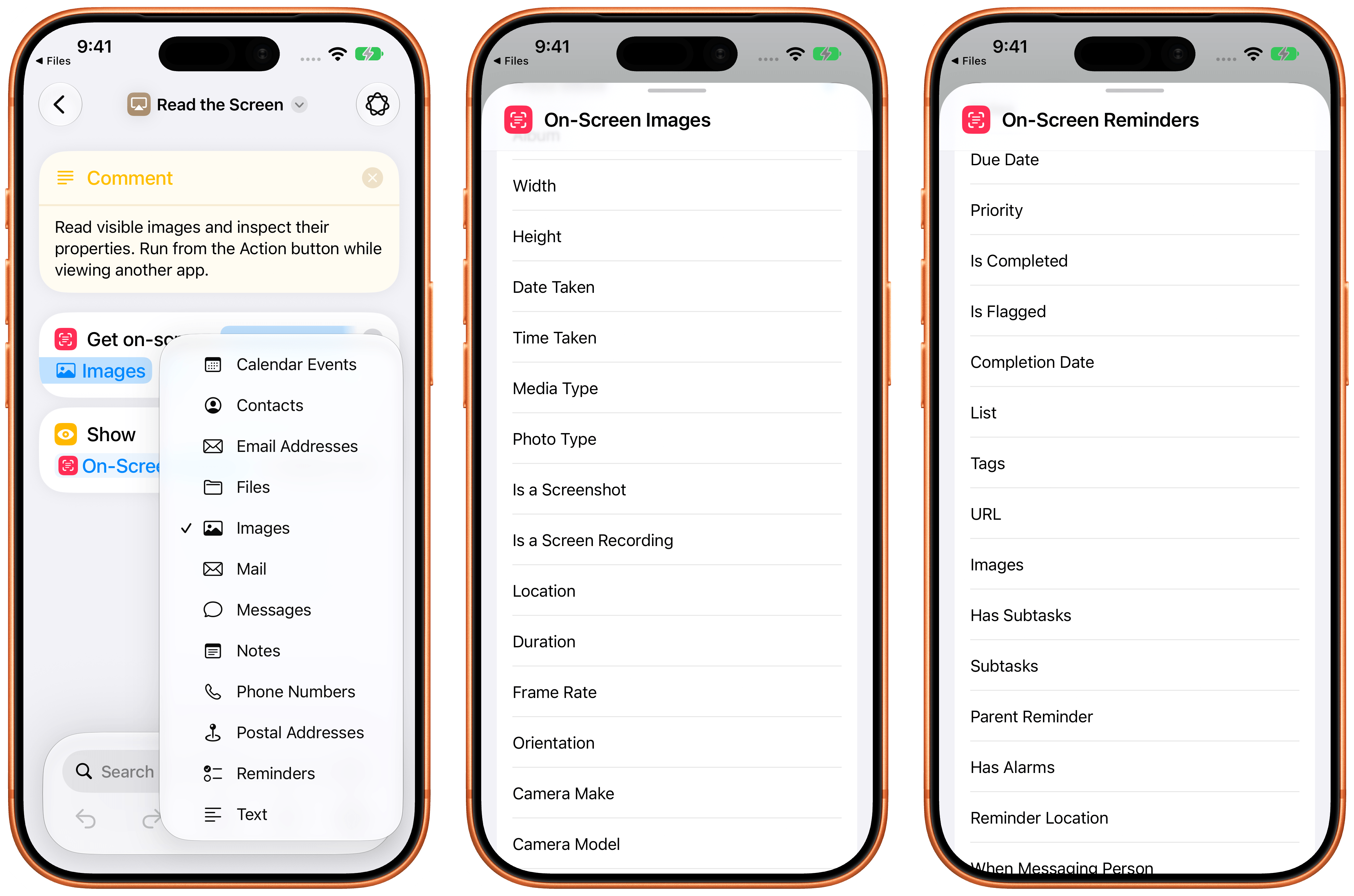
New properties for on-screen variables.
The possibilities of this new action are nearly endless: since it matches Siri’s on-screen awareness, you can do the same things as Siri AI, but programmatically and with controls designed by you. Even better, the action is fully compatible with iPads and the iPhone Duo: a toggle lets you choose whether you want to limit the scope to the visible app only or read from all visible apps.
There’s also another new action in this category: ‘Get Selected Text’. As the name implies, this action simply gets the text that is currently selected on screen – like the other action, it is best experienced when used via Siri and the Action button, or perhaps as a shortcut from the iPad’s Dock.
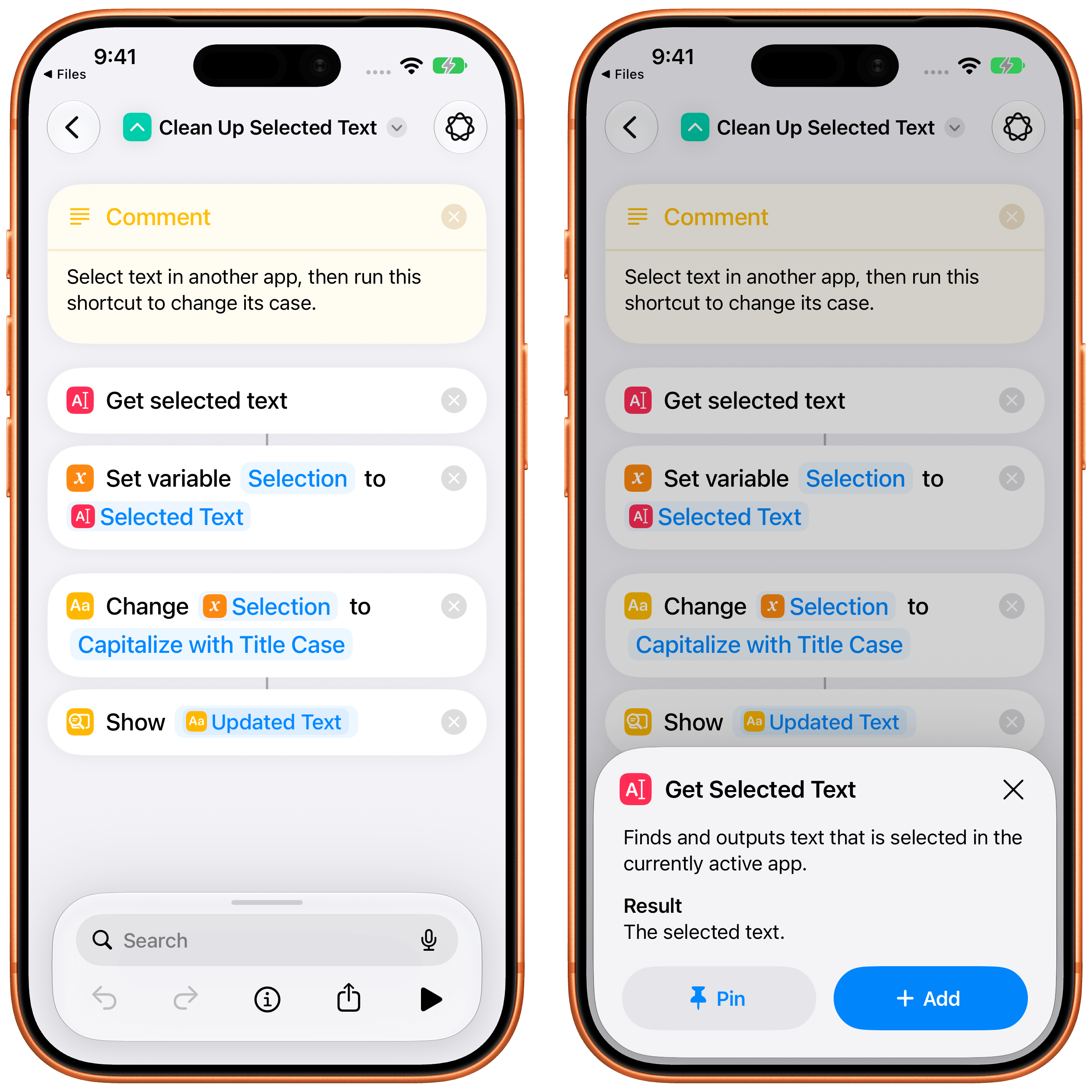
This action has no parameters. I’ve wanted this for years, mostly because it means text-processing shortcuts no longer have to go through the clipboard or the share sheet. It also means I can now make shortcuts that get Markdown text selected somewhere and publish that as an article on MacStories.
Add Item to List
Speaking of actions I’ve wanted for years: ‘Add Item to List’ can insert an item into an existing list variable at the beginning, the end, or a specific index.
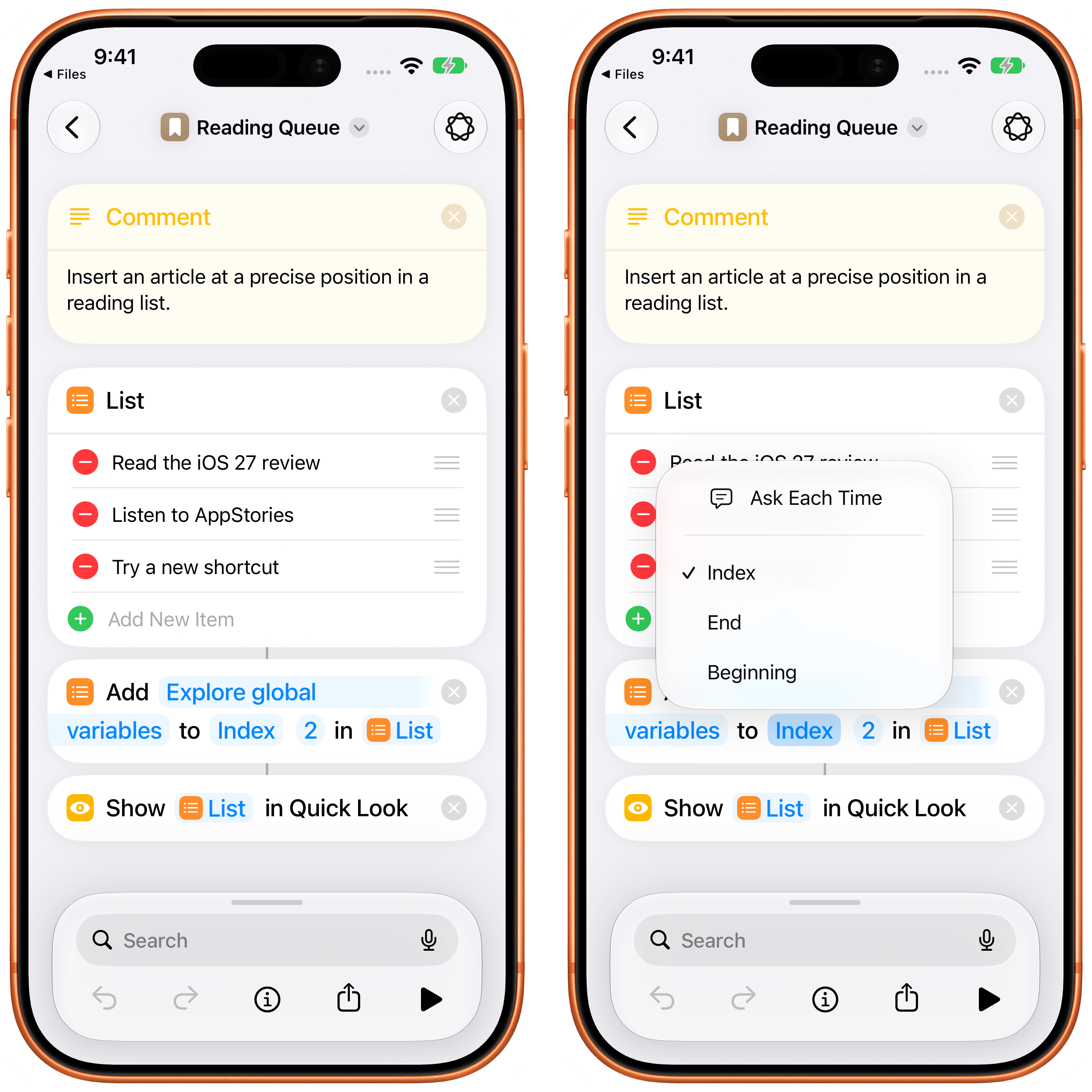
If you’ve ever built a Repeat loop just to reconstruct a list with one extra item in the right position, you’ll understand why I’m mentioning such a basic action in the review.
Find VPNs and Get Current VPN
Tailscale and VPN users, this one’s for you.
The new ‘Find VPNs’ action returns your VPN configurations with different filters as optional parameters; ‘Get Current VPN’ tells you which one is active, if any. Combined with the existing ‘Set VPN’ action, you can now build a proper VPN menu shortcut or an automation that checks whether you’re already connected before doing something else.
Messages
The Messages app received a variety of actions this year that confirm how Apple is thinking about Shortcuts now: it needs to expose the same actions that are otherwise available in Siri AI. The new actions are:
- Delete Conversations
- Delete Messages
- Mark as Read
- Open Inbox
- Search in Messages
- Send Tapback
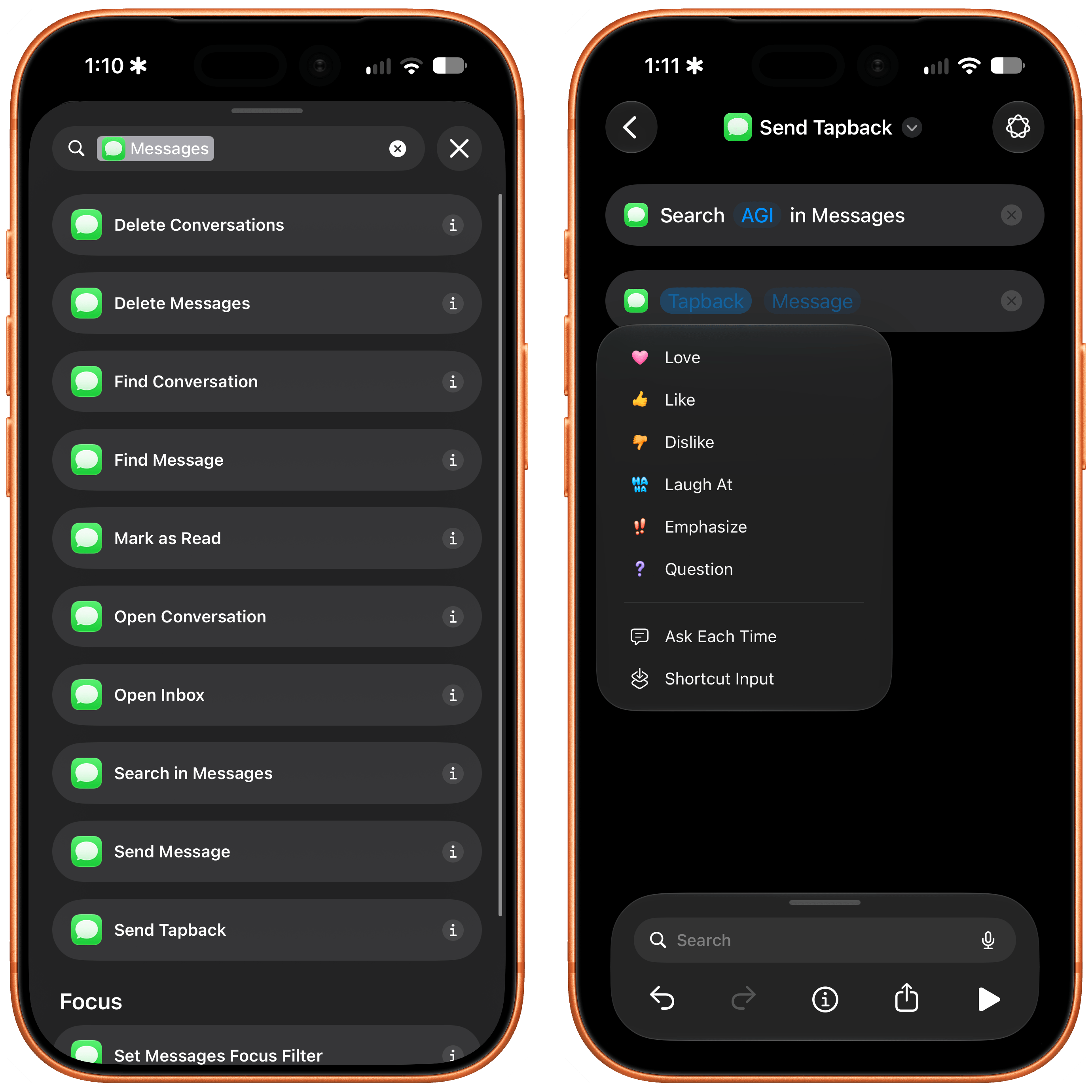
As you can see, these actions essentially reconstruct what you can do with Messages and Siri AI, but inside Shortcuts, with support for variables and user-defined flows. I especially like the ‘Send Tapback’ action, which reacts to a specific message with one of the six standard Tapbacks (Love, Like, Dislike, Laugh, Emphasize, and Question). To use this action effectively, you’ll have to pair it with the ‘Find Messages’ action, which needs to retrieve a variable for the specific message from the Messages app first.
Photos
As with Messages, Photos gained a bunch of new actions that match the capabilities of Siri AI:
- Auto Enhance Photo
- Delete Albums
- Favorite Photos
- Find Albums
- Hide Photos
- Open Photo
While I’ve never played around with Photos automation much, I’m very intrigued by the idea of scripting my albums in iOS 27.
Reminders
I’m very happy to see Reminders – which has been my task manager for almost a year at this point, a new record for me – receive some great new actions in iOS 27:
- Create Group
- Create Section
- Delete Groups
- Delete Lists
- Delete Sections
- Edit List
Sadly, the ‘New Reminder’ action still does not support adding a task to a specific section of a list – a strange omission given improved section support in other actions this year.
Updates to Existing Actions
In addition to new actions, I want to mention some updates to existing actions:
Notes: Markdown, at Last
As I mentioned before, Notes’ ‘Create Note’ and ‘Append to Note’ actions now support Markdown as text input. The ‘Append to Note’ action has also gained a ‘Section’ parameter to choose where in the note the text should go and an ‘Ignore Empty Lines’ option.
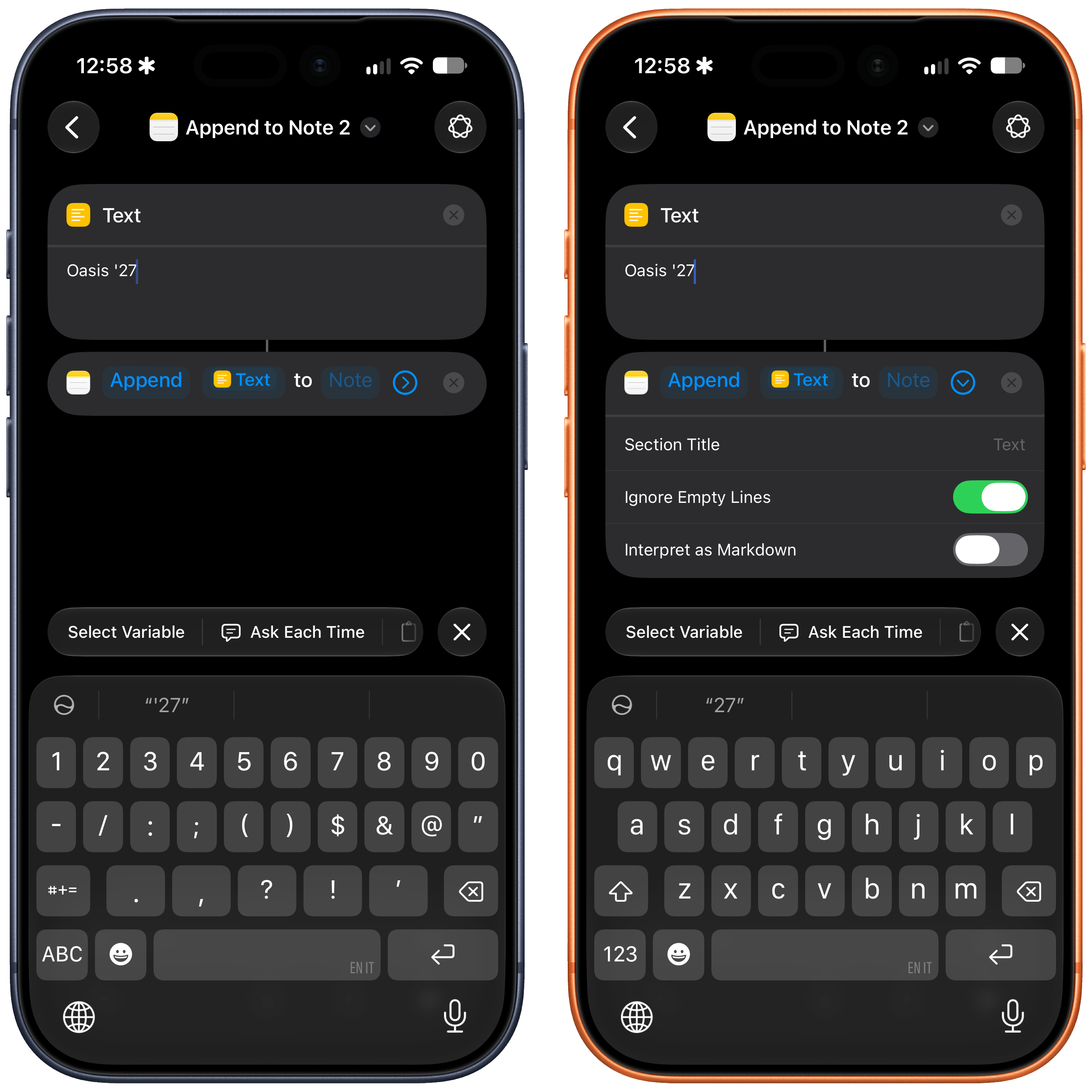
If you’ve built a journaling or logging shortcut around Notes – and I know a lot of you have – this replaces an entire category of workarounds.
If: Otherwise If
Eight years after Apple relaunched Workflow as Shortcuts, it has added support for “else if” branches inside conditional blocks.
Two years ago, I wrote about compound conditions making If blocks more readable; this is the other half that was missing from that redesign of conditionals. Programmers should obviously be familiar with the concept of “else if”, but if you’ve ever played around with advanced shortcuts, I’m sure you know what I’m talking about here. Instead of nesting a separate ‘If’ block inside an ‘Otherwise’ inside another ‘If’, you chain the conditions in a single block now. That’s really all there is to it, and this more elegant approach has also resulted in dramatically better performance for multi-condition flows in the Shortcuts editor.
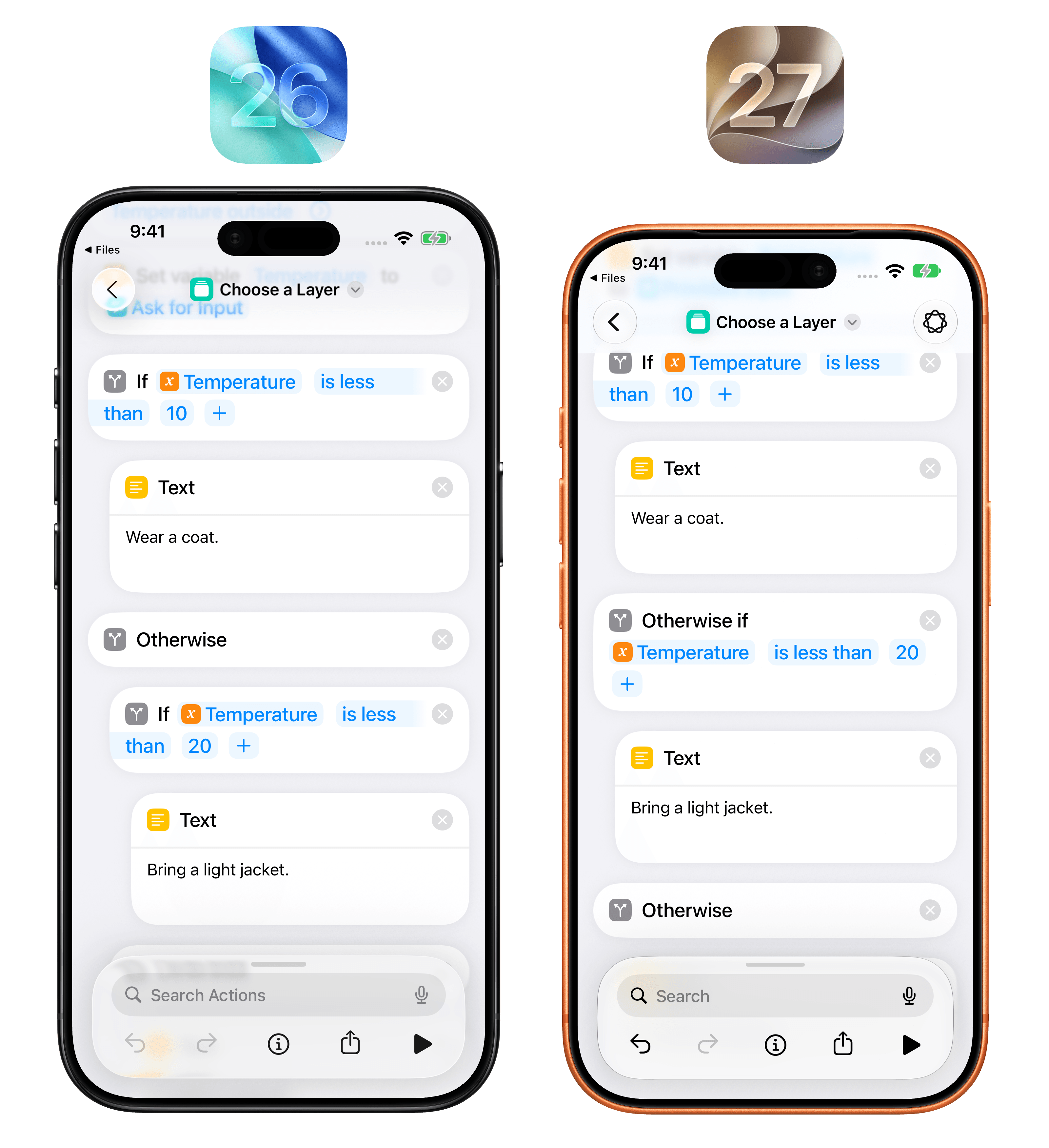
My older shortcuts are full of indented conditionals that I’m now going to rebuild.
Use Model: Follow Up, Cloud Pro, and World Knowledge
The ‘Use Model’ action has gained a couple of new options, matching what is also possible in Siri AI. First, Cloud Pro is available as a model option for tasks that require deeper reasoning, although it does not let users set a specific reasoning level like third-party developers can in their apps.
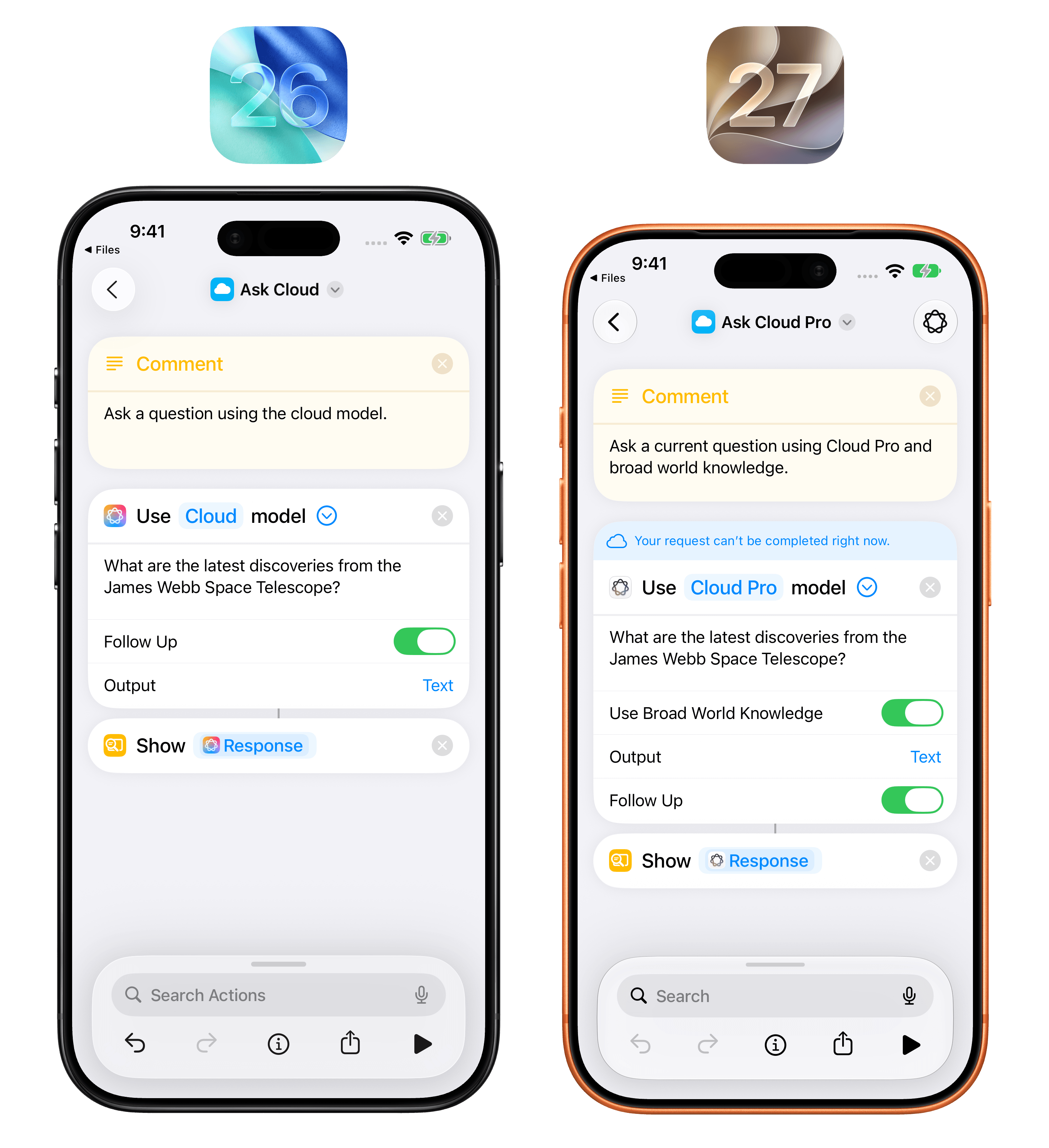
Additionally, there’s a new ‘Use Broad World Knowledge’ toggle that lets the model answer by tapping into Apple’s proprietary world knowledge database. In my tests, flipping this switch and combining it with Cloud Pro for web searches has produced some pretty good, up-to-date results.
Maps: Avoid Highways and Avoid Tolls
The ‘Get Travel Time’ action now has ‘Avoid Highways’ and ‘Avoid Tolls’ toggles, so your “time to leave” shortcut can finally match how you drive.
Extract Text from Image: Text, Lists, and Tables
‘Extract Text from Image’ has a new parameter with three options: Text, Lists, and Tables.
The last two mean you can point the action at a photo of a list or a table and get structured output instead of a flat block of text. This matches the vision capabilities of Siri AI in Visual Intelligence, and I’m especially keen to combine these with adding structured content to Apple Notes.
Scan QR or Barcode: Extract Mode
‘Scan QR or Barcode’ has two modes now: Scan opens the camera like before; Extract reads a code from an image you pass in as input.
Yes, this means you no longer have to point your iPhone at your own screen to read a QR code in a screenshot. I’ve done that more times than I’d like to admit.
Safari: Create Tab Group
The ‘Create Tab Group’ action got a ‘Contents’ parameter that accepts URLs or existing tabs, so you can create and populate a tab group with a single action.
New Reminder: Urgent
While it didn’t receive support for sections, ‘New Reminder’ did get an ‘Urgent’ toggle, matching the modern urgency feature from the Reminders app last year.
Get Network Details: Ethernet
‘Get Network Details’ received an Ethernet option alongside Wi-Fi and cellular, with nine fields:
- Interface Name
- IPv4 Address
- IPv6 Address
- Subnet Mask
- Router IP
- Is Connected
- Link Speed
- Ethernet Standard
- Hardware MAC Address
Set Volume
Matching what is now possible in the Clock app, the ‘Set Volume’ action now lets you automate volume levels for alarms and timers, or alerts and system sounds, separately from media and ringtone.
Below, I’m compiled a collection of 10 shortcuts that demonstrate some of the new capabilities in iOS 27.
You can find all shortcuts in a new iOS 27 category of the MacStories Shortcuts Archive. 20 more shortcuts will be released for Club MacStories members later this week.

Selection Stats
Select text in another app and invoke this shortcut without leaving that app, or share the passage through the Share Sheet. It counts words and characters and estimates reading time at 200 words per minute. Demonstrates the new Get Selected Text action in iOS 27. Selection access depends on the source app.

Toll-Free ETA
Enter a destination to compare three driving-time estimates from your current location: normal routing, avoiding tolls, and avoiding highways. Demonstrates the new Avoid Tolls and Avoid Highways options in Get Travel Time in iOS 27. These are time estimates, not toll prices; this shortcut does not start navigation.

Dinner Rescue
Share a list of ingredients or enter what you have, your time limit, and dietary restrictions. Apple Intelligence suggests two dinner ideas and lets you follow up with substitutions or a full recipe. Demonstrates Follow Up and Broad World Knowledge in Use Model in iOS 27. Requires Apple Intelligence.

Project Starter
Enter a new project name to create a Reminders list with Next, Waiting, and Later sections. Each run creates a new list. Demonstrates the new Create Section action in iOS 27; Create List supplies the list that all three sections use.

Photo Shortlist
Review up to 30 photos from the past seven days, newest first. Choose the keepers to add to Favorites. Nothing is preselected; cancel the picker to leave your library unchanged. Demonstrates the new Favorite Photos action in iOS 27. Requires Photos access.

Screenshot QR
Share a screenshot or image containing a QR code, or run this shortcut to choose a photo. Pick a detected code to copy its content and see the result. Demonstrates Extract from image in Scan QR or Barcode in iOS 27. Links are displayed without being opened automatically.
Table to Clipboard
Share an image of a table, or run this shortcut to choose a photo. It extracts table text, copies the result to the Clipboard, and shows a preview. Demonstrates the Tables option in Extract Text from Image in iOS 27. Check the extracted rows before pasting them into your document.

Pack for Today
Choose Office, Gym, or Day Trip, add an optional must-remember item, and keep the items you need. The shortcut creates and opens a new packing note in Notes. Demonstrates Add Item to List at the Beginning and Create Note with Markdown in iOS 27.

Message Finder
Share a name, phrase, or reference number to search for it in Messages. Run directly to choose Search Messages or Open Unread Messages. Results appear in Messages. Demonstrates the new Search in Messages and Open Inbox actions in iOS 27.

Parking Pin
Save your current parking spot, find it later in Maps, or clear it when you leave. Run this shortcut when you park and choose Save This Spot. The stored location belongs to this shortcut; saving again replaces the previous spot. Demonstrates Store, Get, and Delete Stored Content in iOS 27.
Automations
Alongside the plethora of new actions we’re getting in Shortcuts this year, my other favorite change is the complete redesign of automations: they’re no longer a separate section of the app, but instead appear as “special actions” at the very top of a shortcut, which means that you can also share shortcuts that contain automations with other users. Finally.
You can add an automation to a shortcut either via natural language (more on this in the next section), or by opening the action library in the editor and selecting the new ‘Automation’ category. Doing this will let you browse the catalog of automation triggers, and you can tap one to add it to the shortcut, where it’ll always be placed at the top, ready to be configured.
Automations are now actions at the top of a shortcut.
Because automation triggers are actions, though, it also means something else: we can now stack multiple automations in the same shortcut! Power users will love this: it lets us run the same shortcut when any of several conditions is met, instead of creating a separate trigger for each one, as was the case in iOS 26.
Multiple triggers for the same shortcut.
Apple has designed the sharing flow thoughtfully: to avoid the risk of someone else installing a shortcut from the web that contains an automation they don’t know about, automations will be disabled by default (and visibly grayed out) on the receiver’s end upon installation. To enable an automation, you’ll have to flip its main toggle at the top of a shortcut, and then it’ll be able to run with configuration options previously set by the creator of the shortcut.
A disabled automation (left).
You can still browse all shortcuts that contain automations in a dedicated Automations page of the app, which also lets you quickly turn them on or off, filter them, and see the ones that you haven’t finished setting up.
As a longtime Shortcuts creator, I’m incredibly happy to see automations become something I can share directly with my readers instead of being a fiddly feature I need to explain how to set up manually. This is an excellent change, and having automations live in the editor also makes them easier to configure and tweak.
In addition to unified automations, there are also new automation types to choose from. With the new Keyboard trigger, you can configure a shortcut to run when any keyboard is connected to or disconnected from your device. This could be particularly handy with an iPad, for instance, if you want to switch to specific Home Screens or Focus modes when the Magic Keyboard is detached.
There’s also a Notification trigger. With this automation, you can let a shortcut run when you receive a notification from a specific app and optionally filter the title, subtitle, or message contained in the notification itself. You can even process a dedicated ‘Notification’ magic variable in the editor for further checks against its body text, time-sensitive nature, or date.
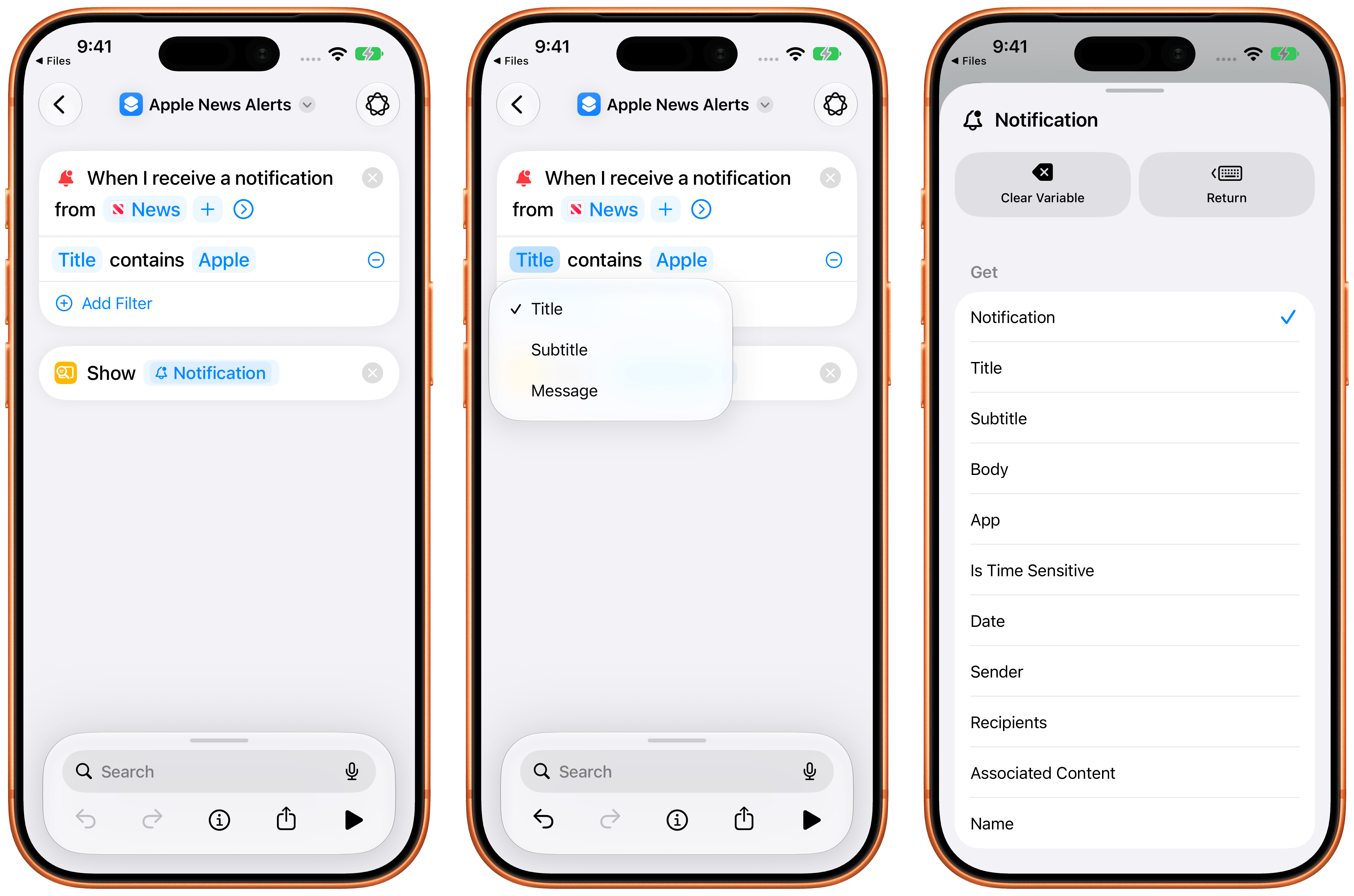
While I’m the type of person who tries to reduce incoming notifications as much as possible, I’ll admit that I see lots of potential for fun use cases of this automation trigger, such as flashing your HomeKit lights red when a food delivery is nearby, unlocking the front door when your spouse’s car pulls into the garage, and more.
Describe a Shortcut
I saved the most important feature of the Shortcuts app this year for last: you can now describe shortcuts with natural language, and AI will make them for you, in seconds, right inside Shortcuts.
I knew that this was going to happen soon when I released my Shortcuts Playground plugin for Codex and Claude earlier this year, and you may think that I’m upset that Apple “sherlocked” me with this feature. So, let me state this very clearly:
I’m ecstatic that Apple is shipping this feature in Shortcuts for free, and that they’ve made it so easy to use. The biggest barrier to entry for the Shortcuts app has always been teaching people how to use the editor and connect actions together: with the ability to describe a shortcut and will it into existence in a few seconds, that barrier has been destroyed. Apple has done an excellent job making it fast and reliable at generating simple- to medium-complexity shortcuts.
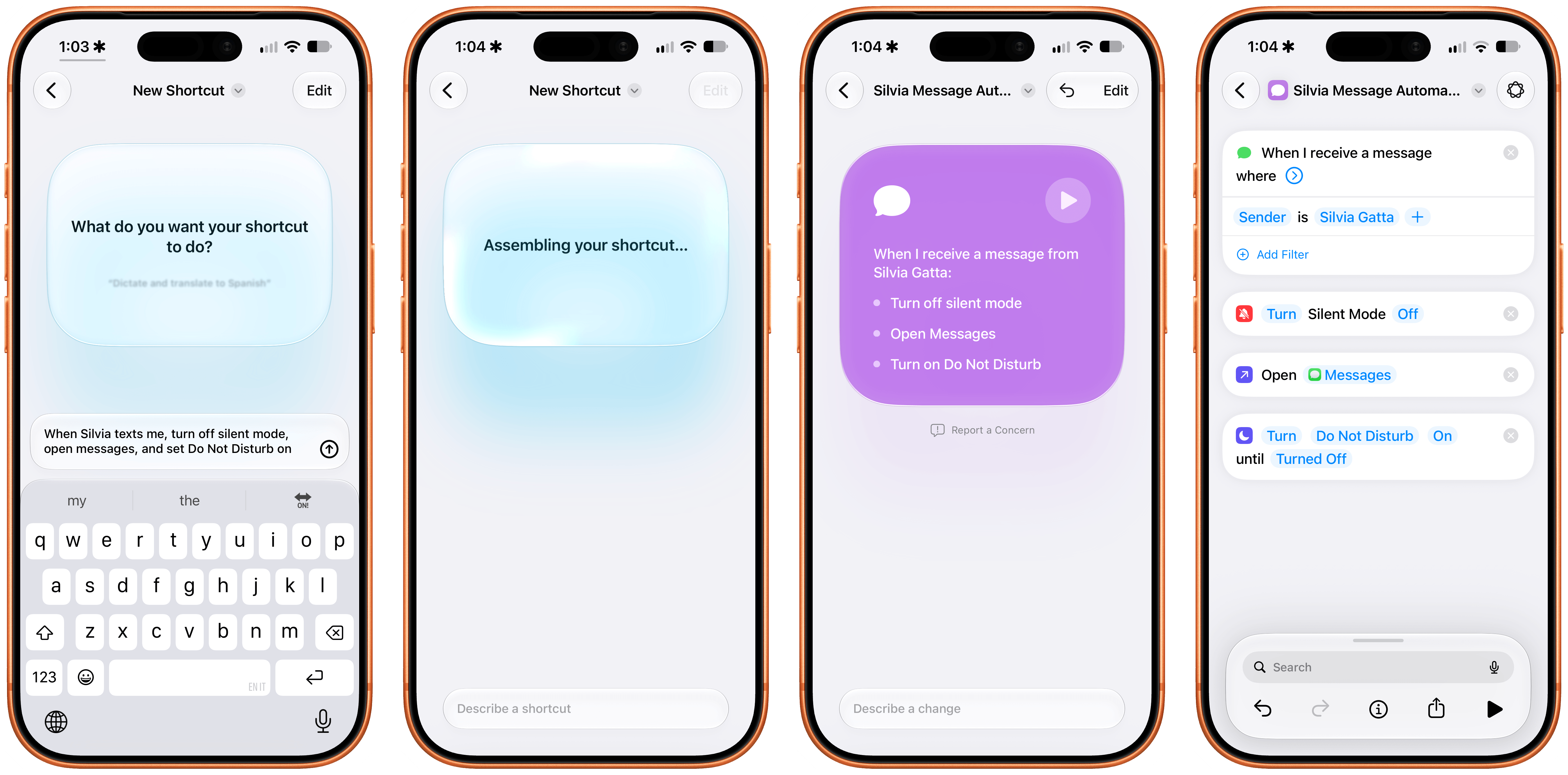
Generating a shortcut with an automation in iOS 27.
See, that’s why I’m not upset: Apple’s natural language shortcut creation cannot generate highly complex shortcuts that span hundreds of actions, or go off to the web to research an API and then make a shortcut for it. My Shortcuts Playground plugin can literally make and remix Apple Frames (I made version 4.0 of the shortcut with it!); Apple’s feature will stop short of generating anything that involves reasoning for longer than 30 seconds. There is still plenty of space in this field for an agent-agnostic, long-running plugin such as Shortcuts Playground to exist. (In fact, I’ll have a major announcement about it soon.)
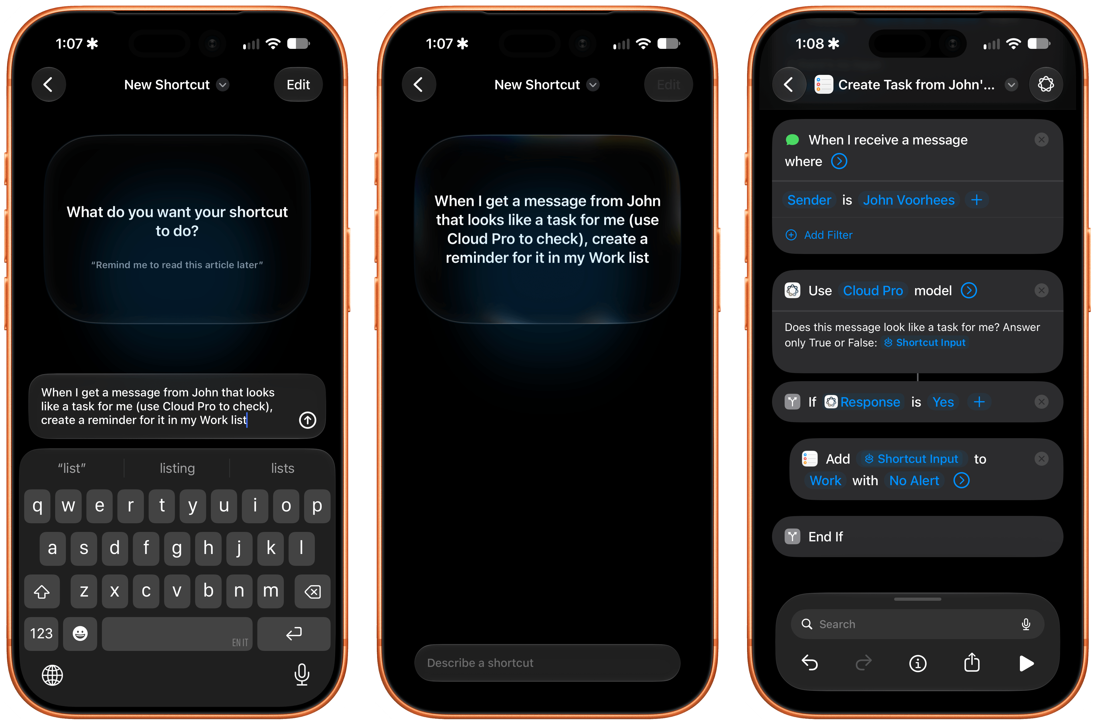
And here’s another thing: a simpler, faster, more reliable version of Shortcuts Playground made by Apple is exactly what I wanted and needed as a user. The ‘Describe a Shortcut’ feature can one-shot all kinds of shortcuts in 15 seconds or so. It can pre-fill all supported parameters in all supported actions. It can pre-scan parameters during the generation phase to make sure they’re valid (such as checking whether a note exists if you ask to make a shortcut to append to a specific note). It can configure all supported toggles in each action for you. It’s also beautifully designed with a gorgeous Liquid Glass animation, and it supports editing shortcuts with natural language by describing further changes to them.
Generating a shortcut in iPadOS 27.
In case it is not clear enough: Describe a Shortcut is a marvel of engineering and, possibly, the most impressive demo of Foundation models to date. It’s no surprise that Apple believes in this feature so strongly that it’s now the default screen when you create a new shortcut in the app.
I’ve been testing this feature all summer, and while it’s not capable of making shortcuts for third-party apps (I assume this will be coming in the future) or third-party web APIs not in its knowledge base, it is an excellent starting point for most users of the Shortcuts app. I once called Shortcuts a bicycle for the mind; the ability to turn an idea into a working automation is the ultimate expression of that philosophy. This is what computers should do: they should help us spend less time managing the computer itself, and more time doing what we actually like.
Go play around with ‘Describe a Shortcut’, test its limits, and have fun with it. I bet it’s going to teach you some things you didn’t know about Shortcuts, and, most importantly, it’ll help you do things with your iPhone and iPad you didn’t think were possible.
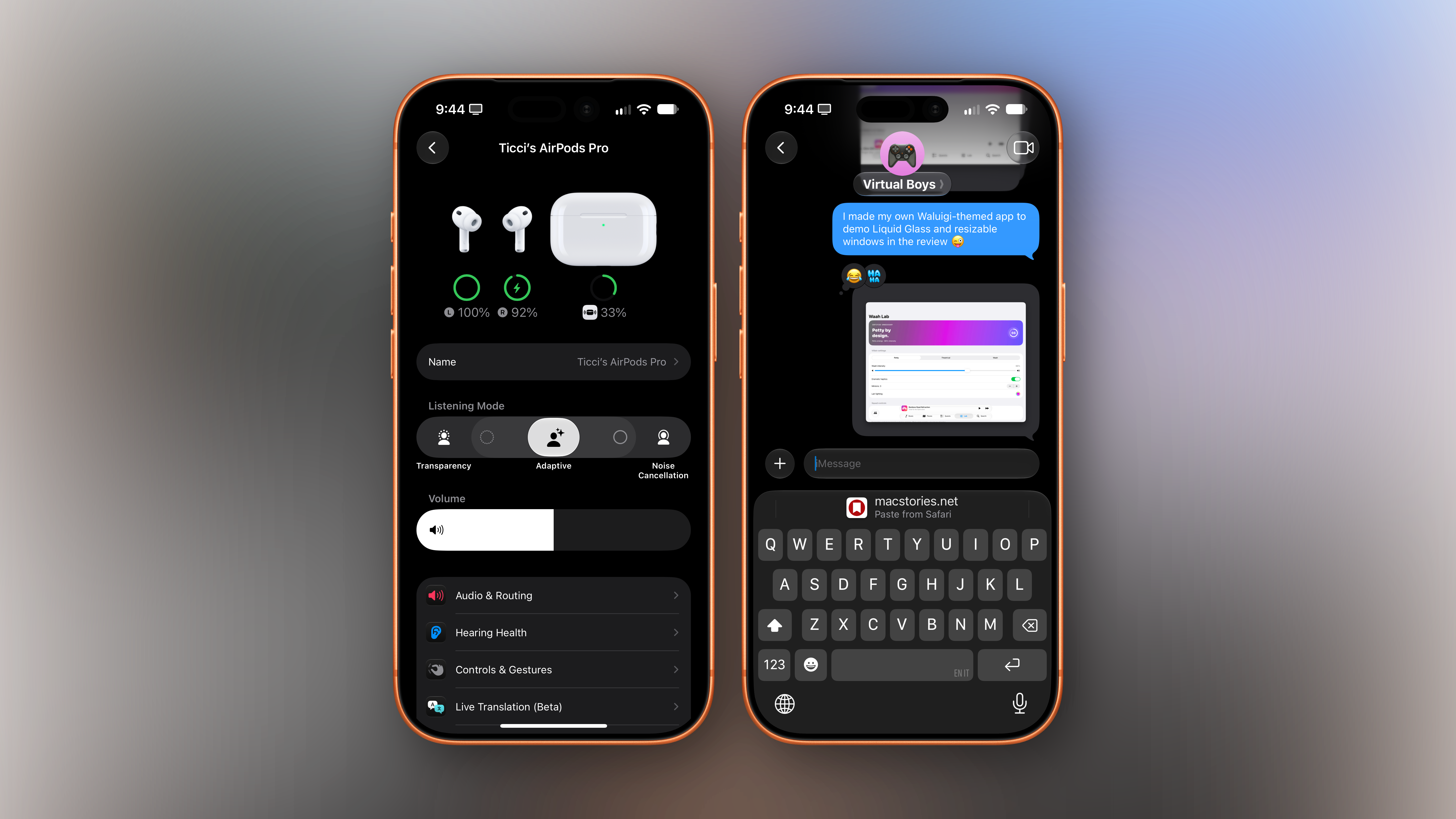
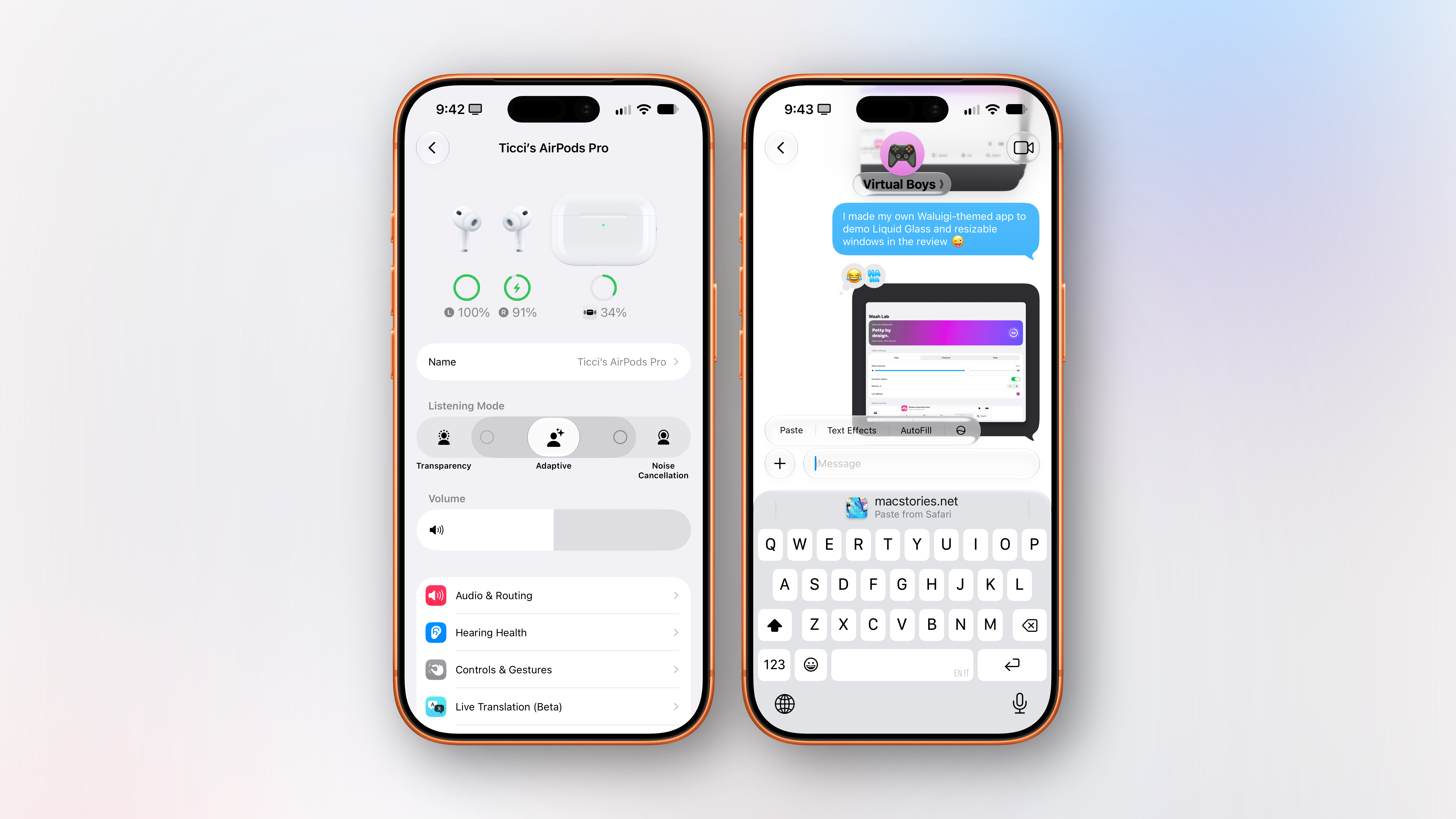
Everything Else
As is always the case with new versions of iOS and iPadOS, changes in the operating systems run the gamut from tentpole features to quality-of-life improvements and smaller tweaks that you may not notice at first.
Let’s take a look at everything else that’s new in iOS and iPadOS 27.
AirPods
In iOS 27, Apple completely revamped the AirPods management page in Settings, going from a bland, long list of toggles and sub-menus to a more colorful page that neatly organizes everything into richer menus:
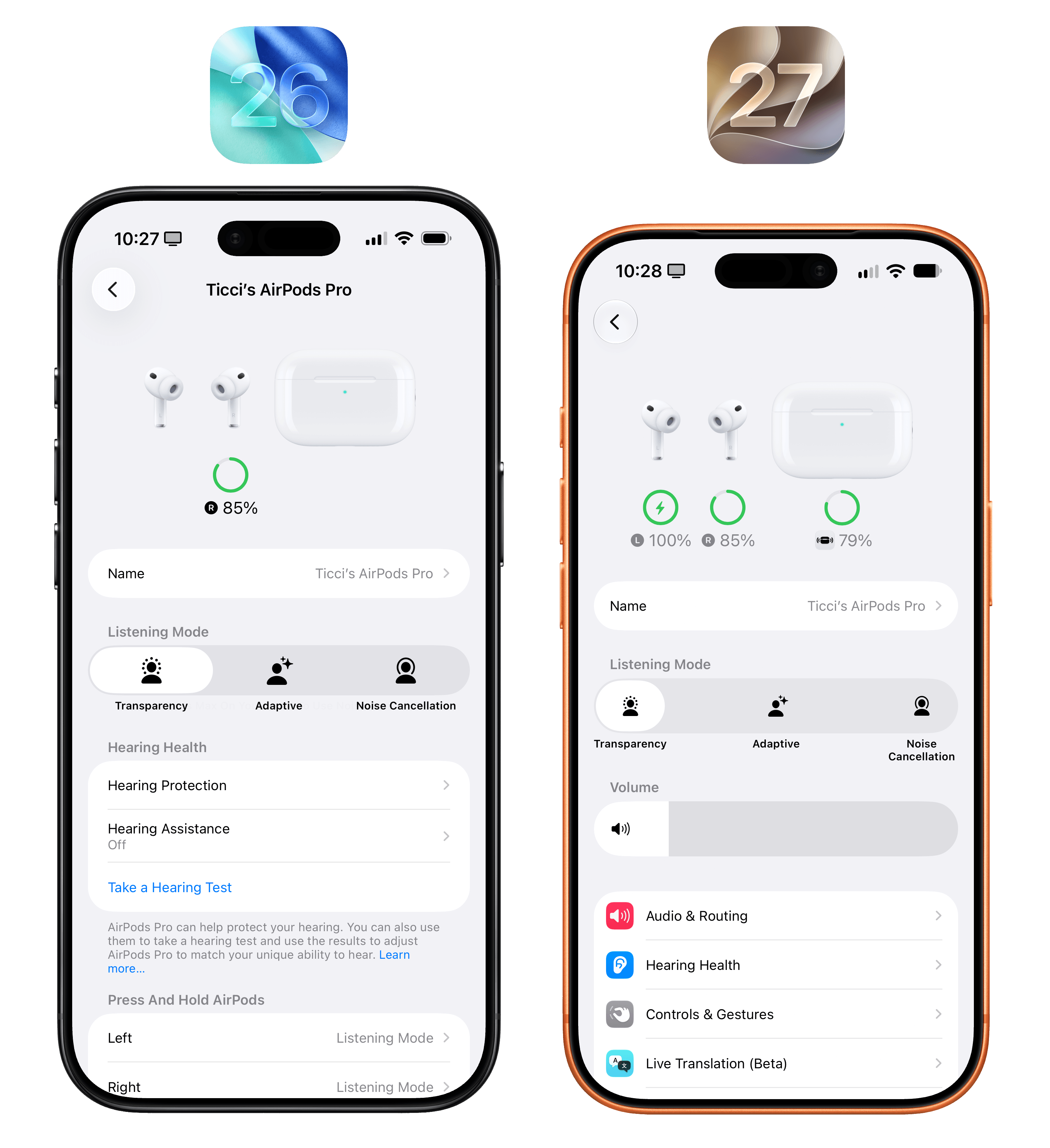
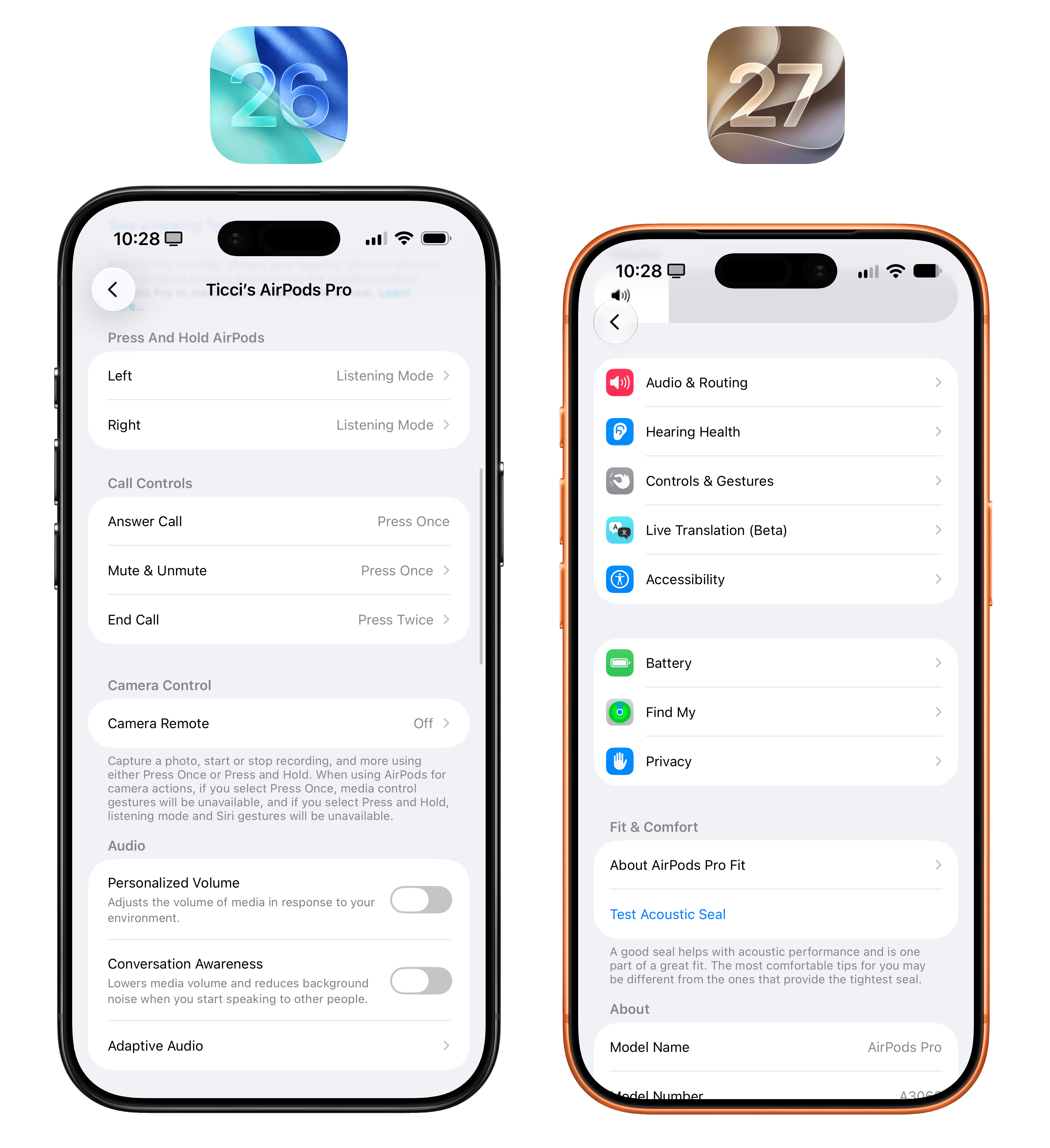
As you can see, a volume slider was added underneath the different listening modes supported by compatible AirPods, but that’s not all. When selecting ‘Adaptive’ mode in the top slider, iOS 27 will reveal new options to make its intensity lighter (leaning more toward Transparency mode) or stronger (toward Noise Cancellation). I’m glad Apple did this: I never fully understood Adaptive mode, and I’ve long preferred to toggle between Transparency and Noise Cancellation because I felt like Adaptive was suppressing too much background noise for my taste. I’ve set the new slider between Transparency and Adaptive and, so far, it’s working well.
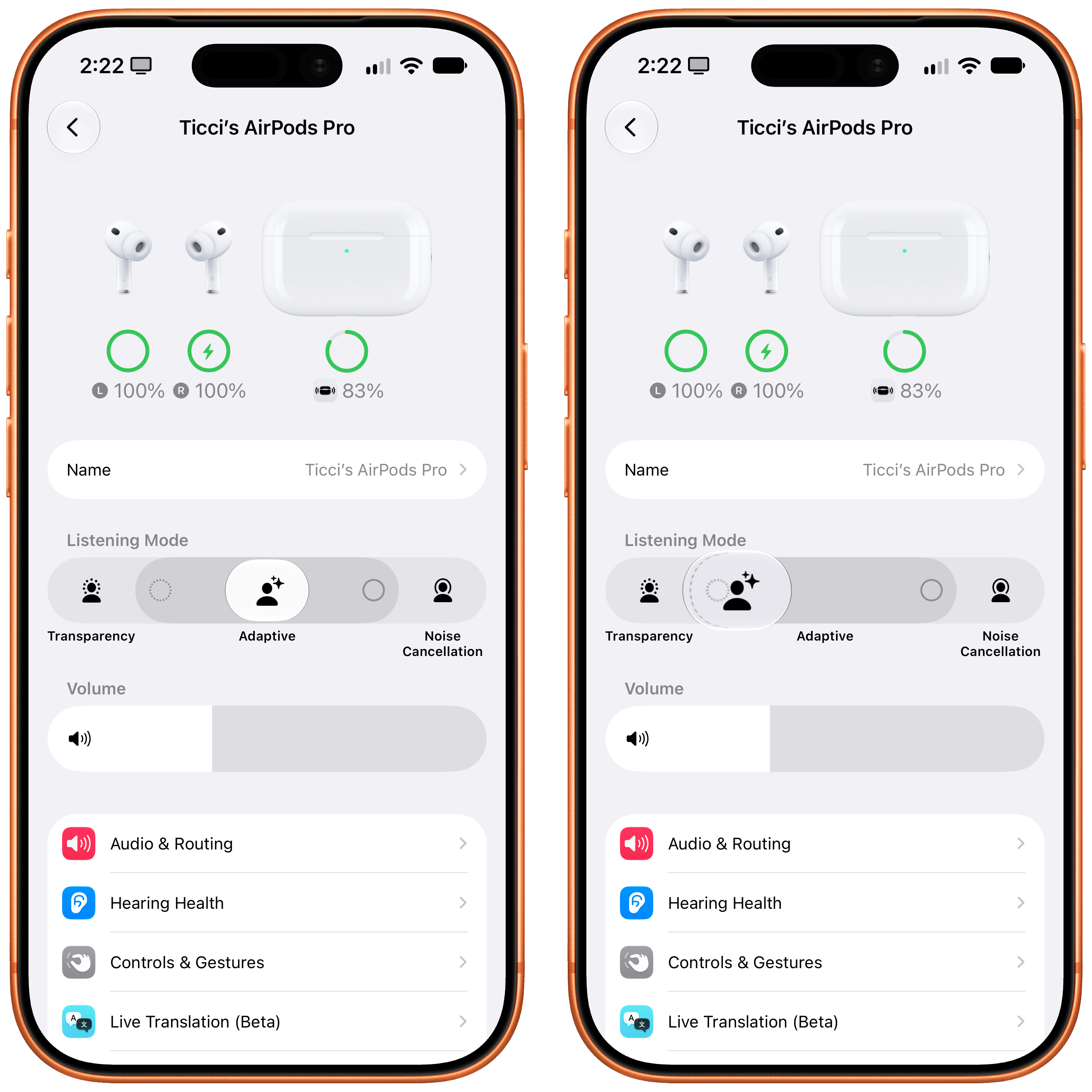
I’ve never been into equalizers myself, but iOS 27 also introduces custom EQ support for AirPods Pro 3, AirPods 4 and later, and AirPods Max 2. Unfortunately, I haven’t been able to test this since the option to install AirPods beta firmware never appeared on my devices.
Cellular
As part of iOS 27’s focus on performance improvements across the board, Apple brought a couple of useful changes to how the system handles cellular and Wi-Fi connections behind the scenes.
First, iOS 27 intelligently transitions between Wi-Fi and cellular as you move around, keeping your data connection working without you having to go into Control Center to toggle Wi-Fi off.
I know firsthand that this works because I used to run into this very problem every single day. You see, in the 10 meters that separate our apartment’s front door from the elevator on our floor, my iPhone would stay connected to Wi-Fi in the apartment, but I couldn’t actually do anything because data wouldn’t work. Like every flawed human being, I must take advantage of the 30 seconds that I spend waiting for the elevator to open social media and doomscroll. iOS 27 fixes this: as soon as I walk out of the house, the system detects a weak connection, intelligently re-routes it to cellular, and I can get to my timeline while I mindlessly wait for the elevator to arrive. Maybe I shouldn’t have wished for Apple to fix this? In any case, the feature works well – and it’s one of those things that you’ll stop noticing and take for granted until you go back and experience what iOS 26 used to be.
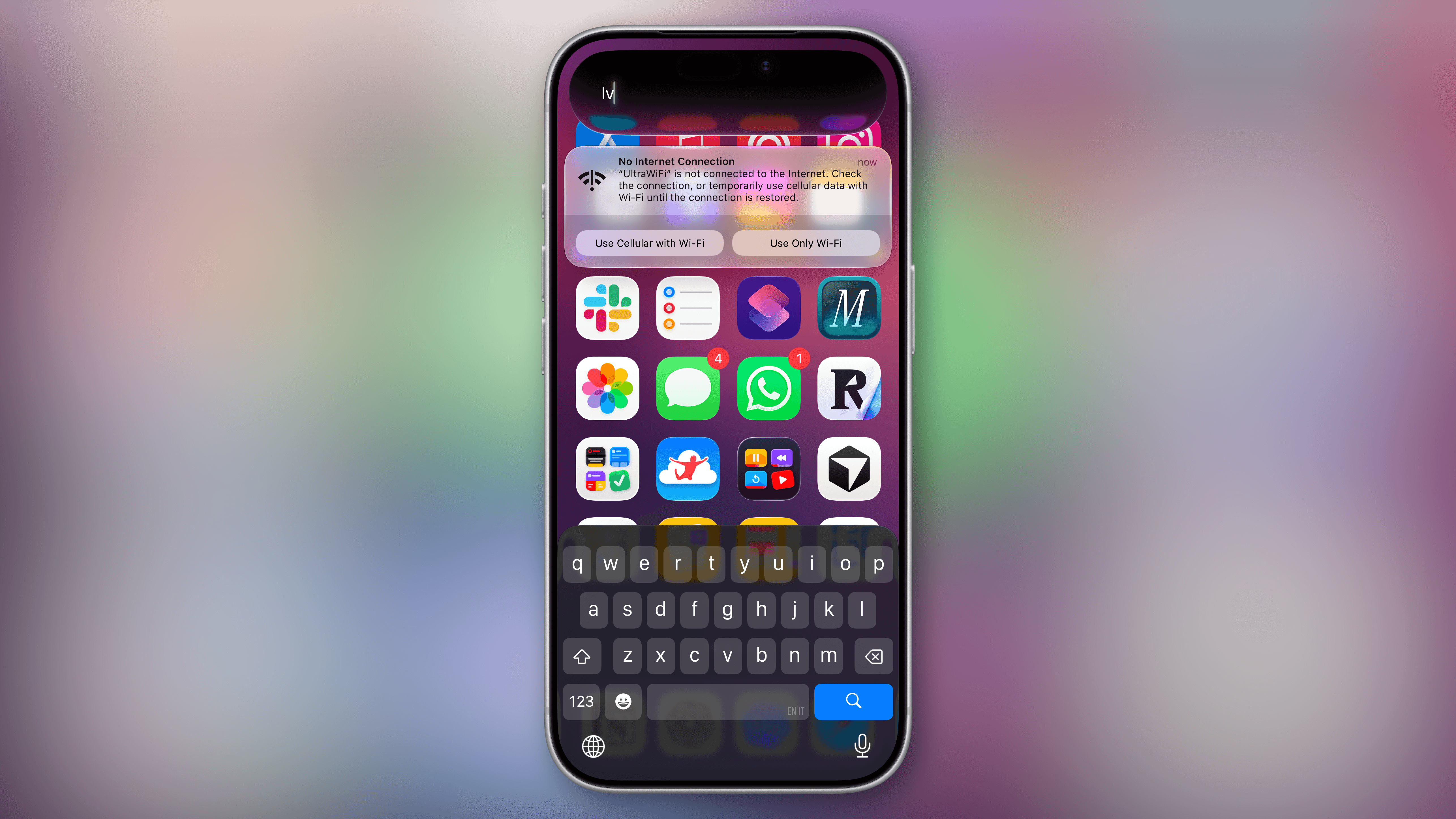
Second, there’s a new design for notifications that tell you about Wi-Fi connections that aren’t working. I hope you never get this.
Keyboard
There are always keyboard-related updates in this chapter of the review, and iOS 27 does not break tradition. I mentioned this before in the Siri AI chapter, but it bears repeating here: the larger, more powerful AFM 3 Core Advanced on-device model (which is only supported on modern devices) enables a faster, more reliable dictation experience.
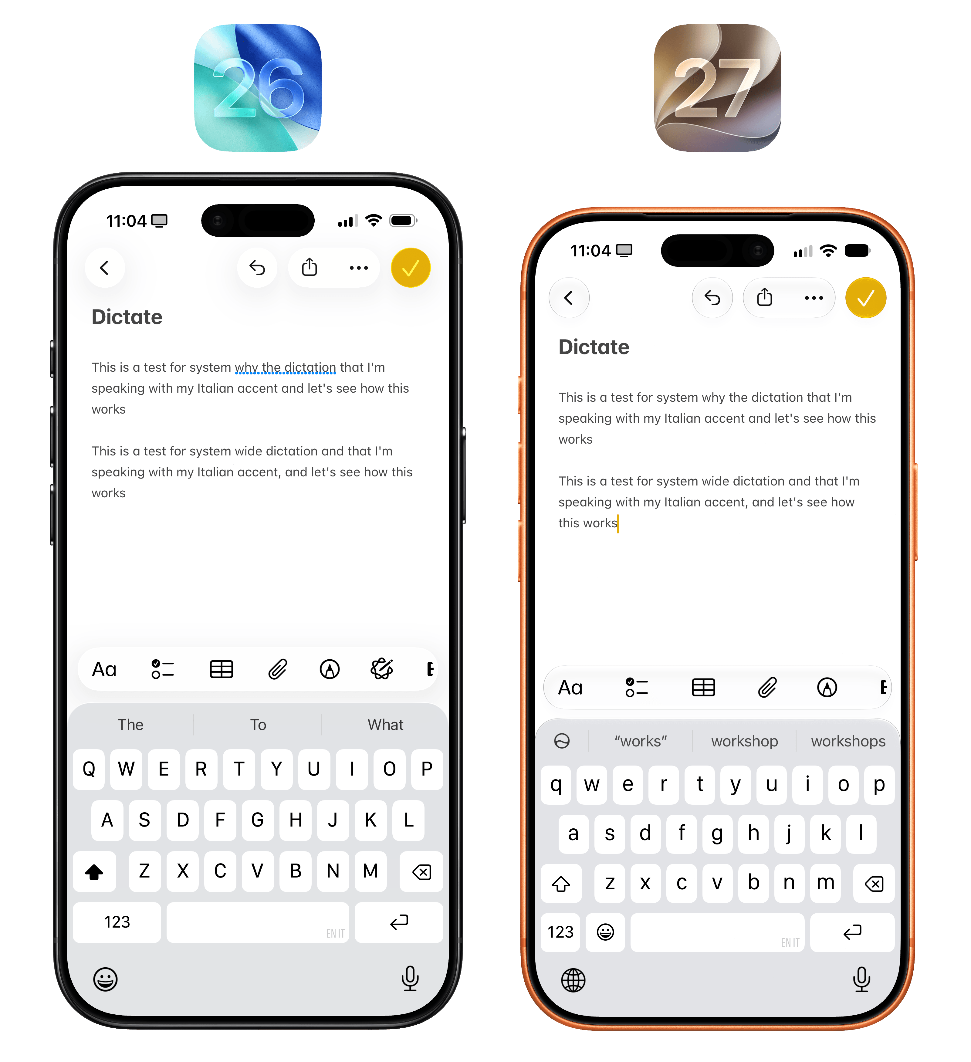
You probably won’t notice the differences at first since the UI looks the same, but in my experience, the new dictation is way more accurate than the previous one. As someone who uses an iPhone in English with an Italian accent, I’ve noticed that iOS 27 transcribes certain words more accurately than iOS 26, such as “wide”, which iOS 26 heard as “why” in the comparison above.
As you start using iOS 27, you’ll also notice two more additions to the keyboard experience. First, there’s system-wide automatic proofreading that checks whatever you’ve typed and underlines suggestions in blue. This is not autocorrect: proofreading checks for correctly typed words that do not fit in the context of a sentence – such as “this is a tests”, where the word “tests” would be underlined. You can accept suggestions by tapping on them.
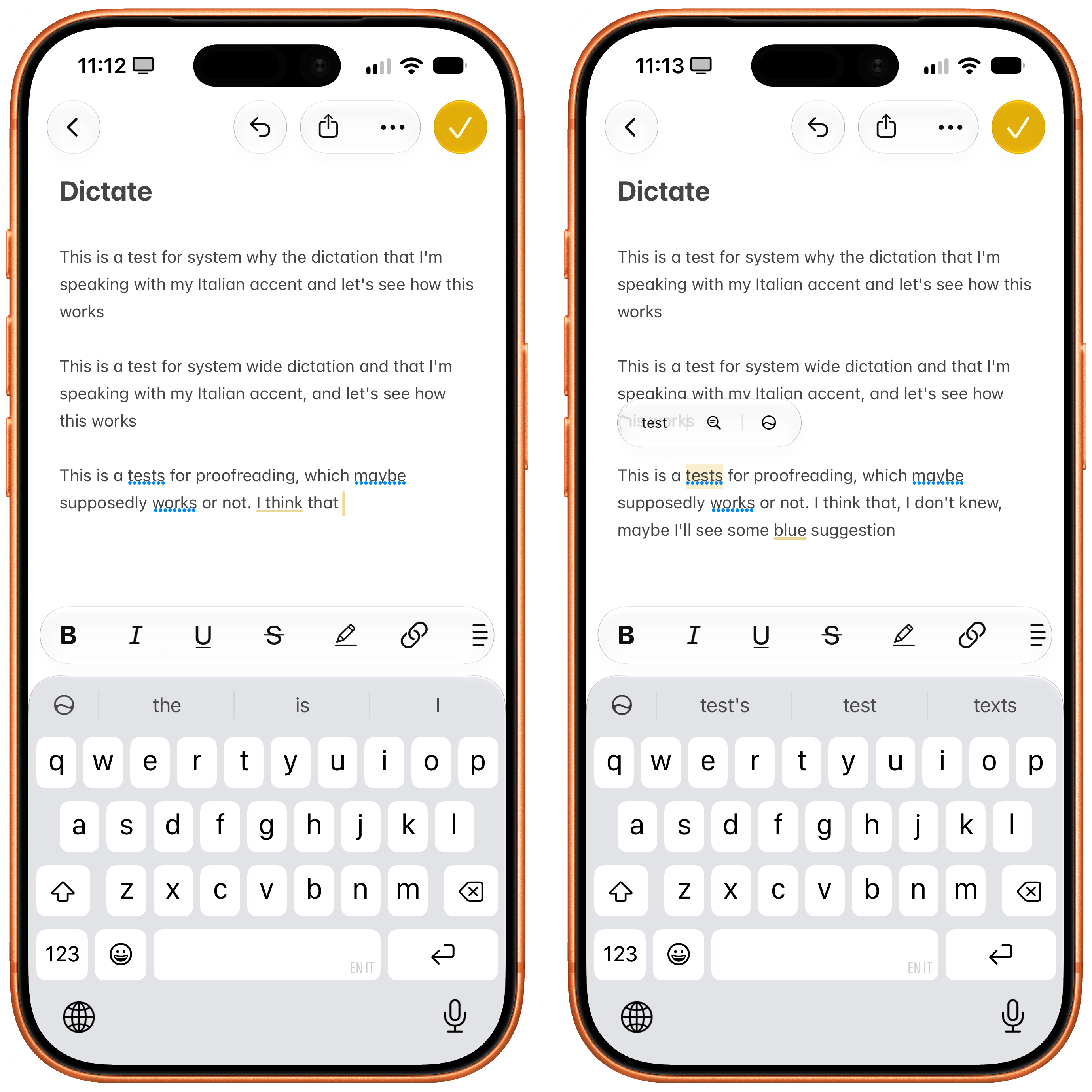
Automatic proofreading.
Second, when you copy something to the clipboard – whether it’s some text, a link, or an image – the next time you select a text field, you’ll see a suggestion above the keyboard to instantly paste what you just copied.
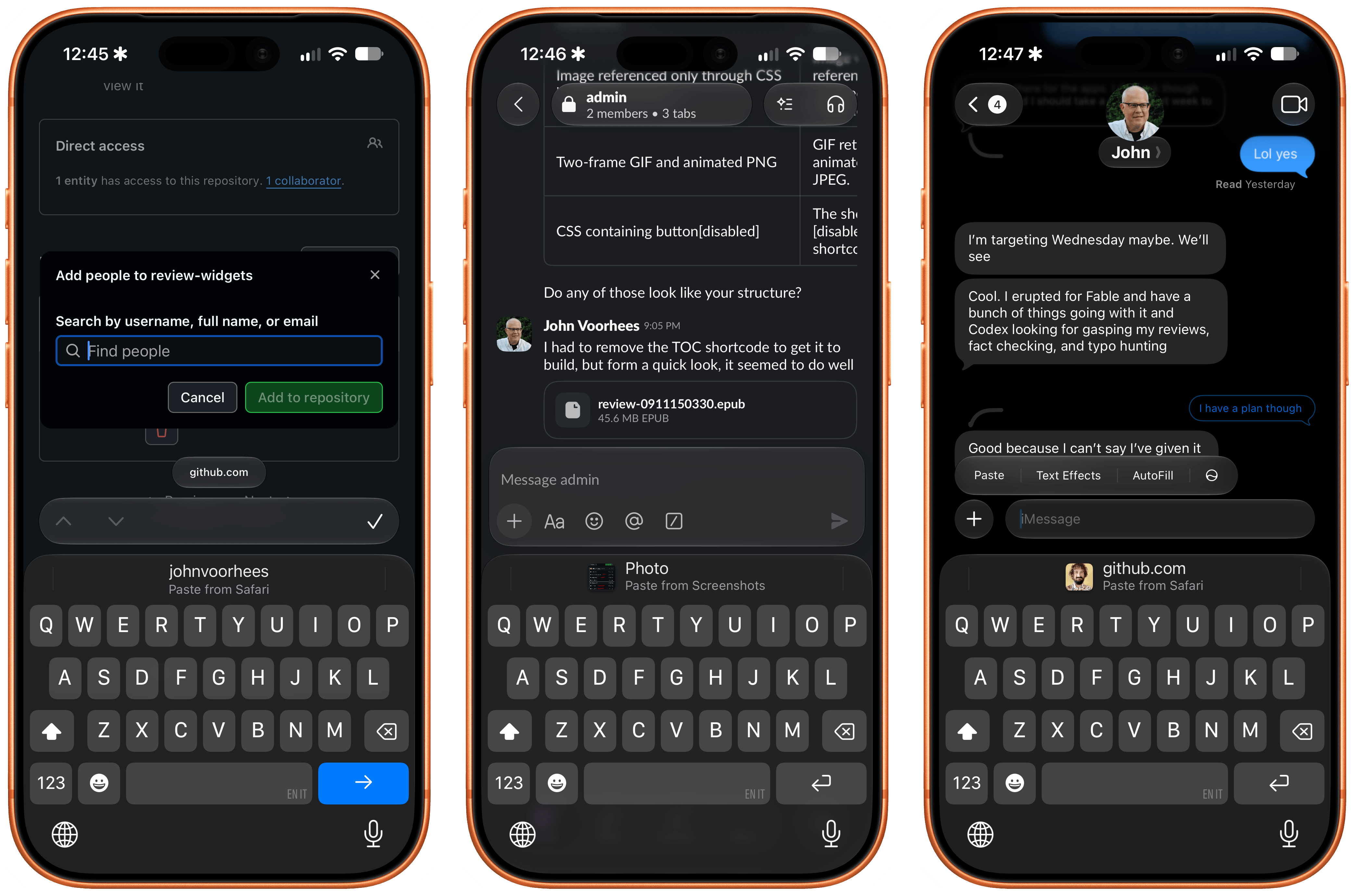
Another banger from Apple’s quality-of-life department.
It’s a small tweak, but it’s one of those time-saving features that Apple drops out of nowhere every year and that become instant classics. I think millions of people will love this enhancement to the keyboard.
And More…
More features? More features. Let’s bring this home:
There is a new Mac-like recovery mode. As reported by 9to5Mac, there’s a brand new recovery flow in iOS 27 that resembles the page you get on macOS when you need to recover your device. If you see this screen, something’s gone wrong.
A new design for Apple Pay on the web. The Apple Pay sheet has a new look when you’re buying something on the web. I like how it handles multiple associated cards because it makes it clearer how to switch between them.
Notifications go sideways. For reasons that, in hindsight, make more sense because of the iPhone Duo, notification banners now appear with a new animation that swoops in from the top-left corner of the screen. This is not just cosmetic or optimized for the Duo, though: the animation also serves to reinforce that you can swipe from the top-left corner to open Notification Center, as opposed to swiping from the center, which opens Siri AI now.
Gotta go fast. Most reviews of iOS and iPadOS 27 (is anyone else still writing them?) will probably only focus on this part of the experience, and highlight it at the beginning of their narrative. I saved it for the end, because I think it’s important to see what iOS 27 does differently before appreciating how much faster it makes everything.
There’s no way around it: iOS 27 is the most reliable, fastest, smoothest version of iOS Apple has ever released. From smoother unlocks and scrolling Home Screen pages to better performance under heavy load (thanks to a new CPU scheduler, a part of the OS Apple has been improving a lot lately) and 30% faster app launches (courtesy of preloading app data), there is virtually no part of iOS 27 that hasn’t been affected by Apple’s focus on performance this year.
You have to see it to believe it. Which is why I’d recommend you go to Settings, load up Software Update, and upgrade from iOS 26 as quickly as you can.
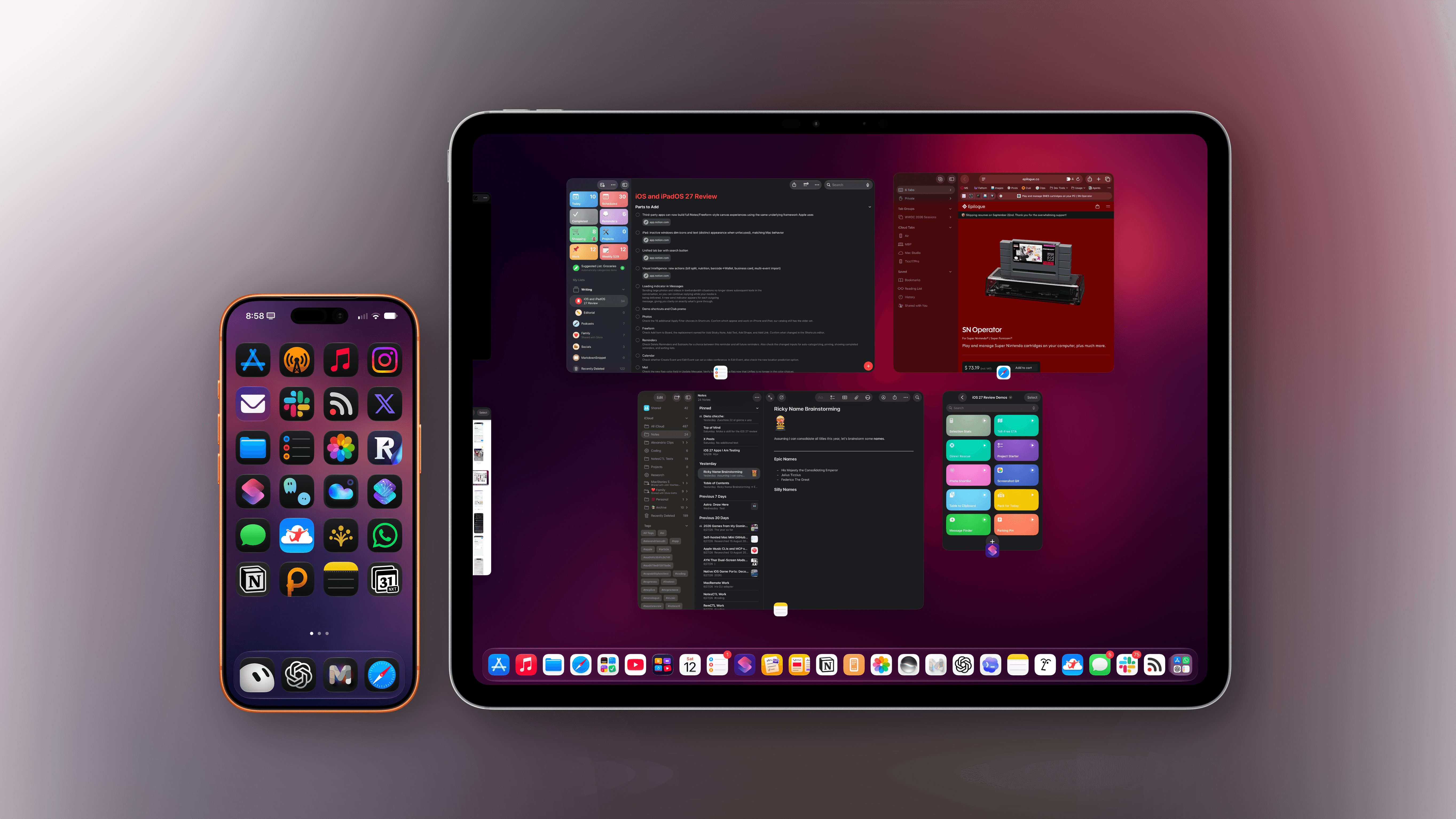
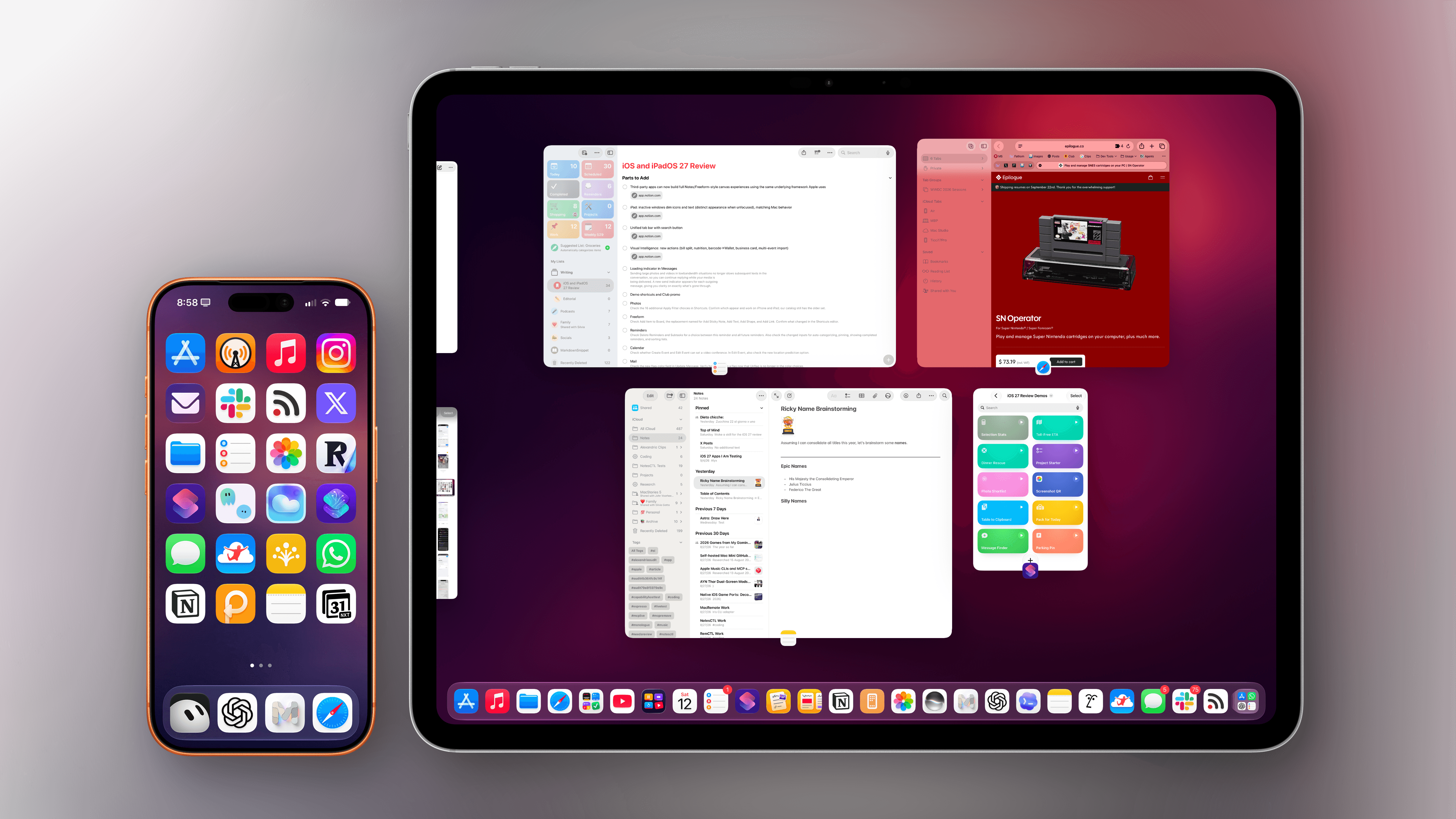
Conclusion
A question loomed large over Apple ahead of WWDC three months ago:
Will they deliver on AI and make good on the new Siri they promised two years ago and never shipped?
Three months later, we have our answer: they did, and the new Siri AI actually works and is useful. This is not to say that it is perfect. Siri AI is a limited rollout in a single language, with no availability in the EU; it’s based on Foundation models that are still behind the current state of frontier AI; and it’s predicated upon the assumption that third-party developers will put in the work to support the architecture Siri AI requires.
Despite these limitations, it’s undeniable that Apple’s entry into the AI assistant space feels like someone finally designed a chatbot for how normal people use their phones. As a power user, sure, I would have liked to see more features and options. But I also have to remember that starting from advanced users is not how Apple operates. Siri AI is an assistant designed around the iPhone and iPad, built to take advantage of their app ecosystem. It could have been a chatbot bolted onto the OS, and perhaps some would have been happy with it. But Apple went in a different direction.
In my career at MacStories, I’ve never witnessed a topic as divisive as AI and what it’s doing to the tech industry right now. We have been critical of certain aspects of AI over the years, and we’ve championed others that are fundamentally changing what we do on our computers – and what the computer is supposed to do for us. In a world of hot takes and extremist positions around this topic, I choose to remain pragmatic and optimistic. And I choose to believe that there’s still room for nuanced takes on AI that put our readers and developers first, so we can explain what’s useful about it, and what’s possible to build with it.
With that in mind, this is how I plan to explore the potential of Siri AI over the next few years. Apple’s new assistant is making a strong debut in iOS 27, powered by excellent integrations with native apps, a solid balance of speed and privacy, and a pervasive intelligence that is only made possible by Apple’s interplay of hardware and software. Time will tell if millions of consumers will find Siri AI to be a compelling alternative to ChatGPT, but I think Apple is making something else very clear with iOS 27, the iPhone 18 Pro, and the iPhone Duo:
Artificial intelligence is here to stay on Apple platforms, and it’s going to reshape our relationship with the company’s devices. You can disagree with it, but you can’t ignore it. I want to understand Siri AI, because we need more companies that give a damn about design, app developers, and privacy in the AI world.
Because, after all, I still love writing about a company that, against all odds, is hungry and foolish enough to try something new.
Credits
My annual iOS and iPadOS reviews are a labor of passion, curiosity, and – to an extent – sheer endurance. I do them because I love everything about the process. The review wouldn’t have been possible without the support from the following people people and dogs:
- My girlfriend Silvia, for her wisdom, unending support, love, suggestions, and patience. This review wouldn’t be possible without you. I love you.
- Zelda and Ginger, my two dogs and the love of my life. Thank you for making me happier every day.
- John Voorhees, a friend and tireless business partner. Running MacStories with you is more fun and interesting every day.
- Granola, the sponsor of this review.
- Lachlan Campbell, for their invaluable, detailed notes and suggestions.
- Myke Hurley
- Stephen Hackett
- Notion, Codex, Claude, Shareshot, Shortcuts, Open Minis, oMLX, HandBrake, Unread, and Superhuman – the tools behind the making of this review.
- Every app developer who sent me betas during the summer.
- Designers and engineers at Apple, who always make reviewing iOS and iPadOS each summer fun.
- Every Club MacStories, Club MacStories+, and Club Premier member, for supporting us directly in everything we do.
- Our Discord members, for always pushing me to do my best.
And finally, every MacStories reader, for allowing me to do what I love every single day. Thank you.
SOCIAL SHARE CARD GENERATOR