
📚 How to Build Responsive Users Card Using TailwindCSS
💡 Newskategorie: Programmierung
🔗 Quelle: dev.to
 platform](https://res.cloudinary.com/practicaldev/image/fetch/s--gYPwV08X--/c_limit%2Cf_auto%2Cfl_progressive%2Cq_auto%2Cw_880/https://dev-to-uploads.s3.amazonaws.com/uploads/articles/aajody5raddslkzkj0z4.png)
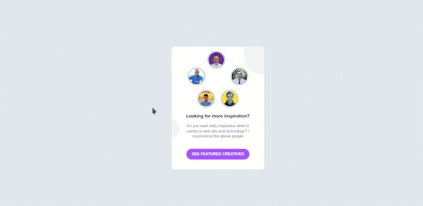
User Cards is a feature designed to enable managers and colleagues to quickly access learner profile data, learning history, goals, and associated job profiles.
It can have different structures, sizes and content. As a matter of fact, a card in design and technology is defined as a UI design pattern that groups related information in a flexible-size container visually resembling a playing card.
On the internet, we get in contact with a card or a hybrid from it at least once every day.
It is important or it will be great to know how to build such a component. As it is highly used in almost all web platforms.
Without wasting much time, let's build this up.
Understanding the Task
It’s important to divide your work or design into different parts, I always do that, it helps me break it down into smaller components that I can easily build, then join them all together to form the bigger component.
if you are used to my post, you surely know I call it the “Divide and Conquer “ approach😉
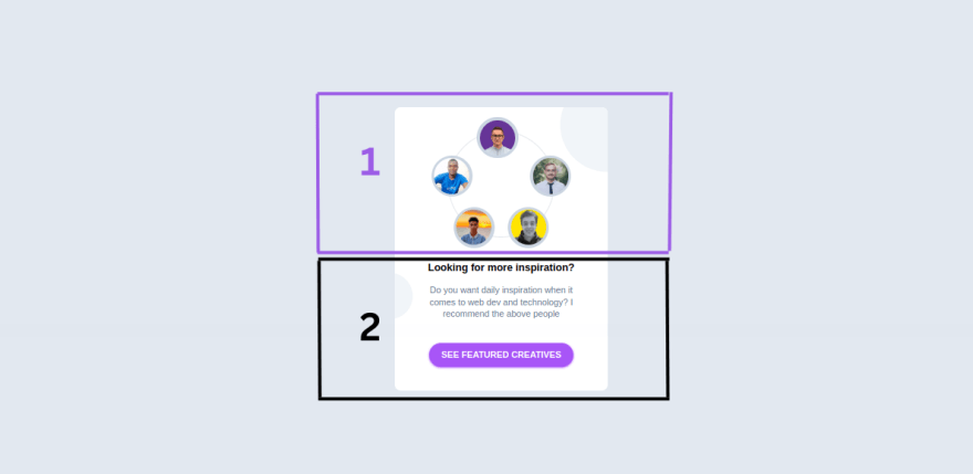
Sincerely speaking, we don't need to separate this into different parts. But to make it a little bit easier to understand, we can divide it into 2 main parts, Images and Summary.
I couldn't really get nicer names to name the different parts. 😅 Please let's just take it like that.
Structure of Code
As I always say, I have the same structure when it comes to designing components. Simply because I believe they somehow have the same root. 😃
This is how it goes
<body>
<!-- First Layer -->
 <div>
<!-- Second Layer -->
  <div>
        <!-- Images -->
            <div></div>

        <!-- Summary -->
            <div></div>
  </div>
 </div>

</body>
Images
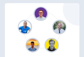
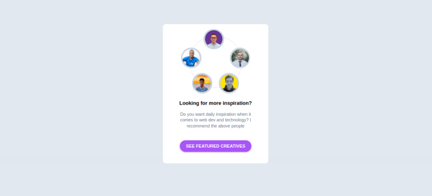
This is what we will be doing here. This beautiful round image wheel.
<!-- Second Layer -->
<div>
        <!-- Images -->
    <div>
      <ul class="w-36 h-36 rounded-full border-2 relative [&>*]:absolute [&>*]:w-14 [&>*]:h-14 [&>*]:bg-slate-300 [&>*]:rounded-full [&>*:hover]:scale-110 [&>*]:p-1 [&>*>img]:h-full [&>*>img]:object-cover [&>*>img]:rounded-full">
        <!-- Image 1 -->
       <li class="-top-5 right-12 hover:bg-purple-700">
        <img src="https://yt3.googleusercontent.com/cs7kGRac3WXF6cidW6N9cfDUEc4vYVIWdqQGL6Iuba7uwfLpFxFC0zLqbOblvSFHb1tb0QTz=s900-c-k-c0x00ffffff-no-rj" alt="">
       </li>
         <!-- Image 2 -->
      <li class="top-8 -left-6 hover:bg-blue-600">
        <img src="https://media.licdn.com/dms/image/D4E03AQH7P9arsYmElA/profile-displayphoto-shrink_800_800/0/1671708712233?e=2147483647&v=beta&t=2zGHmVsWVcsifWCCt_FAuZr8vytcaU_nCc-twF-iWCk" alt="">
      </li>
         <!-- Image 3 -->
      <li class="top-8 -right-6 hover:bg-slate-500">
        <img src="https://media.licdn.com/dms/image/C4E03AQEvvbJVGMtDWg/profile-displayphoto-shrink_200_200/0/1577999315397?e=1680739200&v=beta&t=ps3VVA6fmP-zU8pWNZg31wUrD_bTHa0vd6nGoPc2-3g" alt="">
       </li>
          <!-- Image 4 -->
      <li class="-bottom-4 left-1.5 hover:bg-slate-900">
          <img src="https://pbs.twimg.com/profile_images/1627084229174771712/cT6fvHnL_400x400.jpg" alt="">
       </li>
         <!-- Image 5 -->
     <li class="-bottom-4 right-1.5 hover:bg-yellow-500">
       <img src="https://pbs.twimg.com/profile_images/1633405008715685888/HtwI6PCv_400x400.jpg" alt="">
      </li>
     </ul>

     </div>
</div>
As the name of the section describes, it consists of many profile images (5 to be specific, but you can always customize the number to your liking).
Now let's understand the code we just wrote, I will specifically focus on the main container holding the images.
We gave this container a width and height of w-36 and h-36 respectively, a border-radius of rounded-full and position it relative, in order to allow us to move the different images to a different positions within it.👌
If you are used to my posts, by now you surely know the meaning of [&>*] in tailwindcss.
But if you are new, The property [&>*] simply means “select each child individually”, this allows us to apply the same styling properties to all the immediate children.
To each child, we gave it a width and height of w-14 and h-14 respectively, we also gave each of them a border-radius of rounded-full, transform property of scale-110 on hover and a padding of p-1.
We also use a similar approach to select the images inside their containers. This was achieved using [&>*>img]. In English it can be translated as, for every immediate child, select the image within it (Is tailwindcss not wonderful? 😍).
For each of these images, we gave them a height and h-full made them responsive with object-cover and rounded with border-radius of rounded-full
And that should be pretty much it for the general styling.😃
Specific effects were added to each of the images and were position absolute to their relative parent container. For example, taking the case of the topmost picture
        <!-- Image 1 -->
<li class="-top-5 right-12 hover:bg-purple-700">
        <img src="https://yt3.googleusercontent.com/cs7kGRac3WXF6cidW6N9cfDUEc4vYVIWdqQGL6Iuba7uwfLpFxFC0zLqbOblvSFHb1tb0QTz=s900-c-k-c0x00ffffff-no-rj" alt="">
 </li>
a background-color change effect was applied on hover, and it was positioned at the top center using -top-5 and right-12
Similar properties were applied to other images to archive the end result
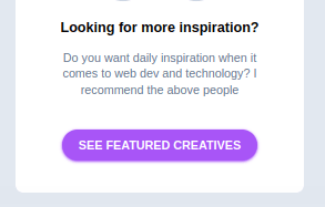
Summary
This section is simple and straight to the point
        <!-- Summary -->
 <div class="flex items-center justify-center flex-col">
        <!-- Description -->
 <div class="w-4/5 text-center  my-8">
   <h2 class="font-bold mb-3">Looking for more inspiration?</h2>
   <p class="text-slate-500 text-xs">Do you want daily inspiration when it comes to web dev and technology? I recommend the above people</p>
  </div>
        <!-- Button -->
 <div class="px-4 py-2 font-semibold text-xs bg-purple-500 text-white rounded-full w-fit cursor-pointer hover:scale-[1.03] active:scale-95 shadow shadow-purple-500">
         <h2>SEE FEATURED CREATIVES</h2>
 </div>
</div>
The summary container is a flexbox that is used to center its whole content using flex items-center justify-center flex-col
Description: No extraordinary styling, just
font-weightoffont-bold, containerwidthofw-4/5Button: This is the call to action button at the bottom of the card. we gave it a
padding-inlineofpx-4padding-blockofpy-2font-weightoffont-semiboldfont-sizeoftext-xs,background-colorofbg-purple-500,border-radiusofrounded-fullzooming effect onhoverwithhover:scale-[1.03], pressing effect usingactive:scale-95and light purplebox-shadoweffectshadow shadow-purple-500
Layer Styling
Let's apply some styling to the different layers to achieve the design we have
<body class="bg-slate-200 text-sm flex items-center justify-center min-h-screen">
<!-- First Layer -->
 <div class="w-[18rem] bg-white py-8 rounded-lg relative overflow-hidden [&_*]:transition-all [&_*]:ease-linear [&_*]:duration-200">
<!-- Second Layer -->
  <div class="flex flex-col justify-center items-center">
        <!-- Images -->
            <div></div>

        <!-- Summary -->
            <div></div>
  </div>
 </div>

</body>
Here is the result
It doesn’t look bad at all, but it’s kinda too plain for me. Let’s add those before rounded circles to this. 🤓
<body class="bg-slate-200 text-sm flex items-center justify-center min-h-screen">
<!-- First Layer -->
 <div class="w-[18rem] bg-white py-8 rounded-lg relative overflow-hidden [&_*]:transition-all [&_*]:ease-linear [&_*]:duration-200">

NEW -> <div class="absolute -right-16 -top-10 bg-slate-100 w-32 h-32 rounded-full"></div>

<!-- Second Layer -->
  <div class="flex flex-col justify-center items-center">
        <!-- Images -->
            <div></div>

        <!-- Summary -->
            <div></div>
  </div>

NEW ->  <div class="absolute -left-10 bottom-24 bg-slate-100 w-16 h-16 rounded-full"></div>
    </div>
 </div>

</body>
We just added the two circles in our component, position them absolutely then place them in the position seen using left and right properties
You can easily identify this component by looking at [NEW] in the above code.
And that’s pretty much it. 😍
We just designed a responsive Users Card Component!

Conclusion
We just built a simple and responsive Users Card component without opening our CSS file😃. Thanks to Tailwindcss.
Many employers will need such components to be added to their websites, and right now you should be proud that you are one of those few who know how to build it in less than 5mins, and you can do that without even leaving your HTML document 😎.
You can have a Live preview on Codepen or find the code on GitHub
Don’t hesitate to share with me if you were able to complete the tutorial on your end, I’d be happy to see any additions styling you added to your card.
If you have any worries or suggestions, don’t hesitate to leave them in the comment section! 😊
See ya! 👋
...