
📚 Build a product gallery app easily with TailwindCSS and StorefrontUI
💡 Newskategorie: Programmierung
🔗 Quelle: dev.to
Working with a component library to build your custom UI can be complicated, especially when you want to integrate with other tools, such as TailwindCSS. In this post, we will explore how to build a product gallery with Storefront UI, a fast and beautiful component library for E-commerce, and TailwindCSS in a Nuxt application.
Table of Content
- Table of Content
- Prerequisites
-
Storefront UI 2 as the robust E-commerce Component Library
- Installing Storefront UI with TailwindCSS
-
Building a product gallery with grid view mode
- Implementing ProductCard component
-
Using SfLink with Nuxt
- Resources
- Summary
Prerequisites
It would be best if you had your Nuxt application set up and ready to go by using the following command:
npx nuxi init storefrontui-demo
Which storefrontui-demo is the name of our code demo application. You can change to any name per your preference.
Since Storefront UI is designed with TailwindCSS in mind, you need to install the TailwindCSS module for Nuxt with the following command:
yarn add -D @nuxtjs/tailwindcss @storefront-ui/vue
In nuxt.config.ts, we add the TailwindCSS module as follows:
export default defineNuxtConfig({
  modules: ['@nuxtjs/tailwindcss']
})
To prepare for our gallery demo, we need to add some sample data for our gallery in listing.json, following the the Product declaration interface (types/Product.type.ts) since we are working with TypeScript:
export interface Product {
    title: string;
    description: string;
    images: string[];
    quantity: number;
    price: number;
    ratings: number[];
    currency_code: string;
    sku: string;
}
And with that, we are ready for our tutorial!
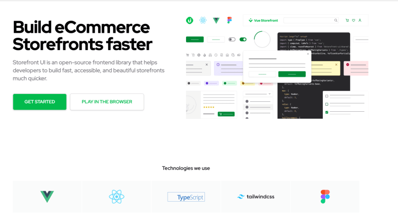
Storefront UI 2 as the robust E-commerce Component Library
Starting as a component library in Vue projects, Storefront UI aims to deliver to developers a set of fast, accessible, and customizable components for E-commerce exclusively. From Storefront UI 1.x to StorefrontUI 2.x, there have been significant improvements, both in the developer experience (DX) and in the user experience (UI) of the library.
Compared to Storefront UI 1.x, Storefront UI 2.x leans towards to more composable (or building block) approach, where you can:
- Use the base components to compose higher-level blocks, or
- Use the UI logic hooks (or composables) to create your custom UI components, or/and
- Use the Block examples as the reference for your higher-level building blocks.
At the time of writing, Storefront UI is at 2.1.0, freshly released from the oven. It also supports React, Vue, and soon Angular!
How about we start to use StorefrontUI in our application? Let's check it out, shall we?
Installing Storefront UI with TailwindCSS
We first install the Storefront UI package for Vue using the following command:
yarn add -D @storefront-ui/vue
Then in tailwind.config.ts, we will import the Storefront UI presets for Tailwind to have the SFUI utility classes detected, as follows:
// tailwind.config.ts
import type { Config } from 'tailwindcss';
import { tailwindConfig } from '@storefront-ui/vue/tailwind-config';

export default <Config>{
  presets: [tailwindConfig],
  content: ['./**/*.vue', './node_modules/@storefront-ui/vue/**/*.{js,mjs}'],
};
And we now can use components of StorefrontUI and start building our product gallery!
Building a product gallery with grid view mode
For our product gallery - components\ProductGallery.vue, we want it to display a list of products in a grid (card) view with the following base template:
<template>
    <h1 class="my-4 text-3xl font-extrabold text-gray-900 md:text-4xl text-center">All products</h1>
    <ul class="mx-8 my-4 flex flex-wrap gap-3 justify-center">
        <li v-for="product in products" :key="product.sku">
            <!--gridView-->
        </li>
    </ul>
</template>
And in the <script setup> section, we get the products from a composable useProducts(), as below:
<script setup lang="ts">
import { useProducts } from '~/composables/useProducts';

const { products } = useProducts();
</script>
Now let's create a composables/useProducts.ts file which will return a reactive list of products as our sample data:
import { Product } from '~/types/Product.type';
import data from '../listing.json';

export const useProducts = ():{ products: Ref<Product[]> } => {
    const products = reactive(data as any as Product[]);

    return {
        products
    }
}
Note if you are fetching data from an external API and updating the entire products array's value (or reference), you should use ref() instead of reactive().
So far, so good. Next, we implement the ProductCard component for our gallery's grid view.
Implementing ProductCard component
Since ProductCard is a product's concise snapshot in a card view, we will need to display the following essential details:
- Product image
- Product's title
- Product ratings and how many votes it has
- Product's price, with currency code.
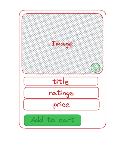
Also, it needs to offer users some actions, including adding to the cart and making it a user's favorite. So, how should we implement it?
We can start from scratch with some help of the following base components from Storefront UI:
-
SfLinkfor displaying the product's page URL. -
SfButtonfor the actions -
SfIconShoppingCartandSfIconFavoritefor the action icons. -
SfRatingto display the rating score graphically (using stars) and beautifully. -
SfCounterto display the number of the voters according to the format(<voters>)like(11).
All these components come with the option to override their default template or a specific section of its template using a named slot pattern, giving you the full capability to build your ProductCard on top of them.
Or, with a less-code approach, we can head to Product Card Vertical - Storefront UI page, where the team has prepared the ready-to-use example code snippet for us to reuse.
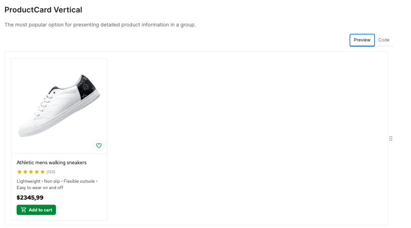
Let's hit the Code tab and copy the code to your components/ProductCard.vue. We now have the necessary code for our component implemented.
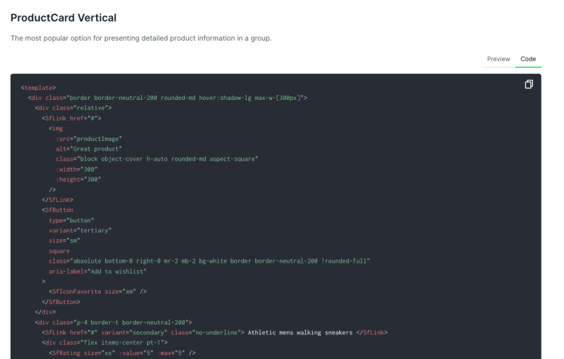
The snippet comes with hard-coded data for product info, so we still need to modify it to match our needs.
In the script section, we will modify the code to make sure our component receives item as a prop type of Product, manually calculates the totalRatings from item.ratings array, and map item.images[0] to productImage as the image link, to the following:
import { SfRating, SfCounter, SfLink, SfButton, SfIconShoppingCart, SfIconFavorite } from '@storefront-ui/vue';
import type { Product } from '../types/Product.type';
import type { PropType } from 'vue';

const props = defineProps({
    item: {
        type: Object as PropType<Product>,
        required: true
    }
})

const totalRatings = computed(() => {
    const rating = prop.item.ratings.reduce((a, b) => a + b, 0) / prop.item.ratings.length;
    return +(rating.toFixed(1));
});

const productImage = computed(() => props.item.images[0])
And then, in the template section, we replace the second div element, which contains all the static data to the following:
<div class="p-4 border-t border-neutral-200 flex-1" id="product-card--details">
    <SfLink :href="`/products/${item.sku}`" variant="secondary" class="no-underline"> {{ item.title }} </SfLink>
    <div class="flex items-center pt-1">
        <SfRating size="xs" :value="totalRatings" :max="5" />
        <SfLink href="#" variant="secondary" class="pl-1 no-underline">
            <SfCounter size="xs">{{ item.ratings.length }}</SfCounter>
        </SfLink>
    </div>
    <span class="block pb-2 font-bold typography-text-lg">{{ item.currency_code }}{{ item.price }}</span>
    <SfButton type="button" size="sm" class="m-4 w-fit self-end">
        <template #prefix>
          <SfIconShoppingCart size="sm" />
        </template>
        Add to cart
    </SfButton>
</div>
In which, we map item.title and /products/${item.sku} as the label and the href of SfLink , totalRatings as the value of SfRating, item.ratings.length as the label for SfCounter, and display the item's price according to our wished format.
We also to change the alt for the product image to item.title instead of the default text Great product, for accessibility, as follows:
<img
    :src="productImage"
    :alt="item.title"
    class="block object-cover h-auto rounded-md aspect-square"
    :height="300"
/>
Lastly, we place the wrapper div to article element for better HTML usage practice. Our final template structure will look like below:
<article class="border border-neutral-200 rounded-md hover:shadow-lg max-w-[300px] h-full flex flex-col">
    <div class="relative">
        <!--image & favorite icons-->
    </div>
    <div id="product-card--details">
        <!---product information and add to card-->
    </div>
</article>
That's it. We only need to use it in our ProductGallery.vue component, and our gallery component is complete.
<!--ProductGallery.vue-->
<template>
    <h1 class="my-4 text-3xl font-extrabold text-gray-900 md:text-4xl text-center">All products</h1>
    <ul class="mx-8 my-4 flex flex-wrap gap-3 justify-center">
        <li v-for="product in products" :key="product.sku">
            <ProductCard :item="product" />
        </li>
    </ul>
</template>
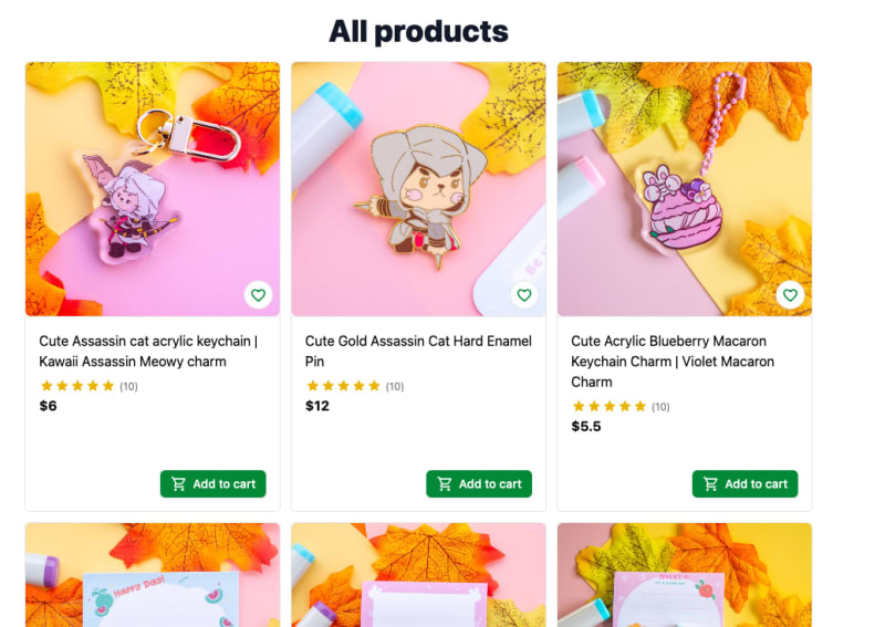
After we replace the NuxtWelcome will ProductGallery in app.vue and run the project using yarn dev, we will see our product gallery displayed in the browser as in the following screenshot:
Using SfLink with Nuxt
One important note when using SfLink with Nuxt is that SfLink will render to an anchor element that is out of Nuxt context, causing a full page loading/reloading every time a user clicks on it. Also, it will not trigger any watcher on the router or route object using watch. Hence, to fix it, you need to render SfLink as a NuxtLink component, following the below steps:
- Resolve the
NuxtLinkas a Vue component usingresolveComponent
import { resolveComponent } from 'vue';
const NuxtLink = resolveComponent('NuxtLink');
- In
SfLink, bindNuxtLinktotagprop:
<SfLink :href="`/products/${item.sku}`" :tag="NuxtLink">
    <!--...-->
</SfLink>
Now when clicking on the link, the app will work as expected.
Resources
You can find the working code here
Summary
In this post, we have explored how to use Storefront UI documentation to create a product gallery using Storefront UI, TailwindCSS, and Nuxt at minimum effort. Indeed, there is still work to do, and we can continuously improve our app and component to work better, such as adding a list view for our gallery using ProductCard Horizontal component snippet.
Building blocks are not a new concept in the component library. Still, with Storefront UI, you can enjoy the benefits of customization and a ready-to-use essential component system as the base for your project. If you have built any components for e-Commerce using Storefront UI, share them with me in the comment section!
👉 If you'd like to catch up with me sometimes, follow me on Twitter | Facebook.
👉 Learn about Vue with my new book Learning Vue. The early release is available now!
Like this post or find it helpful? Share it 👇🏼 😉
...