
How to uncover insights from data like a pro
Working as a data scientist in the consumer tech industry for the past six years, I’ve carried out countless exploratory data analyses (EDA) to uncover insights from data, with the ultimate goal of answering business questions and validating hypotheses.
Drawing on this experience, I distilled my key insights into six data analysis principles. These principles have consistently proven useful in my day-to-day work, and I am delighted to share them with you.
In the remainder of this article, we will discuss these six principles one at a time.
- Establish a baseline
- Normalize the metrics
- MECE grouping
- Aggregate granular data
- Remove irrelevant data
- Apply Pareto principle
Establish a Baseline
Imagine you’re working at an e-commerce company where management wants to identify locations with good customers (where “good” can be defined by various metrics such as total spending, average order value, or purchase frequency).
For simplicity, assume the company operates in the three biggest cities in Indonesia: Jakarta, Bandung, and Surabaya.
An inexperienced analyst might hastily calculate the number of good customers in each city. Let’s say they find something as follows.

Note that 60% of good customers are located in Jakarta. Based on this finding, they recommend the management to increase marketing spend in Jakarta.
However, we can do better than this!
The problem with this approach is it only tells us which city has the highest absolute number of good customers. It fails to consider that the city with the most good customers might simply be the city with the largest overall user base.
In light of this, we need to compare the good customer distribution against a baseline: distribution of all users. This baseline helps us sanity check whether or not the high number of good customers in Jakarta is actually an interesting finding. Because it might be the case that Jakarta just has the highest number of all users — hence, it’s rather expected to have the highest number of good customers.
We proceed to retrieve the total user distribution and obtain the following results.
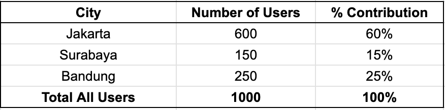
The results show that Jakarta accounts for 60% of all users. Note that it validates our previous concern: the fact that Jakarta has 60% of high-value customers is simply proportional to its user base; so nothing particularly special happening in Jakarta.
Consider the following data when we combine both data to get good customers ratio by city.
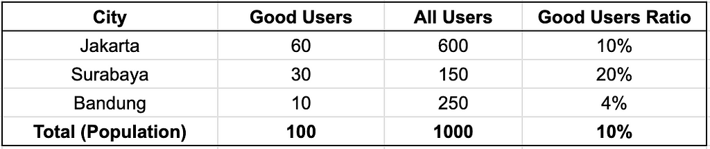
Observe Surabaya: it is home to 30 good users while only being the home for 150 of total users, resulting in 20% good users ratio — the highest amongst cities.
This is the kind of insight worth acting on. It indicates that Surabaya has an above-average propensity for high-value customers — in other words, a user in Surabaya is more likely to become a good customer compared to one in Jakarta.
Normalize the Metrics
Consider the following scenario: the business team has just run two different thematic product campaigns, and we have been tasked with evaluating and comparing their performance.
To that purpose, we calculate the total sales volume of the two campaigns and compare them. Let’s say we obtain the following data.

From this result, we conclude that Campaign A is superior than Campaign B, because 450 Mio is larger than 360 Mio.
However, we overlooked an important aspect: campaign duration. What if it turned out that both campaigns had different durations? If this is the case, we need to normalize the comparison metrics. Because otherwise, we do not do justice, as campaign A may have higher sales simply because it ran longer.
Metrics normalization ensures that we compare metrics apples to apples, allowing for fair comparison. In this case, we can normalize the sales metrics by dividing them by the number of days of campaign duration to derive sales per day metric.
Let’s say we got the following results.

The conclusion has flipped! After normalizing the sales metrics, it’s actually Campaign B that performed better. It gathered 12 Mio sales per day, 20% higher than Campaign A’s 10 Mio per day.
MECE Grouping
MECE is a consultant’s favorite framework. MECE is their go-to method to break down difficult problems into smaller, more manageable chunks or partitions.
MECE stands for Mutually Exclusive, Collectively Exhaustive. So, there are two concepts here. Let’s tackle them one by one. For concept demonstration, imagine we wish to study the attribution of user acquisition channels for a specific consumer app service. To gain more insight, we separate out the users based on their attribution channel.
Suppose at the first attempt, we breakdown the attribution channels as follows:
- Paid social media
- Facebook ad
- Organic traffic

Mutually Exclusive (ME) means that the breakdown sets must not overlap with one another. In other words, there are no analysis units that belong to more than one breakdown group. The above breakdown is not mutually exclusive, as Facebook ads are a subset of paid social media. As a result, all users in the Facebook ad group are also members of the Paid social media group.
Collectively exhaustive (CE) means that the breakdown groups must include all possible cases/subsets of the universal set. In other words, no analysis unit is unattached to any breakdown group. The above breakdown is not collectively exhaustive because it doesn’t include users acquired through other channels such as search engine ads and affiliate networks.
The MECE breakdown version of the above case could be as follows:
- Paid social media
- Search engine ads
- Affiliate networks
- Organic

MECE grouping enables us to break down large, heterogeneous datasets into smaller, more homogeneous partitions. This approach facilitates specific data subset optimization, root cause analysis, and other analytical tasks.
However, creating MECE breakdowns can be challenging when there are numerous subsets, i.e. when the factor variable to be broken down contains many unique values. Consider an e-commerce app funnel analysis for understanding user product discovery behavior. In an e-commerce app, users can discover products through numerous pathways, making the standard MECE grouping complex (search, category, banner, let alone the combinations of them).
In such circumstances, suppose we’re primarily interested in understanding user search behavior. Then it’s practical to create a binary grouping: is_search users, in which a user has a value of 1 if he or she has ever used the app’s search function. This streamlines MECE breakdown while still supporting the primary analytical goal.
As we can see, binary flags offer a straightforward MECE breakdown approach, where we focus on the most relevant category as the positive value (such as is_search, is_paid_channel, or is_jakarta_user).
Aggregate Granular Data
Many datasets in industry are granular, which means they are presented at a raw-detailed level. Examples include transaction data, payment status logs, in-app activity logs, and so on. Such granular data are low-level, containing rich information at the expense of high verbosity.
We need to be careful when dealing with granular data because it may hinder us from gaining useful insights. Consider the following example of simplified transaction data.

At first glance, the table does not appear to contain any interesting findings. There are 20 transactions involving different phones, each with a uniform quantity of 1. As a result, we may come to the conclusion that there is no interesting pattern, such as which phone is dominant/favored over the others, because they all perform identically: all of them are sold in the same quantity.
However, we can improve the analysis by aggregating at the phone brands level and calculating the percentage share of quantity sold for each brand.
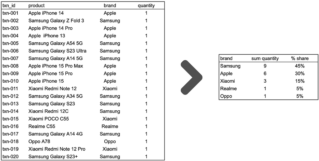
Suddenly, we got non-trivial findings. Samsung phones are the most prevalent, accounting for 45% of total sales. It is followed by Apple phones, which account for 30% of total sales. Xiaomi is next, with a 15% share. While Realme and Oppo are the least purchased, each with a 5% share.
As we can see, aggregation is an effective tool for working with granular data. It helps to transform the low-level representations of granular data into higher-level representations, increasing the likelihood of obtaining non-trivial findings from our data.
For readers who want to learn more about how aggregation can help uncover interesting insights, please see my Medium post below.
! 👋
on Medium, where people are continuing the conversation by highlighting and responding to this story.

SOCIAL SHARE CARD GENERATOR